William Eggleston: Portraits (National Portrait Gallery, 21 July-23 October 2016)
Author / flares

Dead Reconing
* Rec (Jaume Balagueró and Paco Plaza, 2007)
I remember sitting through The Blair Witch Project in a state of sheer terror.
Painting Exposed
Painting with Light (11 May-24 September 2016, Tate Britain)
I am bringing two pieces of baggage to this show.
Firstly a sense that a few London galleries seem to be finding excuses to show the ever popular Preraphs — compare the National Gallery Painters’ Paintings and the V&A’s Botticelli. And also the talk by Karen Shepherdson on Tony Ray-Jones and Martin Parr puts a debate about photography as art and commerce onto my mind. And having just seen William Eggleston at The National Portrait Gallery, my mind was on art.
Continue reading →
Ray-Jones of Light
I don’t think that Tony Ray-Jones was a name known to me, but I’m pretty sure I’d seen a photo or two — I’m thinking couple having a picnic at the Glynebourne festival, surrounded by cows. And then Martin Parr curated an exhibition of his photos and his own work, which I think opened the Media Space at the Science Museum I suspect an attempt to ease their presence out of Bradfoford, but that’s another story. That show, Only in England, has toured and I missed it by a day at Liveroool. Now a selection has come to Canterbury’s Beaney, supported by a talk by my comrade Karen Shepherdson.
There’s a curious tension in the photos — modernity and nostalgia, realism and the comic, celebration and, maybe, condescension. That last one is arguable. Shepherdson, whose own practice includes working on the harbour at Broadstairs, has enjoyed eavesdropping on the gallery’s viewers, noting their engagement and their memories.
Ray-Jones was born in 1941, son of Raymond Jones, a painter and etcher and part of the St Ives school (he had changed his name to Ray-Jones to help his image) who died when the photographer was an infant. After an unhappy time at Christ’s Hospital school in Horsham, he studied at the London College of Printing and won a scholarship to Yale, as spending time at the Design Lab, Manhattan, where he was introduced to street photography. He returned to England with a new aesthetic and credo, partly as an outsider in the era of British pop art and the Mersey sound and Swinging London.
Shepherdson pointed out the significance of the seaside to British photography. In the U.K. We are never further than seventy miles from the sea and it became the default destination for the working class day out or holiday. From the early days of photography in the Victorian era, businesses set up on the beach or promenade, taking walker that would be developed and sold to the subject within minutes. Companies had props and backdrops, and portable developing facilities or darkcars. Hundreds of photographs would be taken each day — in the early days ambrotypes and ferrotypes. It became a precious memento of a family jolly, rare in the century before camera phones. The beach is also a carnival space — it is a holiday, even if a day trip, alcohol might have been involved and the family is off duty. Morality … slips. At the same time there is a curious formality — most people would have had work clothes and best clothes, so the beach visitors are often in suit and tie.
Whilst Ray-Jones did not only take photographs at the seaside — and had used colour film in America — the beach photos were part of a self conscious project cut short by his death in 1973 from leukaemia. Among his notes are lists of seaside towns — Ramsgate, Margate, Broadstairs, Bridlington and so on — with the one visited ticked off. The south east was more completed than the north east. He toured round England in a dormobile 1966-79 with his wife, seeking to capture an England at risk of becoming Americanised. The seaside towns frequently document nineteenth century resorts in decline — and to my mind offer a sequel to the charabanc trip in Uses of Literacy.
In a series of notes to himself, he lists his credo: “Don’t take boring pictures”. He wanted to avoid mid shots in for close ups, to be part of the action. “Be more aggressive.” “Get in closer.” “Not all at eye level.” It seems good advice.

Karen showed a picture of people on a boat trip — it gets labelled somewhere like Scarborough but in fact is off Beachy head. A crew member and several passengers are on a pleasure boat, looking in all directions, including a figure you might read as a shepherd in a Yorkshire context. At the centre are a casually dressed young couple, kissing and embracing, he in glasses, she looking like she’s walked off a French new wave film. Je t’Aime. Je t’Aime. They are the only people of their generation in view. The picture was cropped from the original — she is bare footed, a scantily clad woman is off frame. I also notice an older woman in glasses, the only person apparently aware of Ray-Jones at work. Despite Ray-Jones’s injunction to take fewer photos, there were about seventy on the boat.
Parr paired Ray-Jones’s pictures with his Nonconformist series, mostly taken around Hebdon Bridge as it made an awkward transition from manufacturing town to a trade based on tourism. He records rituals and routine, again the observation of the every day, with an eye to the absurd. There’s a tableau Shepherdson showed us of a mayoral buffet, a scrum of people at a table, some with filled plates, some yet to reach through, and again a single figure in the background eyeing the photographer. Like Ray-Jones the framing is both perfect and there a sense of people coming in and out of frame, and towards and away from the photographer’s (and our) viewpoint.

Parr’s seaside photos – many again in Thanet, perhaps most striking a series at New Brighton in the early days of Thatcherism after he had spent two years in Ireland – are in a garish colour, for me teetering on camp or kitsch, rather like the resorts themselves. There is an honesty and a knowingness – and I recall Parr saying that the beach was a laboratory for his wider photographic practice.
Shepherdson notes a sense of estrangement at the heart of both photographers – they make us look again at the every day. At the same time, this risks making the ordinary look alien. In taking these anonymous people and making them into – well, if not art then a quasi-ironised representation (although I’m happy for it to be art, baggage and all) – there’s the risk of being accused of looking down. The photographer here takes his telling image and moves on, having used. Maybe. Shepherdson suggests they refract rather than reflect.
But it is up to us to empathise and celebrate and recognise — and as Karen said, perhaps quoting Parr or Ray-Jones, walk like Alice through the looking glass.
Speech for Arthur C. Clarke Award, 24 August 2016
My speech as Non-voting Chair of JudgesTM at Foyles, 24 August 2016. Gratifyingly well received.
Novels with spaceships and novels with spiders,
near future Europe with parallels beside her,
a modified woman – flying with wings,
these are a few of my favourite things.
You’d think after thirty years it’d be easy to choose the Clarke winner – we’d turn up and all know that that novel is the one.
But this year we had a tough time getting to a short list and a tough time agreeing on a winner.
All of the books play with and reinvigorate the sandbox of science fiction – generation starships, ill-matched crews, AIs, parallel universes, mutants and have one or more moments of conceptual breakthrough, when you realise that the fictional universe is more complicated than you think.
It was suggested to me by Ian Whates, Leila Abu El Hawa, Andrew McKie, Liz Bourke and David Gullen that in a sense all the books on the short list were winners
But I pointed to the rule that There Can Be Only One.
Might it be Dave Hutchinson’s Europe at Midnight, follow-up to his Clarke shortlisted Europe in Autumn, with the Balkanised Europe now neighboured by a pocket universe consisting of a university, a pocket university, if you will? Of course, this is a very timely book, a very important book, said one of the judges, and we were deciding on a winner just over a week after the Brexit vote. This is my favourite book, said one of the judges.
There’s a pocket world in Iain Pears’s Arcadia, which laminates together a Tolkien-esque author and their fantasy world, and time travel from the near future to a parallel world. Pears nods, of course, to Tolkien and Lewis, to Sir Philip Sidney and to As You Like It, as well as many other references. Pears’s app add to the reading experience, challenges the linearity of reading and adds to the pleasure of the novel. This is my favourite book, said one of the judges.
Or might it be, Becky Chambers’s The Long Way to a Small Angry Planet, Kitshchie award-winning, originally self-published, lazily comparable to Firefly, but it does diversity and explores identity so much better than Whedon and almost effortlessly. Great fun, this is my favourite book, said one of the judges.
Or might it be a book that has to overcome a phobia of many of its readers and at least one of our judges, Adrian Tchaikovsky’s Children of Time. This is an epic tale, told across generations, as the last of humanity think they have found a terraformed planet to settle, only it is defended by an AI who is protecting the dominant species of the planet, which has been uplifted (and the novel has at least one nod to David Brin). Defying disbelief, that species turns out to be able to defend itself more than adequately. This is my favourite book, said one of the judges.
Alternatively, J.P. Smythe’s Way Down Dark is also set on a ship that has a voyage which will last generations –but here the passengers are awake, but society is falling apart. Chan has tried to maintain the Arboretum against the attacks of a savage gang. When her mother dies, Chan has to become leader in her place and save the ship. But nothing is quite as it seems and we are taken on quite a journey in the first of a trilogy. This is my favourite book, said one of the judges.
Finally, Nnedi Okorafor’s The Book of Phoenix, a prequel to Who Fears Death, forces the reader to confront some interested moral questions in the choice of protagonist – in some ways it’s a superhero origin story, but in truth it is more complex. Phoenix Okore is a modified, accelerated woman, imprisoned in a skyscraper in New York. When she breaks out in search of the truth, it starts a bloody chain of events in Ghana and the U.S. This is my favourite book, said one of the judges.
You can see our problem. What do you mean by favourite?
Each year, for thirty years, the judges have to decide that for themselves. A different set of judges every year and a different favourite. How did they decide this year?
Novels with spaceships and novels with spiders,
near future Europe with parallels beside her,
a modified woman – flying with wings,
these are a few of my favourite things.
Butler’s Third Law of Research
Write the material using the wrong referencing format, so you can prevaricate by correcting this.
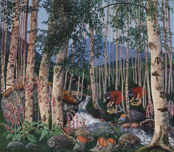
Norwegian Marigold
Painting Norway: Nikolai Astrup (Dulwich Picture Gallery, 5 February-15 May 2016)
It’s perhaps odd to think of landscape as political. It shouldn’t seem odd – humanity has shaped the planet with earthworks and agriculture and transportation across the centuries, and the ideological boundaries of course define it. Landscape painting goes further in its selection and depiction of topic, to write a nationality in oil or watercolours.
We’re pretty pisspoor when it comes to Norwegian artists – we only really know Edvard Munch and we mostly know him through misreading The Scream. Add to that Johan Dahl and Peder Balke (to whom I will come back in future blog entries), and I fear the list is exhausted. Munch isn’t really known for his landscapes as such, more his figures in them, but his backgrounds are clearly psychological in nature.
There’s a Dahl painting of a tree in one of the Bergen galleries, which represents Norway. This is presumably an echo, conscious or otherwise, of one of Caspar David Friedrich’s paintings of a tree, which represents Germany. Sylvan metonymy is the way forward – and no doubt a head scratching or two would recall an English oak to mind.


Astrup (1880-1928) is an artist whose dates straddle the establishment of an independent Norway, and who is considered to be part of a generation of painters who were creating the country in paint – Norway had become ceded to Sweden from Denmark in 1814 and began fighting for independence, but it was not until 1905 that this finally came about. (I think there’s a set of artists, composers and writers in the 1840s and 1850s who were also working on this project, including Dahl.) Until the Dulwich Picture Gallery show Astrup had not been shown in the UK – and he was unknown to Andrew Graham-Dixon’s somewhat, uh, erratic, documentary on Norwegian art. The majority of canvases on show were landscapes – although sometimes there are groups of people, usually his family, whether siblings or wife and children, but also peasants planting or harvesting.
The most relevant image here is seen best in A Morning in March (c. 1920), a twisted trunk with two branches reaching upwards and splitting, with narrower twigs radiating out. On closer inspection, the tree becomes personifiable, animorphic, as a stretching figure – yawning? Screaming? – with those branches as hands. In woodcuts, some earlier, the figure looks more masculine, in others seems to be breasted.

Astrup was the son of a Lutheran minister and thus grew up both in a religious household and a damp one – the parsonage was not the healthiest of places. He seems to have spent many weeks in bed, presumably staring out of the windows, thus seeing the view in a variety of lights. Rather like Munch, although I suspect for different reasons, Astrup keeps returning to the same images – the same lake, the same mountain – but with different coloration. In painting different colours, he is painting different moods, which attach to spring, summer, autumn and winter.
Alongside oils and water colours are wood block prints, carefully carved up from a number of different pieces of wood, ready to be applied with different colours of paint. (Remember, if you think this a primitive technique, that this was Escher’s preferred media.) Each time a block is applied, he has to wait for the paper to dry again – and the paper was liable to shrink and the block expand. A complex image like Foxgloves – which exists in numerous versions – might require twenty dryings before it was complete and a single bodge could ruin the image. Sometimes he would expand a print by adding oil paint ting, sometimes he would add it to an oil painting.
Whilst this was creating a national Norwegian visual language, he was inspired by the Japanese woodcuts he saw in Paris in 1902 and in London in 1908 – most clearly in the design known as Bird on a Stone, with a dipper on a stone on the edge of a fjord, a skinny tree in the foreground and mountains in the distance. The Japanese used water-based pigments, but like him pressed the paper against the block rather than vice versa.
This layout was to lead to a set of images of tree, fjord and mountainside, made concrete in the woodcut cover design for Stein Bugge’s Vår oh Vilje (1916), Spring and Desire, where a closer inspection of the mountains in the background reveal a naked woman lying on her back – a recumbent ice queen. This segues into Spring Night and Willow and A Morning in March, in which the ice queen forms an opposition to the (male) tree troll.


The same double take is necessary in his painting and prints of Grain Poles, where the wheat echoes the image of the troll – the catalogue helpfully points us to Theodor Kittelsen’s Troll Wondering How Old He Is (1911) and Grain Poles in Moonlight (1900), as well as pointing to a house as skull (Ålhus Church) and flames as dragons (Preparations for the Midsummer Eve Bonfire (1908)).
Such haunted landscapes would have been at odds with his father’s Lutheranism – indeed the paganism or Norse mythology underlying the Midsummer Eve Bonfires that he was to repeatedly paint reflect a tension with a disapproving parent. He had to stand at a distance – away from its ungodliness and eroticism. But it has its roots in a mythology than underpins Norwegian identity. At the same time, a painting such as Autumn Dusk in the Garden (1902) has a warm light coming from the parsonage and he seems to have been upset by its fall into disrepair and demolition.
The confluence of identity and landscape comes most clearly in his landscapes with marsh marigolds. These would include A Clear Night in June and A June Night and Marsh Marigolds. The vanishing of the flowers represents the passing of an earlier world and a nostalgia for it, as well as concrete evidence of agricultural development.

A number of Astrup’s paintings show the planting of crops or their harvesting, and in his later years he established a smallholding that was garden, house, studio and source of food. He experimented with traditional native plants and cross breeding. He worked on trees to turn them into trolls.
At the heart of his work, then, seems to be the need to record a passing way of life in an industrialised age that then faced the horrors of the First World War. His paintings fix a past that generate a sense of a Norwegianness that had only just achieved constitutional identity and may yet disappear in a globalised world. The authentic Norwegian appears to be art, customs and costumes associated with the rural farmers and peasants, presumably on the grounds that they remained untouched by Swedish and Danish influence, with Norway isolated from the rest of Europe, in part because of a distrust of centralisation. More than this, I am not yet qualified to pin down – I evidentally need to do some reading.
*
[I note “Traditionally Norway has had neither a strong landed gentry nor a solid urban bourgeoisie, and the vast majority of Norwegians were farmers or fishermen right up to the beginning of the 20th century.” (Thomas Hylland Eriksen) but “Furthermore, he [Øyvind Østerud] shows how important aspects of our national identity were defined by the urban bourgeoisie in the last century: ‘It was the urbane ruling class that defined the culture of the mountain peasantry – in an idealized form – as quintessentially Norwegian.'”]
Bibliography
- Frances Carey, Ian Dejardin and MaryAnne Stevens Painting Norway: Nikolai Astrup 1880-1928 (London: Scala Arts, 2016)
Butler’s Second Law of Research
If you are stalled on a research project, make sure you have a second project with an urgent and immovable deadline coming up soon.
Butler’s First Law of Research
Write it down.
No, seriously, write it down.
In the bibliography to my thesis I quote Walter Benjamin, “The only exact knowledge there is is the knowledge of the date of publication and the format of books”.
(Of course, date of publication isn’t always clear — see Endangering Science Fiction Film with its copyright date of 2016 that I got in 2015.)
Quoting this to other people, it occurred to me I didn’t have the source. Pah.
Ironic, but. Pah.
It seemed likely to be in Illuminations, if only because that’s the book I know best. But could I find it?
A year ago, perhaps reading about Benjamin, maybe for the stuff on special effects and Brecht, I relocated the quote.
But I still didn’t write it down.
Last week I was talking to Rob McPherson about the materials he’s been turning up about pubs and brewing, and I was sat at my iPad, occasionally searching for webpages to clarify details. One of these was from the Canterbury Archaeological Trust and had an interesting quote which I want to follow to its source. There’s a copy of that book in Ashford Library. The quote related to a Canterbury family who either brewed or owned pubs or …
I still didn’t write it down.
Cue frantic searching through Kent County Council Libraries catalogue.
By a miracle, the name reappeared in my memory.**
I am the kind of person with a physical memory of the “it’s halfway down p. 222” type, but I should know not to rely on it.
** The Flint family, if you’re wondering. The volume is Brief Records of the Flint Family.
Bait and Switch
It has been an emotional week as the general not-quite-year-end exhaustion continues.
The good news that I’ve been given money to employ a research assistant was rather tempered by having to do it all right now, but initial forays into the archives unveiled a document that required checking out before we could proceed. (I shall write about it here in due course.) The rather convenient idea of going on Monday was upended by the archive’s opening hours and so we ended up there yesterday.
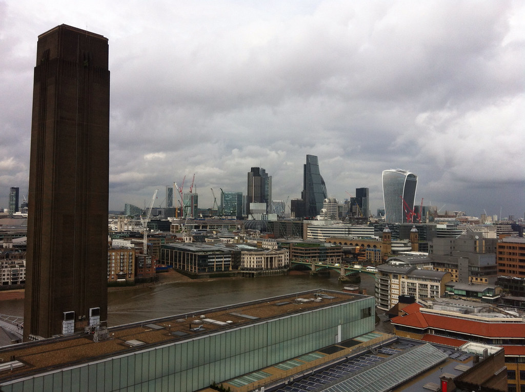
And thus it was not until 2.25 that I hit HS1 for St P. and the Thameslink to Blackfriars to catch the opening of the Tate extension.

In fact, I got there for 3.50, ten minutes before opening, and joined the queue that was just past the top of the ramp. We shuffled into the Turbine Hall (which I think has Thomas Schutte on display and one of Ai Weiwei’s trees), down the ramp (which may have lost the ghost of Shibboleth, the crack drilled and filled in a decade ago) to the Tanks (a new space open for a couple of months a few years ago).
I’d been sceptical of the development, not so much because of the nature of modern art, but of the damage potentially done to Sir Giles Gilbert Scott’s design. The extension is brick, and clearly no pastiche or imitation, but will take time to settle in. In any case, architectural phalluses have ringed the original footprint, of which more in a second.
My instinct was to go to the viewing platform — floor ten, which has an express lift although initially it could only make it to nine and the stairs. (The interior of the extension has the luxury of swirling staircases. This one is narrower.) And of course, the view is fantastic, 360, across London. I hit a rainstorm, but even so.
And most amusingly, there are the new flats being built, with show flats that are in Awfully Awfully Good Taste, and may well offer a soap opera.
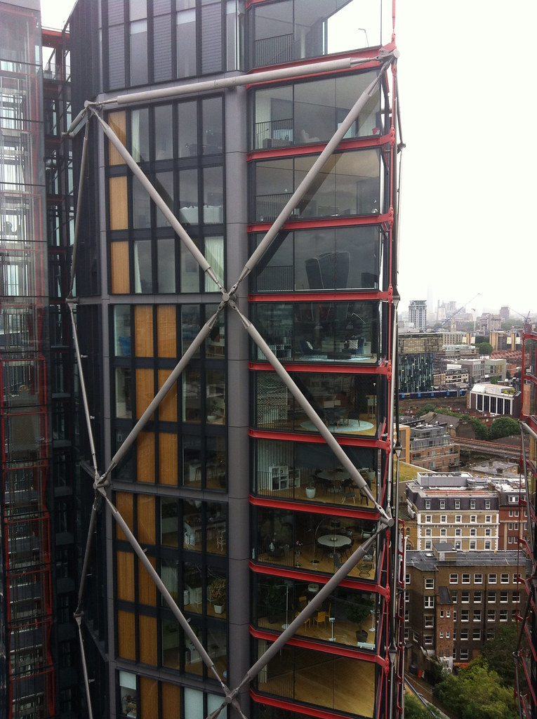
Certainly a lot of sniggers. I assume the blinds will come down.
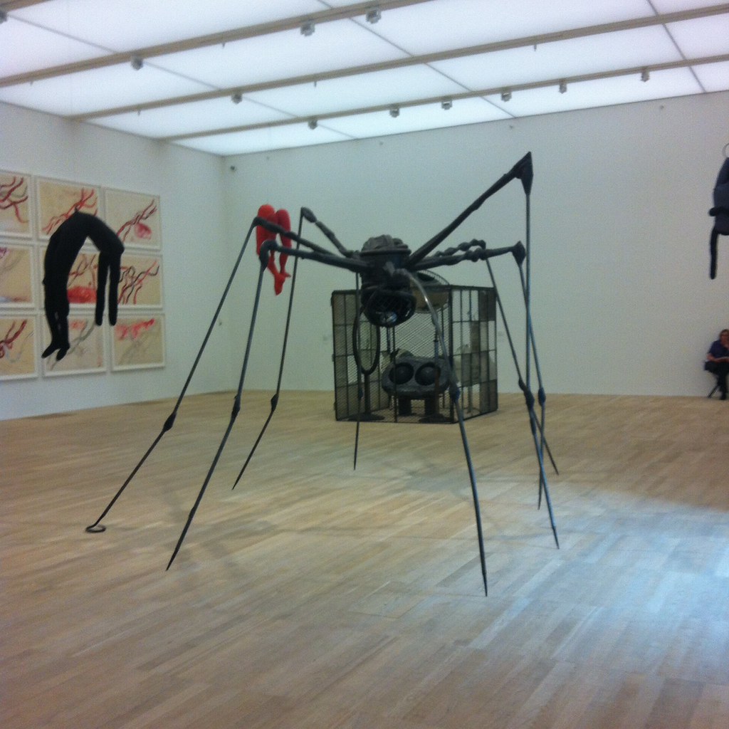
And then, one says, let’s go do some art. Three floors, mostly geared to the broadly sculptural, and whilst I deliberately slid over the surfaces, very little blew me away. There are rooms I will go back to and linger in, but post-1960 sculpture and performance art is the stuff that perhaps risks bringing out the philistine suspecting the emperor’s tailor.
I think I’ve seen the installation with the beach and macaws at Liverpool Tate, and there, as here, there is a long spiel about the macaws being cared for. I was uneasy.
But the highlight — aside from the City of Couscous — was the Artists Room on Louise Bourgeois.
I recall the criticism of the new Tates in 2000 — the division of Britain and Modern into four zones seemed arbitrary and potentially obscuring gaps in collections. Over the years it has come good. I’m sure the same will be true of the new extension.
