Stone Me, Would You Beleaf It?

Leaning Into the Wind (Thomas Riedelsheimer, 2018)

Andy Goldsworthy is a sculptor who works with — and in — nature. More to the point, he worked as a farm labourer in his teens.

He was in one of the Folkestone Triennials, on the Old High Street, smearing mud on the interior of a shop window and allowing it to crack and dry out. There was also a film of one of his rain shadows — lying on a street as it starts to rain, leaving a ghostly impression of his body. And he has works at the Yorkshire Sculpture Park — a sheepfold with dead tree — and Jupiter Artland — including lumps of coal in trees, Stone Coppice.

We see him almost absorbed into landscapes — South American forests, Cumbrian and French hills, Scottish woodland, climbing across blackthorn coppices, through bushes, between roots. We see him maneuvre trees into mud-lined buildings, draw lines with leaves on steps in Edinburgh, decorating a tree with narrow branches pinned in by pine needles. Sometimes he is working alone, especially with a fallen elm tree, sometimes with his apparently more-talented daughter Holly, sometimes with a team of labourers, cutting rock into open sarcophagi. It is site-specific artwork, even if he has half a dozen schticks.

He is most clearly moved when talking about the fallen elm — someone has removed some of the branches in his absence — and when he is about to cut into bedrock.

(Spoiler: he doesn’t. Quarrying is one thing, but disturbing the geology is another.)

And somewhere in here is his former wife, who died after their divorce.

It’s hard to grasp how startling his work is on a large screen, let alone a tablet, but the camerawork and the drone shots do their best. You get a sense of his empathy and shared knowledge with a Spanish-speaking old woman, who shows him a clay, dung and straw floor, and that he is clearly learning from her — not quite appropriating. Whilst you hear from her, his daughter, some of his assistants (one of whom he compares scars with, in a presumable unintended homage to Jaws), there are no vox pops, nor curators, nor art histories. We don’t know who commissions the works. We do hear Fred Frith’s quasi-indigenous soundtrack, which is frankly irritating pastiche rather than enriching.

And the wind and the lean? We see that as his penultimate work — you might not spot the one in the closing credits — where it is him and the wind. Whilst Antony Gormley’s works are sculptures based on his body, they are monumental and solid, whether iron figures in the sea or giant above the road to Gateshead; here Goldsworthy’s body is more fragile, more self-effacing..

Exhibitions for Expotitions — October Editions

I used as various times to maintain a Googlesheet of exhibitions I might possibly interested in going to — then life intervened repeatedly, and it got out of date. Over the past few months I’ve been updating it and there are still a few venues missing, but it’s a l-o-n-g list and I need to work out a decent format still. I have a list sorted by closing date and by venue, and below is opening soon.

Information presented in good faith — a lot of mistakes came to light in this update — and check website before travelling. There’s a south eastern bias, plus major cities in Wales, Scotland and Ireland (I still haven’t been to Northern Ireland). Additions welcome. Continue reading →

Figuring It Out

Face to Face: The Figurative Sculpture of Sean Henry (The Lightbox, Woking, 12 August-5 November 2017)

I first knowingly encountered the sculptures of Sean Henry on a day trip to Newbiggin by the Sea with the Aged P. Faced with the problem of being a north eastern coastal town — and the last pub before Norway not being necessary nor sufficient — they turned to Art and commissioned a giant double statue, Couple, to be placed in the bay, an implicit answer to whatever question was being asked by a certain northern angel.

Continue reading →

Great Scotch!

Edward Krasiński (Tate Liverpool, 21 October 2016–5 March 2017)

I confess I walked through Edward Krasiński rather quickly on my first visit — I’d been delayed by a shop having moved and thus a late check-in at my hotel, followed by further delay as I tried to access my work email. And I wanted, at least, a look over the stunning Blake-Emin combo to see if it was what I feared.

Spoilers!

I was there to see Yves Klein, even if somewhere in my head it was Yves Tanguy. And I had just over an hour instead of the best part of ninety minutes. The next day, albeit again running late, I spent the best part of an hour in there.

But something had brought me up short — what looked like a broken ladder and then dangling black squares and a blue line.

Blue is beautiful.

Blue is best.

Did Tate Liverpool really schedule by the colour blue?

Krasiński’s early works are apparently Dadaist and surreal, but I assume that these are not on display. He seems to have been a late starter, with the works here dating from about 1960 when he was about forty. There are various small assemblages, too complex to be tagged Readymades (I feel the hand of Duchamp and Beuys on his shoulder), which are hanging on the walls. The materials include wood, metal, plastic, felt, acrylic and I get the sense that in part he is playing with the triangle set up between object, space and beholder. My understanding is that these would have been shown in darkness, a kind of labyrinth of art, but here the dark browns offset the whiteness of the walls and the bright light of this space. Later he would take photographs of some of his works on location, undercutting privileged vantage points (although a photo does fix one).

There’s also a large photo, Untitled (1996) of man in suit holding a hose coming off a roll — the end of the column column protrudes, next to a small piece of rope, and a bit of blue tape that I didn’t notice on my first go round. A relic of an earlier exhibition or deliberated short?

The second area has various solids hanging from wires (although I did wonder if these didn’t need to be less visible. Composition in Space 4 (1965) has a vertical suspension of black discs, each with a red to white colour red disc of decreasing size in each centre. There were also a numbers of broken spears, with the same dark brown, red, white colour gradation, suspended more or less horizontally, one looking like a broken rope ladder. And then there were a series of balls, not quite a Newton’s Cradle — and I wonder if Cedric Christie came across these works. There’s a capturing of time and space, a freezing of movement.

The third space — although I was quite clear of the trajectory, and I suspect Krasiński would lead us — had various small assemblages on white plinths, interventions, consisting of cords, cylinders, slopes and bits of wood. There’s a black cylinder, apparently filled with blue stuff, dribbling over the edge. J-4 (1968) is a tube going through a cylinder, cable in tube on curved white ribbon, from which the numbers 234567890 emerge. Where is number one?

But the breakthrough seems to have come with the Tokyo Biennale, when his sculptures were delayed in transit. He was going to send them a telex — the word BLUE five thousand times and this would be on display, on a coil of paper. To mark time, he arranged for a strip of blue Scotch Tape to be placed around the room: “After that there was nothing more I could do; it was so radical there was no turning back”

BLUE SCOTCH – WIDTH 20MM
LENGTH UNKNOWN
I STICK IT HORIZONTALLY
AT A HEIGHT OF 130 CM EVERYWHERE
AND ONTO EVERYTHING
WITH IT I ENCOMPASS EVERYTHING AND REACH
EVERYWHERE.
IT MAY OR MAY NOT BE ART,
BUT IT DEFINITELY IS
BLUE SCOTCH – WIDTH 20MM
LENGTH UNKNOWN.

We get sculptures of white and blue — a white rectangle, blue at the bottom, a blue cable dangling; two white books, one labelled A (and the other B?), a blue cable emerging, a blue surface between the books; a gutted white phone, dark blue wire tangled; the A/B opposite pages of an open white book with a blue tube emerging…

“I have lost the end” he says, in a photo of him trying to untangle some string or rope or cable.

The next room is of interventions — black and white axonometric drawings, unmasking the reality of the flat and the three dimensional, a kind of demented IKEA catalogue, with his now trademark blue stripe following the walls, weaving past a toilet chain and water pipe, giving illusions of depth.

the blue stripe is the intervention by the artist who is an on-looker/witness of the events taking place. It is an observer of changing phenomena that contain time. All that exists is time. Even inanimate objects are not extemporal: they are mutable”

… this leads us into the next space, which includes a false corridor, and a photographic and artistic replication of his apartment and gallery.

The artist Henryk Stażewski had invited him to live in his apartment and eventually left it to Krasiński. Art would be made there — or in his bedroom — and then shown in the apartment as gallery, with photographs of the space sometimes being shown in other galleries. The blue line continues across further axonometric drawings, and some white three dimensional objects, line with black. Photos of Krasiński’s acquaintances and other artists hang on cubes, striped blue, apparently making visual puns (although I didn’t get the joke). There is a token example of Henryk Stażewski’s work, black lines on a white background, like needles

And then there are sculptures of large, bent paperclips.

We’ve all been there.

The final intervention is a series of square mirrors, with black reverses, hung from the ceiling disrupting the space. They are utterly hypnotising.

img_0755

Krasiński’s art has a deceptively simple idea underlying it, but it was so seductive. On the one hand, a kind of minimalism, on the other complexity. It might be site specific — in that the meaning of the site it is found in is changed by the work. But the work could be everywhere.

There is a photo of Krasiński conducting the sea, a moment worthy of Klein, a musical Cnut. But he has such a strange power — a strip of blue Scotch Tape, 20mm,* at a height of 130cm, length unknown or unnecessary can turn anywhere into art.

* or 19mm. Imagine if Scotch Tape were to go bust. The end of art.

To Be Frink

Elisabeth Frink: The Presence of Sculpture (Djanogly Gallery, Nottingham Lakeside Arts, 25 November 2015–28 February 2016)

My sculptures of the male figure are both man and mankind. In these two categories are all the sources of all my ideas for the human figure. Man, because I enjoy looking at the male body and this has always given me and probably always will, the impetus and the energy for a purely sensuous approach to sculptural form. I like to watch a man walking and swimming and running and being. I think that my figures of men now say so much more about how a human feels than how he looks anatomically. I can sense in a man’s body a combination of strength and vulnerability — not as weakness but as the capacity to survive through stoicism or passive resistance, or to suffer or feel

One for PigeonhedOutside Caffè Nerd on Dover Street, just off Piccadilly, is a small equestrian statue, usually with a pigeon on its head. I sat by it a few times before I realised it was an Elisabeth Frink, and I confess that I don’t recall why I began to pay attention to her. There was a small show at Woking I took myself off to a couple of years ago and materials at the Beaux Arts Gallery, London.

In my mental map, British twentieth-century scuplture was dominated by three names — Henry Moore, Barbara Hepworth and Eduardo Paolozzi — before we get into the Caros and the Gormleys and the more conceptual sculptors. Moore and Hepworth seem to occupy a curious middle ground between neoromanticism and modernism — shapes somewhere between the abstract and the bodily, sensual, demanding to be caressed. Paolozzi is plainly of the machine age — the aesthetics of collage and the cyborg, Lego bricks and circuit boards in bronze.

Standing ManWhilst all three are producers of solid work, Moore and Hepworth are more abstract and Paolozzi is more surreal than Frink. Frink’s sculpture has an extraordinary physicality to it. Her statues are of walking, running, jumping, flying and falling men — yeah, pretty well all men — and clearly there is tension between such movement and the fitness of bronze or concrete. Even the standing men seem to loom, arms behind their back, cock and balls hanging, solid presences, somewhere between threatening and sexualised.

Riace IIIImagine: some of these were commissioned for the headquarters of W. H. Smiths. Remember that when you try to get your free chocolate bar with a copy of The Mail on Sunday. The Walking Man became one of the Riace, named for the bronze statues found in the sea in 1972, and is in white face, one of Frink’s odd experiments in coloured bronze. Apparently her statue of a dog was coloured; the Desert Quarter (1985) bronze is white. Are these angels or demons?
Desert Quarter
She’s presented here in a curiously dialectic way; on the one had she was a child during the Second World War although she knew of the horrors of Belsen and the atomic bombs, the anxieties of the Cold War; on the other hand her public commissions are associated with the Utopianism of the Garden City and New Town movement in the post-war rebuilding. Sculpture was meant to inspire people — whether outside civic buildings or shopping centres, or in the new Coventry and Liverpool Metro Cathedrals.

Her Christ, in a gouache, is muscular, the emphasis on the physicals over the divine. There are pictures here of the crucified Christ, the body emphasised over the cross. There is a Mary and a nun, and a study for Judas, which is also known as the warrior. Her military men — the flying men, the air men — always already seem traumatised, the sculptural equivalent of post-traumatic stress syndrome. And that makes me wonder about her Judas; he betrayed with a kiss, he was paid his thirty pieces of silver, he bought the field and hung himself. Was Judas a warrior — did he fight with his demons and lose?

BirdmanThere is her Birdman, apparently commissioned for a school but thought destroyed (like her first commission, but a damaged version was found this year), a tall, gangly man, with stubs on his back, decommissioned wings perhaps, a fallen angel among men. There is her Running Man (1978), not, apparently, an athlete, but rather a fugitive from some unspecified conflict. Her Flying Men (1982) are hang gliders but seem about to cast themselves into space — inspired by one Léo Valentin (1919-56) who made his own birdlike wings in a vain attempt to fly. Is he also her Falling Man (1961)?

BoarThere are animals — lots of horses, sometimes with riders, a boar for Harlow, warthogs and dogs. Dogs whose heads you want to pat but mustn’t. There are birds, but of ill omen, her Harbinger Bird III (1961) and Warrior Bird (1953), corvids, menacing; on the other hand her eagles, often designed for pulpits and linked to the Kennedy assassination (there is also an uneasy sculpture, The Assassins, but all of them are uneasy).

And of course, there is the baboon, commissioned for London Zoo, but it’s a different version here. And there’s a water colour, apparently inspired by an Australian trip although that makes little sense, of an encounter between a man and a baboon. Apparently the baboon is unimpressed by the man.

BaboonBaboon

So her subject is man rather than woman. She may have done mother and child pairs like Hepworth and Moore, but none are here on display, and she was clearly a mother. The few female statues here are caped or cowled. Is there an avoidance of female objectification? Is her aim to objectify men? There were warrior women she could have portrayed, traumatised refugees. But clearly that was not for her.

Take A Chance On Me

Take a Chance on Me

Risk (Turner Contemporary, 10 October 2015-17 January 2016)

The Anthea Turner — a gallery whose Chipperfield design works better in Wakefield — is committed to always showing some J. M. S. Turner and contemporary art, for which read the past one year’s except when it suits them. They’ve had some great solo shows (Mondrian and Colour was frankly more interesting than the Liverpool Tate show), which are interspersed with themed shows. The second exhibition, about Youth, was amazing, Curiosity had some good items but wasn’t more than the sum of its parts and the Self left me a little cold.

So, Risk. Art which puts the artist at risk or may offend against dominant values?

Well, yes, Ruth Proctor films herself falling off a scaffold onto cardboard boxes (here is the scaffold, here are the boxes), Bas Jan Ader documents the start of his transAtlantic voyage that was never completed, Ai Weiwei gives various landmarks the finger. Meanwhile we have surgery footage of Orlan’s cosmetic surgery, Gregor Schneider’s faintly uncanny film of two neighbouring houses redecorated to be identical, Martha Abramovic leaning back from a bow and arrow pointed at her heart.

But then it’s extended to chance and fate. Gerard Richter scrapes back at his paint with a squeegee, post Minimalists let their art hang according to gravity, Marcel Duchamp drops string and Chris Burden drops steel beams into wet concrete.

And then, brace yourself, Turner experiments to see how different paints dry or soak into paper.

Careful now.

There’s a print of an old life jacket and a reconstruction of an ancient Chinese earthquake detector.

What there isn’t is any Jackson Pollock who also allowed chance into his aesthetic through pouring and dripping or Helen Frankenthaler with her too-wet paint or Frank Bowling’s dribbles. One might object that being open to chance is an abandonment of craft, but presumably there’s a selection process. There’s a film (whose makers I forget) which is a kind of mouse trap sequence, where rolling ball sets off a chain reaction. We don’t see however many versions didn’t work. And we don’t see what Duchamp did with the templates he made from the string.

There wasn’t any art that has been banned or challenged (Mapplethorpe’s photos, Magritte’s nudes might have been interesting, some of the vandalised art show at Tate Britain a couple of years back).

The biggest risk here, of course, is that there is such a show in a multimillion pound gallery in one of the more deprived corners of England — Margate was a Portas town, its twin industries of TB recovery and funfair being undermined by progress. Like Gateshead’s BALTIC, another venue which is curated rather than collected, it could simply do crowd pleasers (such as Grayson Perry), but instead challenges its clientele. It has to risk failure.

With a few exceptions, alas, in this it was a success.

Meanwhile, a ten minute walk, a megabaguette, a thirty minute bus ride and another ten minute walk away there is the UpDown Gallery, which specialises mainly in limited edition prints. ive not caught every show there, but those I have I’ve liked.

Upstairs, ending really soon, is the work of Loukas Morley, a ready-made artist in the tradition of Beauys with the colour sense of Hodgkin. Painting on various types of wood, either circular or rectangular or squaregular, clearly on the flat, he builds up layers of paint and resin, abstract yet active, usually allowing the ghost of the grain below. There are also witty sculptures – a board rubber, plastic lids from spray paints, crumpled metal á la John Chamberlain, a lemon as still life. He has been curated by Cedric Christie in the past and I suspect a cross-influence.

Meanwhile, downstairs, ending really soon, is Martin Grover and his (to be honest, annoyingly titled) The Peoples Limousine. It would be unfair to call Grover (like Magritte) a one-joke artist, even if it is a funny joke. He specialises in fake bus stop signs, wring out variants on the symbols, possible stops and kinds of route. One refer to Talking Heads songs, another to British movies set in London (Going Places: The London Nobody Knows/Meantime & High Hopes/Seven Days to Noon/The Fallen Idol/The Bells Go Down). Yes, it’s arbitrary, but it’s done with wit and charm.

There are also lists of lists, masquerading as compilation albums, depictions of famous musicians (Barry White, Marvyn Gaye) wandering around London or past CarpetRight. And then my favourites: The South London Procrastination Club (Established: not just yet). There’s a hint of the thirties railway destination poster about his more straight forward prints, but any of them should put a smile on your face.

It’s too late for this show — unless you go on Sunday — but keep an eye out.

Because You’re Hepworth It

Barbara Hepworth: Sculpture for a Modern World (Tate Britain, 24 June-25 October 2015)

I’ve already written a rather grumpy account of this exhibition, which has a few things that annoyed me. I should also add that the plinths bearing the sculptures could do with a second label describing the work, since sod’s law meant that on almost every occasion I would look at the other three sides first. Sometimes, of course, the label turns out to be on the wall. Grr.

I was fairly sure, however, that the work would transcend my caveats — and so, having read the catalogue, I went back for a second look.

WakefieldMeanwhile, up in Wakefield, the Hepworth is showing a film of the 1968 Tate Hepworth retrospective made by Bruce Beresford. What strikes me immediately about this is how many of the works of art are freely visible and not behind glass. I guess that she was still alive then and could have repaired anything that got broken — the insurance is presumably much higher now. It is so frustrating though. We’re told (she tells us? — and I get the sense from this film of Hepworth speaking unlike the bloody awful Dudley Ashton Shaw Sculpture in a Landscape documentary where a highly theatrical Cecil Day-Lewis intones Jacquetta Hawkes’s poetry in an odd example of barking despite having a dog of your own) that she is interested in the oval, the vertical and the human. From my notes — maybe from the film — I’ve written

inner and outer form, nut in shell, child in womb, shell/crystal, puritanical and geometric spiritual

And then I’ve added (and this is me): modern or romantic (and that is a ponder for another post).

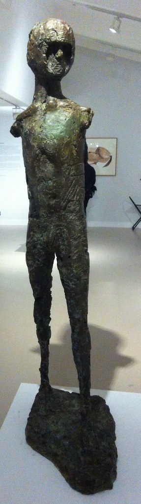
So we’ll walk through the rooms again — beginning with the maze of vitrines. This is her early handcarvings, broadly speaking figurative, realist, mimetic. There are animals, torsos, seated figures and a baby. These works are direct carved on various kinds of wood and marble, and the missing name here is Leon Underwood, who seems to have been the master of the technique.

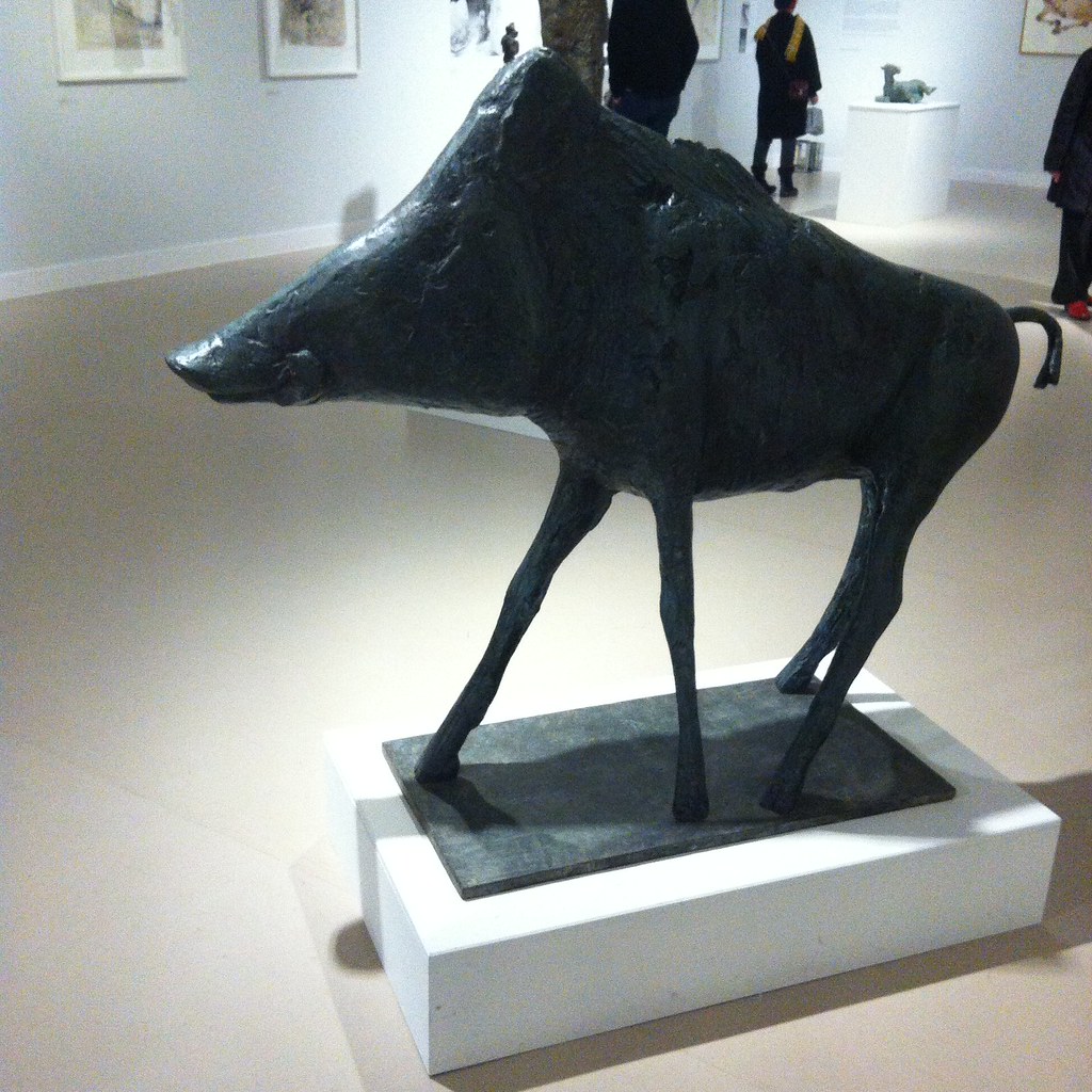
Hepworth’s shown here among her contemporaries, largely — husband John Skeaping, Henry Moore, Jacob Epstein and I noted two women, Ursula Edgcumbe and Elsie Henderson for future reference. The cynical side of me wonders if this downplays her — she was not unique. Skeaping’s Buffalo (1930) in lapis lazuli is beautiful and I think her side by side doves (1927) are better than Epstein’s one on top of the other (1914-15), but frankly you want your Picasso for doves and Epstein’s strengths lie elsewhere. The positive side is that she can hold her own in a wider community of sculptors between the wars. Infant (1929) is perhaps the most striking, the narrow Torso (1932), made from African blackwood and more like a totem, is the most Hepworthian.

By this point, of course, she had been born in Wakefield in 1903 and studied art in Leeds (meeting that Henry Moore chappy), moving to London where it was as cheap and as easy to get to Paris and Europe than back to Yorkshire. (There’s your north/south divide in a nutshell.) She was runner up to a prize that took her to Italy and which was to inspire her work and led her to marry the actual winner, John Skeaping.

She split from Skeaping in 1933 — the catalogue suggests in part that he was not sympathetic to her Christian Science — and had already met Ben Nicholson who at that point (1931) was married to the artist Winifred Nicholson. The two became lovers and moved in together. So in the second room we have the fruits of their lives together, with artists of different ages inspiring each other. The cynical reading is he helped her, the radical reading is she helped her. I write as a fan of Ben Nicholson — who triangulated romantic landscape, still life, abstraction and the faux naïf. His landscapes flatten into abstraction, and through the 1920s and 1930s the shapes became simplified into squares and rectangles — in time he met with Mondrian, although I think the link was more through Winifred. In time he removed colour, to produce a kind of white, almost flat, sculpture. His art seems to be an exploration of how much can be removed from an image and remain something you can see.

It has to be said that the influence of Hepworth on Nicholson is more obvious than the reverse — I’d be clearer in seeing her as a muse to him than vice versa. Throughout his pictures there are a series of double faces in profile, reduced to lines, intersecting, overlapping, Mr and Mrs. We see this motif in her self portrait in sonogram, and perhaps in one of the sculptures where the face appears to be two intersecting faces. It wasn’t immediately clear what else aesthetically she was getting out of the deal, beyond shifting to a point when she gave more abstract descriptive names for her work. Perhaps he gave her a scratchier sensibility. He was apparently more sympathetic to her religious beliefs than Skeaping had been.

With Nicholson she travelled again in mainland Europe, meeting Hans Arp, Pablo Picasso and Piet Mondrian. She contributed photos of her work to art journals such as Circle and Abstraction-Création (which included Marlow Moss, I see, and had odd ideas about alphabetical order). Mondrian was later to live downstairs from them in London, before his final move to New York. A lot of her pieces of the later 1930s seem to be two smooth pieces — often discs, placed together on a plinth. Apparently both pieces weren’t necessarily fixed, so a degree of adjustment could then be made. Among these pieces were works called Mother and Child — the Madonna and Child trope being oddly missing from the first room — although apparently she broke from tradition by having these as distinct rather than single pieces.


In 1943, she seems to have started adding string to her work. I seem to recall Moore did something similar, but I don’t know who got there first. Sculpture and Colour (Oval Form) Pale Blue and Red (see what I mean about those titles?) is white, almost eye shaped, but hollowed out with two holes. In one you can see the blue interior, and red strings from the edge of the hole to a single, vanishing, point. It is as if goes to infinity. Through the other, side, hole, you can see the strings from a different angle.

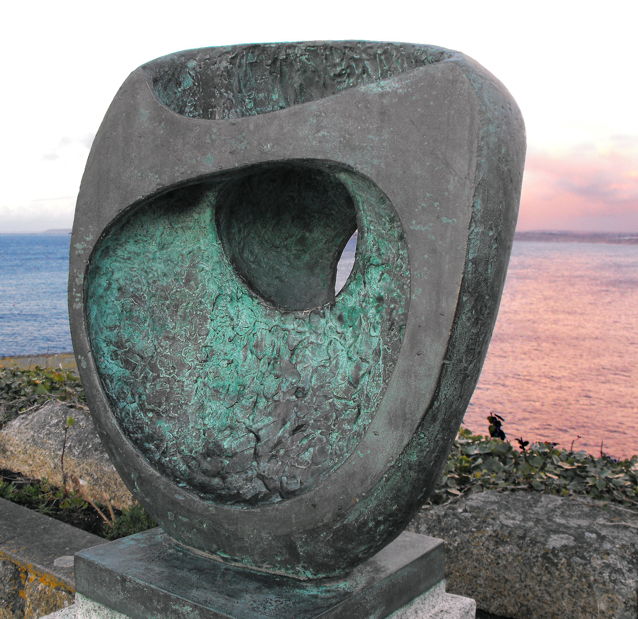
By the fourth room we’re up to the Second World War. One side has some of the drawings and paintings she did in a hospital of various operations, after her daughter was ill, apparently intrigued by the similarities between doctors’ and artists’ hands — and I think I saw more of these at Mascalls Gallery once. You need a strong nerve. Another wall has more abstract pieces — the exegetical text tells us she didn’t have time or space for more during the war, but the Hepworth in Wakefield notes the way that she used two dimensional work as a way into sculpture as well as on its own merits. But central to the room are four pieces of carved wood, Pendour (1947), Pelagos (1946), Wave (1943-44) and Oval Sculpture (1943), some plane, some elm, all but hollowed out and curled. They perhaps have the look of hazelnuts nibbled by squirrels, but are beautiful and the best pieces in the exhibition.


By the fifth room time begins to trip over itself. At some point she’s moved to St Ives and has a studio where she lives with a garden space and has rented the Palais de Danse as a second studio. She has become more ambitious, wanting to make bigger pieces; the catalogue notes her wish to crack America. Around three walls we see photos of some of her works in the studio and in situ, her big pieces for Mullard electronics (1956), John Lewis (1963) and the United Nations (1961-64), and we also see her montages imagining sculpture in rural or modernist locations. This is also the room with the ropey documentary.

Behind it, the exhibition redeems itself — four pieces made from a heavy African wood called guarer. The catalogue explains there is a mystery as to who got the wood for her and who paid for it, and what happened to the parts left over. They are larger cousins to the wooden pieces in the previous room; they seem to be experiments in how much you can take away from a form and still have some form.

Ah, you can look, but you mustn’t touch…

Finally, there’s the recreation of the Rietveld Pavilion (1956); concrete air bricks for a wall, partly filled in, some kind of wooden roof, and (here) an end wall purporting to be forest. Hepworth’s work was shown here in 1965 and since. It doesn’t fool us we’re outside, but there are five or so bronze pieces. Some have forms within forms, are twisted, some might be weathered anvils. These are clearly not mimetic, but nor do they feel organic — they are their own thing. Their sublime beauty is enough to make you forget that it’s not until 1975 that Hepworth died, in a fire.


But Hepworth is at her best in St Ives and Wakefield and the Yorkshire Sculpture Park and Edinburgh Botanical Gardens and at the front of Tate Britain and in a garden on Attebury Street.

Exhibitions for Expotitions

This is in no way complete… it’s mainly exhibitions that I could conceive of getting to, with a London/Southeastern bias. Although I can conceive Edinburgh, Newcastle, Gateshead, Liverpool and Manchester. Go figure. Check details before travel — galleries really don’t like Mondays.

Corrections welcome.

Yes, I know this is messy. Tidier next month.

Closing September 2015

Continue reading →

Hep Hep Hooray (Part Two to Follow)

Barbara Hepworth: Sculpture for a Modern World (Tate Britain 24 June-25 October 2015)

Hepworth plaqueI really like Barbara Hepworth’s work. It has a kind of tactility to it, a sensuousness — it cries out to be touched and caressed. I’ve been up to Wakefield and looked at the plasters and maquettes and the blue plaques, and down to St Ives to see the studio and at some point saw the hospital drawings.

So I was looking forward to this Tate overview, in the same space where they showed Henry Moore.

I’m going to do two write ups, because I want to do it justice. But this time round, I’m going to be critical whilst thinking you should really go.

Major galleries still rarely do one women shows (although note Tate Modern this spring and summer).

There’s always a danger when providing context that this takes away rather than enriches your appreciation of the materials. In the first room, there are lots of hand carved sculpture, not all by Hepworth. We’re told that one of her strengths was direct carving — inspired in this by Henri Gaudier-Brzeska, Jacob Epstein and Eric Gill, but also by the fact that the was apparently a whole lot more of this than we realised. Everyone was up to it. One missing name was Leon Underwood, whom I might well come back to, who was a tutor to Henry Moore. Was she that special?

Before she married Moore, she married Ben Nicholson and before that John Skeaping — another direct carver — and there is a room of works by Nicholson responding to hers and vice versa. I like Nicholson’s work, but, again, I’m a little worried it takes away from her. I suspect not, but.

Hepworth SculptureIn a later room there’s a documentary, Figures in a Landscape (Dudley Shaw Ashton, 1953), with Cecil Day-Lewis reading bad poetry over footage of the Cornish coast, telling us about how history and then Man has sculpted the landscape — you know that “invisible” sexism that defaults to and his? You want to scream, YOU KNOW HEPWORTH IS A WOMAN, YES? Eventually her sculptures start appearing in the landscape, and for a more you assume the apes will start worshiping them and a certain theme will appear on the soundtrack. Or you assume it’s the inspiration for Led Zeppelin’s Presence.

At the end of the show, there’s a recreation of the Rietveld Pavilion from a Dutch sculpture garden, with sculpture finally naked — up to then, more or less, everything is in vitrines. I know that hands can leave marks and grease and patina — but I don’t recall Moore’s being so glassed off. Were there ropes? It’s great to get a full 360 view of them, but it makes the exhibition a maze (where have they hidden the label this time?) and its frustration because you just wanna touch. And at the end it’s not clear if you can.

Hepworth died in 1975.

The pavilion was 1965.

Did she not sculpt for a decade? Was the later work earlier? Or was it all large scale stuff like the UN piece or the John Lewis’s one?

It just stops.

Did I miss a chronology of the artist? Okay, the exhibition guide tells you she died in a fire, but it still feel a little off-key.

The really sad thing is there is fantastic stuff here, but I’m not sure justice is done to it. I will go back, I suspect in late August now, having read the catalogue, and say more.

Exhibitions for Expotitions (February/March 2015)

I have a Google spreadsheet on which I keep a list of exhibitions that I am thinking of going to. It isn’t complete, it’s south-east centric and check before you travel if it’s on or open. (Plus if I’m not going to be interested in a thousand years, I don’t list it).

I’ve trued to be clever and list here the show opening or closing between now and 31 March 31, by ordered of urgency (THEY’RE CLOSING). Unfortunately, in switching between programs my highly logical European date format (day/month/year) have converted to the odd US ones (month/day/year) and I’ve no inclination to correct them this time.