The Art of the State: 2020 Exhibitions Part Two

I got my money’s worth out of my Art Fund card, just about, and Tate membership and the RAA card make life a little easier, but you need to be fast to catch the members’ previews. I have a suspicion that my listing below is a little inaccurate for February — for example, and I think a saw a couple more things in St James/Mayfair.

Continue reading →

The Art of 2019 — Part One

I started, as so often I do, with keeping a list of consumed culture. This petered out, so I am relying on memory.

2019 was Van Gogh and Rembrandt and Schiele and Munch.

Every year should be Munch year.
Continue reading →

Exhibitions for Expotitions — 11 June 2019 Update

I used to maintain a list of exhibitions, because I kept missing stuff. I’m recreating this, as it went out of date. I’m based in the south-east UK so, with the exception of Dublin, Edinburgh, Glasgow and Tate St Ives, it’s stuff I can do in a day trip (unless I want to make an exception). I can’t pretend to completist (especially now I’m rebuilding) but let me know of stuff I’ve missed and I may add.

Information is presented in good faith — check opening days/hours before travelling and whether stuff is free.

I recommend the National Art Pass for discount — this and Tate/Royal Academy membership pay for themselves if London is getatable.

[Still to add: BALTIC 39, Courtauld Gallery, Fitzwilliam Museum, Foundling Museum, Gagosian Britannia Street, Gagosian Davies Street, Gagosian Grosvenor Hill, Henry Moore Institute, Hepworth, Herbert, IKON, Jerwood Gallery, Kettle’s Yard, Leeds Art Gallery, Manchester Art Gallery, Modern Art, Modern Art Oxford, Edinburgh Modern One, Edinburgh Modern Two, Museum of London, Museum of London Docklands, National Galleries of Scotland, National Media Museum, National Museum of Wales, National Portrait Gallery, New Art Gallery, Norwich Castle Museum, Nottingham Contemporary, Nottingham Lakeside Arts, Pallant House, Photographers’ Gallery, Queen’s Gallery, Holyrood, Queen’s Gallery, Buckingham Palace, RAA, Royal Pavilion, Science Museum, Scottish National Portrait Gallery, Somerset House, Strawberry Hill House, The New Art Gallery, Towner, Turner Contemporary, Victoria and Albert, White Cube Bermondsey, White Cube Mason’s Yard, Whitechapel Gallery, Whitworth Art Gallery, Yorkshire Sculpture Park.]

Closes June 2019

Continue reading →

It’s a Scream

I didn’t go to Oslo just to see The Scream (1893), but it would have been worth it. I’ve seen a pen and ink version at Bergen, but this was the first time I’ve seen this version in the flesh – there’s a later, probably 1910, version supposedly at the Munch Museum (but it wasn’t on display) and the one owned by Petter Olsen and sold for $120,000,000 but we take this to be the original.

Continue reading →

Showing his True Colours

J.M.W. Turner: Adventures in Colour (Turner Contemporary, 8 October 2016-8 January 2017)

Joseph Mallord William Turner has to be the hardest working artist in British history. Pretty well every provincial art gallery I’ve been to has one of his works, usually of a local view. This island is obviously well gifted with landscapes, the genre which he made his own. Even the Carbuncle in Lisbon has a couple on display. In his early career, I presume he used coaches, but steam boats and then trains presumably helped his meandering — especially after the end of the Napoleonic Wars. He got to Italy, France, Belgium, the Netherlands, Poland, Czech, Slovenia, Austria and so on.

And yet I confess to a little resistance to him — I suspect there’s a little too much TurnerTM, Heritage painting, and I even went through a phase of liking the earlier, more classical styles. And I have a memory of visiting the Clore Gallery at the Tate — as you have to if you want your Blake fix — where a chunk of Turner’s unsold paintings he left to the nation are on display. Someone came in, took photos of every single panting, and left after four minutes. Very odd.

He was, of course, controversial in his day, his tastes and methods questioned, so I need to reevaluate him and his work. The Turner Contemporary has offered a couple of chances to do so — it always aims to have one of his works on show, it did a big Turner and the Elements show and now has J.M.W. Turner: Adventures in Colour as another opportunity.

The Tate posted an image of Turner’s The Fighting Temeraire on Facebook, and I noted it was a shame that this image of a sailing ship being towed by a steamboat out of a sunset to be broken up would be better if the coast were on the correct side. Someone responded that this was to do with composition and did I know the story of how Turner, on varnishing day at the Royal Academy of Arts, struck a red blob of paint on his canvas, next to Constable’s, and then worked it into a buoy.

Well, yes, actually, I do, if there’s one story that everyone knows about Turner, it’s the one where Turner, on varnishing day at the Royal Academy of Arts, struck a red blob of paint on his canvas, next to Constable’s, and then worked it into a buoy.

The coast is still in the wrong side. And anyway, sailing out of a sunset is hardly elegiac.

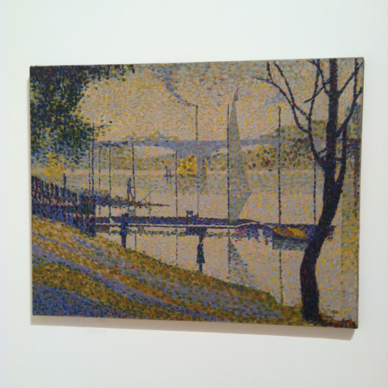
But clearly, the man had a way with colour, and the joy of the book on Turner and the Elements was its discussion of the technology of colours and Turner’s acquaintance with scientists of the day. The two cultures were not so divided back then. I think he was the first artists in Britain to use cobalt paints and I wish there’d been a bit more on this back then. I suspect, in what is a show that is frankly too big, the narrative got a little lost.

The first paintings you pick up as you enter are views of Norham Castle and Lincoln Cathedral. These follow the rules of landscape painting which I learned from Astrup’s breaking of them: you accentuate earthy brown in the foreground and exaggerate the blue in the background. This adds to the sense of perspective and scale — ideally you stick a human figure or an animal in the frame to give an identificatory viewpoint or a yardstick for size. Dolbadarn Castle (1800), silhouetted by the evening son, features bandits, adding a narrative (apparently about a Welsh family). Failing that, a spot of white or a splash of red will draw the viewers’ attention. His Fishermen upon a Lee-Shore (1792) has a limited pallete of browns and greens, made mobile by flecks of white and a red jacket.

In his training at the Royal Academy he was exposed to Claude Lorrain, Salvator Rosa, Nicolas Poussin, Titian and Canaletto, painters who tended to classical or Biblical narratives with landscape background. In the period of striving for realism I think you can see this — in his volcanos, fireworks and burning Houses of Parliament you can see Rosa. At much the same time, Joseph Wright was doing more interesting things with the light and John Martin finding a more monumental scale, but that’s more my taste.

Troubled by the sludginess of the browns and greens, Turner from 1805 started preparing his canvases with white paint or pigments, which gives a greater luminosity to everything that goes on top — I wonder if this was to be a Postimpressionist technique, as L. S. Lowry was to use it on advice of an French artist. Of course, sometimes the whiteness began to overwhelm the painting — the more famous canvases of clouds and seascapes, the mistiness of Frosty Morning (1813), the almost monochrome Venice with the Salute (1844) looking like spilt milk. On the other hand, he uses a European blue-coloured paper to stand in for sky or water in some drawings and a rich vermilion in Vermilion Towers (1838).

We learn along the way that he uses a mix of linseed oil and resin, megilp, as a means of enriching his standard paints and he started engaging with debates about the nature of colour. As Professor of Perspective — great job title — at the Royal Academy, he lectured on colour, colour wheels and chromatography, and whilst we have his handwritten notes on show, his writing is not legible. A transcript would have been useful — I should of course Google to see if they have been published. More annoying is the mention of refutation of Isaac Newton’s work on colour by Johann Wolfgang von Goethe, in which Turner sided with Newton, who described the splitting of light into the spectrum via the prism and discussed colour as reflected light. Goethe, on the other hand…

Well, I’m not sure what his theory is. I m not even clear, from further reading, that it is a theory. In part, in seems to depend on the prism being a special case and the refraction being more complicated than Newton allows, as well as the colour of shadows. Scratches head. Goethe’s Theories of Colour was translated by Charles Lake Eastlake in 1840, apparently a friend of Turner. Again the two cultures was unformed.

This comes to a head in Turner’s Late square canvases, with the colour taking on the curves of the circle — although I seem to recall the same circles in the work of John Martin. Two examples, I think Shade and Darkness — the evening of the Deluge (1843) and Light and Colour (Goethe’s Theory), The Morning after the Deluge — Moses writing the Book of Genesis (1843) — seem to be explorations of Goethe’s thoughts on colour and emotion, but I’m not clear how this follows through.

These paintings might be pointing back nearly forty years to his picture The Deluge (1805), in itself a response to Poussin’s painting Winter (The Deluge) (1660-64), which features a boat within a cove or a cave pool by the sea. Turner seems to have seen this in 1802 and commented “The colour of this picture impresses the subject more than the incidents which are by no means fortunate either as to place, position or colour, as they are separate spots untouched by the dark colour that pervades the whole.” Turner is setting out to correct the deficiencies he goes into note, and adds a black sailor, although this might be a much later addition. The gallery notes Turner’s investment in 1805 in a cattle farm in Jamaica, connecting him to the slave trade. However, Turner was to become abolitionist in later years.

But the story of Turner and colour is distracted by the various views of Margate that Turner produced over the years — and it is undeniably interesting to see the obscure fishing village that became a watering hole transformed over the decades, and to note how much the town has declined since. Whilst the revamped (and distinctly post-Turner) Dreamland seems to limp along from financial crisis to financial crisis, the Turner Contemporary seems to flourish. The temptation to offer local views is understandable and is one thing that will draw people in.

Just as Mitchell and Kenyon clearly filmed locals to whom they then screened the films in the 1900s and for decades the walky photographers took photos of tourists to sell to tourists, so Turner clearly had an eye on what would sell to locals — or might interest those on tour. The corner devoted to engravings and mezzotints shows how Turner could further monetise his work — with some extraordinary work — even as his perfectionism cut against this success. As a painter of working class origin, he would see no shame in pleasing as many markets as he could, even as his experiments clearly pushed at the boundaries.

Bridget Courbevoie

Bridget Riley: Learning from Seurat (Courtauld Art Gallery, 17 September 2015–17 January 2016)

I tried to find the bridge (Bridge at Courbevoie (1886-87)) on Google maps but failed — the river Seine, the bridge, a distant factory, trees, fisher men, walkers. Georges Seurat’s brand of Post-Impressionism, pointillism, made up from coloured dots, half way between colour printing and cathode ray tubes. In another place, Roy Lichtenstein was to enlarge dots and make pop art of comics.

Copying is original.

Deliberately, if annoyingly, the copy and original hang either side of the doorway, challenging you to find a viewpoint from which they can be compared. You carry the memory of one to the other.
photo (2)

Bridget Riley may have seen the painting at the Courtauld – I presume it was at the Warburg Institute, Woburn Square in 1959, having recently moved from Portman Square? — but instead it struck her in R.H. Wilenski’s book on Seurat and she then decoded to paint her own version. It’s bigger, of course, but then the book may not have been clear how big the original was. I think she knew, really, so decided to make the dots larger, and so the intensity of the original is pushed even further from photorealism. The sky is curiously yellow, matching the colour in the water and the grass. He creates light from colour and that seems to be what fascinated Riley.

If the colours become abstract, then so do the shapes — triangles, poles, lozenges, anticipating Riley’s move from stripes into something more… foliated. The Lagoon paintings, for example.

sketch

And then, on an opposite wall, Pink Landscape (1960), the shimmer of summer heat in Sienna represented by dots of red and green and pink and orange and blue, and a child’s farmhouse of white walls and a red roof. The shapes of the fields form lozenges.

Wilenski writes of Bridge that “The little man in the bowler hat has missed his train back to Paris and will be scolded by his wife; the child will be late for tea and spanked, maybe, by its mother.”

Heigho.

But we would lose the narrative in Riley as the pinstripes become stripes.

Here we’re offered variants on stripes — Late Morning I (1967) with green and red and white and blue stripes insisting on length and direction, the vertical, Vapour (1970) with white, brown, purple, green stripes overlapping, question the plane and Ecclesia (1985), thicker stripes, taking on volume.

But Tremor (1962) draws the eye — black and white triables that also form curves and ribbons and you swear the painting rotates in front of you.

A painting approximates reality through strokes, dots, stripes and the pointillist returns it to dots. Riley’s insight was to occupy the geometry, to chase the relation of shape, in canvases that move both optically and emotionally, to create luminence.

Bibliography

  • Bridget Riley: Learning from Seurat (London: The Courtauld Gallery/Ridinghouse, 2015)
  • Wilenski, R. H., Seurat (London: Faber & Faber, 1949)

Watts the Name of the Gallery

The Art of Bedlam: Richard Dadd (Watts Gallery, 16 June-1 November 2015)

I wonder when we first associated art with madness? Perhaps the cave painters were seen as magical because of perceived links between bison and lunch. Certainly by the time of the Greeks we get all the stuff about muses and possession. We are fascinated by Blake and his angels and Syd Barrett and his madcap laughs and Spike Milligan and his depressions.

In the early to mid-nineteenth century we have mad poet John Clare and mad painter Richard Dadd.

Dadd was born 1817 in Chatham to a father who was clearly an intellectual mover and shaker, involved with the local philosophical and literary society. But they moved to London, specifically to Sussex Street, just around the corner from the Royal Academy of Arts (pre Somerset House days and pre-Burlington House presumably), and little Richard began to train as an artist. His reputation seems to have been made by a painting of Puck, a large child-like figure sat in the centre of a round picture in front of a crescent moon, with smaller fairies dancing around him.

He was commissioned in 1842 to travel with former Newport mayor and barrister Sir Thomas Phillips (1801–1867) on a grand tour, painting his way in Greece and Egypt and the Holy Land. There is a stunning picture of a campfire in the desert, a stripy blue sky, and, most curiously, the moon pierced on the top of a lance, although this is thought to have painting after his return. The painting, The Artist’s Halt in the Desert (c. 1846), disappeared into private hands, only to be rediscovered on The Antiques Road Show in the 1980s.

By then, Dadd’s mental health was already deteriorating — perhaps due to the heat, perhaps due to the exoticism, perhaps due to an existing condition. He was sent home. Back in England, whilst on a walk, he murdered his father and escaped to the continent. He might have escaped, but on the train he tried to kill two of his fellow passengers. He was overpowered and arrested and sent to prison in France for a year. In time he was deported to England, where he was put on trial but was declared criminally insane. For two decades he was incarcerated in Bethlem, then on the site of what was to become the Imperial War Museum, before being moved to the newly built Broadmoor where he died and was buried in 1886. As Nicholas Tromans points out, his period in the asylum coincides with the Foucauldian epistemological break of the regulation of mental health by doctors, and the growth of case records.

Whilst in the asylum, he was allowed to paint with greater or lesser freedom and resources, with one of his physicians, Charles Hood, becoming a collector of his work. This was partly therapy, partly because Hood was a connoisseur. There is a picture, Portrait of a Young Man, which is thought to be a portrait of Hood in an imagined leisure garden at the asylum; on the other hand there is a satiric piece The Curiosity Shop, which features a “connoisseur” looking at a picture through binoculars. Was Dadd playing games with Hood? Meanwhile he produced a series, Sketches to Illustrate the Passions — hatred, agony/raving madness, Ingratiation or self-contempt, deceit or duplicity, anger, grief or sorrow and patriotism — that seem to be a diagnostic set of mental conditions. The latter features two elderly military types, smoking pipes, in front of a map “A General Plan of the City of Olabolika” and a plan in incredibly tiny print.

All of these pictures are on display in this Watts Gallery exhibition, but that is to get ahead of ourselves.
Continue reading →