Stuff Happened

Nicole Eisenman: What Happened (Whitechapel Gallery, 11 October 2023–14 January 2024)

Born in Verdun, France, in the 1960s, Eisenman practices in Brooklyn and I’m very glad I caught this just before it closed – although a more awake me would have spent longer and a more alert me would have made the link to Ridykeulous at Nottingham Contemporary. (I seem to keep missing stuff here – maybe it’s just the wrong part of not central London. But engineering works led me, via the Dulwich Picture Gallery and Rubens to Blackfriars and the District Line…) It formed quite a contrast from the relative elegance of the Rubens oil on panels – especially as the theme of that exhibition was to evade the Rubenesque – and I felt much more in a R. Crumb/George Condo/Philip Guston tradition of the grotesque.

Continue reading →

The Art of the State: 2020 Exhibitions Part Two

I got my money’s worth out of my Art Fund card, just about, and Tate membership and the RAA card make life a little easier, but you need to be fast to catch the members’ previews. I have a suspicion that my listing below is a little inaccurate for February — for example, and I think a saw a couple more things in St James/Mayfair.

Continue reading →

The Art of 2019 — Part One

I started, as so often I do, with keeping a list of consumed culture. This petered out, so I am relying on memory.

2019 was Van Gogh and Rembrandt and Schiele and Munch.

Every year should be Munch year.
Continue reading →

Exhibitions for Expotitions — 11 June 2019 Update

I used to maintain a list of exhibitions, because I kept missing stuff. I’m recreating this, as it went out of date. I’m based in the south-east UK so, with the exception of Dublin, Edinburgh, Glasgow and Tate St Ives, it’s stuff I can do in a day trip (unless I want to make an exception). I can’t pretend to completist (especially now I’m rebuilding) but let me know of stuff I’ve missed and I may add.

Information is presented in good faith — check opening days/hours before travelling and whether stuff is free.

I recommend the National Art Pass for discount — this and Tate/Royal Academy membership pay for themselves if London is getatable.

[Still to add: BALTIC 39, Courtauld Gallery, Fitzwilliam Museum, Foundling Museum, Gagosian Britannia Street, Gagosian Davies Street, Gagosian Grosvenor Hill, Henry Moore Institute, Hepworth, Herbert, IKON, Jerwood Gallery, Kettle’s Yard, Leeds Art Gallery, Manchester Art Gallery, Modern Art, Modern Art Oxford, Edinburgh Modern One, Edinburgh Modern Two, Museum of London, Museum of London Docklands, National Galleries of Scotland, National Media Museum, National Museum of Wales, National Portrait Gallery, New Art Gallery, Norwich Castle Museum, Nottingham Contemporary, Nottingham Lakeside Arts, Pallant House, Photographers’ Gallery, Queen’s Gallery, Holyrood, Queen’s Gallery, Buckingham Palace, RAA, Royal Pavilion, Science Museum, Scottish National Portrait Gallery, Somerset House, Strawberry Hill House, The New Art Gallery, Towner, Turner Contemporary, Victoria and Albert, White Cube Bermondsey, White Cube Mason’s Yard, Whitechapel Gallery, Whitworth Art Gallery, Yorkshire Sculpture Park.]

Closes June 2019

Continue reading →

Halfterm Hockney Hideously Heaving

Hockney puts the queue in queer.

David Hockney (Tate Britain, 9 February-29 May 2017)

Several years ago, I travelled back to Nottingham for the opening of Nottingham Contemporary for an exhibition of Hockney’s early work; when I arrived on the Friday the queue was around the block. I never saw the RAA iPod exhibition as all the tickets sold out. I did see the prints at Dulwich Picture Gallery — and that was heaving. The portraits at the RAA were crowded, but I think I booked in advance.

So it was hardly surprising see that there were substantial queues for the Tate Britain exhibition — it had only just opened and it was half term. But if you want to go, book first. Use the cloak room. It’ll get hot in the exhibition.

It is sobering and instructive to realise that aside from a few pictures in the first and second rooms, you could have an entirely different retrospective of Hockney’s sixty years of work: there are the Rake’s Progress pictures; illustrations to Grimm; his prints; the bigger picture of the Yorkshire trees; the chair portraits recently shown at the RAA…

This is not to say that Hockney is a repetitive artist, indeed he is the opposite, constantly reinventing himself, but perhaps as a consequence he seems a difficult artist to pin down.

Which Hockney is on display?

I confess I found the crowd overwhelming — you see the art watchers not the work — and I went around rather quickly. I was a little surprised as to the size of the exhibition — the special exhibition space on the ground floor is normally four large rooms, much smaller than the spaces at Modern. But here we have a dozen rooms, I presume expanded into the final part of the walk through of British art. I will have to go back — maybe in members’ hours.

The first room is a little odd in its mix of periods, and you do wonder whether chronology is to be abandoned. Certainly interpretation is not there for you — each room is named, but the labels for each work are limited to names and dates. When we reach portraits, there is no biography, when we see the famous painting with the misnamed cat, Mr and Mrs Clark and Percy, you’re not going to find the real name, although some details are in the gallery guide.

The second room sees him on the edge of pop art — with canvas often visible around the paint, as if the paintings are unfinished, There are almost cartoonish figures, graffiti, obscenities, gay themes. We Two Boys Together Clinging is an obvious example, a nod to Whitman; was this the painting in Nottingham which was connected to Hockney’s obsession with the headline “TWO BOYS CLING TO CLIFF ALL NIGHT”, next to the royal insignia painting CR (for Cliff Richard)? We get the first signs of the obsession with America, which will turn into studies of swimming pools and sunbathers and boys lying on beds. Sometimes he is leaning in the direction of the abstract, sometimes a mix of the photographic (but curiously flat) and sometimes there’s a nod or two to Seurat and pointillism.

And then to photography itself, with pictures assembled from Polaroids and then 35mm, multiple viewpoints of the same topic, with a nod to Picasso perhaps.

This feeds back into paintings made on several canvases, landscapes that don’t quite connect, whether Yorkshire or way out west. Eventually this would lead to the Yorkshire trees that filled one wall at an RAA summer exhibition — but shown here only in preparatory paintings. Years later he would drive a landrover along a country road in each of the four seasons, constructing the landscape from several screens. On the one hand there are black and white charcoal drawings, on the other highly coloured landscapes that owe something to Vincent Van Gogh. It is as if he overdoses on colour and then revivifies himself with monochrome shapes and vice versa.

And in conclusion the iPad pictures, animated constructions, but from first sight not as interesting in completion as in execution. Somewhere we break from painting as time fixed on a plane from a single point of view to a reality constructed from multiple perspectives that foregrounds the time factor. Somewhere this ties back to his use of photocopiers and faxes and multiple layered prints (sometimes involving layer Perspex), none of which is on show here. His painting of space or the elimination of space.

And so, somehow, for all his apparent radicalism, Hockney like Alan Bennett has become a national treasure, packing us in. Somehow I need to penetrate his apparent shallowness — the depth of depthlessness. But it will take at least one more visit.

Modern Art = Modern Arse?

Turner Prize 2016 (Tate Britain, 27 September-2 January 2017)

One of the benefits of having Tate Membership is that you can go to the Turner Prize show and not feel you’ve wasted money on it.

Unless George Shaw is shortlisted, when it’s worth it.

Of course, the winner has been announced, but I didn’t get my ass in gear before that to post any commentary. I’d probably been to a couple of other exhibitions first, so I might have been arted-out.

img_0147

This year there were four artists nominated, beginning with Helen Marten who had also won the inaugural Hepworth Prize for Sculpture and rather sweetly divided the prize between everyone on the shortlist. [Wouldn’t it be fun if a painter like Frank Auerbach won for sculpting so much paint onto a canvas?] I guess her work is a series of ready mades, sculptures put together from found objects, a mad set of Airfix kits put together with the wrong pieces but the right instructions. I’m kind of meh with this, distinctly underwhelmed, and was ready to move onto …
img_0148

Anthea Hamilton, who is channelling Antonin Artaud and his theatrical images and the Theatre of Cruelty. We have fake bricks on the wall in half of the room — Tate does Colouroll? — and the blue but cloudy London sky in the other. A large golden arse divides the room — Project for a Door (After Gaetano Pesce) — and then a series of pant shapes hanging, like washing, on chains from the roof. There’s a suit of brick coloured material. It’s funny, it’s cheeky (did you see what I did there?), it rips off René Magritte and it deserves to win.

img_0146Josephine Pryde is also fun — creating photos from kitchen worktops using chemicals and camera-less exposure. On the other walls are photos, often involving hands or slogans, or phones, a kind of anti-fashion shoot, Hands “Fur Mich”, which were clearly worth a peruse. In the centre of the room is a Class 66 diesel train scale model, The New Media Express in a Temporary Siding (Baby Wants to Ride), which indeed could be ridden in other versions of the show and here couldn’t even be sat on. I think she’s the one who should win.

IMG_0149.PNG

Finally, Michael Dean, the token man, whose room is dominated by (United Kingdom poverty line for two adults and children: twenty thousand four hundred and thirty six pounds sterling as published on 1st September 2016), a pile of pennies equivalent to the amount the government believes a family of four can live on, minus a penny. Shades of Mr McCawber. This was the most evidently political piece, but in a classic case of more is less, the surrounding sculptures of surreal body parts and faked shipping posters just get in the way. Meh.

And the winner was — Marten, who again split the prize. As I’ve said, not my choice of winner, and not the piece I felt was the best art, but there you go.

Next year, the Prize will be in Hull. I can’t wait. And no, that isn’t snark.

If You Go Back to the Woods Today

My Back to the Woods (National Gallery, 11 May-30 October 2016)

George Shaw is that rare beast, a painter who has been nominated for the Turner Prize. I was enough lucky to see the exhibition at the BALTIC, Gateshead, and to my mind it was the best work.

It couldn’t possibly win.

I don’t mean that in a modern art is crap way. I like contemporary art. I just haven’t found myself agreeing with the winners that often. Continue reading →

Take A Chance On Me

Take a Chance on Me

Risk (Turner Contemporary, 10 October 2015-17 January 2016)

The Anthea Turner — a gallery whose Chipperfield design works better in Wakefield — is committed to always showing some J. M. S. Turner and contemporary art, for which read the past one year’s except when it suits them. They’ve had some great solo shows (Mondrian and Colour was frankly more interesting than the Liverpool Tate show), which are interspersed with themed shows. The second exhibition, about Youth, was amazing, Curiosity had some good items but wasn’t more than the sum of its parts and the Self left me a little cold.

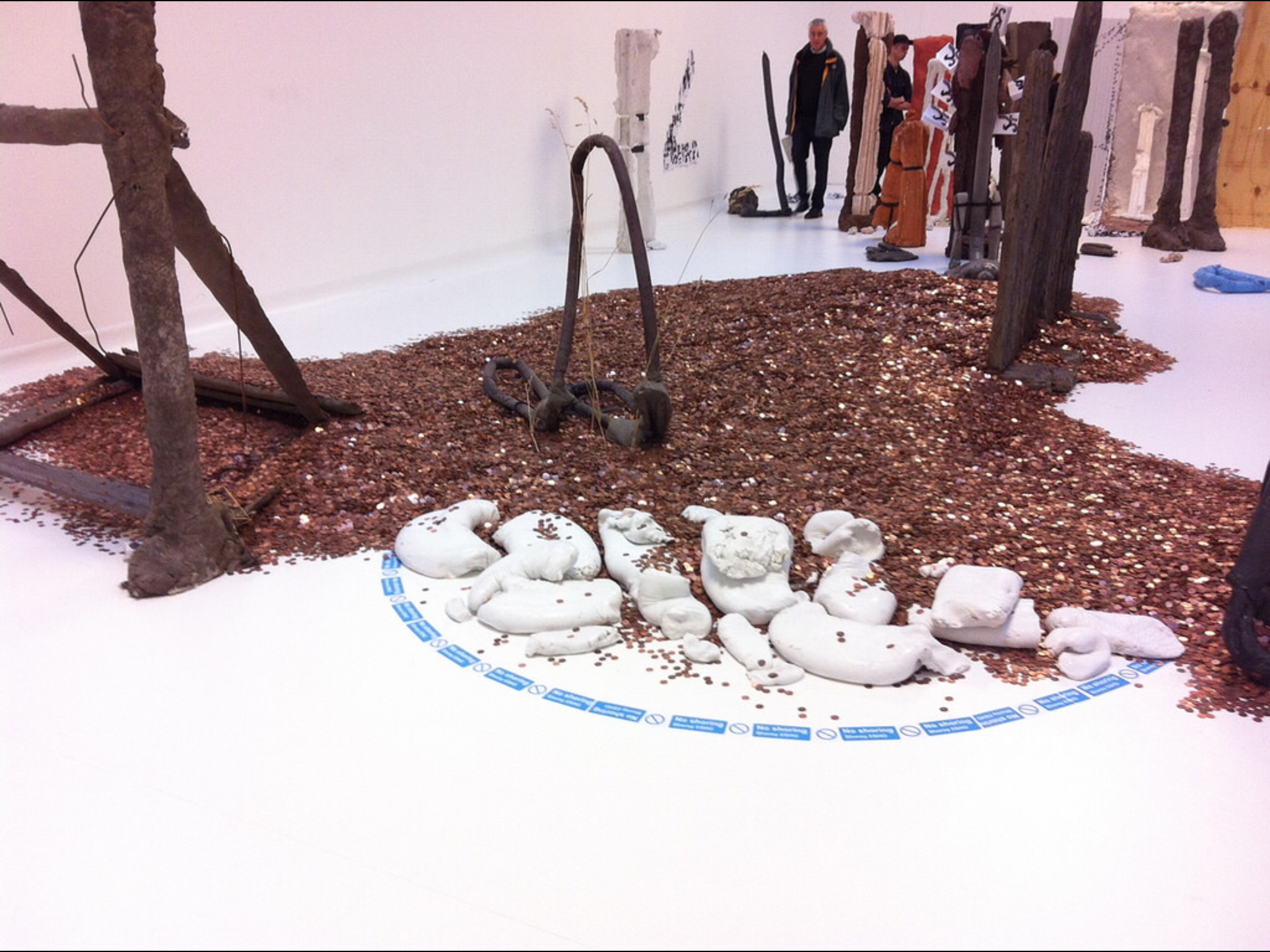
So, Risk. Art which puts the artist at risk or may offend against dominant values?

Well, yes, Ruth Proctor films herself falling off a scaffold onto cardboard boxes (here is the scaffold, here are the boxes), Bas Jan Ader documents the start of his transAtlantic voyage that was never completed, Ai Weiwei gives various landmarks the finger. Meanwhile we have surgery footage of Orlan’s cosmetic surgery, Gregor Schneider’s faintly uncanny film of two neighbouring houses redecorated to be identical, Martha Abramovic leaning back from a bow and arrow pointed at her heart.

But then it’s extended to chance and fate. Gerard Richter scrapes back at his paint with a squeegee, post Minimalists let their art hang according to gravity, Marcel Duchamp drops string and Chris Burden drops steel beams into wet concrete.

And then, brace yourself, Turner experiments to see how different paints dry or soak into paper.

Careful now.

There’s a print of an old life jacket and a reconstruction of an ancient Chinese earthquake detector.

What there isn’t is any Jackson Pollock who also allowed chance into his aesthetic through pouring and dripping or Helen Frankenthaler with her too-wet paint or Frank Bowling’s dribbles. One might object that being open to chance is an abandonment of craft, but presumably there’s a selection process. There’s a film (whose makers I forget) which is a kind of mouse trap sequence, where rolling ball sets off a chain reaction. We don’t see however many versions didn’t work. And we don’t see what Duchamp did with the templates he made from the string.

There wasn’t any art that has been banned or challenged (Mapplethorpe’s photos, Magritte’s nudes might have been interesting, some of the vandalised art show at Tate Britain a couple of years back).

The biggest risk here, of course, is that there is such a show in a multimillion pound gallery in one of the more deprived corners of England — Margate was a Portas town, its twin industries of TB recovery and funfair being undermined by progress. Like Gateshead’s BALTIC, another venue which is curated rather than collected, it could simply do crowd pleasers (such as Grayson Perry), but instead challenges its clientele. It has to risk failure.

With a few exceptions, alas, in this it was a success.

Meanwhile, a ten minute walk, a megabaguette, a thirty minute bus ride and another ten minute walk away there is the UpDown Gallery, which specialises mainly in limited edition prints. ive not caught every show there, but those I have I’ve liked.

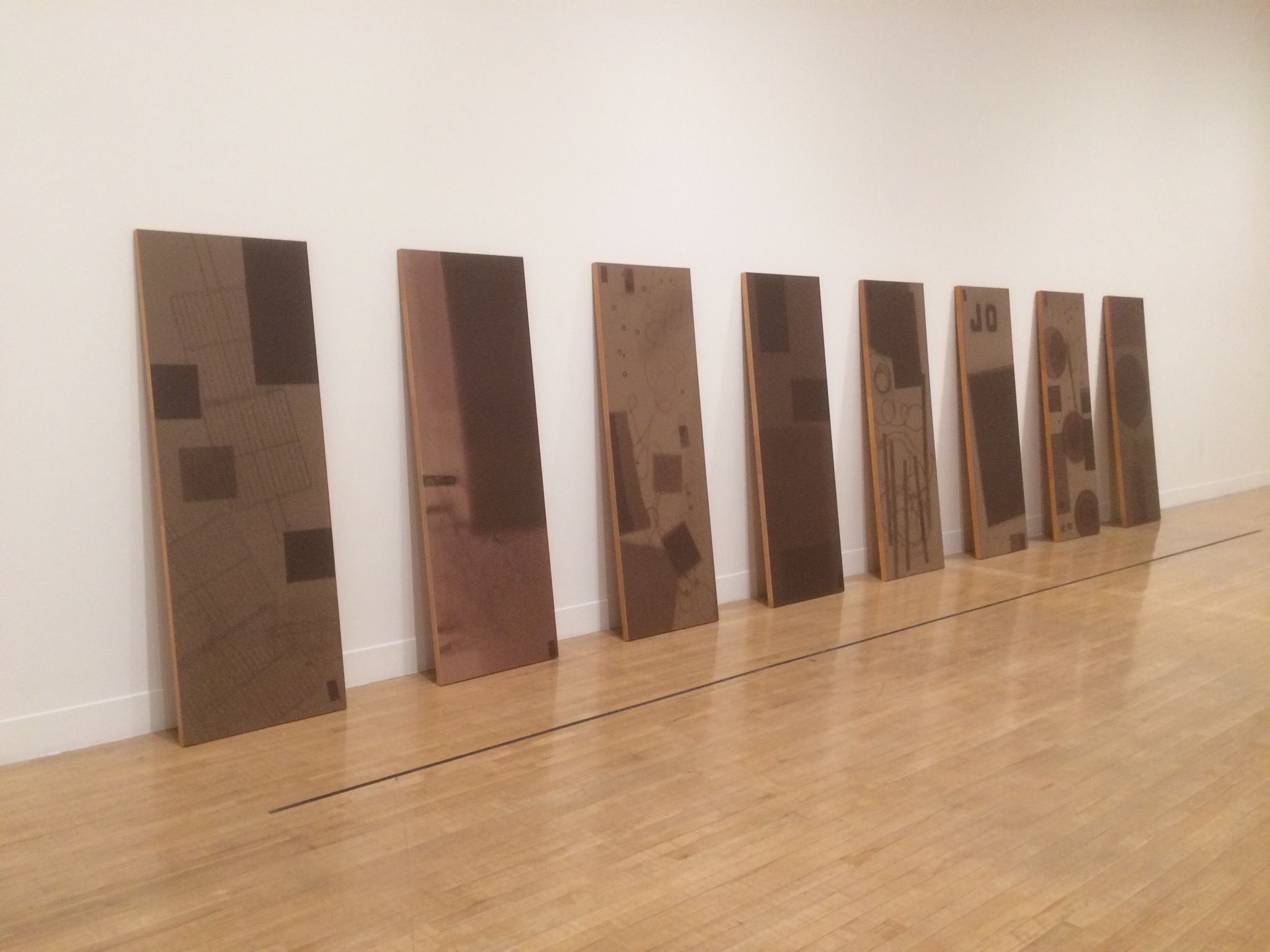
Upstairs, ending really soon, is the work of Loukas Morley, a ready-made artist in the tradition of Beauys with the colour sense of Hodgkin. Painting on various types of wood, either circular or rectangular or squaregular, clearly on the flat, he builds up layers of paint and resin, abstract yet active, usually allowing the ghost of the grain below. There are also witty sculptures – a board rubber, plastic lids from spray paints, crumpled metal á la John Chamberlain, a lemon as still life. He has been curated by Cedric Christie in the past and I suspect a cross-influence.

Meanwhile, downstairs, ending really soon, is Martin Grover and his (to be honest, annoyingly titled) The Peoples Limousine. It would be unfair to call Grover (like Magritte) a one-joke artist, even if it is a funny joke. He specialises in fake bus stop signs, wring out variants on the symbols, possible stops and kinds of route. One refer to Talking Heads songs, another to British movies set in London (Going Places: The London Nobody Knows/Meantime & High Hopes/Seven Days to Noon/The Fallen Idol/The Bells Go Down). Yes, it’s arbitrary, but it’s done with wit and charm.

There are also lists of lists, masquerading as compilation albums, depictions of famous musicians (Barry White, Marvyn Gaye) wandering around London or past CarpetRight. And then my favourites: The South London Procrastination Club (Established: not just yet). There’s a hint of the thirties railway destination poster about his more straight forward prints, but any of them should put a smile on your face.

It’s too late for this show — unless you go on Sunday — but keep an eye out.

Pot Look

Grayson Perry: Provincial Punk (Turner Contemporary, 23 May 2015-13 September 2015)

Grayson Perry has his USP: the crossdressing, his alterego of Claire. This has speeded him on to National Treasure status, alongside his Turner Prize, Channel 4 documentaries and Reith Lectures. As always the avant garde and the rebellious is absorbed into the mainstream.

The Anthea Turner show acts as a retrospective and was heaving both times I went. I hope this is an appreciation of his work rather than a Dreamland ride of aghastness. You are repeatedly warned that some items on display are not suitable for children. They’re certain not suitable if you aren’t open to irony.

Because irony was the mode I was operating in. In a vitrined at the halfway point of the exhibition is a leather one piece motorcycle suit, with customised wording. It’s Thom Gunn drag, the hypermasculine, but from Essex rather than Kent. Does he love or hate Essex? Mockney Essex Boy Jamie Oliver is invoked at at later point. Pukka. Does he love or hate working class culture? Does he love or hate middle class culture? Does he love or hate arts and crafts? Does he love or hate the art world?

The first room is a series of pots — for the exegesis you have to consult pink handouts with the titles and descriptors of each pot, although the numbering is at random. I Love Beauty is one of the simpler ones — muted palette, a St Eustache-style deer vision, a Union Falg in monochrome, a woman (Claire?) holding sceptre and bird. Football Stands for Everything I Hate echoes the Eurocup, but with a list of pet hates: shouting; special brew; chewing gum; duvet covers and so on.

The second room was the hest to my taste — although here is where we get the most exegesis as to his background. More pots, tiles for a house, archive matials and a series of engravings: A Map of Days; Map of an Englishman and Print for a Politician. The latter is an imaginary landscape of a battleground, labelled with special interest grouos such as atheists, broadsheets, teenagers, gifted, fitness fanatics, Modernists, republicans, countryfolks, non-smokers. Which side are you on? It is encyclopedic without being completist, whimsical in its arbitrariness. Which side is Perry on? A similar aesthetic is at work in the other two etchings — qualities, moods and so on.

The third space, with the motorcycle suit, has two films, the less said about the better (there is also one in the second room), but then I’ve a low tolerance for filmed art. I’m sure he and his friends had fun, but we’re at a disadvantage in coming in oartway into 47 minutes and note really being able to hear the sound. My loss, perhaps.

The final room has three of his tapestries, handdrawn onto PhotoShop and then made on a computer controlled loom. Whilst in Tracey Emin’s tapestries shown here a few years ago, the labour of socres of women in producing them was silenced, here the labour is erased in favour of mechanisation. Again the mood is encyclopedic collage — the first piece is Comfort Blanket, A British Citizen at its heart, a stylised queen to the right, a monotone union flag to the left and a list of people and things that offer comfort. Margot Fonteyn, Beatrix Potter, Francis Bacon, David Bowie, Agatha Christie, Jamie Oliver… Is confort good or bad? The Walthamstow Tapestry, from where London bleeds into Essex or vice versa (and wasn’t William Morris from around those parts?), is a tapestry of the seven ages of man, not so much a rake’s progress as a trademark’s progress. Finally there is a work on heaven and pilgrimage, whose name I failed to note, made for his British Museum Tomb of the Unknown Craftsman exhibition: a series of names for heaven surrounded by places of pilgrimage and stylised drawings that need not match the placename.

It is problematic to gender art modes, but there is a tradition of tapestry and embroidery being the work of women. Is the same true of pottery? As crafts they might get conceived of as lesser than the other arts — and then we bounce off that Tomb of the Unknown Craftsman and Virginia Woolf’s assertion that “Anon[…] was often a woman.” Does “Claire” give Grayson access to such folk arts (although let’s note the various sailors’ embroiderings shown at the Tate’s Folk Art exhibition)? On the other hand, just as sf is not a male genre, so pottery should not be a female one. But something makes me twitchy.

I came away feeling a little underwhelmed; it reminds me of some versions of the dérive, where people walk according to some algorithm except when they’re not. There’s clearly a sexualised unconscious being revealed/concealed among the bricolage, and that’s a fair enough schtick. A thing of beauty is a joy til morning, as someone once said and beauty is in the eye of the potmaker. Beauty is a measure of capital and class, among other things.

Meanwhile, it needs to be noted (and applauded) that the Anthea Turner will always display contemporary art alongside JMS Turner. Sometimes an artist will curate alingside her retrospective, sometimes paintings on the theme of the main exhibition will be shown. Here it is noted that Perry uses technology in the making of his work — and Turner was also an explorer of the latest technique. I see straws being clutched at…