A. J. Cronin, Crusader’s Tomb (1956)
I read this somewhat under false pretences, it having knocked around various to-be-read piles for a couple of years.
Continue reading →A. J. Cronin, Crusader’s Tomb (1956)
I read this somewhat under false pretences, it having knocked around various to-be-read piles for a couple of years.
Continue reading →Joanna Moorhead, The Surreal Life of Leonora Carrington (2017, revised edition)
The journalist Joanna Moorhead knew that she had an older cousin, Prim, who was estranged from the rest of her family and was some kind of artist in Mexico. At a party, she discovered that Carrington was not only an artist, but one of the most respected artists in Mexico and was still alive. Moorhead decided to travel across the Atlantic to meet her and the two became friends, with Carrington agreeing that she could write a biography.
Continue reading →David Hockney, The Arrival of Spring, Normandy, 2020 (Royal Academy of Arts, 23 May–26 September 2021)
You have to admire Hockney for his prolificness and his ability to reinvent himself in a sixty-odd year career. The Tate retrospective was great but, the 1960s rooms aside, you could imagine at least two surveys of his work that didn’t overlap with that one. Having made art with paint, pencil, charcoal, various kinds of prints and Polaroids, it was hardly surprising that he’d embrace iPads and for some years he has been using them to make landscape images.
Here we have 116 works drawn on iPads around his newish home in Normandy during the early Covid weeks of 2020, printed above their created size on paper and on the walls of three of the rooms in the Main Galleries (and they will move in August to the slightly smaller Gabrielle Jungels-Winkler Galleries). But are they any good?
Well, they’d look good on a fridge.
Continue reading →
I got my money’s worth out of my Art Fund card, just about, and Tate membership and the RAA card make life a little easier, but you need to be fast to catch the members’ previews. I have a suspicion that my listing below is a little inaccurate for February — for example, and I think a saw a couple more things in St James/Mayfair.
Continue reading →So I didn’t need to be at the theatre until 7.15 for a 7.45 start, so I thought a HS1 to Saint P would put me on the Victoria to the Royal Academy of Arts, a coffee and expotition booking, the Victoria down to Pimlico and t’Tate t’Britain, Victoria/Northern to Borough and The Royal Oak for an annual half of Harvey’s Christmas Ale, with time for a walk to a Caffè Nerd near London Bridge to sober up for the theatre.
I saw and enjoyed a preview of the Dalì/Duchamp exhibition and will write that up, but I took a second look and my sense that Dalì is the better artist but Duchamp the more interesting one stays. And I got to admire the Christ of Saint John of the Cross again, having not seen it (obviously) Glasgow.
Meanwhile, the From Life show is a group show based on the idea of art taken from life that begins with a horse’s arse (literarily) and is dominated by art student images of Iggy Pop curated by Jeremy Deller, a selection of Gillian Wearing portraits and two instantly identifiable sculptures by Yinka Shonibare MBE, based on laser scans of two statues (or casts?) in The Academy collection
But what drew my attention were three portraits by Jonathan Yeo, the central one being a Paolozzi style sculpture. I didn’t have a predisposition to like Yeo, in a case perhaps of guilt by association, having seen portraits of luminaries such as Andrew Lloyd Webber, Rupert Murdoch, the Duchess of Cornwall and Tony Blair at the Laing Art Gallery. But these two paintings were based on scans of his face and body and were called The Unteleported Man and The Simulacra.


Clearly a Philip K. Dick fan. And quite striking.
A couple of hours later I made it to the Tate and finally did the Rachel Whiteread exhibition. The first woman to win the Turner Prize, she is probably best known for Ghost, the interior of a demolished house, and her Fourth Plinth commission, a cast of the plinth.
A room full of her stuff is a little overwhelming, or perhaps underwhelming. And it is one room —the Tate having removed the walls that usually guide you through the galleries. It is the same idea repeated: lots of casts of doors or mattresses, a cast of Room 101, a cast of bookshelves, a cast of a staircase… you get the idea. I’m glad I didn’t pay, for I clearly wasn’t in the mood and I had to go in search of colour in paintings to detox. I’ve liked works individually, but a retrospective made me recall the sublime Roger Hiorns copper sulphate cast of a council flat, Seizure.
In fact, a proper Whiteread retrospective would be a cast of Tate Britain.
Your kilometerage may vary.
And then in the shop I noticed a copy of Dick’s Confessions of a Crap Artist.

Yes, obviously, I know “crap” isn’t acting as the emphasised adjective — Jack Isidore is not an artist who is crap and I’m not saying that Whiteread is an artist who is… But I couldn’t immediately see why the book was there.
In a sense she creates alternate realities, making the space solid… but why that book? What did I miss?
Hockney puts the queue in queer.
David Hockney (Tate Britain, 9 February-29 May 2017)
Several years ago, I travelled back to Nottingham for the opening of Nottingham Contemporary for an exhibition of Hockney’s early work; when I arrived on the Friday the queue was around the block. I never saw the RAA iPod exhibition as all the tickets sold out. I did see the prints at Dulwich Picture Gallery — and that was heaving. The portraits at the RAA were crowded, but I think I booked in advance.
So it was hardly surprising see that there were substantial queues for the Tate Britain exhibition — it had only just opened and it was half term. But if you want to go, book first. Use the cloak room. It’ll get hot in the exhibition.
It is sobering and instructive to realise that aside from a few pictures in the first and second rooms, you could have an entirely different retrospective of Hockney’s sixty years of work: there are the Rake’s Progress pictures; illustrations to Grimm; his prints; the bigger picture of the Yorkshire trees; the chair portraits recently shown at the RAA…
This is not to say that Hockney is a repetitive artist, indeed he is the opposite, constantly reinventing himself, but perhaps as a consequence he seems a difficult artist to pin down.
Which Hockney is on display?
I confess I found the crowd overwhelming — you see the art watchers not the work — and I went around rather quickly. I was a little surprised as to the size of the exhibition — the special exhibition space on the ground floor is normally four large rooms, much smaller than the spaces at Modern. But here we have a dozen rooms, I presume expanded into the final part of the walk through of British art. I will have to go back — maybe in members’ hours.
The first room is a little odd in its mix of periods, and you do wonder whether chronology is to be abandoned. Certainly interpretation is not there for you — each room is named, but the labels for each work are limited to names and dates. When we reach portraits, there is no biography, when we see the famous painting with the misnamed cat, Mr and Mrs Clark and Percy, you’re not going to find the real name, although some details are in the gallery guide.
The second room sees him on the edge of pop art — with canvas often visible around the paint, as if the paintings are unfinished, There are almost cartoonish figures, graffiti, obscenities, gay themes. We Two Boys Together Clinging is an obvious example, a nod to Whitman; was this the painting in Nottingham which was connected to Hockney’s obsession with the headline “TWO BOYS CLING TO CLIFF ALL NIGHT”, next to the royal insignia painting CR (for Cliff Richard)? We get the first signs of the obsession with America, which will turn into studies of swimming pools and sunbathers and boys lying on beds. Sometimes he is leaning in the direction of the abstract, sometimes a mix of the photographic (but curiously flat) and sometimes there’s a nod or two to Seurat and pointillism.
And then to photography itself, with pictures assembled from Polaroids and then 35mm, multiple viewpoints of the same topic, with a nod to Picasso perhaps.
This feeds back into paintings made on several canvases, landscapes that don’t quite connect, whether Yorkshire or way out west. Eventually this would lead to the Yorkshire trees that filled one wall at an RAA summer exhibition — but shown here only in preparatory paintings. Years later he would drive a landrover along a country road in each of the four seasons, constructing the landscape from several screens. On the one hand there are black and white charcoal drawings, on the other highly coloured landscapes that owe something to Vincent Van Gogh. It is as if he overdoses on colour and then revivifies himself with monochrome shapes and vice versa.
And in conclusion the iPad pictures, animated constructions, but from first sight not as interesting in completion as in execution. Somewhere we break from painting as time fixed on a plane from a single point of view to a reality constructed from multiple perspectives that foregrounds the time factor. Somewhere this ties back to his use of photocopiers and faxes and multiple layered prints (sometimes involving layer Perspex), none of which is on show here. His painting of space or the elimination of space.
And so, somehow, for all his apparent radicalism, Hockney like Alan Bennett has become a national treasure, packing us in. Somehow I need to penetrate his apparent shallowness — the depth of depthlessness. But it will take at least one more visit.
J.M.W. Turner: Adventures in Colour (Turner Contemporary, 8 October 2016-8 January 2017)
Joseph Mallord William Turner has to be the hardest working artist in British history. Pretty well every provincial art gallery I’ve been to has one of his works, usually of a local view. This island is obviously well gifted with landscapes, the genre which he made his own. Even the Carbuncle in Lisbon has a couple on display. In his early career, I presume he used coaches, but steam boats and then trains presumably helped his meandering — especially after the end of the Napoleonic Wars. He got to Italy, France, Belgium, the Netherlands, Poland, Czech, Slovenia, Austria and so on.
And yet I confess to a little resistance to him — I suspect there’s a little too much TurnerTM, Heritage painting, and I even went through a phase of liking the earlier, more classical styles. And I have a memory of visiting the Clore Gallery at the Tate — as you have to if you want your Blake fix — where a chunk of Turner’s unsold paintings he left to the nation are on display. Someone came in, took photos of every single panting, and left after four minutes. Very odd.
He was, of course, controversial in his day, his tastes and methods questioned, so I need to reevaluate him and his work. The Turner Contemporary has offered a couple of chances to do so — it always aims to have one of his works on show, it did a big Turner and the Elements show and now has J.M.W. Turner: Adventures in Colour as another opportunity.
The Tate posted an image of Turner’s The Fighting Temeraire on Facebook, and I noted it was a shame that this image of a sailing ship being towed by a steamboat out of a sunset to be broken up would be better if the coast were on the correct side. Someone responded that this was to do with composition and did I know the story of how Turner, on varnishing day at the Royal Academy of Arts, struck a red blob of paint on his canvas, next to Constable’s, and then worked it into a buoy.
Well, yes, actually, I do, if there’s one story that everyone knows about Turner, it’s the one where Turner, on varnishing day at the Royal Academy of Arts, struck a red blob of paint on his canvas, next to Constable’s, and then worked it into a buoy.
The coast is still in the wrong side. And anyway, sailing out of a sunset is hardly elegiac.
But clearly, the man had a way with colour, and the joy of the book on Turner and the Elements was its discussion of the technology of colours and Turner’s acquaintance with scientists of the day. The two cultures were not so divided back then. I think he was the first artists in Britain to use cobalt paints and I wish there’d been a bit more on this back then. I suspect, in what is a show that is frankly too big, the narrative got a little lost.
The first paintings you pick up as you enter are views of Norham Castle and Lincoln Cathedral. These follow the rules of landscape painting which I learned from Astrup’s breaking of them: you accentuate earthy brown in the foreground and exaggerate the blue in the background. This adds to the sense of perspective and scale — ideally you stick a human figure or an animal in the frame to give an identificatory viewpoint or a yardstick for size. Dolbadarn Castle (1800), silhouetted by the evening son, features bandits, adding a narrative (apparently about a Welsh family). Failing that, a spot of white or a splash of red will draw the viewers’ attention. His Fishermen upon a Lee-Shore (1792) has a limited pallete of browns and greens, made mobile by flecks of white and a red jacket.

In his training at the Royal Academy he was exposed to Claude Lorrain, Salvator Rosa, Nicolas Poussin, Titian and Canaletto, painters who tended to classical or Biblical narratives with landscape background. In the period of striving for realism I think you can see this — in his volcanos, fireworks and burning Houses of Parliament you can see Rosa. At much the same time, Joseph Wright was doing more interesting things with the light and John Martin finding a more monumental scale, but that’s more my taste.
Troubled by the sludginess of the browns and greens, Turner from 1805 started preparing his canvases with white paint or pigments, which gives a greater luminosity to everything that goes on top — I wonder if this was to be a Postimpressionist technique, as L. S. Lowry was to use it on advice of an French artist. Of course, sometimes the whiteness began to overwhelm the painting — the more famous canvases of clouds and seascapes, the mistiness of Frosty Morning (1813), the almost monochrome Venice with the Salute (1844) looking like spilt milk. On the other hand, he uses a European blue-coloured paper to stand in for sky or water in some drawings and a rich vermilion in Vermilion Towers (1838).

We learn along the way that he uses a mix of linseed oil and resin, megilp, as a means of enriching his standard paints and he started engaging with debates about the nature of colour. As Professor of Perspective — great job title — at the Royal Academy, he lectured on colour, colour wheels and chromatography, and whilst we have his handwritten notes on show, his writing is not legible. A transcript would have been useful — I should of course Google to see if they have been published. More annoying is the mention of refutation of Isaac Newton’s work on colour by Johann Wolfgang von Goethe, in which Turner sided with Newton, who described the splitting of light into the spectrum via the prism and discussed colour as reflected light. Goethe, on the other hand…
Well, I’m not sure what his theory is. I m not even clear, from further reading, that it is a theory. In part, in seems to depend on the prism being a special case and the refraction being more complicated than Newton allows, as well as the colour of shadows. Scratches head. Goethe’s Theories of Colour was translated by Charles Lake Eastlake in 1840, apparently a friend of Turner. Again the two cultures was unformed.
This comes to a head in Turner’s Late square canvases, with the colour taking on the curves of the circle — although I seem to recall the same circles in the work of John Martin. Two examples, I think Shade and Darkness — the evening of the Deluge (1843) and Light and Colour (Goethe’s Theory), The Morning after the Deluge — Moses writing the Book of Genesis (1843) — seem to be explorations of Goethe’s thoughts on colour and emotion, but I’m not clear how this follows through.
These paintings might be pointing back nearly forty years to his picture The Deluge (1805), in itself a response to Poussin’s painting Winter (The Deluge) (1660-64), which features a boat within a cove or a cave pool by the sea. Turner seems to have seen this in 1802 and commented “The colour of this picture impresses the subject more than the incidents which are by no means fortunate either as to place, position or colour, as they are separate spots untouched by the dark colour that pervades the whole.” Turner is setting out to correct the deficiencies he goes into note, and adds a black sailor, although this might be a much later addition. The gallery notes Turner’s investment in 1805 in a cattle farm in Jamaica, connecting him to the slave trade. However, Turner was to become abolitionist in later years.

But the story of Turner and colour is distracted by the various views of Margate that Turner produced over the years — and it is undeniably interesting to see the obscure fishing village that became a watering hole transformed over the decades, and to note how much the town has declined since. Whilst the revamped (and distinctly post-Turner) Dreamland seems to limp along from financial crisis to financial crisis, the Turner Contemporary seems to flourish. The temptation to offer local views is understandable and is one thing that will draw people in.
Just as Mitchell and Kenyon clearly filmed locals to whom they then screened the films in the 1900s and for decades the walky photographers took photos of tourists to sell to tourists, so Turner clearly had an eye on what would sell to locals — or might interest those on tour. The corner devoted to engravings and mezzotints shows how Turner could further monetise his work — with some extraordinary work — even as his perfectionism cut against this success. As a painter of working class origin, he would see no shame in pleasing as many markets as he could, even as his experiments clearly pushed at the boundaries.
Christopher Wood, Sophisticated Primitive (Pallant House, 2 July–2 October 2016)
There is a shadow over the art of Christopher Wood:
Aged twenty-nine, having just had tea with his mother, he threw himself under a train at Salisbury and was killed.
L. S. Lowry: The Art & the Artist (The Lowry, Salford Quays)
A few years ago I was lucky enough to have the Tate Britain exhibition of L. S. Lowry to myself for my birthday.
Well, maybe for a minute.
Ten seconds.
But it was mine.
About twenty years ago I went to Salford for a job interview and looked at the Lowrys on display in the Salford Museum and Art Gallery, which was since moved to a purpose-built gallery on Salford Quays. In the meantime I’d visited Berwick on Tweed and South Shields — Lowry holiday spots — an exhibition of drawings (at Sunderland?) and the Jerwood Lowry and the Sea exhibition.
All of this showed he was more than the naive artist of the matchstalk men and matchstalk cats and dogs claim; for a start he was taught painting for a number of years in the Manchester and Salford area.
Going to the Lowry — the largest public collection of his art — reveals an even richer story, although there are perhaps too many pieces of work to deal with in a single trip.
It all hangs on the mysterious Portrait of Ann and his repeated claims that his art — even of phallic columns in the sea — is a series of self portraits.
He was born into a reasonably well off family and lived in a nice part of Manchester — his father a lay preacher and a clerk expecting to become a partner and his mother a piano teacher. But they were living beyond their means and moved to Pendlebury, with Lowry having to get a job as a rent collector rather than becoming an artist. He used his first wage packet to pay for lessons, but his growing interest in representing the industrial north west did not win him British customers — although he was successful in mainland Europe. The death of his father left him in debt and led his mother to take to her bed until she died.
Lowry had found his vision after a Manchester Guardian critic had told him his paintings were too dark — he started priming his canvases with layers of white paint to create a lighter background. Frequently he adds a railing or a curb or a brown shade along the bottom edge of his canvas as if it is a proscenium arch.
At the Tate Britain show, they were selling copies of Luigi Pirandello’s Six Characters in Search of an Author without any explanation – apparently it was a favourite play and it expires a certain amount of meta drama and the issue of representing the real.
Meanwhile we have the Portrait of Ann,his offering to a Royal Academy show and atypical of how he was thought. Who was this woman? Sometimes he said she was a model, a daughter of a Yorkshire industrialist, a god daughter, other times a prima Donna ballerina, presumably for the Rambert. She was Ann Herder or maybe Ann Hilder. But apparently she has never been traced and yet she appears across dozens of paintings.
An ex? A model glimpsed in the streets?
In footage shown at the gallery, a suited Lowry — looking for all the world like a William S. Burroughs — explains his favourite composers are Donazetti and Bellini, the latter recommended to him…
…by Ann.
Once Lowry started earning money from his paintings he started buying art — an early Lucian Freud, various late Dante Gabriel Rosettis. These, apparently, were hung in his bedroom and were mostly portraits of Jane Morris.
These were perhaps his impossible girl, a woman forever out of reach.
The guide to the exhibition pointed to a painting The Funeral Party (1953) with nine distinct and disconnected figures — possibly Lowry’s father to the far right, a Lowry as child on the left, apparently wearing a dress. The boy is looking at a young girl in shorts. Cross-dressing or a phenomenon of hand me downs, I wonder? Nine figures in search of an artist.
Would this make one of the women his mother?
There’s a double portrait where a Lowry-like figure over laps with an Ann; male and female. His nightmarish self portrait Head of a Man is apparently painted over an earlier self portrait on top of a portrait of a woman, possibly of his mother. There is, apparently, a portrait of Ann of the same dimensions.
It seems as if Lowry could never quite please his mother, could never be the son she wanted — more to the point, could never be the daughter she wanted. The Anns and the later pictures of miniskirted young women clearly offered an erotic charge for him — given a comment in the gallery’s documentary about “innocent girls playing tennis”, I wonder if he ever saw that Athena poster of a tennis player — but we also need to remember that he saw all of his art as a self portrait. He also painted erotica, found after his death, destroying or tearing up some of it.
Whilst we must not ignore the class analysis at the heart of his art — the thoughts of a friend that Salford gallery or art school was not the place for the likes of them, the social climb and fall, the thin line between making do and poverty, the snobbery of the London sophisticates — there seems to be an attempt to heal a wound in his art. This seems to have failed.
Lowry never married — perhaps he was too involved in supporting his mother, perhaps he wasn’t interested in women that way… It’s a wild kind of speculation, but was there some kind of masquerade or cross dressing, did he try to become — in art or reality — the daughter? Was Ann an imaginary friend?
I honestly don’t know. Maybe Ann was just Ann, but why mislead so often and wildly about her in interviews?
And meanwhile, crazily, I hear the strains of a Bernard Herrmann score and a vision of Mrs Bates….

Elisabeth Frink: The Presence of Sculpture (Djanogly Gallery, Nottingham Lakeside Arts, 25 November 2015–28 February 2016)
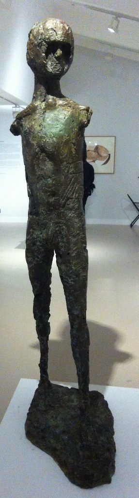
My sculptures of the male figure are both man and mankind. In these two categories are all the sources of all my ideas for the human figure. Man, because I enjoy looking at the male body and this has always given me and probably always will, the impetus and the energy for a purely sensuous approach to sculptural form. I like to watch a man walking and swimming and running and being. I think that my figures of men now say so much more about how a human feels than how he looks anatomically. I can sense in a man’s body a combination of strength and vulnerability — not as weakness but as the capacity to survive through stoicism or passive resistance, or to suffer or feel
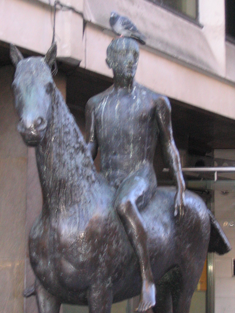 Outside Caffè Nerd on Dover Street, just off Piccadilly, is a small equestrian statue, usually with a pigeon on its head. I sat by it a few times before I realised it was an Elisabeth Frink, and I confess that I don’t recall why I began to pay attention to her. There was a small show at Woking I took myself off to a couple of years ago and materials at the Beaux Arts Gallery, London.
In my mental map, British twentieth-century scuplture was dominated by three names — Henry Moore, Barbara Hepworth and Eduardo Paolozzi — before we get into the Caros and the Gormleys and the more conceptual sculptors. Moore and Hepworth seem to occupy a curious middle ground between neoromanticism and modernism — shapes somewhere between the abstract and the bodily, sensual, demanding to be caressed. Paolozzi is plainly of the machine age — the aesthetics of collage and the cyborg, Lego bricks and circuit boards in bronze.
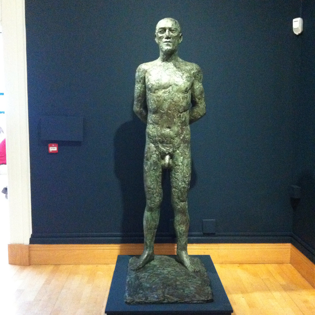 Whilst all three are producers of solid work, Moore and Hepworth are more abstract and Paolozzi is more surreal than Frink. Frink’s sculpture has an extraordinary physicality to it. Her statues are of walking, running, jumping, flying and falling men — yeah, pretty well all men — and clearly there is tension between such movement and the fitness of bronze or concrete. Even the standing men seem to loom, arms behind their back, cock and balls hanging, solid presences, somewhere between threatening and sexualised.
 Imagine: some of these were commissioned for the headquarters of W. H. Smiths. Remember that when you try to get your free chocolate bar with a copy of The Mail on Sunday. The Walking Man became one of the Riace, named for the bronze statues found in the sea in 1972, and is in white face, one of Frink’s odd experiments in coloured bronze. Apparently her statue of a dog was coloured; the Desert Quarter (1985) bronze is white. Are these angels or demons?
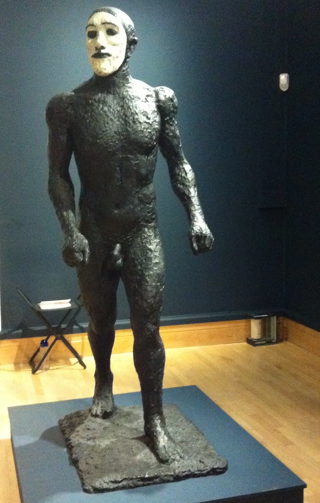
She’s presented here in a curiously dialectic way; on the one had she was a child during the Second World War although she knew of the horrors of Belsen and the atomic bombs, the anxieties of the Cold War; on the other hand her public commissions are associated with the Utopianism of the Garden City and New Town movement in the post-war rebuilding. Sculpture was meant to inspire people — whether outside civic buildings or shopping centres, or in the new Coventry and Liverpool Metro Cathedrals.
Her Christ, in a gouache, is muscular, the emphasis on the physicals over the divine. There are pictures here of the crucified Christ, the body emphasised over the cross. There is a Mary and a nun, and a study for Judas, which is also known as the warrior. Her military men — the flying men, the air men — always already seem traumatised, the sculptural equivalent of post-traumatic stress syndrome. And that makes me wonder about her Judas; he betrayed with a kiss, he was paid his thirty pieces of silver, he bought the field and hung himself. Was Judas a warrior — did he fight with his demons and lose?
 There is her Birdman, apparently commissioned for a school but thought destroyed (like her first commission, but a damaged version was found this year), a tall, gangly man, with stubs on his back, decommissioned wings perhaps, a fallen angel among men. There is her Running Man (1978), not, apparently, an athlete, but rather a fugitive from some unspecified conflict. Her Flying Men (1982) are hang gliders but seem about to cast themselves into space — inspired by one Léo Valentin (1919-56) who made his own birdlike wings in a vain attempt to fly. Is he also her Falling Man (1961)?
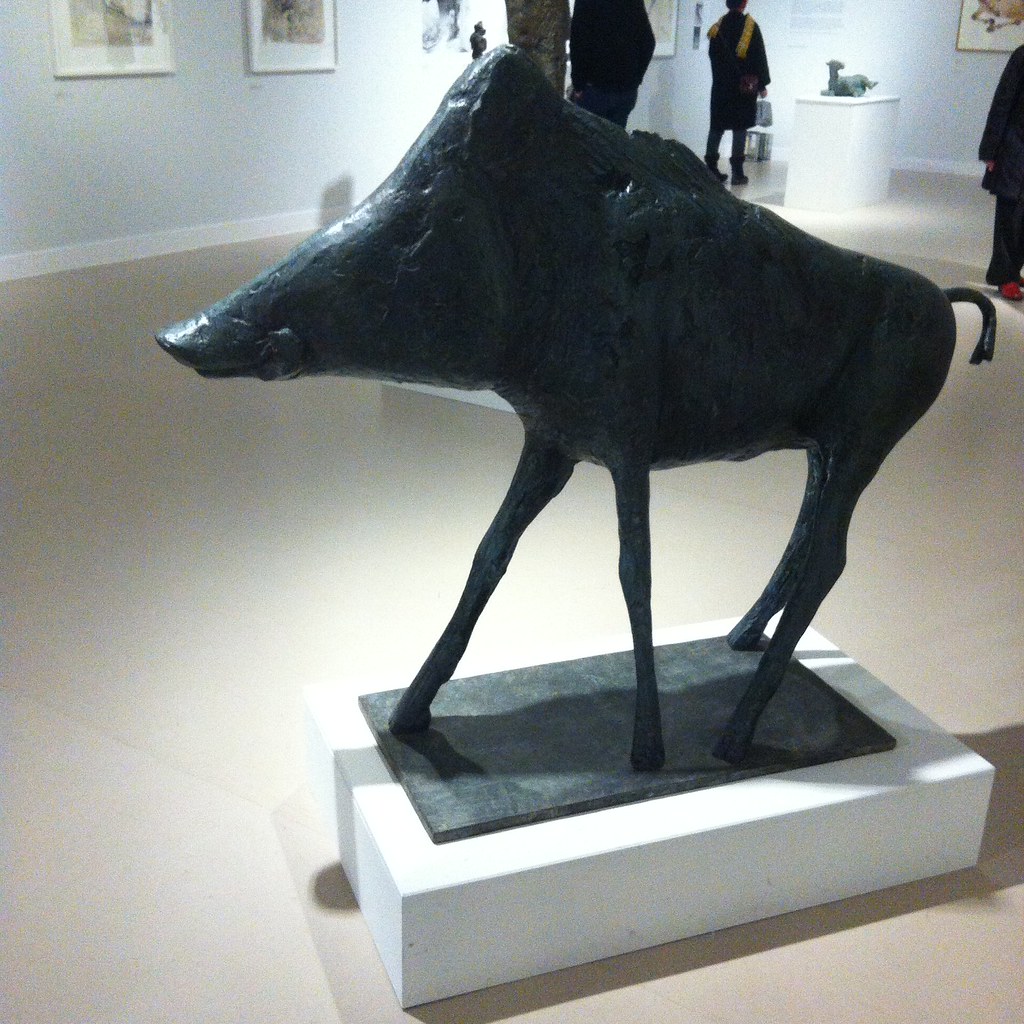 There are animals — lots of horses, sometimes with riders, a boar for Harlow, warthogs and dogs. Dogs whose heads you want to pat but mustn’t. There are birds, but of ill omen, her Harbinger Bird III (1961) and Warrior Bird (1953), corvids, menacing; on the other hand her eagles, often designed for pulpits and linked to the Kennedy assassination (there is also an uneasy sculpture, The Assassins, but all of them are uneasy).
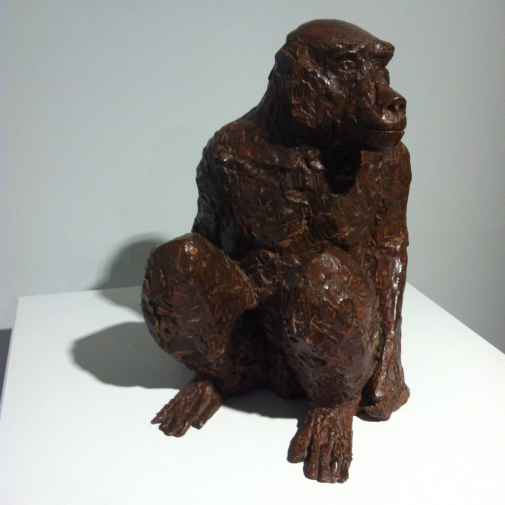
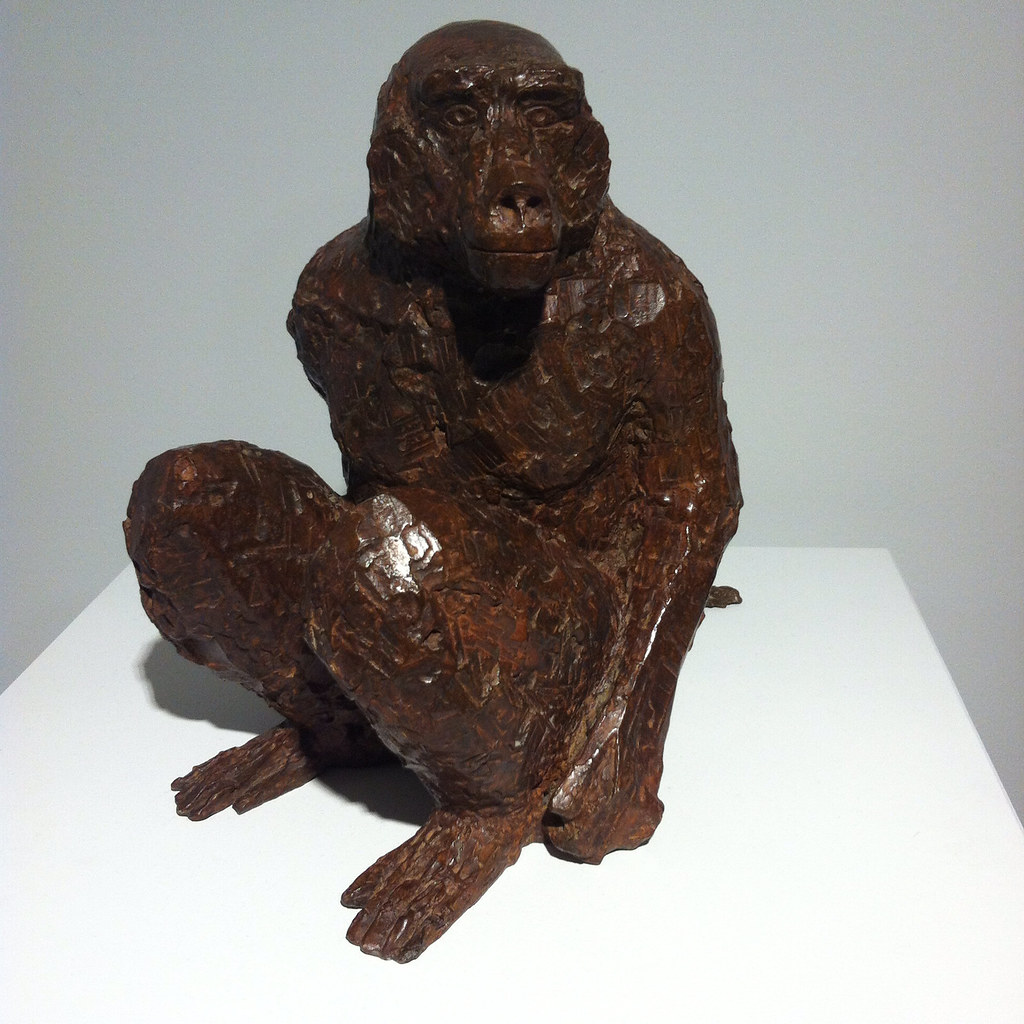
And of course, there is the baboon, commissioned for London Zoo, but it’s a different version here. And there’s a water colour, apparently inspired by an Australian trip although that makes little sense, of an encounter between a man and a baboon. Apparently the baboon is unimpressed by the man.
So her subject is man rather than woman. She may have done mother and child pairs like Hepworth and Moore, but none are here on display, and she was clearly a mother. The few female statues here are caped or cowled. Is there an avoidance of female objectification? Is her aim to objectify men? There were warrior women she could have portrayed, traumatised refugees. But clearly that was not for her.
