I started, as so often I do, with keeping a list of consumed culture. This petered out, so I am relying on memory.
2019 was Van Gogh and Rembrandt and Schiele and Munch.
Every year should be Munch year.
Continue reading →
I started, as so often I do, with keeping a list of consumed culture. This petered out, so I am relying on memory.
2019 was Van Gogh and Rembrandt and Schiele and Munch.
Every year should be Munch year.
Continue reading →
I used as various times to maintain a Googlesheet of exhibitions I might possibly interested in going to — then life intervened repeatedly, and it got out of date. Over the past few months I’ve been updating it and there are still a few venues missing, but it’s a l-o-n-g list and I need to work out a decent format still. I have a list sorted by closing date and by venue, and below is opening soon.
Information presented in good faith — a lot of mistakes came to light in this update — and check website before travelling. There’s a south eastern bias, plus major cities in Wales, Scotland and Ireland (I still haven’t been to Northern Ireland). Additions welcome. Continue reading →
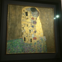
One of the most loved paintings in the world is Gustav Klimt’s The Kiss (1907-8), aka The Lovers. Sometimes I’m in agreement with this — Edvard Munich’s Scream and Vincent Van Gogh’s Sunflowers. It was bought by the Austrian Gallery before it was completed, originally shown at the Lower Belvedere and in the Upper Belvedere since then.
 This canvas is nice, but it doesn’t quite do it for me. I saw a load of Klimt drawings alongside works by Egon Schiele at the Royal Academy of Arts, but Schiele won. He was, however, key to a generation of Viennese artists before the end of the First World War.
I didn’t go to Oslo just to see The Scream (1893), but it would have been worth it. I’ve seen a pen and ink version at Bergen, but this was the first time I’ve seen this version in the flesh – there’s a later, probably 1910, version supposedly at the Munch Museum (but it wasn’t on display) and the one owned by Petter Olsen and sold for $120,000,000 but we take this to be the original.
Nikolai Astrup: The Way Home (23 January 2016 to 22 January 2017, KODE 4, Bergen)
Whilst many of the important Nikolai Astrup paintings were out on tour to places such as the Dulwich Picture Gallery, Bergen offered a selection of work to demonstrate his emergence as an artist. Since Astrup is hardly known outside of Norway, it shouldn’t be a surprise that few of these are household names. Norwegian art for us begins and ends with Munch, alas.
Albert Moore: Of Beauty and Aesthetics (York Art Gallery, 7 April-1 October 2017)
This exhibition comes with a thesis. I have to confess I wasn’t convinced.
York-born artist Albert Joseph Moore (1841-1893), son of painter William Moore (d. 1851) and brother to several artists, was part of the Aesthetic movement with Burne-Jones, Leighton, Watts and Whistler. The exhibition claims that his privileging of colour and mood over subject in search of beauty and art for art’s sake was a precursor to British abstract art. Digging around, I found a review of Moore and Burne-Jones from 1881: “Mr. Albert Moore paints neither incidents nor subjects nor allegories: he limits himself very much to the realisation of perfectly balanced for and exquisitely ordered colour.”
Continue reading →
Transferences: Sidney Nolan in Britain (Pallant House, 18 February—4 June 2017)
Sometimes you hold contradictory thoughts in your head to your own detriment — I’d known that Sidney Nolan was one of the most significant Australian painters, but I hadn’t realised he was so good.
Let’s phrase that a bit differently — whilst I had seen Nolan paintings (I’m presuming) in Melbourne and at the RAA Australia exhibition, I hadn’t been hugely struck by his work. I seem to recall there’s a painting in the Tate walkthrough of British art, and I just remember the colour brown.
The Pallant House Gallery, in collaboration with the Sidney Nolan Trust, have put together an exhibition to mark his centenary, drawing on the property of the trust and paintings in the Tate collection (I suspect rarely shown), paintings from Leicester Art Gallery, Walker Gallery and so on. It is an impressive collection.
Like (most?) Australian painters, he is drawn to landscapes, and there are several incredible moonscapes of the centre of Australia — mountains and craters and deserts, often as glimpsed from an aeroplane. These were too big to do on site, and I wonder if there are notebooks of sketches not shown here? They are suitable huge, but you notice that he seems more likely to paint the vertical or in a square than in landscape format, presumably to fit in all the layers of horizon and height and depth, rather than a wide, empty sweep. Inland Australia, I guess, is one of those rare exceptions.

Occasionally, he also painted on glass, almost like a contour map, using Ripolin, a kind of enamel paint (making him a precursor to George Shaw). Alongside the Australian desert is the Antarctic one — as dead as Australia interiors seem but freezing rather than hot. There are also paintings such as Carcase in Swamp, a title that is seemingly half right, a product of a commission of a newspaper or magazine to record seemingly the worst drought in Northern Queensland, where corpses were strewn across landscapes or somehow caught up trees. No magazine would touch them, but it was clearly stored in his image bank (to reappear in theatre designs decades later).
Sidney Nolan had been sought out by Kenneth Clark of Civilisation when the latter visited Australia, and this led to Nolan moving to Britain in 1951, away from his increasingly complicated love life in Heide outside Melbourne, although I suspect it became no less complex as a result. It needs therefore to be borne in mind that many of Nolan’s landscapes were painted in retrospect from a very different location. Indeed, he had a studio without windows to avoid distraction.
We get to see glimpses of three of his series of paintings — Ned Kelly, Burke and Willis and Mrs Fraser and Bracewell. I guess the Ned Kelly series is the most well-known — the Irish-descended bushranger convicted for stealing horses who went on the run after the attempted murder of a policeman. He fled to the Bush as an outlaw, being involved in the death of further policemen and a number of hold-ups. The final showdown was at Glenrowan, where the gang wore the homemade metal suits and were shot dead — Kelly survived, to be put on trial and executed in 1880 aged 25. Apparently Nolan’s grandfather was one of the police officers at Glenrowan — and Nolan painted this shootout at least once.

Typically Kelly is reduced to the square, spade-like mask, with a slot for the eyes, sometimes just showing the eyes. The mask stands on a spindly neck on an abstracted body, sometimes on a horse, often wielding a weapon. In other paintings, the mask becomes painted in blocks of colour, a moment of Mondrian or Miro. His Australian symbol could also be twisted to other uses — Kelly Spring 1956 gives him a blue background, a tree with blossom and is presumably a nod to events in Hungary.
And then there’s large, vertical, landscape painting, Ned Kelly and Policeman, with the landscape rather over shadowing the three policemen at the bottom of the image and Kelly on a horse. The label seems to be suggesting that Kelly is facing them down, but to me it looks like he is riding away. Of course, the mask looks the same from either side. There is also the painting of the death mask of Kelly, another mask but this time of his “real” face, based on the post-execution cast. (Do I recall Francis Bacon had a death mask of William Blake? Did I make that up? There are apparently others links too.) Death of a Poet has the bright blue background and strange plants twirling around much of the picture space, especially on the left. Apparently this is also a nod to Arthur Rimbaud, French poet and gun runner, although I’m not entirely clear how.
The second myth he draws on is of Burke and Wills, leaders of a 1860–61 expedition to cross Australia from Melbourne to the Gulf of Carpentaria in the north, which failed on its return to Cooper’s Creek where Burke and Wills died. On the one hand, this was a heroic journey — humanity vs. the landscape — on the other hand this was stupidity, given their lack of knowledge of bushcraft. Burke seems to stand out though — there is The Explorer Burke on a Camel (1966), where a naked Burke almost seems to be merging with the camel, a huge empty landscape behind him.
And then there’s Camel and Figure (1966).

Again, the landscape is striking, overwhelming, the camel stretched out toward a ?naked? Burke, almost subservient to him. Apparently nudity is the sign of someone who has given up and is about to die in a desert. Of course, he’s naked in both the paintings.
Finally, Mrs Eliza Anne Fraser was shipwrecked off the coast of Queensland in 1836 and claimed to be captured by Aboriginal people. She was rescued by convicts John Graham and (in legend) David Bracewell. In the legend, Bracewell asked for a pardon for escorting her to safety, but was betrayed. Novelist Colin MacInnes suggests we read the legend as an allegory for the relationship between the British empire and convict Australia; they’ve also been read in relation to Nolan’s relationship to Sunday Reed, with whom he’d had an affair. There are three paintings here — Convict in a Billabong (1960), a picture dominated by the browns of the vertical reeds and the light green of the trees, with Bracewell picked out in horizontal white and brown lines that parallel the stripes of the billabong. Meanwhile, Woman and Billabong (1957), a mix of browns, yellows and ochre, Mrs Fraser viewed from behind, in the billabong, to the left a weird figure somewhere between a finger and a phallus, presumably Bracewell? This surprisingly idyllic scene contrasts with the equally brown In the Cave (1957), where there is an almost randomly brown field, presumably the cave, with Bracewell in rather darker brown stripes; Mrs Fraser is drawn as a sexualised figure in supposedly aboriginal style, with a blue, red and yellow stripe as waist. The authentically “primitive” Australian here being envisioned seems at odds with the British empire metaphor.
One painting that seems to be outside the usual series and themes of his work is Peter Grimes’s Apprentice (1977) — a drowned figure in purple inspired by Benjamin Britton’s opera. Nolan and Britten knew each other, presumably through Nolan’s work in opera design, and Britten had died the year before. The drowned boy, with ginger hair, is in purple, with what appears to be a fish hook design on his jumper, which only seems appropriate. He is surrounded by fish, which almost seem like musical notes and are about to chew on him. It is a rather strange Ophelia-theme, peaceful yet fearful, an accidental (and tragic) rather than deliberate death.

And then, finally, I’ll turn to a late self-portrait, Myself (1988), depicting an old man with round glasses, somewhere between John Lennon and infinity, and scrawled over the top a frame like Ned Kelly’s mask — cementing an ongoing identification between Nolan and the convict, whether Kelly or Bracewell (I’m less clear he wants to be Willis). But perhaps he is transported to Britain rather to to Australia, the downunder upended. Scrawled is not quite the word — it is a portrait in spray paints, a long from graffiti but haunted by semilegal street art and apparently typical of his late work. The colours are incredible. (Apparent IKON have an exhibition of the portraits coming up.)
And here’s something that appears to only being discovered slowly — alongside the spray paints, Nolan had used Ripolin, an enamel paint, polyvinyl acetate and other industrial paints. Does this reflect his background in commercial painting — he used what he knew? Might we assume — cultural cringe alert — this was what he had available and so used? Various American pop artists were to use synthetic paints — but Nolan seems to predate them. Not for the first time, we should pay more attention to artists on the fringe of the standard narratives. What becomes very visible are the horizontal or vertical lines of the painting, almost scratched onto the surface.
I also note that most — perhaps all? — of the Tate paintings were donations from Baron McAlpine of West Green, scion of the construction company, property developer in Western Australia, art collector and, er, Tory supporter. I have to confess that he had rather interesting taste in art.
J.M.W. Turner: Adventures in Colour (Turner Contemporary, 8 October 2016-8 January 2017)
Joseph Mallord William Turner has to be the hardest working artist in British history. Pretty well every provincial art gallery I’ve been to has one of his works, usually of a local view. This island is obviously well gifted with landscapes, the genre which he made his own. Even the Carbuncle in Lisbon has a couple on display. In his early career, I presume he used coaches, but steam boats and then trains presumably helped his meandering — especially after the end of the Napoleonic Wars. He got to Italy, France, Belgium, the Netherlands, Poland, Czech, Slovenia, Austria and so on.
And yet I confess to a little resistance to him — I suspect there’s a little too much TurnerTM, Heritage painting, and I even went through a phase of liking the earlier, more classical styles. And I have a memory of visiting the Clore Gallery at the Tate — as you have to if you want your Blake fix — where a chunk of Turner’s unsold paintings he left to the nation are on display. Someone came in, took photos of every single panting, and left after four minutes. Very odd.
He was, of course, controversial in his day, his tastes and methods questioned, so I need to reevaluate him and his work. The Turner Contemporary has offered a couple of chances to do so — it always aims to have one of his works on show, it did a big Turner and the Elements show and now has J.M.W. Turner: Adventures in Colour as another opportunity.
The Tate posted an image of Turner’s The Fighting Temeraire on Facebook, and I noted it was a shame that this image of a sailing ship being towed by a steamboat out of a sunset to be broken up would be better if the coast were on the correct side. Someone responded that this was to do with composition and did I know the story of how Turner, on varnishing day at the Royal Academy of Arts, struck a red blob of paint on his canvas, next to Constable’s, and then worked it into a buoy.
Well, yes, actually, I do, if there’s one story that everyone knows about Turner, it’s the one where Turner, on varnishing day at the Royal Academy of Arts, struck a red blob of paint on his canvas, next to Constable’s, and then worked it into a buoy.
The coast is still in the wrong side. And anyway, sailing out of a sunset is hardly elegiac.
But clearly, the man had a way with colour, and the joy of the book on Turner and the Elements was its discussion of the technology of colours and Turner’s acquaintance with scientists of the day. The two cultures were not so divided back then. I think he was the first artists in Britain to use cobalt paints and I wish there’d been a bit more on this back then. I suspect, in what is a show that is frankly too big, the narrative got a little lost.
The first paintings you pick up as you enter are views of Norham Castle and Lincoln Cathedral. These follow the rules of landscape painting which I learned from Astrup’s breaking of them: you accentuate earthy brown in the foreground and exaggerate the blue in the background. This adds to the sense of perspective and scale — ideally you stick a human figure or an animal in the frame to give an identificatory viewpoint or a yardstick for size. Dolbadarn Castle (1800), silhouetted by the evening son, features bandits, adding a narrative (apparently about a Welsh family). Failing that, a spot of white or a splash of red will draw the viewers’ attention. His Fishermen upon a Lee-Shore (1792) has a limited pallete of browns and greens, made mobile by flecks of white and a red jacket.

In his training at the Royal Academy he was exposed to Claude Lorrain, Salvator Rosa, Nicolas Poussin, Titian and Canaletto, painters who tended to classical or Biblical narratives with landscape background. In the period of striving for realism I think you can see this — in his volcanos, fireworks and burning Houses of Parliament you can see Rosa. At much the same time, Joseph Wright was doing more interesting things with the light and John Martin finding a more monumental scale, but that’s more my taste.
Troubled by the sludginess of the browns and greens, Turner from 1805 started preparing his canvases with white paint or pigments, which gives a greater luminosity to everything that goes on top — I wonder if this was to be a Postimpressionist technique, as L. S. Lowry was to use it on advice of an French artist. Of course, sometimes the whiteness began to overwhelm the painting — the more famous canvases of clouds and seascapes, the mistiness of Frosty Morning (1813), the almost monochrome Venice with the Salute (1844) looking like spilt milk. On the other hand, he uses a European blue-coloured paper to stand in for sky or water in some drawings and a rich vermilion in Vermilion Towers (1838).

We learn along the way that he uses a mix of linseed oil and resin, megilp, as a means of enriching his standard paints and he started engaging with debates about the nature of colour. As Professor of Perspective — great job title — at the Royal Academy, he lectured on colour, colour wheels and chromatography, and whilst we have his handwritten notes on show, his writing is not legible. A transcript would have been useful — I should of course Google to see if they have been published. More annoying is the mention of refutation of Isaac Newton’s work on colour by Johann Wolfgang von Goethe, in which Turner sided with Newton, who described the splitting of light into the spectrum via the prism and discussed colour as reflected light. Goethe, on the other hand…
Well, I’m not sure what his theory is. I m not even clear, from further reading, that it is a theory. In part, in seems to depend on the prism being a special case and the refraction being more complicated than Newton allows, as well as the colour of shadows. Scratches head. Goethe’s Theories of Colour was translated by Charles Lake Eastlake in 1840, apparently a friend of Turner. Again the two cultures was unformed.
This comes to a head in Turner’s Late square canvases, with the colour taking on the curves of the circle — although I seem to recall the same circles in the work of John Martin. Two examples, I think Shade and Darkness — the evening of the Deluge (1843) and Light and Colour (Goethe’s Theory), The Morning after the Deluge — Moses writing the Book of Genesis (1843) — seem to be explorations of Goethe’s thoughts on colour and emotion, but I’m not clear how this follows through.
These paintings might be pointing back nearly forty years to his picture The Deluge (1805), in itself a response to Poussin’s painting Winter (The Deluge) (1660-64), which features a boat within a cove or a cave pool by the sea. Turner seems to have seen this in 1802 and commented “The colour of this picture impresses the subject more than the incidents which are by no means fortunate either as to place, position or colour, as they are separate spots untouched by the dark colour that pervades the whole.” Turner is setting out to correct the deficiencies he goes into note, and adds a black sailor, although this might be a much later addition. The gallery notes Turner’s investment in 1805 in a cattle farm in Jamaica, connecting him to the slave trade. However, Turner was to become abolitionist in later years.

But the story of Turner and colour is distracted by the various views of Margate that Turner produced over the years — and it is undeniably interesting to see the obscure fishing village that became a watering hole transformed over the decades, and to note how much the town has declined since. Whilst the revamped (and distinctly post-Turner) Dreamland seems to limp along from financial crisis to financial crisis, the Turner Contemporary seems to flourish. The temptation to offer local views is understandable and is one thing that will draw people in.
Just as Mitchell and Kenyon clearly filmed locals to whom they then screened the films in the 1900s and for decades the walky photographers took photos of tourists to sell to tourists, so Turner clearly had an eye on what would sell to locals — or might interest those on tour. The corner devoted to engravings and mezzotints shows how Turner could further monetise his work — with some extraordinary work — even as his perfectionism cut against this success. As a painter of working class origin, he would see no shame in pleasing as many markets as he could, even as his experiments clearly pushed at the boundaries.

Bridget Riley: Learning from Seurat (Courtauld Art Gallery, 17 September 2015–17 January 2016)
I tried to find the bridge (Bridge at Courbevoie (1886-87)) on Google maps but failed — the river Seine, the bridge, a distant factory, trees, fisher men, walkers. Georges Seurat’s brand of Post-Impressionism, pointillism, made up from coloured dots, half way between colour printing and cathode ray tubes. In another place, Roy Lichtenstein was to enlarge dots and make pop art of comics.
Copying is original.
Deliberately, if annoyingly, the copy and original hang either side of the doorway, challenging you to find a viewpoint from which they can be compared. You carry the memory of one to the other.

Bridget Riley may have seen the painting at the Courtauld – I presume it was at the Warburg Institute, Woburn Square in 1959, having recently moved from Portman Square? — but instead it struck her in R.H. Wilenski’s book on Seurat and she then decoded to paint her own version. It’s bigger, of course, but then the book may not have been clear how big the original was. I think she knew, really, so decided to make the dots larger, and so the intensity of the original is pushed even further from photorealism. The sky is curiously yellow, matching the colour in the water and the grass. He creates light from colour and that seems to be what fascinated Riley.
If the colours become abstract, then so do the shapes — triangles, poles, lozenges, anticipating Riley’s move from stripes into something more… foliated. The Lagoon paintings, for example.

And then, on an opposite wall, Pink Landscape (1960), the shimmer of summer heat in Sienna represented by dots of red and green and pink and orange and blue, and a child’s farmhouse of white walls and a red roof. The shapes of the fields form lozenges.
Wilenski writes of Bridge that “The little man in the bowler hat has missed his train back to Paris and will be scolded by his wife; the child will be late for tea and spanked, maybe, by its mother.”
Heigho.
But we would lose the narrative in Riley as the pinstripes become stripes.
Here we’re offered variants on stripes — Late Morning I (1967) with green and red and white and blue stripes insisting on length and direction, the vertical, Vapour (1970) with white, brown, purple, green stripes overlapping, question the plane and Ecclesia (1985), thicker stripes, taking on volume.
But Tremor (1962) draws the eye — black and white triables that also form curves and ribbons and you swear the painting rotates in front of you.
A painting approximates reality through strokes, dots, stripes and the pointillist returns it to dots. Riley’s insight was to occupy the geometry, to chase the relation of shape, in canvases that move both optically and emotionally, to create luminence.
Bibliography
The Art of Bedlam: Richard Dadd (Watts Gallery, 16 June-1 November 2015)
I wonder when we first associated art with madness? Perhaps the cave painters were seen as magical because of perceived links between bison and lunch. Certainly by the time of the Greeks we get all the stuff about muses and possession. We are fascinated by Blake and his angels and Syd Barrett and his madcap laughs and Spike Milligan and his depressions.
In the early to mid-nineteenth century we have mad poet John Clare and mad painter Richard Dadd.
Dadd was born 1817 in Chatham to a father who was clearly an intellectual mover and shaker, involved with the local philosophical and literary society. But they moved to London, specifically to Sussex Street, just around the corner from the Royal Academy of Arts (pre Somerset House days and pre-Burlington House presumably), and little Richard began to train as an artist. His reputation seems to have been made by a painting of Puck, a large child-like figure sat in the centre of a round picture in front of a crescent moon, with smaller fairies dancing around him.
 He was commissioned in 1842 to travel with former Newport mayor and barrister Sir Thomas Phillips (1801–1867) on a grand tour, painting his way in Greece and Egypt and the Holy Land. There is a stunning picture of a campfire in the desert, a stripy blue sky, and, most curiously, the moon pierced on the top of a lance, although this is thought to have painting after his return. The painting, The Artist’s Halt in the Desert (c. 1846), disappeared into private hands, only to be rediscovered on The Antiques Road Show in the 1980s.
By then, Dadd’s mental health was already deteriorating — perhaps due to the heat, perhaps due to the exoticism, perhaps due to an existing condition. He was sent home. Back in England, whilst on a walk, he murdered his father and escaped to the continent. He might have escaped, but on the train he tried to kill two of his fellow passengers. He was overpowered and arrested and sent to prison in France for a year. In time he was deported to England, where he was put on trial but was declared criminally insane. For two decades he was incarcerated in Bethlem, then on the site of what was to become the Imperial War Museum, before being moved to the newly built Broadmoor where he died and was buried in 1886. As Nicholas Tromans points out, his period in the asylum coincides with the Foucauldian epistemological break of the regulation of mental health by doctors, and the growth of case records.
Whilst in the asylum, he was allowed to paint with greater or lesser freedom and resources, with one of his physicians, Charles Hood, becoming a collector of his work. This was partly therapy, partly because Hood was a connoisseur. There is a picture, Portrait of a Young Man, which is thought to be a portrait of Hood in an imagined leisure garden at the asylum; on the other hand there is a satiric piece The Curiosity Shop, which features a “connoisseur” looking at a picture through binoculars. Was Dadd playing games with Hood? Meanwhile he produced a series, Sketches to Illustrate the Passions — hatred, agony/raving madness, Ingratiation or self-contempt, deceit or duplicity, anger, grief or sorrow and patriotism — that seem to be a diagnostic set of mental conditions. The latter features two elderly military types, smoking pipes, in front of a map “A General Plan of the City of Olabolika” and a plan in incredibly tiny print.
All of these pictures are on display in this Watts Gallery exhibition, but that is to get ahead of ourselves.
Continue reading →

