I started, as so often I do, with keeping a list of consumed culture. This petered out, so I am relying on memory.
2019 was Van Gogh and Rembrandt and Schiele and Munch.
Every year should be Munch year.
Continue reading →
I started, as so often I do, with keeping a list of consumed culture. This petered out, so I am relying on memory.
2019 was Van Gogh and Rembrandt and Schiele and Munch.
Every year should be Munch year.
Continue reading →
Eventually I’ll write about characteristic Edvard Munch, but I’m very struck by this (to my eyes) French-flavoured portrait, Morning (1884), in the Rastus Meyer Collection. We have a young woman, sat on the edge of a bed, mid dressing, gazing towards the window. The sitter is Thora Emilie Dalen (b. 1868) and she was painted by Munch when he was renting a room in Haugfoss. This was the painting that Munch was to exhibit in Paris and marks a breakthrough.
Two artists muscle to the front of early nineteenth century British art: Turner and Constable. Turner, because of Summer exhibition, yadda yadda, varnishing day, yadda yadda, red paint, yadda yadda, it’s a boat and Constable, because between some prints in the living room and six table mats, he was probably the only artist to make it into my childhood home. I can’t help but feel that William Blake and John Martin are better and more interesting than both, but I suspect time has made them more seem conservative than they deserve. There was a huge retrospective of Constable’s big paintings at the V&A a couple of years ago (I suspect I have notes somewhere), but he doesn’t get me excited.
Abstract Expressionism (Royal Academy of Arts, September 2016—2 January 2017)
There’s a story that in the late 1940s, the CIA funded Abstract Expressionism. It was an exercise of soft power, from the people who funnelled money into the animated Animal Farm and exploding cigars. The Soviets were busy with their Socialist Realism, whilst the Americans were channelling the chap with the lily pads with bigger brushes. The AES paint big, really big, and it takes a lot to transport all those canvases around the world. In one version the Tate wasn’t able to afford a huge exhibition and an benefactor gave the money. The story is the money came from the CIA.
If Abstract Expressionism didn’t bring down the Berlin Wall, then at least it came up with pretty cool murals.
It’s the sort of thing that can leave you cold, but if you surrender to it it’s pretty amazing.
Just like capitalism.
The cavernous spaces of the Royal Academy seem appropriate, although they’ve never quite got the walk through right. These are huge, abstract paintings, determinedly non-representation, yet in theory expressing an inner emotion. Of course, we don’t always know what that emotion is, but you can always supply your own.
The first room was a kind of overture, showing paintings from many of the big names prior to the glory days. Some of these are portraits, few of them are great, but you can see the roots in Barnett Newman’s green stripes on dark red. There’s a curious Mark Rothko, Gethsemane (1944), presumably alluding to the night of Christ’s betrayal, and sort of cruciform, but it might be an eagle with an American football. And a weird cloud flag.

Clyfford’s Still’s PH-726 (1936) has wobbly male and female bodies inscribed within a block — a two dimensional version of what Moore and Epstein were carving at about the same time. A new name to me, I confess, but one I will return to later.
And so the various stars come out — and the rooms which focused on one or two artists were stronger than those which offered dubious thematic arrangements. That being said, I don’t get on with Arshile Gorky, having bounced off his Tate Modern show a few years ago. A numbers of them look like oddly painted figures in a room — say Diary of a Seducer (1947) — and I see I’ve made the note to myself, “bad photoshop”.
Jackson Pollock, on the other hand, is truly sublime. I never quite wrote up all my notes from Liverpool, but the late, black pour, works feel like the figurative abstracted. Like Rorschach tests, you can find the sail boat if you squint right. He gives in to the chaos of the drip, somewhere between randomness, automatic painting and the unconscious at work. There’s a huge mural, designed for Peggy Guggenheim’s New York apartment, with “a prancing, bestial presence” which maybe you wouldn’t want to live with. You don’t get a lot of help from the titles — even Summertime (1948) isn’t that helpful, with its wide, short overlapping of colours and drizzles. The trajectories of flies on a summer’s evening? There’s his Blue Poles (1952), with its striking, vertical totems, daring you to distinguish figure from ground. There are other colours, of course, (black grey white) but it’s striking how often he returns to red, blue and yellow, as if he’s unravelled a Piet Mondrian.

[and there, tucked on one wall, is Lee Krasner, not quite the token woman — though it does have to be said that AE is a very blokey genre with its SIZE DOES MATTER statements in oil — who takes four years to come to terms with Pollock’s stupid death in a car crash, who only then can “wrestle” with his ghost to produce The Eye is the First Circle (1960), which inevitably has to be read as homage and imitation rather than the work of an artist in her own right. Later, we’ll come across Helen Frankenthaler, whose exhibition I missed at the Turner, with Europa (1957) although I saw no bull.]
Mark Rothko is glorious, as always, and the room of his work at Tate Modern can reduce me to tears. As always the paintings seem to ride the walls, rather than be hung on the them, the layers, the laminates of colour lumess and dammit that is a word. You are surrounded by them in an octagonalroom, dwarfed, and I was annoyed to see people taking selfies against them — not because of any objection to such narcissism, but because my instinct is to disappear into these canvas rather than superimpose myself upon them. There are exquisite vertigo.
I don’t think I’ve come across Clyfford Still’s work before, but I’ve put his museum in Denver on my long term to do list (when the US is more sensible about the TSA…). These are vast canvases, representing vast landscapes, abstracted into colours. My favourite was PH247 (1951), also known as Big Blue, a luminous canvas of many blues, interrupted by dark brown and orangish vertical strokes. This, too, is a room to get lost in.
Less successful is Willem de Kooning’s work, here dominated by his paintings of women, of which he wrote “I wanted them to be funny … so I made them satiric and monstrous, like sibyls”. Gee, thanks. These are women as landscapes, rather than in, to my eyes deeply misogynistic. His other landscapes, notably Dark Pond (1948), which I misread as and viewed as Duck Pond, are better, but I don’t feel inclined to follow him up.
The shared rooms were on the whole less successful, with less of a chance to get to know the range of the artists’ work. A few women sneak in here — Joan Mitchell, Helen Frankenthaler, Janet Sobel — and I suspect the only Black artist, Norman Lewis. I wanted to know much more about his work. A room of drawings, books, prints and photographs got a little unruly, as the labels and pictures were not always as clear as they might be in the crowds. The final room gives space to Joan Mitchell’s four huge canvases of Salut Tom, echoing Postimpressionism as much as Abstract Expressionism, and represents late work of some of the big names — although of course Pollock was long since dead.
One final room to draw attention to is the one of Barnett Newman and Ad Rheinhardt, who interrupt swathes of colour with zipped colours or focal zones. Rheinhardt retreated into the Malevich black square for fourteen years — 60″ x 60″ canvases painted all back. The spartan austerity is striking. But Newman was the revelation, and I wonder if he was the inspiration for the Abstract Expressionist Rabo Karabekian’s The Temptation of Saint Anthony in Kurt Vonnegut’s Breakfast of Champions (1973). Eve (1950) is a mostly red canvas with a dark red stripe on the right hand side and its twin Adam (1951-52) is brown with three red stripes of different widths. I have know idea if they connect, but he somehow feeds into Bridget Riley‘s stripes. Newman writes “only those who understand the meta can understand the metaphysical and his paintings are as much their paint as anything else — the rich blues and reds.

Of course, these artists went through a whole range of political experiences from Pearl Harbor to Watergate, and I guess they mark the point when the art world shifts from Paris to New York, with Rauschenberg and Warhol waiting in the wings (and O’Keeffe‘s rather different abstracts predate, postdate and overlap with their heyday). They are, of course, always on the edge of being the emperor’s new clothes, just paint on canvas, randomness. But in the vast spaces of the Royal Academy most of the work transcends that caveat.

Bridget Riley: Learning from Seurat (Courtauld Art Gallery, 17 September 2015–17 January 2016)
I tried to find the bridge (Bridge at Courbevoie (1886-87)) on Google maps but failed — the river Seine, the bridge, a distant factory, trees, fisher men, walkers. Georges Seurat’s brand of Post-Impressionism, pointillism, made up from coloured dots, half way between colour printing and cathode ray tubes. In another place, Roy Lichtenstein was to enlarge dots and make pop art of comics.
Copying is original.
Deliberately, if annoyingly, the copy and original hang either side of the doorway, challenging you to find a viewpoint from which they can be compared. You carry the memory of one to the other.

Bridget Riley may have seen the painting at the Courtauld – I presume it was at the Warburg Institute, Woburn Square in 1959, having recently moved from Portman Square? — but instead it struck her in R.H. Wilenski’s book on Seurat and she then decoded to paint her own version. It’s bigger, of course, but then the book may not have been clear how big the original was. I think she knew, really, so decided to make the dots larger, and so the intensity of the original is pushed even further from photorealism. The sky is curiously yellow, matching the colour in the water and the grass. He creates light from colour and that seems to be what fascinated Riley.
If the colours become abstract, then so do the shapes — triangles, poles, lozenges, anticipating Riley’s move from stripes into something more… foliated. The Lagoon paintings, for example.

And then, on an opposite wall, Pink Landscape (1960), the shimmer of summer heat in Sienna represented by dots of red and green and pink and orange and blue, and a child’s farmhouse of white walls and a red roof. The shapes of the fields form lozenges.
Wilenski writes of Bridge that “The little man in the bowler hat has missed his train back to Paris and will be scolded by his wife; the child will be late for tea and spanked, maybe, by its mother.”
Heigho.
But we would lose the narrative in Riley as the pinstripes become stripes.
Here we’re offered variants on stripes — Late Morning I (1967) with green and red and white and blue stripes insisting on length and direction, the vertical, Vapour (1970) with white, brown, purple, green stripes overlapping, question the plane and Ecclesia (1985), thicker stripes, taking on volume.
But Tremor (1962) draws the eye — black and white triables that also form curves and ribbons and you swear the painting rotates in front of you.
A painting approximates reality through strokes, dots, stripes and the pointillist returns it to dots. Riley’s insight was to occupy the geometry, to chase the relation of shape, in canvases that move both optically and emotionally, to create luminence.
Bibliography
Sickert in Dieppe (Pallant House, Chichester, 4 July—4 October 2015)
So, in my head, I get him mixed up with James Whistler. Or possibly John Singer Sargent. He’s the one that Stephen Knight and Patricia Cornwell reckon to be Jack the Ripper. Whatever. So, he’s born in Munich in 1860, son and grandson of an artist, who initially wanted to be an actor in London, but became a pupil of Whistler (ha!). In 1883 he went to Paris and met Edgar Degas – whose paintings and sculptures include dancers – and learned from him about impressionism. Oddly, he seems to have learned to avoid all the en pleine air nonsense and was advised to make drawings and work in a studio. Splendid. Back in London, he started making pictures of music halls. Splendid. Later he was to become part of the Camden Town group.
He was described as flamboyant and bohemian — and the portraits and photos endorse this. He’d later hang out with Audrey Beardsley and give him a painting lesson. And so it is somewhat of a surprise to me that he first came to Dieppe on his honeymoon with Ellen Cobden (daughter of the anti-Corn Law guy) in 1885. Dieppe was a fashionable seaside resort, increasingly popular with the Bohemian fraternity, and initially Sickert produced seascapes, on small oak panels, before focusing more on architecture. Whilst apparently he had been more interested in portraiture in Britain, now he moved to landscapes. Having spent a number of “seasons” in Dieppe (alongside a trip to Venice), he settled there as his marriage disintegrated and before his divorce was finalised. He found a mistress, Augustine Villain, and lived in the harbour area for a period. In 1912 he bought a house in the Dieppe countryside, with his second wife Christine Angus, but was forced back into town by the outbreak of war. Having returned to England, it was not until 1919 that he got back to Dieppe, but within a couple of years Christine died of tuberculosis. Degas worked once more on the seafront also sketched then painted people at the casino. There were also a series of dark pictures of figures in bedrooms – probably alluding to the Camden Town murder.
 The paintings are mostly street scenes – the Hôtel Royal, the Rue Notre Dame, the church of St. Jacques and the statue of Admiral Duquesne – and the tone is overall rather brown and muddy. Wendy Baron writes: “His main harmony was generally based on hardly more than two colours corresponding to the dark and midtones, with the addition of creamy buff for the lights [… h]e often used blue-black with brown or mauve.” (69). Four commissioned landscapes intended for a restaurant – but rejected by the owner – seem to distill this and you face one of these as you enter the exhibition. There is clearly the essence of Impressionism here, with wet paint applied on wet paint in layers, but you get the sense that it is planned to appear improvised. There are various squared drawings and canvases that show the careful recording of buildings, which then can be painted back in any of his several studios.
 I’m pleased I saw this exhibition – on a day I’d anticipated that I’d actually be in Brighton and after a journey from hell – but I can’t say I warmed to him. He was described as “the Canaletto of Dieppe” – and of course his time there included him working on canvases imagined in Venice. There is a sense of the mysterious to some of the pictures, and the moral commentary that may be in the late casino paintings. There’s a room of painters influenced by Sickert that’s also worth a look – and elsewhere a fascinating if largely black and white collection “St. Ives and British Modernism”, the George and Ann Dannatt Collection.
I can’t help but share a (paraphrased) comment from George Dannatt: “The objection to this art is often that ‘My child can do it’. So give it to a child. The answer is often silence.”
Bibliography
Jean-Étienne Liotard National Gallery of Scotland, 4 July-13 September 2015, Royal Academy of Arts, 24 October 2015-31 January 2016)
 I confess I had never heard of Jean-Étienne Liotard. He was born in Geneva in 1702 and began his training there before going to Paris for further training. He then travelled to Naples and Rome in the 1730s, as well as travelling several times to Constantinople. Much of what he did were portraits, both of the famous people he met and of the people who were effectively on a grand tour. Many of them — including himself — dressed up as if they were Turks, in a clear example of orientalism.
Back in Western Europe, he was much in demand oas a portraitist of the royals families in Vienna, Paris and London, sometimes in oil, sometimes in pastels. Supposedly they are more relaxed and intimate than the typical royal portraits — he had an incredulity to court formality. His depiction of hands is striking — so to speak — or of fingers, almost as if he was showing off. He was very open to making money from his work through mezzotints and engravings. He also painted many self portraits and pictures of his family (it would have been helpful to have these by the side of some of the royal portraits on show at The Queen’s Gallery, Holyrood).
I was slightly confused by the chronology of the exhibition — are the royal and society portraits (actors, actresses) not later than the pictures of Constantinople? Still, the incredible trompe l’oieil of the paintings in the third room are worth seeing last.
I was, naturally, struck by the picture of Count Jean Diodati at his villa c.1762-70; just over forty years later this was to be the birthplace of Frankenstein.
Blind Spots: Jackson Pollock (Tate Liverpool, 1 July 2015-17 October 2015)
Jackson Pollock was born in 1912 in Cody, Wyoming, but grew up in Arizona and California. Having gone to art school (and been expelled), he became an artist for the Federal Work Program. His big stylistic breakthrough was the all-over drip painting, although pouring might be a better word. The whole canvas is covered by oil or thinned enamel paint dripped from brushes or syringes; in most cases the paint over lies and is overlain with other paint, in some cases the canvas is visible.
Pollock was slotted into the abstract expressionism category — abstract because it wasn’t figurative, expressionist because he was expressing his feelings and emotions on the canvas. This wasn’t necessarily a term he liked and I will come back to it. Pollock was an alcoholic and went through Jungian psychoanalysis to attempt to cure this — the assumption is that his art can be understood in Jungian terms, presumably expressing a nonindividuated ego and archetypes. Early paintings had Greek mythic titles and he is also assumed to be drawing in an interest in Native American art.
I hope to return to this but I’m troubled — action painting gives access to the unconscious and more primitive stares of mind, such as that of the Native American.
Koffs.
Really?
In 1951, after a less successful exhibition of the kind of paintings we know Pollock for, he took a change in direction: the black paintings. These were largely blank canvases with thinned black enamel dribbled on them — sometimes calligraphy, sometimes faces, sometimes scribbles — and it is this set of paintings that becomes central to Blind Spots, the current exhibition. Whilst they’ve never been entirely ignored, they have been downplayed.
Pollock wasn’t the first to paint in black — Malevich’s black squares have been seen at at least two British shows in the last year, at Tate Modern and the Whitechapel. Willem de Kooning had a black and white painting, coincidentally also in the Tate at the moment. But Pollock painted just in black.
I was worried — I prefer twentieth to pre-twentieth-century art, but I don’t like all abstract art. I was worried that I’d be wasting my time seeing this, even though I prepared by reading three or four books on Pollock. Pollock is the epitome of the “My six year old can paint like that” school of art criticism; it’s said of Picasso, too. And bollocks. But I wasn’t sure I’d get it.
I don’t pretend this to be profound, but it struck me that there is an opposition between figurative and abstract, figure and ground, paint and canvas and so on. Paint is applied in layers — in three dimensions, however trivially, as new paint obscures old.
If abstract expressionism gives us access to the unconscious, how do we know it’s the artist’s unconscious rather than our own? Does that matter?
Of course, schooled in deconstruction, you’d expect me to pick away at the oppositions.
There are specks rather than spots in this exhibition — but blind spots are the part of your eye where the nerve and exits and lacks rods and cones, there the bit that wing mirrors can’t pick out (Pollock died in a car crash) and blind spots are the things critucs overlook. But there was for me a misprison — I thought of Paul de Man’s Blindness and Insight, the blind spot of a text or of the critic’s reading of it.
Hmmm.
At the start of the exhibition is a found collotype of a mother and child, mostly obscured in black ink.
Obscure vs. reveal. Mask vs. unmask.
The mother and child is a key trope — archetype of — of the history of art. The Madonna and Child. This is clearly a pop art version, but we need to keep an eye out for this in the exhibition. Pollock’s mother and Pollock? Maybe. Is the black ink covering them up or revealing them? It certainly draws attention — you look harder.
The idea of looking is set up for us in the first picture of the show. It is the keynote.
(To be continued…)
Inventing Impressionism (National Gallery, London, 4 March-31 May 2015)
There are two groups of painters that to my mind seem awfully old-fashioned and chocolate box, and having seen their work I feel the need for a blast of Howard Hodgkin or Leonora Carrington. And yet, despite being immensely popular crowd pleasers now, in their time they were as revolutionary as YBAs. I mean the Preraphaelites and the Impressionists.
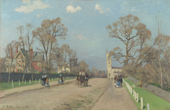
This seems an innocent enough landscape, a suburban church on a spring day. It’s Sydenham, in 1871. The church is still there, although Camille Pissarro makes the tower taller.
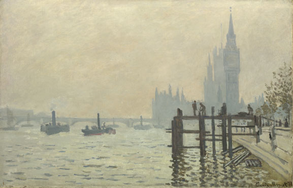
And here’s Monet’s Westminster in 1871. That tower looks wrong.
These and about eighty other paintings were brought together in an exhibition at the National Gallery, based around the dealer, Paul Durand-Ruel, who was a champion of the Impressionists. He had inherited the painting business from his father, and saw potential for an emerging group of artists in Paris in the 1860s. He bought cheap when the market was low, then sold at a huge profit. He seems also to have manipulated the market at times to bid up prices. In 1870 he left Paris, to get away from the Franco-Prussian War, and in a London gallery began a series of shows of French artists. He also met artists such as Claude Monet and Camille Pissarro, who were also living in London. If the French weren’t interested, maybe the British would be. He paid artists a monthly wage and focused on individual artists for catalogues and exhibitions. Whilst his business was subject to the rises and falls of the French economy, he clearly was a hugely successful dealer. And he looked from Europe to America, where a new market awaited, sending one of his sons out there to manage affairs.
And yet critics had conniptions at some of the paintings. Pierre-Auguste Renoir’s “Study: Torso, Sunlight Effect” (1875-6)

Albert Wolff in Le Figaro wrote “Try to explain to Monsieur Renoir that a woman’s torso is not a mass of decomposing flesh with those purplish green stains that denote a state of complete putrefaction in a corpse.” Imagine if they saw a Paula Rego or a Lucian Freud. They’d have heart attacks.
I guess it’s a failure on my part to think myself back into the 1870 mindset — it doesn’t feel revolutionary. It feels nice.
,
John Virtue: The Sea (Towner Gallery, Eastbourne, 17 January 2015-12 April 2015)
Ori Gersht: Don’t Look Back (Towner Gallery, Eastbourne, 7 February 2015-26 April 2015)
Where we perceive a chain of events, he sees one single catastrophe which keeps piling wreckage and hurls it in front of his feet. The angel would like to stay, awaken the dead, and make whole what has been smashed. But a storm is blowing in from Paradise; it has got caught in his wings with such a violence that the angel can no longer close them. The storm irresistibly propels him into the future to which his back is turned, while the pile of debris before him grows skyward. This storm is what we call progress.
As an incomer to southron lands, I guess I should never speak ill of Kent, but Sussex has the edge over it in terms of galleries — Updown, Anthea Turner Contemporary, Mascall’s and Sidney Cooper weighed up against Pallant House, the De La Warr Pavilion, the Jedward and the Towner, not to mention Brighton. Against Chipperfield’s retread of his Wakefield Hepworth design in the (oh go on then) Turner Contemporary, they have a number of glorious modernist or modernist-style buildings and (oh go on then) the Jerwood. More to the point, alongside exhibitions there are collection strategies, but that’s another story.
That being said, as with the De La Warr, the Towner needs a lick of paint.
First to the top floor, and John Virtue’s monochromatic renderings of the sea. I went to see Maggie Hambling’s Walls of Water, in part because of the virtriolic review by Jonathan Jones, and that works on a similar principle of abstract expressionist versions of naturalism. Whilst Hambling allows herself colour, Virtue barely gets to grey. Would the Blakeney Tourist Board be chuffed? I was a little disappointed by the paintings simply having numbers and dates (I like that kind of hermeneutic unpacking) and I wondered how some of them can take three years… And yet, that sizeable floor space of the Towner allows for distance and, once you stop, pause, focus, lose yourself, there is something powerful. I reckon you need Ralph Vaughan Williams’s symphony being played, but there is something going on here. Despite myself, I liked.
And then to Ori Gersht, on the second floor, and a photographer who teaches in Rochester. Central to this show are two films — and I confess to a certain amount of impatience with art films (as opposed to film as art). All too often it’s poor cinematography and I’ve got the joke fairly quickly and how the hell can you view it properly in gallery conditions?
First here, though, a room of photographs, treescapes, mountainsides, a little blurred, a little resembling an album cover, something by Led Zeppelin?

Something, someone, at the back of my head — Caspar David Friedrich, the romantic artist of the mountain top?
Through to a second room — there’s a double, jarring, out of alignment photo of a tree, a silver birch? I have a memory of a painting, I think by Johan Christian Dahl, of a tree, that represented Norway.

And then a further memory, more recent, of someone who did this for Germany. The mind is blank.
Is Gersht in this tradition? [ETA: yes, well, of course… see below]
Onto the film Evaders (2009), a twin screen production which begins… well you watch it on a loop, so you come in partway through, and I’ve lost track, but we have a bearded man in a hotel room, and we have him walking in the dark, and we have wind, we have a storm, we have mountainsides. There is a voiceover, reading Walter Benjamin’s “Theses on the Philosophy of History” in relation to Paul Klee’s Angelus Novus, and Gersht is clearly making a link between Benjamin’s words and his fateful attempted walk to freedom in 1940 from Nazi occupied France across the Pyrenees to Spain. But emigration from Portbou was forbidden and Benjamin, in ill-health, faced deportation back to a concentration camp. He chose to kill himself. Benjamin is played by Clive Russell (I knew I recognised him) and the music is by Scanner.
A number of the photographs shown near the tree were taken almost blindly out of a moving window, from a train Gersht travelled on between Krakow and Auschwitz — a route Jewish prisoners would have been taken on to the camps, but on windowless trains. There’s a problem with art “about” the holocaust, about aestheticizing atrocity — Adorno’s line “Kulturkritik findet sich der letzten Stufe der Dialektik von Kultur und Barbarei gegenüber: nach Auschwitz ein Gedicht zu schreiben, ist barbarisch, und das frißt auch die Erkenntnis an, die ausspricht, warum es unmöglich ward, heute Gedichte zu schreiben”, normally paraphrased something like “no [lyric] poetry after Auschwitz”, springs to mind. But it must be engaged with. The moving camera gives an uncanny blurring; in the next room, Gersht is in Galicia, modern western Ukraine, home of his father and other ancestors. These are overexposed, tending to white out, again haunted. Friedrich is invoked in the notes, the romanticisation of the landscape.
This brings us to the second film, The Forest (2005), again on a loop, mostly of a forest and stillness, but with slow, dreadful, ear-splitting, felling of trees. The film slows into slow motion (he filmed at high speed?), again playing with the durée of the image. The loop means you lose the beginning and the end, until there’s a fade to and from black. Where does the work (of art in the age of mechincal reproduction) begin?
The words “The Clearing” allude to Martin Heidegger, and his sense of Being as standing out as in a clearing.
In the midst of beings as a whole an open place occurs. There is a clearing, a lighting… Only this clearing grants and guarantees to us humans a passage to those beings that we ourselves are not, and access to the being that we ourselves are.
In the film, the labour is invisible, missing, and I think from an ecological perspective, the clearing hear is ambivalent at back. Sustainable forestry? A century or two of growing over in an extend second of fall? And again, we are viewing this within the context of the mid-twentieth century atrocities of the Second World War. There is a sublimity at work here, but a terrible beauty was born.
ETA:

Caspar David Friedrich, Der Einsame Baum (The Lonely Tree, 1822, Alte Nationalgalerie, Berlin)
A little digging pointed me to Der einsame Baum (The lonely tree, 1822) by Caspar David Friedrich. I’m not entirely sure where I came across it — possibly in a book on Peder Baulke (who was Norwegian but active in Germany). The consensus is that this tree is an oak, and among the interpretations is that it represents the German people — although in 1822 it was still Prussia. The Riesengebirge/Krkonoše mountains in the background (if it is them) are now in the Czech republic but marked a division between Bohemia and Silesia. I’ve been unable to find a copy of Gersht’s photo, which looked to my untrained arboreal eye to be a silver birch. It’s a very different image from Friedrich’s, of course, but it’s still within the context of German identity.

