Albert Moore: Of Beauty and Aesthetics (York Art Gallery, 7 April-1 October 2017)
This exhibition comes with a thesis. I have to confess I wasn’t convinced.
York-born artist Albert Joseph Moore (1841-1893), son of painter William Moore (d. 1851) and brother to several artists, was part of the Aesthetic movement with Burne-Jones, Leighton, Watts and Whistler. The exhibition claims that his privileging of colour and mood over subject in search of beauty and art for art’s sake was a precursor to British abstract art. Digging around, I found a review of Moore and Burne-Jones from 1881: “Mr. Albert Moore paints neither incidents nor subjects nor allegories: he limits himself very much to the realisation of perfectly balanced for and exquisitely ordered colour.”

Elijah’s Sacrifice (1863) depicts a moment after three years of drought, when the Israelites are being tempted to worship Baal. Elijah suggests a God-off — both religions will sacrifice a bull and the Israelites will follow the God who answer. The Baal do their stuff, to no avail, but Elijah calls up a fire. The prophets of Baal were put to death and it finally rained.
The colours seem muted — muddy orange and dark greens, a group of men kneeling in supplication before the fire, a few side views, Elijah presumably the most developed character. In the background are mountains, but this still feels a very flat picture plane. But then it clearly has a narrative.
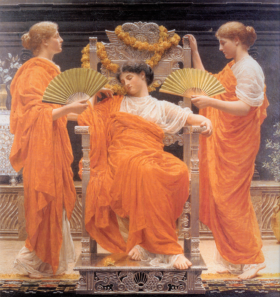
Let’s leap to Midsummer (1887), over twenty years later, a study of robes. There’s a central bare-footed figure in a white dress, draped in orange and asleep in a high backed chair. She is flanked by similarly dressed women, both with green fans — I suspect it is the same model for both women. There is some kind of low wall in the background, plants and flowers in a vase. There are a couple of orange garlands on the chair back, or one long one, twisted. We can almost feel the heat of a summer solstice — although the painting’s card speaks of how the painting “recalls a bright and sunny July day”, this is clearly flaming June.
Or Flaming June.
From what I can make out, Moore knew Leighton and presumably this painting was shown at the Grosvenor Gallery so Leighton could have seen it and stored the idea — as in the latter painting, it is as if the Sun shines from the robes.
But is it storyless? Is it free of allegory? You might think about the labour of the maids — and fans of course just move hot air rather than cool. Is she lazy? Is she charmed asleep? It’s a pretty impressive work, nonetheless.
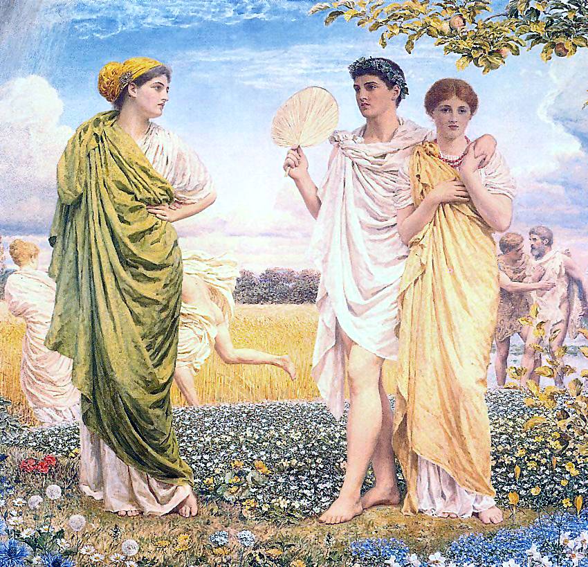
There is surely allegory at work in The Loves of the Winds and the Seasons (1893) — four figures on a field, as Spring, Summer, Autumn and Winter, attended by four winds, the Zephyr and south wind for Spring and Autumn respectively and the north and east for winter. The landscape adjusts for the characters, in fact it takes a while to note the play. (This seems clearer on the actual painting than this reproduction, which has lost a wind.) Apparently this was the last painting Moore worked on, a few days before his death and it is huge — Moore was 52, so hardly a great age.


At this show, the painting is flanked by two vertical paintings, both commissioned by Frederick Leyland of the highly successful Leyland Shipping Line. He also paid money to Rossetti and other Preraphs and Whistler, so he clearly liked his contemporary art. It’s almost triptych in this formation, although the topic is hardly Biblical after the manner of a Bosch. Seagulls (1870-71) is dominated by a woman standing on the beach in a brown dress with yellow drapes — he does go for the folded cloth look — rather than the two members of Laridae over her head. Are they ornithological accurate? Perhaps a nod to a shipping line. Meanwhile Shells (1874) has a similar (the same?) model on the beach, facing more head on, a brown dress but white robe and wearing a pearl necklace. At her feet, obviously, are shells and somewhere in the mix is the (rather different) Botticelli Venus.
The Classical leaks — even if there is a different standard of beauty.

Moore offers a, um, surprisingly muscular and chubby Venus — which reminds me, there is at least one painting in the Tate Queer show where a male model stands in for a female nude. It might have been, for reasons of decorum, Moore had limited access to female models willing to pose nude. But she is rather androgynous. The critics didn’t like it: “Some critics found the technique intolerable, save at a distance.” Coo. Notions of beauty do change, and I don’t mean chubby in a bad way, but she is odd.

Perhaps Pomegranates (1865-66) comes closest to the exhibition’s premise — leaving aside the backdrops and wallpapers which evidently tend to the abstract. Three women are arranged around a cupboard, on which stands a bowl of pomegranates with what seems to be a goldfish design on the glaze. What dominates the composition — aside from the leopard skin rug — are the orange and white tiles on the cupboard. We are led to believe that the tiles are there to display orangeness, that the layout is merely a vehicle for colour, and that the people are treated as objects to shine and are thus abstracted.
Maybe, but I’m not sure how we get from here to, say, Ben Nicholson.
(Pomegranate seeds seeds are part of the Persephone myth among many others and apparently are used to symbolise Christ’s suffering — are we entirely sure there’s no allegory?)
Meanwhile, the inclusion of Henry Moore’s Calm Before the Storm reminds me that the seascapes of Turner speak more to the history of abstraction. Perhaps it is the message that a painting doesn’t need to tell a story — but the aestheticism of art for art’s sake seems a long way from twentieth century abstraction.
