Unknown's avatar

Posts by flares

I am a critic and researcher of sf, with interests in queer theory, postmodernism, psychoanalysis and other long words. I have various blogs.

Farewell, Mike

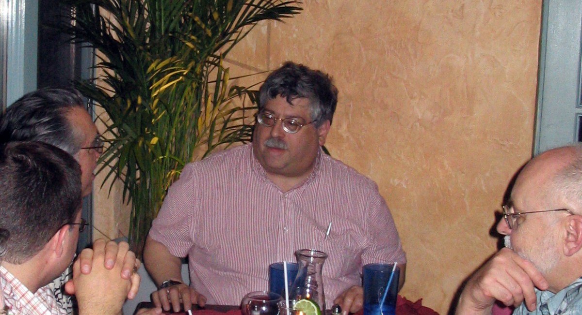
I think the last time I saw Michael Levy was at Worldcon in 2014 — on one of dozens of walks along the centre of the Excel between the hotel and the programming. He was in an electric wheelchair, which threw me a little, but I’d gathered he’d not been well.

We picked up the conversation that we’d had over the years, on either side of the Atlantic, from emails, from social media, and he seemed much more interested in how I was getting on. I suspect we ran into each other again, in more or less the same place, always between events.

I suspect the last time I had contact was an email, gently chivvying me for my tardiness, my lateness in some editorial duties. It is a sign of his gentleness that I applied my own guilt rather than he made me feel guilty — I fgind myself wanting to live up to his standards. He was going into hospital, for an operation, he would be out in a few days, then there seemed to be a delay in his release, and the next I heard he was in a hospice.

I can’t now remember if he was at the Liverpool conference in 2001 — but thinking about it I must have already met him at the SFRA conference in Schenectady in May 2001.

I was well out of my comfort zone and travelling abroad for the first time alone — my first time in America. Pretty well everyone was welcoming — I met or remet the many of the editors of Science Fiction Studies, for example — but I know that Mike put me at my ease. This was as well, because I was co-organising the SFRA conference the following year with Farah Mendlesohn at New Lanark Mills.

Do what you want, he said, you have a free hand.

Well, if I’m being honest, it wasn’t as free as that implied. It wasn’t quite “Tiggers like everything in the world except hunney and haycorns and thistles”, but it turned out there were some SFRA rituals that needed observing.

Mike was unruffled, endlessly patient, and guided us through the minefield. We pulled the conference off.

mikelWhat was clear from this and later encounters is that he had a good word for everyone, and I suspect everyone had a good word for him. If, say, I’d had a bumpy experience with someone, he would listen, be sympathetic, offer counsel, smooth things over. And I tell you, the few people he was less than impressed with… you’d be hardpressed not to agree.

I’d also met Javier Martinez at the 2001 SFRA, and somewhere along the line he stepped in to rescue Extrapolation, and roped in Mike, Sherryl Vint and myself to help out.

Well, two out of three good choices ain’t bad.

And then work and family got in the way for Javier and Mike stepped in to be Managing Editor. We joined up with Liverpool University Press and found a firmer foundation to stand up. Other great academics joined us after Sherryl moved on, filling her shoes, and always there’s been a sense of who will fit in, who can we work with, who will improve the journal?

As someone who is on both sides of the editorial process, I know how bruising submitting an article can be — for example, when there is a needlessly brutal reader’s report. Mike was skilled at dealing with these, at responding to potential writers. On the very rare occasions that we had to deal with a prickly author, he got us through it. I think I was only edited by him once — a piece for The Lion and the Unicorn, a venture outside my comfort zone, but he got me through the process. I’ve lost track of details, but there would have been changes needed, there would have been editorial queries, but Mike left no scars.

Mike was a friend, a confidante, a colleague, a mentor, a scholar, a painstaking and painless editor and — this should not be a surprise but it is still striking — I see that the responses on Facebook to the news that he was dying reveals that he was this and more to lots of other people I already respect as well as people I must get to work with.

I hope he knew that — although in truth I wonder if that would have embarrassed him. I will miss the laughter and his wisdom and the sense of mattering.

And now I’d better get on with copyediting a submission.

Attack of the Spinning Plates

Deadlines have been circulating in the manner of sharks:

  • article on A Scanner Darkly — I have put this to one side whilst I focus on other work
  • book proposal for Sekrit TTTTTTTT project – why is this stalled?
  • revise bounced book manuscript – – why is this stalled?
  • three book reviews — two complete, one almost
  • turn EX_MACHINA, War of the Worlds and The War in the Air papers into articles
  • Chapter needing copyedit
  • continue beer research

I’ve also edited several articles by others. March was productive at its end.

Free Fall

Free Fire (Ben Wheatley, 2016)

This isn’t a postmodern movie like Reservoir Dogs, the academic introducing this movie reassured us, as Wheatley draws on Michael Mann rather than Quentin Tarantino.

Okay…

I’ve only seen two of Wheatley’s previous films (and his Doctor Who episodes) and I suspect I like one of them more than others and one of them less. One switched genre gears pleasingly into Wicker Man territory, the other was a Kevin Brownlow movie directed by Ken Russell. There was a camp if violent tone to both.

Free Fire cranks up the claustrophobia on both — after a couple of road scenes and a factory exterior in Toronto, we’re then stuck in single space in Brighton, although you could read it as Massachusetts and some point in the 1970s if you want to. On the one hand, there are Irish men looking for machine guns, presumably as part of the terror campaign, on the other hand there is a South African and an ex-Black Panther looking to sell. The inbetweeners are a bearded giant and almost the only woman in the film.

Of course, you know it’s going to go wrong and, whilst the film is a taut ninety minutes, it drags a little until the wrongness starts. One of them asks the woman if she is an FBI plant — just like Mr Orange, you’ll think, or in his mould, but that hasn’t been filmed yet. Later we’re told how long it takes to bleed to death — just as we find out in Reservoir Dogs. One faction will, you know, attempt to rip the other group off — or they’ll rip each other off.

There’s a very heavy handed flagging of a gun over a fireplace, although we’re never told what the gun is and … well, as far as I can tell this is a tease and perhaps the only real nod to originality in the film.

As the bullets fly, you rather quickly lose track of who is dead or dying, or perhaps merely dying, or perhaps they’re stunned… beautiful plumage… You can’t help but feel that as the shot, blown up and penetrated crawl over glass, syringes and rubble that they’d be a little more stunned. For all Wheatley’s plotting out of the action in Minecraft, the spaces don’t feel consistent.

There are some laughs. The guys behind me (I think there was only one woman in the auditorium) found shooting a gun hilarious. They found guns jamming hilarious. They found the need to reload hilarious. I think I missed the joke. Cillian Murphy, Michael Riley and even Sam Riley had good lines. Armie Hammer looks good in a beard, perhaps his one character note and a means of telling him apart from the others. Brie Larson has her moments, and I’d like to see her in Concrete Island if Wheatley fancies more Ballard. And Sharlton Copley has the same comic schtick he brought to District 9 and CHAPPiE, minus the CGI. Rather like Life it’s an endurance test for the audience as much as the characters, and I cared marginally more for them.

But solid back story, motivation and something like an actual plot have been carefully eliminated in the name of … well it used to be postmodern and ironic and it used to make a difference from Merchant-Ivory confection but it’s twenty years since Michael Mann in Heat remade his own LA Takedown from a decade before that. Do we have more than a feature-length sitcom with a body count? It is slick, but too slick.

When googling around on Wheatley, I read the comment that he’s the new Noel Clarke. This may have been a compliment.

To be honest, I’m not sure who should be more insulted.

Flaming Nora

Flaming June: The Making of a Masterpiece (Leighton House, 4 November 2016-2 April 2017)

Limping through the undertubes a couple of months back, I was struck by a poster of a painting of what I took at first to be a marigold, but turned out to be a young woman in a dress. FINAL WEEKS it proclaimed, but I’m not convinced that it gave a closing date. I think I’d gathered it was at Leighton House, a venue in Kensington that was on my radar to visit.

And then I forgot.

A friend went to see it, it was his favourite painting. I paid attention. I plotted. I planned to visit it on a Tuesday, my research day.

Leighton House. Closed Tuesdays.

Good job I checked.

So I postponed an idea of Eastbourne, and decided to combine this with a trip to the RAA and Russian and American art, and navigated via a Caffe Nerd and attempting to remember what the Design Museum on High Street Ken looked like when it was the Commonwealth Institute. It wasn’t yet June, but was about the first sunny day in a while even if I sat outside in the shadows at Nerd. And eventually getting there, and one of those slightly weird negotiations of what are the rules for this exhibition?

In my limited mental picture, he was part of the Pre-Raphs, of which I’m not exactly a fan despite their supposed radicalism (which now looks like a box of fudge waiting to happen). I vaguely remember his paintings coming back to the Tate after an absence (to where?), but I couldn’t picture any. No good, eh? He clearly got lorded, and I vaguely assumed he was an ascendant of someone who taught me.

Anyway, the woman in orange, although popular fiction would call her The Girl in the Flaming Dress, one of five paintings Leighton prepared for the Royal Academy summer exhibition, as he was in the final months of his life. I think one of them has gone missing, as has the one he substituted for one he didn’t like at the last minute.

And apparently it was amazing we have this.

It didn’t sell at the show and was bought by The Graphic to be turned into a print to give away in Christmas 1895. After being shown in their office window, it was loaned to the Ashmolean and dropped out of sight — I’m not the only one to be unimpressed by Victorian confectionary. It turned up in Battersea, boxed in over a chimney, and was nearly bought by a young Andrew Lloyd Webber (make your own snide comments). A Puerto Rican industrialist, Luis A. Ferré, partly in town to buy art for his gallery, saw it in The Maas Gallery, London in 1963 and paid £2,000 for it. Since then, it has been at the Museo de Arte de Ponce, aside from rare loans to other galleries

So we have a woman in an orange dress, curled up almost in a circle, an oleander plant to her top right, a shining sea behind her, and draping cloth around her. It is undeniably attractive, with a striking horizontal line of her leg parallel to the golden frame, the ledge and sea, with a zig zag of her lower legs and arms, an almost circular composition. If you look carefully — and of course you do, since you’ll most likely not be heading off to Puerto Rico in the foreseeable future — there is a hint of nipple, of the skin tone under the diaphanous orange draperies.

Is that a word?

Of course, my gaydar had been triggered earlier by a small male nude on the staircase and a frankly camp Arab Hall of dark green tiles brought in from some grand tour or other. He never married, but there are rumours of affairs with a female model and a close relationship with a male friend. We just don’t know, it seems. Anything else is gossip.

Shrugs.

Next to it is a much smaller painting, a practice perhaps for Flaming, with tiny island in the sea, lost from the final version, and a slightly different top to the picture.

To its left, are the remaining paintings from 1895. ‘Twixt Hope and Fear is an elegantly dressed woman, sat on a chair so she looks over her shoulder at us. The vertical to diagonal arm dominates the composition — as does the double take I had about whether there was an iPhone in her right hand and she was taking a selfie.

Methinks not.

The Maid with the Golden Hair — see, that’s a proper title, but girl would be moderner — has a young girl reading a book, caught in a private moment. They reckon it’s Lena Dene, younger sister of his main model, Dorothy (he’s a friend of… nevermind), but I’d rather know what she is reading.

Verticals are accented in Lachrymae — a woman stood, supporting her head and arm on a fluted pillar bearing an urn, presumably a funerarararary one. The sun glints through the cypress tree behind her — a tree which is a symbol of (guess what?) mourning. At her foot is a wreath.

The final picture is Candida, a head and shoulders portrait, replaced by a (lost) painting Listener (although there’s a colour reproduction of it). So, five (or six) lone women, three of them possibly the same model and a Miss Lloyd.

Then you realise you’ve done this in the wrong order.

Hidden in his bedroom, with a spartan-looking single bed and letters that tempting to touch, and a fur rug that isn’t, is the print from The Graphic, a little worse for wear.

Back in the Silk Room are various preparatory drawings — black and white chalk on paper as he attempted to get the posture of the woman right and, Lo and behold!, a photogavure of his Summer Moon (c. 1872), two women asleep, one of them not unpostured like Flaming Nora, their arms curved in parallel, a circular opening behind them. Another photogravure, The Garden of the Hesperides (1893?), three women asleep under a tree (and now in the Lever collection, so I guess I’ve seen it in Port Sunlight. And then there’s Summer Slumber (1894), also seen in photogravure and notable for the flaming June relief in the wall this slumberer is slumbering on. This strikes me that Flaming June must be a little earlier than suggested. I’m not clear where the actual painting is.

And there are also preparatory pictures for some of the other paintings; in the studio are other paintings of oleanders and a photo of some carvings, although it requires a bit of detective work to work out what you should be looking at. It also took me a while to realise I need to go anti clockwise round the Silk Room and how the painting of an Algiers Courtyard fitted in.

But then I was back to Flaming, to soak her in again.

I can’t say I am converted to Leighton, and I suspect the works normally here are not his best, but it was intriguing to see this rarity.

Great Scotch!

Edward Krasiński (Tate Liverpool, 21 October 2016–5 March 2017)

I confess I walked through Edward Krasiński rather quickly on my first visit — I’d been delayed by a shop having moved and thus a late check-in at my hotel, followed by further delay as I tried to access my work email. And I wanted, at least, a look over the stunning Blake-Emin combo to see if it was what I feared.

Spoilers!

I was there to see Yves Klein, even if somewhere in my head it was Yves Tanguy. And I had just over an hour instead of the best part of ninety minutes. The next day, albeit again running late, I spent the best part of an hour in there.

But something had brought me up short — what looked like a broken ladder and then dangling black squares and a blue line.

Blue is beautiful.

Blue is best.

Did Tate Liverpool really schedule by the colour blue?

Krasiński’s early works are apparently Dadaist and surreal, but I assume that these are not on display. He seems to have been a late starter, with the works here dating from about 1960 when he was about forty. There are various small assemblages, too complex to be tagged Readymades (I feel the hand of Duchamp and Beuys on his shoulder), which are hanging on the walls. The materials include wood, metal, plastic, felt, acrylic and I get the sense that in part he is playing with the triangle set up between object, space and beholder. My understanding is that these would have been shown in darkness, a kind of labyrinth of art, but here the dark browns offset the whiteness of the walls and the bright light of this space. Later he would take photographs of some of his works on location, undercutting privileged vantage points (although a photo does fix one).

There’s also a large photo, Untitled (1996) of man in suit holding a hose coming off a roll — the end of the column column protrudes, next to a small piece of rope, and a bit of blue tape that I didn’t notice on my first go round. A relic of an earlier exhibition or deliberated short?

The second area has various solids hanging from wires (although I did wonder if these didn’t need to be less visible. Composition in Space 4 (1965) has a vertical suspension of black discs, each with a red to white colour red disc of decreasing size in each centre. There were also a numbers of broken spears, with the same dark brown, red, white colour gradation, suspended more or less horizontally, one looking like a broken rope ladder. And then there were a series of balls, not quite a Newton’s Cradle — and I wonder if Cedric Christie came across these works. There’s a capturing of time and space, a freezing of movement.

The third space — although I was quite clear of the trajectory, and I suspect Krasiński would lead us — had various small assemblages on white plinths, interventions, consisting of cords, cylinders, slopes and bits of wood. There’s a black cylinder, apparently filled with blue stuff, dribbling over the edge. J-4 (1968) is a tube going through a cylinder, cable in tube on curved white ribbon, from which the numbers 234567890 emerge. Where is number one?

But the breakthrough seems to have come with the Tokyo Biennale, when his sculptures were delayed in transit. He was going to send them a telex — the word BLUE five thousand times and this would be on display, on a coil of paper. To mark time, he arranged for a strip of blue Scotch Tape to be placed around the room: “After that there was nothing more I could do; it was so radical there was no turning back”

BLUE SCOTCH – WIDTH 20MM
LENGTH UNKNOWN
I STICK IT HORIZONTALLY
AT A HEIGHT OF 130 CM EVERYWHERE
AND ONTO EVERYTHING
WITH IT I ENCOMPASS EVERYTHING AND REACH
EVERYWHERE.
IT MAY OR MAY NOT BE ART,
BUT IT DEFINITELY IS
BLUE SCOTCH – WIDTH 20MM
LENGTH UNKNOWN.

We get sculptures of white and blue — a white rectangle, blue at the bottom, a blue cable dangling; two white books, one labelled A (and the other B?), a blue cable emerging, a blue surface between the books; a gutted white phone, dark blue wire tangled; the A/B opposite pages of an open white book with a blue tube emerging…

“I have lost the end” he says, in a photo of him trying to untangle some string or rope or cable.

The next room is of interventions — black and white axonometric drawings, unmasking the reality of the flat and the three dimensional, a kind of demented IKEA catalogue, with his now trademark blue stripe following the walls, weaving past a toilet chain and water pipe, giving illusions of depth.

the blue stripe is the intervention by the artist who is an on-looker/witness of the events taking place. It is an observer of changing phenomena that contain time. All that exists is time. Even inanimate objects are not extemporal: they are mutable”

… this leads us into the next space, which includes a false corridor, and a photographic and artistic replication of his apartment and gallery.

The artist Henryk Stażewski had invited him to live in his apartment and eventually left it to Krasiński. Art would be made there — or in his bedroom — and then shown in the apartment as gallery, with photographs of the space sometimes being shown in other galleries. The blue line continues across further axonometric drawings, and some white three dimensional objects, line with black. Photos of Krasiński’s acquaintances and other artists hang on cubes, striped blue, apparently making visual puns (although I didn’t get the joke). There is a token example of Henryk Stażewski’s work, black lines on a white background, like needles

And then there are sculptures of large, bent paperclips.

We’ve all been there.

The final intervention is a series of square mirrors, with black reverses, hung from the ceiling disrupting the space. They are utterly hypnotising.

img_0755

Krasiński’s art has a deceptively simple idea underlying it, but it was so seductive. On the one hand, a kind of minimalism, on the other complexity. It might be site specific — in that the meaning of the site it is found in is changed by the work. But the work could be everywhere.

There is a photo of Krasiński conducting the sea, a moment worthy of Klein, a musical Cnut. But he has such a strange power — a strip of blue Scotch Tape, 20mm,* at a height of 130cm, length unknown or unnecessary can turn anywhere into art.

* or 19mm. Imagine if Scotch Tape were to go bust. The end of art.

The Spinning Plates Menace

How are my energy levels? Next question.

  • article on A Scanner Darkly — 23 January — hah — various ideas but no more written. Next week, maybe, but it’s likely too late for the special issue.
  • book proposal for Sekrit TTTTTTTT project – asap
  • revise bounced book manuscript – asap – this hasn’t left the house for once this month
  • three book reviews — one almost complete
  • turn EX_MACHINA, War of the Worlds and The War in the Air papers into articles
  • Chapter on Star Wars — 22 February 2016 — I’ve started writing and this is three quarters done, in search of a conclusion — submitted
  • continue beer research

So, another idea for a book is hovering and a couple of talks need to be written. We’ll see.

Blue is Beautiful, Blue is Best

Yves Klein (Tate Liverpool, 21 October 2016-5 March 2017)

In the photos of Yves Klein I sort began to do a double-take for Buster Keaton. He has a sort of deadpan look, aided by the wearing of a smart suit or a waistcoat and shirt, which is at odds with the performance of his art — he’s somewhere between a clown and a ringmaster.

Continue reading →

“Cheese” Seems to Be the Hardest Word

The Radical Eye: Modernist Photography From The Sir Elton John Collection (Tate Modern, 10 November 2016–21 May 2017)

So Elton John got sober in 1990 and sold much of what he owned – but an art dealer friend showed him some black and white photographs and he became hooked enough to buy a dozen on the spot. Since then he has amassed something like 8,000 of them, which grace the walls of his Atlanta apartment in Academy style frame-by-frame, check-by-check. About 150 of them are on display, in John’s frames, in the new exhibition space at t’Tate t’Modern.

It is an extraordinary collection of modernist images, from the big names and the less well known, from the 1920s to the 1950s. Inevitably, it needs stamina – and the sudden bursts of colour on two walls is a relief from black and white, no matter how beautiful black and white is. As these are photographs as art, colour is mostly banished from the practice until the 1970s anyway. But when the photos can be as small as a cigarette card and no larger than A4, a certain amount of (sorry) focus is required.

Broadly speaking, the images split into three categories: the portrait; the document; and the estrangement. To my eye, the last is the most interesting, the first the least, but the categories overlap.

A lot of the portraits are of artists, authors or musicians, as artist photographs document their own circle. There are muses, teachers and pupils – so we have Man Ray, Edward Weston, Tina Modotti, Alfred Stieglitz as subject or object. Alfred Stieglitz’s portrait of Georgia O’Keefe is unusual as her face takes up the left side of the print, with wood, perhaps fencing, forming the right half; usually he chops her up into body parts. We have a row of artists and composers, André Breton and Ivor Stravinsky among others, where we are invited to perceive the artistic impulse at work in the face staring back at us.

Projection, much?

Along one wall, almost appropriately, are Irving Penn’s images of celebrities jammed into the corner of a wall apparently structured for the purpose. Noel Coward looks especially tall and wiry, although the caption, “Noel Coward was a playwright, director, composer and noted wit”, whilst not wrong, seems a little… off. Spencer Tracy did indeed win two Oscars, but that seems a little clipped too. Meanwhile, Carl Van Vechten depicts Leo Coleman as Toby in The Medium 18 May 1946, but doesn’t explain Leo Coleman was a black dancer in the Katherine Dunham troupe who appeared in an opera, The Medium, premiered at Columbia University ten days earlier. Dora Maar appears, but it’s assumed that you know she’s one of Picasso’s muses as well as a photographer and painter.

There is a room devoted to documentary, with some of the greats – Ansel Adams, Ilse Bing, Walker Evans, Dorothea Lange, Helen Levitt and so on, the great projects of the WPA in the 1930s and images of cities. Of course, there are all kinds of ironies and paradoxes – not least the millionaire rock musician and philanthropist owning and empathising with an image of poverty such as Lange’s Migrant Mother (1936). We have the art of poverty rather than the poverty of art, but we are projecting the story on the image. Part of the documentation is possible due to new smaller format cameras or faster films; some of the pictures are snatched street photographs, taken without their object’s knowledge, others would have been carefully set up. The distinction is not clear here; you’ll need to go elsewhere (the catalogue?) for technical details. I appreciated a picture by Robert Frank of Paris, I suspect the only living photographer from the exhibition.

Finally, the estranging, the avant garde, the experimental. Lazló Moholy-Nagy’s View From the Berlin Radio Tower (1928) is a good starting point, as objects blur into abstraction when viewed from on high – as does the Boy On Bicycle From Brooklyn Bridge by Ralph Steiner. There are several radio towers and aerials here, some as vantage points, others a view from below, as choice of bird or worm’s eye view collides with modernity. In distinction from distance, there is the close-up of objects (eggs, cups, plants) or tight cropping, to make us question what we are seeing. The photo as still life become abstract. Paul Strand – a protégé of sorts of Stieglitz and underrepresented here – combines both with the play of shadows of the commuter against the columns of Wall Street. And then there are the distortions in the photographing or developing stages, the double exposures, the scratches and damaged. I knew Herbert Bayer’s Humanly Impossible (Self Portrait) (1932) with the missing underarm chunk, but I hadn’t connected him to Lonely Metropolitan (1932), the eyes on hands in front of montaged buildings, which I half recognised. There is Man Ray’s Glass Tears, the titular drops like beads across a tightly cropped face, I think a mannequin’s? (It’s telling I can’t tell – take that, uncanny valley. Apparently he made it just after he split up from Lee Miller; I don’t think there were any of her photos on display here but it’s a depressing though that she would be so replaced.) And of course, there’s the Rayographs, one of several versions of the technique of camera-less pictures where objects are placed on light sensitive paper.

There is much here to enjoy and appreciate, if you can have the patience to slow down and admire. John evidently has taste, or has been well-curated (odd labelling aside). Ideally, I think, you’d go in and see half a dozen pictures and then go and stare at a bright coloured painting to recalibrate. But the thought of whatever selection there is of eight thousand pictures on his walls – where inevitably they must become invisible, feels me with a sense of unease.

On a Certain Tendency in British Art 1920-1950

In using the myth, in manipulating a continuous parallel between contemporaneity and antiquity, Mr. Joyce is pursuing a method which others must pursue after him. They will not be imitators, any more than the scientist who uses the discoveries of an Einstein in pursuing his own, independent, further investigations. It is simply a way of controlling, of ordering, of giving a shape and a significance to the immense panorama of futility and anarchy which is contemporary history. […] Instead of narrative method, we may now use the mythical method. It is, I seriously believe, a step toward making the modern world possible for art”

The Mythic Method: Classicism in British Art 1920-1950 (Pallant House, 28 October 2016-19 February 2017)

Occasionally I feel as if I should have done some homework before seeing an exhibition.

I will have read, I’m sure, “”ULYSSES, ORDER, AND MYTH” by T.S. Eliot back in the day, 1988 or 1989, and so would have once been aware of the tension between Classicism and Romanticism, and Modernism’s fight against the Victorians. Ulysses appears to the unwary reader a chaotic work, but if anything it is over structured, with bodily organs and literary styles and of course the narrative of the Odyssey. We have a dialectic tension between bringing an archetypal tale up to date and raising a wandering Jew and a wandering poet to the level of classical heroes.

The Pallant, a gallery of which I thoroughly approve down to hours of train timetable research to get there, has a thesis here of British art adopting what Eliot calls the mythical method in the aftermath of the First World War. The attempt is to present the contemporary, the up to date, through a classical lens. Perhaps it is a clutching at order in the ruins of the British Empire. We had had all the isms — Futurism, Vorticism, Cubism — and then a move from the abstract back into the representational. Compare, say, the early work of David Bomberg (who is missing from here) to his post war work.

It is a good story.

Take John Armstrong’s GPO Pheidippides, one of a series of posters advertising the GPO using historical narratives, here the runner who brought news of a battle to Sparta. The athlete is central, between images of male soldiers and waiting women. The image is meant to be of a Greek urn, but there is no attempt at perspective here. Telecommunications with the kudos of myth.


Or Meredith Frampton’s curious Still Life (1932), a hyperreal, photorealistic and yet surreal account of a broken urn on a plinth, alongside masonry and a sculpted head, sawn and shattered trees, flowers, barley and a tape measure. It is a Ozymandian, fallen world, highly suggestive of … hmmm.

And we have more evidently classical subjects — the Vanessa Bell and Duncan Wood Toilet of Venus (a pudgy Venus among the orange and yellow and pink), William Roberts’s The Judgement of Paris (1933) (where the trousered Paris guards his golden apple from a dog) and Roberts’s Parson’s Pleasure (a classical image of donnish nudity on the banks of the Cherwell, with dog paw like trees — and a nod to Le Déjeuner sur l’herbe).

The second room has one of my favourite painters — Edward Burra, with Arcadia, a satire perhaps of the Bright Young Things of the Waugh generation, some in fancy dress, some in berets, over the top male nude statues,cross dressers, and even the staircases in the ornamental garden setting seem voluptuous (Pallant is all too coy, alas). And a little dog steals the show. The other stand out pieces here are again John Armstrongs, as if they wanted a show on him but couldn’t get enough, Psyche Crossing the Styx (1927); Psyche is here a figure from Munch, the rowers fleshy skeletons and the setting seems like it in an interior bodily space. In the Wings (1930) mixes a bust and body parts in a Angus Calder like set of mobiles and wire frames.

The third room offers portraits, by both Proctors, by Frampton again, and more strikingly Gerald Leslie Brockhurst. Here we have Wallis, Duchess of Windsor, described as a contemporary Mona Lisa but with a less enigmatic grin. The flawless depiction, three quarter length, was evidently a piece of propaganda, hard to see now without the unease of eighty years of further royal history and what we think we know about Windsor sympathies. The painting must just predate the Second World War as it is 1939. Meanwhile there is an air about the other portraits of Magritte — indeed many of the paintings on show seem to be edging towards the suburban surreal.

The penultimate room is dominated by photos and a second Burra. The photographs are almost all by Madame Yevonde, working name of Yevonde Cumbers Middleton, with subjects somewhere between art and fashion, in stunning colours. She takes a series of wives of famous men — and each of them is labelled Mrs Famous Man — and dresses them as a classical goddess or figure. Mrs Bryan Guinness, for example, is better known as Diana Mitford, who was to marry Oswald Mosley at Goebbels’s house with Hitler in attendance. At around the same time, Leni Riefenstahl was using classical imagery to dangerous effect; it should be noted that the bleached ruins of Armstrong’s Pro Patria (1938) are anti-fascist in tone.

The Burra is Santa Maria in Aracolei balances several storeys of a building and windows — one with green curtains and a face — with a strange, Daliesque statue with a oddly human hand and a shirt of … feathers? Between the two halves is a staircase, which seems to have a real world equivalent although apparent Burra hadn’t visited the site. Like Burra’s other paintings it is a water colour, in this case on four sheets of paper. It nicely echoes Edith Rimmington’s double portrait of Athena, Sisters of Anarchy in which one of two statues of Athena is turning into an owl. I’d just come across the name at Sussex Modernism, where Rimmington is presented as a photographer.

I don’t seem to have made many notes in the final room — I think there was something by David Jones, a name to which I will return — but the stand out piece was Frank Runacres’s Untitled (Ruins) (1939) where works of art, sculpture, wheels, frames and other rubble seem precariously piled over a woman, her head on hand. The bombing of Spain had already happened, but this seems to be looking ahead to the blitz. And in a corner, two small pieces by Henry Moore, one a reclining figure in bronze, but with atypical drapery.

And so we have an interesting narrative, although that one Jones and a single Eric Gill piece point to a counter narrative that could also be told: artists of the period also drew on Biblical narratives, although I would admit the mythic points more to the work of Ravilious, Wadsworth, Nash and other English Romantic Surrealists. Don’t forget Christopher Wood, however, nor Stanley Spencer, probably superior to any of the works on display here.

And if you go back to the PreRaphaelites you can see an equivocation between the mythic and Biblical, but with much more denial of the contemporary in complex ways.

And so, the method is, methinks, a tendency, among other tendencies, but no less interesting for that.

My Heart Belongs to Yes I Said Yes I Will Yes

Tom Stoppard, Travesties (Director: Patrick Marber, Apollo Theatre, Shaftesbury Avenue)

As I’m sure I’ve written before, I fell out of love with theatre thanks to Nottingham Playhouse’s patronising use of social realist dramas. My few returns to theatre, aside from Hobson’s Choice and Glen Garry Glen Ross, seem to have been Shakespeare. But there have been the odd Stoppard — the original production of Arcadia (I also saw Hapgood) and the Chichester revival of The Real Inspector Hound. I’d read Travesties thirty years ago, but I’d never seen it until now.

It’s a play that sort of demonstrates what we “know” about Stoppard. He cares more about ideas than people. He’s not a radical playwright. He’s too clever for his own good.

Certainly I overheard conversations in the interval and after the curtain in which audience members declared they didn’t understand it. “Great acting, great production, but I don’t think I understand it.”

Stoppard’s jumping off point is the fact that Lenin, Joyce and Tzara were all in Zurich in 1917. He presents these through the memories of the British Consul… the assistant British Consul… an assistant British Consul… Henry Carr, from about fifty years later. Carr is an unreliable narrator, which gets around the dates not quite working, the minor anachronisms. Joyce, in the middle of writing Ulysses, invites Carr to play Algie in Wilde’s The Importance of Being Ernest, which led to lawsuits being exchanged between the two of them. Lenin, meanwhile, is waiting for revolution in Russia and trying to work out how to get across Germany to Petrograd. And Tzara, having just “invented” Dadaism, has fallen in love with Carr’s sister.

Each of the three great men are given chances to make speeches about their ideas and argue with Carr — the role of art, the role of the artist, the place of the the revolutionary, whether man can live on bread alone when he cannot live on art. I guess the confusion comes in when you try to work out where Stoppard stands, as a playwright who seems to be more about ideas than social change. Given some of his plays and television work about Czechoslovakia and the Soviet bloc, and an interview with him some thirty years ago, you’d assume his sympathies are not with Lenin. But then Stoppard asserted that he had to play fair and give Lenin some decent lines. And his major opponent is Carr, who pretty well emerges as a jerk. For that matter, I recall seeing some left wing playwrights who are similarly dialogic.

There is the glorious level of intertextuality — The Importance of Being Ernest, of course, although I thought there were more quotations, a few sequences that are indebted to the catechism chapter of Ulysses (which I probably didn’t catch in the 1980s) — as well as playing with limericks and poems, translations, and so forth. The start of the second half has a very clever (and rude) joke with Joyce dictating the ending of Ulysses. There are cut ups of one of Shakespeare’s sonnets and sequences which break into song and dance. Sometimes, I fear, I cringed a little, but there’s a Brechtian playfulness that recurs.

There are a couple of other texts that haunt it — there’s the Orson Welles cuckoo clock speech from The Third Man which you’d think would be alluded to in a conversation about war, peace and Switzerland and the dress and make-up of sister Gwendolyn and librarian Cecily seem to anticipate the play with twins in Hapgood.

It might be the strength of the acting, but you do care for the characters. Tom Hollander plays Carr as old man and young, and his comic timing and height feel spot on. His opening speech, more or less, is a three page soliloquy, which is hitting the ground running after some added silent business. The actor playing the butler, Bennett, almost steals his scenes, with some radical comments I think have been added to the script since 1974. Cecily (Clare Foster) and Gwendolyn (Amy Morgan) have a thankless first half, but come into focus in the second. The play isn’t just about the men — although only the men are famous. Cecily teeters on the edge of feminist or political killjoy — Carr declares her a pedant — but this allows her to name the play. The original exchange between the two women was in verse, but here it is played in song (with Joyce on mandolin).

Of course, it is hard to understand on some levels — the need of art to be political or not to be art is not resolved, but then you wouldn’t expect it to be. Because it isn’t resolvable.

Let’s end with one odd twist: Freddie Fox, of the Fox dynasty, is Tzara — initially Romanian, but quickly English as he shades into an The Importance of Being Ernest character. In 1974 he was played by John Hurt. I’m not sure I can quite imagine that.