Waiting for Hamlet

Rosencrantz and Guildenstern are Dead (directed by David Leveaux, Old Vic, cinema relay)

This is a haunted play and I suspect only partly deliberately. I saw the Mark Arden-Stephen Frost-Lionel Blair version at Nottingham Playhouse thirty years ago, which was I now realise a twentieth anniversary of its profession debut at the Old Vic in 1967 after a 1966 Edinburgh Fringe run. It is a play that weaves in and out of Hamlet in an ingenious way — the backstage to the main plot as it were. And every time I see Hamlet, I feel that it is a play full of quotations… even leaving aside any debt to Thomas Kyd’s The Spanish Tragedy and an ur-Hamlet.

But it is also Samuel Beckett — the two tramps who are passing time, Waiting for Godot, visited by Lucky and Pozzo, philosophising. And playing games. In Beckett’s play there is a reaching for a deeper meaning, at least on the part of the audience, but without the sense of quite what that is. Not only that, but once we see the barrels on board ship, I am transported back to Happy Days (1961), with characters in barrels.

It might be a young man’s play, with effortless riffing on probability (a coin landing heads ninety times), chaos theory (a hint at the butterfly effect) and other scientific ideas, but there’s also thinking about death, what real death is, whether it can be represented rather than known, the nature of memory. Seeing it again, possibly fifteen years after I saw Stoppard’s intriguing film version with Tim Roth and Gary Oldman, twenty years or more after having last read it, I am struck by the cleverness of the structure, the thematic unities between the first and second half (although I think this production moves the interval — certainly Stoppard has done rewrites). The coin toss game leads to the which-hand-is-it-in giving Rosencrantz (or is it Guildenstern?) the chance to give back some of the money he won from Guildenstern (or was it Rosencrantz?) at the start of the play. And the looking in barrels for people is somewhere between find the lady and Schrödinger’s cat.

So here we have Daniel Radcliffe as Rosencrantz — the box office gold, although it may be depressing that Stoppard needs a star as draw. Radcliffe wants to show his acting chops — even as he disguises them under an actorly beard. He’s done Equus, another classic, another play where it is hard to place the author’s own point of view. It would be easy to be uncharitable, and here I certainly had the sense he was the weak link. Arden and Frost were a double act, I could almost imagine Steve Punt and Hugh Dennis playing the roles (there’s even a physical resemblance) and I think there’s an instinctive camaraderie that is needed to get the timing pitch perfect. Perhaps it was the distraction of the cameras, but in the first act at least he seemed not quite on cue. It doesn’t help that he is in the dimmer role — his vacant, smiling, rabbit in the headlights seemed a little one note. In the second act he hit his stride — there is more action to set against, and there was a louder audience reaction, even an awww.

His costar, Josh McGuire, is undoubtedly stronger, but table tennis needs two great players. I’ve looked him up, and I don’t remember him from the things he’s in that I have seen. He’s more obvious comic, also a little camp, and at times seems to be acting as the director (of the play of “life”?) in a way I don’t recall from earlier viewings.

In the short film tour of the Old Vic that preceded the play, he is the lead compared to Radcliffe, whom both Chris and I noted was never looking at the camera. Is this the celeb who has learned not to make eye contact? Real shyness as himself? Would the play work if the casting were to be reversed? Radcliffe, the star, as Rosencrantz is the supporting part to a minor role.

I suspect there was a severe rake to the stage, because the other actors towered over them at times. Chris was reminded of The Lord of the Rings and there was a visual affinity to Frodo and Sam — with Radcliffe as Sam. That leaves the idea of Ian McKellen as the Player, here played by David Haig.

Haig is best known as sitcom actor and the Richard Curtis “comedies”, but I have seen him in Chichester’s play version of Yes, Prime Minister as Jim Hacker against Henry Goodman’s Sir Humphrey, foregrounding his insecurities and pettiness against the oily superiority. There is little insecurity here, though, even as the Player craves the audience. He is the cockney actor manager, tough, full of the gift of the gab, and oddly sexually ambivalent — here I think Stoppard has added a few more sexual touches to a play first professionally performed in the year that homosexuality was partially decriminalised. Alfred (Matthew Durkan) as the boy act forced to cross dress rather steals his scenes.

The cast of the main play of Hamlet feel a little slight, and I was slightly confused by the choice of a black actor (Wil Johnson) as Claudius, uncle and now father to a very pale Hamlet (Luke Mullins). Colour blind casting? I guess he and Hamlet sr could be half brothers or… I don’t know, it seemed an odd distraction. Did Theo Ogundipe double as Horatio (son of the white Polonius) and Fortinbrass? Or am I foolish to look for realism in this play?

But, yes, the play took wing towards the end and the relationship between the leads finally fell into place. The creative director of the Old Vic tells he always chooses plays which are politically meaningful, and it is in that second act that we get the lines about not placing faith in England:

Rosencrantz: I don’t believe in it anyway.
Guildenstern: What?
Rosencrantz: England.
Guildenstern: Just a conspiracy of cartographers, then?

The words of the almost thirty-year-old Stoppard, né Tomáš Straussler, clearly in love with the language and clearly not afraid to take on the masters of the English theatre.

Revolutionary Red

Revolution: Russian Art 1917-1932 (Royal Academy of Arts, 11 February-17 April 2017)

There were revolutions in Russian art before the turbulent events of 1917. There were artists who painted shape and colour, constructivists, people like Lyubov Popova, who rejected figurative art, and there was Malevich, with his variations on the black square. Revolutionary thinking requires revolutionary representation — except that there’s a line of left wing thinkers who prefer the photographic and the realistic. There’s an argument that realist art — especially in the written form — evolved to document commodities (see the patron and his stuff); soviet socialist realism ended up in a similar place. And the avant garde adapted or died. Or both.

The Royal Academy has brought together a large number of Russian paintings from 1917 to the mid-1930s, tracing some of the routes that artists took over almost two decades, from the October Revolution to the early days of Stalin’s purges. It’s too rich a brew to do full justice to, and I only wish I had my O Level notes on the revolution to hand. There were lots of photos — of workers, of artists, of politicians — and some of them seemed to echo the work of Stieglitz and Strand from about the same time. I’m guessing there’s crossover between the two.

The first room dealt with the image of Vladimir Lenin, the great leader the Germans let through to try and shift the balance on their Eastern Front. The Bolsheviks overthrew the provisional government of the February Revolution, nationalised various companies and redistributed land. A massive personality cult clearly developed around cult — suppressing opposition. Isaak Brodsky’s Vladimir Lenin and a Demonstration has the leader in a dark coat, arm stretched out to his right on a sheet of paper, with a crowd behind him, presumably revolting. Behind him is a red sheet, not quite a curtain, too furled to be a flag, red for communism or perhaps red for blood. The same artist’s Lenin in Smolny (1930) is even more realist, depicting Lenin writing in a chair which is covered with a sheet, placed on bare wooden floor boards. The Central Committee of the Soviets was initially located in the Smolny Institute for Young Noble Ladies in Petrograd and this is where a life-size Lenin (dead by 1930, of course) is hard at work he could almost be Thomas Hardy. Kliment Redko’s Insurrection (1925) is an extraordinary image — a rectangular canvas of much darkness, with Lenin in the centre in front of a burning fire, surrounded by soldiers in a diamond shape, with fighting coming from the corners. The painting was hidden until 1980 — Lenin’s icon status forbidden. Georgy Rublev’s Portrait of Joseph Stalin (1930) has the dictator sat in a white, possibly wicker chair, for all the world a Habitat seat, and in a white suit. He is reading a newspaper, I assume Pravda. The background is an orange red, and almost invisible on this is a dog. I’m really not sure how to read this — unsurprisingly the painting was not exhibited whilst Stalin lived.

There was more experimental stuff alongside this realism. Natan Altman’s Russian Labour (1921) is abstract, sculpture as much as painting consisting of paper, enamel and charcoal on mahogany. Several of Popova’s Space-Force Construction (1921) show her stripes and curves of colour. Pavel Filonov’s Formula occurs in several versions, almost superimposed surreal images within images colours, almost like Richard Gadd in their obsessive detail. More experimentation can be found in Ivan Klyun’s Objective Painting According to the Principle of Light-Colour 1921. Then there’s Konstantin Yuon’s extraordinary New Planet (1921): red and yellow planets and moons on a landscape, a group of figures reaching up to a red planet. It is revolution as science fiction.

Of course, Malevich with his black square is one off the most challenging figures — this is a later copy I believe, but we’ve not long seen versions at Tate Modern and The Whitechapel Art Gallery. Malevich is represented from the Fifteen Years of Artists of the Russian Soviet Republic exhibition, held 1932-33 in what was then Leningrad – a Black Square, Red Square, coloured figures like crash test dummies, small white models, archons, architectural maquettes… remarkably all but one of the paintings survived. In 1932 this was apparently marginalised, but here it is clearly a highlight.

But the avant garde is countered by revolutionary realism and counter revolutionary realism. There are the paintings of peasants and supervisors and the electrification of the Soviet Union — the great shift from feudal society to an attempt at modenrnity, unsurprisingly doomed to failure. And one that led to thousands starving (which was hardly new). Konstantin Rozhdestvensky’s Family in a Field (1932) with spectrum strips of colour blue to red for the fields and horizon and sky, with an impressionist worker with sickle in the foreground. Suprematism meets realism. In a section of Eternal Russia, the art shows nostalgia for the old days and a wish to preserve the old ways, the old religion. We have birch trees by a lake — and I suspect the tree often presents the idea of national identity (see John Dahl and Caspar David Friedrich). Then there’s Marc Chagall’s celebration of his wife, Promenade (1917-18), a flying purple woman levitating above a green self portrait. There’s an almost Cubist green landscape and a pink church.

If you didn’t have a flying wife, then maybe you could avail yourself of one of Vladimir Tatlin’s worker’s flying bicycles — part glider, part dragonfly, likely as successful as Icarus’ feathers and wax, and tempting to see it as a metaphor for the Russian revolution’s utopian project. The Academy suspends a replica in its octagonal room, where I last saw Rothkos, and I was transfixed by the shadows and its slow rotation.

And then a room devoted to Kuzma Petrov-Vodkin, whose Beside Lenin’s Coffin was in the first room. He’s lying in a red orange casket, green plants either side, mourners in the background. It is at his trademark raised angle, looking down forty five degrees. Petrov-Vodkin was inspired by Renaissance art he saw in Italy, notably Giotto and Fra Angelico. His Petrograd Madonna (1918 in Petrograd) balances a blue background and pink foreground, with the peasant in a green dress and a head scarf, clearly and definitely not being Mary. The icon tradition lives on.

His landscape Midday. Summer (1917) shows a fecundity the five year plans were grasping for with apples, a farmer, cattle, and in the middle of the landscape, the funeral of the artist’s father. This breaks chronology, of course.

We end with Stalin’s utopia — images of sports, marches, displays, collages and footage of the destruction of a cathedral, alongside a model of a planned replacement. And a photo of Joseph Stalin. Meanwhile, a booth has names and pictures of the shot, the executed, the exiled and the imprisoned. It is sobering.

This is no straight forward celebration of Soviet art and propaganda. You need a tin ear to hear that. Throughout the exhibition we read of the fate of many figures in the arts — disappeared, starved, sidelined. Life under the tzars had not been great — their overthrow hardly improved much. And as for perestroika…. well, we are where we are.

Have I Got Your Attention Now? Good

The Boss Baby (Tom McGrath, 2017)

This animation is more fun than it has any right to be — in part because of the vocal talents of Tobey Maguire as the narrator, Steve Buscemi as the villain and, above all, Alec Baldwin as the eponymous baby.

We have a few notes of political subtext — seven-year-old Tim’s imagining life in the jungle seems to be setting up a survival of the fittest philosophy that you imagine may collide with capitalism — but it brings the anxieties of the older offspring feeling edged out by the new baby.

The new baby is a ringer, who had been found to be insufficiently empathic, who has therefore been sidelined into management of Baby Corp and is now clad in a business suit. He has been sent to Tim and the Templeman family to try and discovers why puppies are becoming more popular than babies. Tim has discovered the truth about the baby, but is unable to convince any of the adults about the secret. Inevitably, however, the two have to work together to rescue the parents and stop the baby from growing up.

There is a strange mix of animation — an almost photorealistic style colliding with something rather more impressionistic. Repeatedly there are moments where you sense the animators at just showing off. The Baby Corp sequences are fun (although they have to go to great lengths to protect the naked babies’ modesties) and there are some fun moments of Elvis impersonators.

Of course we have a sense of contradiction here — the massive behemoth of DreamWorks satirising commerce — and sadly the opportunity for the cynical ending is sacrificed in favour of the feel good and the growing up and large hook for a sequel.

But frankly I feel forgiveness for a film that uses Alec Baldwin so well and allowing me the cultural capital of being the only person in the cinema to pick up on a Glen Garry Glen Ross reference.

But Not As We Know It

Life (Daniel Espinosa, 2017)

A year, maybe two years, ago there was viral footage of an octopus sliding around the deck of a ship and eventually escaping through a teeny weeny hole. Cute.

That wasn’t the only moment of déjà vu that I had watching this sf-horror hybrid — most obviously its DNA is infused with Ridley Didley’s Alien, with an alien inadvertantly being brought back on board a spaceship and killing the crew one by one until we’re left with the final girl. On a purely CGI level, you might well be able to make the case that the effects have improved in forty years and I do confess that the tension is satisfactorarily cranked up in the final third, but we will forget about this film before the next Star Wars release.

What was I writing about?

There is also no denying that there is an impressive single continuous take at the opening as we are introduced to a pleasingly international crew on the International Space Station, moving in and out of space and connecting corridors and so forth in a seeming cry of fuck you, Gravity, I can do this too. But this is presumably relatively easy in the motion capture and digital era — imagine what Hitchcock could do with Rope now.

So there’s a probe which has a soil sample (sans potatoes) from Mars that is going to be analysed on the ISS what with quaranteen and all, only it’s approaching too fast and is likely to collide with the ship or the astronaut playing catch. For the sake of the plot, the probe is snagged and, for the sake of no nausea, continuity editing is reestablished.

Ship’s biologist Hugh Derry (Ariyon Bakare) locates a cute little monocell critter, apparently dormant, so he plays around with the atmosphere in the lab vitrine and gives it some ECT and it yawns and says hello daddy. Before you can say that’s not a bleeding obvious subtext, school children have decided that the alien will be christened Alien McAlienface — sorry, no, Calvin. I mean, it’s not as if the crew is going to be divided into the damned and the elect, is it? I may have hallucinated a character saying “I have a bad feeling about this”, but Calvin is pissed at the electronic probing and fights back and escapes. It can squeeze through the tiniest spaces.

And so, eventually, we get a body count and the kind of random disaster plotting that has been played with most recently in The Martian and Passengers — being knocked out of stable orbit, using up too much fuel, losing radio contact with Earth… And having carefully established that each cell can do the same thing as all the other cells, it rapidly becomes apparent that there is more than one Calvin. And fewer crew.

There are further attempts at the Deep and Meaningful — one character is reading The Interpretation of Dreams (“Can you say, ‘Monster from the Id’*”) and a copy of Margaret Wise Brown and Clement Hurd’s Goodnight Moon is produced as a present for an astronaut who has just become a father (and that presumably has significance if you’ve read it).l

But the film cannot really recover from the sense that the characters are so shallow and lack sufficient back story to really make you care. There are some pretty deaths, and you do kind of root for the characters, but not with any enthusiasm. And even the almost obligatory genre ending can’t really redeem it.

* Anachronistic joke, obviously, as Interpretation is 1899, 1900, and The Ego and the Id (1923).

Americon Gothicon

I suspect I first saw American Gothic after seeing the cover of the British paperback of Philip K. Dick’s The Man Whose Teeth Were All Exactly Alike and then watching (or rewatching) The Rocky Horror Picture Show, which has a copy on the wall in one scene and I think has two characters dress up as the people in the painting. It was only then that I discovered who Grant Wood was (although I forget how) and the myriad parodies his masterpiece has inspired.

I don’t suppose I ever thought that it was on display somewhere, or that I would see it, but I once heard that it would be the centrepiece of an American painting in the 1930s exhibition at the Royal Academy of Arts I knew it would by my chance to see it in the flesh. Although, it was with some trepidation – would it stand up to the hype?

So we have two people, a young going on middle-aged woman on the left, an older man on the right, a white board house behind them and a red building over his left shoulder. It’s not clear whether they are wife and husband or daughter and father, but he is in front, holding a three-pronged pitchfork. Their clothing echoes each other and the setting: her dress or apron seems to the blinds in the church-like window behind them, her collar and neck broach answers the button on his collar less shirt and his glasses. The curve of her neckline echoes the curve of his dungarees and the pitchfork. Meanwhile, the vertical tines parallel the lines on his shirt, the dungaree seams and the boards and pillars of the house and red building. The vertical leads to a lightning conductor, not quite above the tine and, what is presumably a spire in the distance.

He looks deadly serious, has a high prominent forehead and John Lennon specs, and grasps the tool of his work firmly, even as he may be wearing his Sunday best jacket, possibly his only jacket. If we take the picture to be contemporary with its painting, 1930, there is perhaps an old fashionedness about it, although I assume we still heft hay about. He’s not quite looking at us, he’s perhaps looking at the artist, or over his shoulder.

She isn’t looking at us or the artist – her head is turned, her eyes elsewhere as perhaps she wants to be? Her blonde hair is tied back, severe, and yet a lock has escaped, dangling down.

And behind her, the stoop, with cactus — mother-in-law’s tongue, a three-pronged echo of the pitchfork and a begonia. Cacti are prickly, not exactly welcoming, but are hardy and survive in the heat. There’s a window behind that, with green blinds, looking a bit battered.

The house frames the two heads – her eyes just above the guttering of the roof, his lips in line, the roof meeting the wall of the upper storey in line with his ear lobes.

Of course, what you never see in reproductions of the painting, is the frame. It’s a rather thick, grey wood, unvarnished, pitted with holes like it has wood worm. (I don’t know what that looks like, to be honest, but it’s how I’d imagine that.) It’s practical and not at all showy – the broach, the jacket, the plants, they’re showy.

There’s an echo of Northern Renaissance paintings – something like the Arnofini portrair but reversed and the couple here are closer together. There’s a cold, undead, touch to the skin. The enigma of their exact looks makes me think of this as the American Mona Lisa.

And so anyhow, it turns out that she is Wood’s sister, Nan Wood Graham, and he is their dentist, Dr. Byron McKeeby, and they are envisaged as daughter and father. The apron was mail order, I think from Sears. The house is the Dibble House, in Eldon, Iowa, apparently built in the Carpenter Gothic style in 1881-82.

And yes, the painting is remarkable in real life too – worth the price of the ticket alone.

Farewell, Mike

I think the last time I saw Michael Levy was at Worldcon in 2014 — on one of dozens of walks along the centre of the Excel between the hotel and the programming. He was in an electric wheelchair, which threw me a little, but I’d gathered he’d not been well.

We picked up the conversation that we’d had over the years, on either side of the Atlantic, from emails, from social media, and he seemed much more interested in how I was getting on. I suspect we ran into each other again, in more or less the same place, always between events.

I suspect the last time I had contact was an email, gently chivvying me for my tardiness, my lateness in some editorial duties. It is a sign of his gentleness that I applied my own guilt rather than he made me feel guilty — I fgind myself wanting to live up to his standards. He was going into hospital, for an operation, he would be out in a few days, then there seemed to be a delay in his release, and the next I heard he was in a hospice.

I can’t now remember if he was at the Liverpool conference in 2001 — but thinking about it I must have already met him at the SFRA conference in Schenectady in May 2001.

I was well out of my comfort zone and travelling abroad for the first time alone — my first time in America. Pretty well everyone was welcoming — I met or remet the many of the editors of Science Fiction Studies, for example — but I know that Mike put me at my ease. This was as well, because I was co-organising the SFRA conference the following year with Farah Mendlesohn at New Lanark Mills.

Do what you want, he said, you have a free hand.

Well, if I’m being honest, it wasn’t as free as that implied. It wasn’t quite “Tiggers like everything in the world except hunney and haycorns and thistles”, but it turned out there were some SFRA rituals that needed observing.

Mike was unruffled, endlessly patient, and guided us through the minefield. We pulled the conference off.

mikel
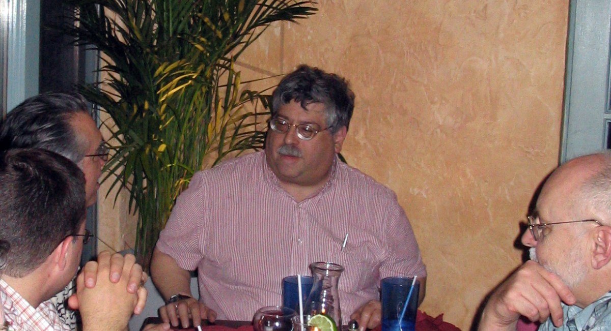
What was clear from this and later encounters is that he had a good word for everyone, and I suspect everyone had a good word for him. If, say, I’d had a bumpy experience with someone, he would listen, be sympathetic, offer counsel, smooth things over. And I tell you, the few people he was less than impressed with… you’d be hardpressed not to agree.

I’d also met Javier Martinez at the 2001 SFRA, and somewhere along the line he stepped in to rescue Extrapolation, and roped in Mike, Sherryl Vint and myself to help out.

Well, two out of three good choices ain’t bad.

And then work and family got in the way for Javier and Mike stepped in to be Managing Editor. We joined up with Liverpool University Press and found a firmer foundation to stand up. Other great academics joined us after Sherryl moved on, filling her shoes, and always there’s been a sense of who will fit in, who can we work with, who will improve the journal?

As someone who is on both sides of the editorial process, I know how bruising submitting an article can be — for example, when there is a needlessly brutal reader’s report. Mike was skilled at dealing with these, at responding to potential writers. On the very rare occasions that we had to deal with a prickly author, he got us through it. I think I was only edited by him once — a piece for The Lion and the Unicorn, a venture outside my comfort zone, but he got me through the process. I’ve lost track of details, but there would have been changes needed, there would have been editorial queries, but Mike left no scars.

Mike was a friend, a confidante, a colleague, a mentor, a scholar, a painstaking and painless editor and — this should not be a surprise but it is still striking — I see that the responses on Facebook to the news that he was dying reveals that he was this and more to lots of other people I already respect as well as people I must get to work with.

I hope he knew that — although in truth I wonder if that would have embarrassed him. I will miss the laughter and his wisdom and the sense of mattering.

And now I’d better get on with copyediting a submission.

Attack of the Spinning Plates

Deadlines have been circulating in the manner of sharks:

  • article on A Scanner Darkly — I have put this to one side whilst I focus on other work
  • book proposal for Sekrit TTTTTTTT project – why is this stalled?
  • revise bounced book manuscript – – why is this stalled?
  • three book reviews — two complete, one almost
  • turn EX_MACHINA, War of the Worlds and The War in the Air papers into articles
  • Chapter needing copyedit
  • continue beer research

I’ve also edited several articles by others. March was productive at its end.

Free Fall

Free Fire (Ben Wheatley, 2016)

This isn’t a postmodern movie like Reservoir Dogs, the academic introducing this movie reassured us, as Wheatley draws on Michael Mann rather than Quentin Tarantino.

Okay…

I’ve only seen two of Wheatley’s previous films (and his Doctor Who episodes) and I suspect I like one of them more than others and one of them less. One switched genre gears pleasingly into Wicker Man territory, the other was a Kevin Brownlow movie directed by Ken Russell. There was a camp if violent tone to both.

Free Fire cranks up the claustrophobia on both — after a couple of road scenes and a factory exterior in Toronto, we’re then stuck in single space in Brighton, although you could read it as Massachusetts and some point in the 1970s if you want to. On the one hand, there are Irish men looking for machine guns, presumably as part of the terror campaign, on the other hand there is a South African and an ex-Black Panther looking to sell. The inbetweeners are a bearded giant and almost the only woman in the film.

Of course, you know it’s going to go wrong and, whilst the film is a taut ninety minutes, it drags a little until the wrongness starts. One of them asks the woman if she is an FBI plant — just like Mr Orange, you’ll think, or in his mould, but that hasn’t been filmed yet. Later we’re told how long it takes to bleed to death — just as we find out in Reservoir Dogs. One faction will, you know, attempt to rip the other group off — or they’ll rip each other off.

There’s a very heavy handed flagging of a gun over a fireplace, although we’re never told what the gun is and … well, as far as I can tell this is a tease and perhaps the only real nod to originality in the film.

As the bullets fly, you rather quickly lose track of who is dead or dying, or perhaps merely dying, or perhaps they’re stunned… beautiful plumage… You can’t help but feel that as the shot, blown up and penetrated crawl over glass, syringes and rubble that they’d be a little more stunned. For all Wheatley’s plotting out of the action in Minecraft, the spaces don’t feel consistent.

There are some laughs. The guys behind me (I think there was only one woman in the auditorium) found shooting a gun hilarious. They found guns jamming hilarious. They found the need to reload hilarious. I think I missed the joke. Cillian Murphy, Michael Riley and even Sam Riley had good lines. Armie Hammer looks good in a beard, perhaps his one character note and a means of telling him apart from the others. Brie Larson has her moments, and I’d like to see her in Concrete Island if Wheatley fancies more Ballard. And Sharlton Copley has the same comic schtick he brought to District 9 and CHAPPiE, minus the CGI. Rather like Life it’s an endurance test for the audience as much as the characters, and I cared marginally more for them.

But solid back story, motivation and something like an actual plot have been carefully eliminated in the name of … well it used to be postmodern and ironic and it used to make a difference from Merchant-Ivory confection but it’s twenty years since Michael Mann in Heat remade his own LA Takedown from a decade before that. Do we have more than a feature-length sitcom with a body count? It is slick, but too slick.

When googling around on Wheatley, I read the comment that he’s the new Noel Clarke. This may have been a compliment.

To be honest, I’m not sure who should be more insulted.

Flaming Nora

Flaming June: The Making of a Masterpiece (Leighton House, 4 November 2016-2 April 2017)

Limping through the undertubes a couple of months back, I was struck by a poster of a painting of what I took at first to be a marigold, but turned out to be a young woman in a dress. FINAL WEEKS it proclaimed, but I’m not convinced that it gave a closing date. I think I’d gathered it was at Leighton House, a venue in Kensington that was on my radar to visit.

And then I forgot.

A friend went to see it, it was his favourite painting. I paid attention. I plotted. I planned to visit it on a Tuesday, my research day.

Leighton House. Closed Tuesdays.

Good job I checked.

So I postponed an idea of Eastbourne, and decided to combine this with a trip to the RAA and Russian and American art, and navigated via a Caffe Nerd and attempting to remember what the Design Museum on High Street Ken looked like when it was the Commonwealth Institute. It wasn’t yet June, but was about the first sunny day in a while even if I sat outside in the shadows at Nerd. And eventually getting there, and one of those slightly weird negotiations of what are the rules for this exhibition?

In my limited mental picture, he was part of the Pre-Raphs, of which I’m not exactly a fan despite their supposed radicalism (which now looks like a box of fudge waiting to happen). I vaguely remember his paintings coming back to the Tate after an absence (to where?), but I couldn’t picture any. No good, eh? He clearly got lorded, and I vaguely assumed he was an ascendant of someone who taught me.

Anyway, the woman in orange, although popular fiction would call her The Girl in the Flaming Dress, one of five paintings Leighton prepared for the Royal Academy summer exhibition, as he was in the final months of his life. I think one of them has gone missing, as has the one he substituted for one he didn’t like at the last minute.

And apparently it was amazing we have this.

It didn’t sell at the show and was bought by The Graphic to be turned into a print to give away in Christmas 1895. After being shown in their office window, it was loaned to the Ashmolean and dropped out of sight — I’m not the only one to be unimpressed by Victorian confectionary. It turned up in Battersea, boxed in over a chimney, and was nearly bought by a young Andrew Lloyd Webber (make your own snide comments). A Puerto Rican industrialist, Luis A. Ferré, partly in town to buy art for his gallery, saw it in The Maas Gallery, London in 1963 and paid £2,000 for it. Since then, it has been at the Museo de Arte de Ponce, aside from rare loans to other galleries

So we have a woman in an orange dress, curled up almost in a circle, an oleander plant to her top right, a shining sea behind her, and draping cloth around her. It is undeniably attractive, with a striking horizontal line of her leg parallel to the golden frame, the ledge and sea, with a zig zag of her lower legs and arms, an almost circular composition. If you look carefully — and of course you do, since you’ll most likely not be heading off to Puerto Rico in the foreseeable future — there is a hint of nipple, of the skin tone under the diaphanous orange draperies.

Is that a word?

Of course, my gaydar had been triggered earlier by a small male nude on the staircase and a frankly camp Arab Hall of dark green tiles brought in from some grand tour or other. He never married, but there are rumours of affairs with a female model and a close relationship with a male friend. We just don’t know, it seems. Anything else is gossip.

Shrugs.

Next to it is a much smaller painting, a practice perhaps for Flaming, with tiny island in the sea, lost from the final version, and a slightly different top to the picture.

To its left, are the remaining paintings from 1895. ‘Twixt Hope and Fear is an elegantly dressed woman, sat on a chair so she looks over her shoulder at us. The vertical to diagonal arm dominates the composition — as does the double take I had about whether there was an iPhone in her right hand and she was taking a selfie.

Methinks not.

The Maid with the Golden Hair — see, that’s a proper title, but girl would be moderner — has a young girl reading a book, caught in a private moment. They reckon it’s Lena Dene, younger sister of his main model, Dorothy (he’s a friend of… nevermind), but I’d rather know what she is reading.

Verticals are accented in Lachrymae — a woman stood, supporting her head and arm on a fluted pillar bearing an urn, presumably a funerarararary one. The sun glints through the cypress tree behind her — a tree which is a symbol of (guess what?) mourning. At her foot is a wreath.

The final picture is Candida, a head and shoulders portrait, replaced by a (lost) painting Listener (although there’s a colour reproduction of it). So, five (or six) lone women, three of them possibly the same model and a Miss Lloyd.

Then you realise you’ve done this in the wrong order.

Hidden in his bedroom, with a spartan-looking single bed and letters that tempting to touch, and a fur rug that isn’t, is the print from The Graphic, a little worse for wear.

Back in the Silk Room are various preparatory drawings — black and white chalk on paper as he attempted to get the posture of the woman right and, Lo and behold!, a photogavure of his Summer Moon (c. 1872), two women asleep, one of them not unpostured like Flaming Nora, their arms curved in parallel, a circular opening behind them. Another photogravure, The Garden of the Hesperides (1893?), three women asleep under a tree (and now in the Lever collection, so I guess I’ve seen it in Port Sunlight. And then there’s Summer Slumber (1894), also seen in photogravure and notable for the flaming June relief in the wall this slumberer is slumbering on. This strikes me that Flaming June must be a little earlier than suggested. I’m not clear where the actual painting is.

And there are also preparatory pictures for some of the other paintings; in the studio are other paintings of oleanders and a photo of some carvings, although it requires a bit of detective work to work out what you should be looking at. It also took me a while to realise I need to go anti clockwise round the Silk Room and how the painting of an Algiers Courtyard fitted in.

But then I was back to Flaming, to soak her in again.

I can’t say I am converted to Leighton, and I suspect the works normally here are not his best, but it was intriguing to see this rarity.

Great Scotch!

Edward Krasiński (Tate Liverpool, 21 October 2016–5 March 2017)

I confess I walked through Edward Krasiński rather quickly on my first visit — I’d been delayed by a shop having moved and thus a late check-in at my hotel, followed by further delay as I tried to access my work email. And I wanted, at least, a look over the stunning Blake-Emin combo to see if it was what I feared.

Spoilers!

I was there to see Yves Klein, even if somewhere in my head it was Yves Tanguy. And I had just over an hour instead of the best part of ninety minutes. The next day, albeit again running late, I spent the best part of an hour in there.

But something had brought me up short — what looked like a broken ladder and then dangling black squares and a blue line.

Blue is beautiful.

Blue is best.

Did Tate Liverpool really schedule by the colour blue?

Krasiński’s early works are apparently Dadaist and surreal, but I assume that these are not on display. He seems to have been a late starter, with the works here dating from about 1960 when he was about forty. There are various small assemblages, too complex to be tagged Readymades (I feel the hand of Duchamp and Beuys on his shoulder), which are hanging on the walls. The materials include wood, metal, plastic, felt, acrylic and I get the sense that in part he is playing with the triangle set up between object, space and beholder. My understanding is that these would have been shown in darkness, a kind of labyrinth of art, but here the dark browns offset the whiteness of the walls and the bright light of this space. Later he would take photographs of some of his works on location, undercutting privileged vantage points (although a photo does fix one).

There’s also a large photo, Untitled (1996) of man in suit holding a hose coming off a roll — the end of the column column protrudes, next to a small piece of rope, and a bit of blue tape that I didn’t notice on my first go round. A relic of an earlier exhibition or deliberated short?

The second area has various solids hanging from wires (although I did wonder if these didn’t need to be less visible. Composition in Space 4 (1965) has a vertical suspension of black discs, each with a red to white colour red disc of decreasing size in each centre. There were also a numbers of broken spears, with the same dark brown, red, white colour gradation, suspended more or less horizontally, one looking like a broken rope ladder. And then there were a series of balls, not quite a Newton’s Cradle — and I wonder if Cedric Christie came across these works. There’s a capturing of time and space, a freezing of movement.

The third space — although I was quite clear of the trajectory, and I suspect Krasiński would lead us — had various small assemblages on white plinths, interventions, consisting of cords, cylinders, slopes and bits of wood. There’s a black cylinder, apparently filled with blue stuff, dribbling over the edge. J-4 (1968) is a tube going through a cylinder, cable in tube on curved white ribbon, from which the numbers 234567890 emerge. Where is number one?

But the breakthrough seems to have come with the Tokyo Biennale, when his sculptures were delayed in transit. He was going to send them a telex — the word BLUE five thousand times and this would be on display, on a coil of paper. To mark time, he arranged for a strip of blue Scotch Tape to be placed around the room: “After that there was nothing more I could do; it was so radical there was no turning back”

BLUE SCOTCH – WIDTH 20MM
LENGTH UNKNOWN
I STICK IT HORIZONTALLY
AT A HEIGHT OF 130 CM EVERYWHERE
AND ONTO EVERYTHING
WITH IT I ENCOMPASS EVERYTHING AND REACH
EVERYWHERE.
IT MAY OR MAY NOT BE ART,
BUT IT DEFINITELY IS
BLUE SCOTCH – WIDTH 20MM
LENGTH UNKNOWN.

We get sculptures of white and blue — a white rectangle, blue at the bottom, a blue cable dangling; two white books, one labelled A (and the other B?), a blue cable emerging, a blue surface between the books; a gutted white phone, dark blue wire tangled; the A/B opposite pages of an open white book with a blue tube emerging…

“I have lost the end” he says, in a photo of him trying to untangle some string or rope or cable.

The next room is of interventions — black and white axonometric drawings, unmasking the reality of the flat and the three dimensional, a kind of demented IKEA catalogue, with his now trademark blue stripe following the walls, weaving past a toilet chain and water pipe, giving illusions of depth.

the blue stripe is the intervention by the artist who is an on-looker/witness of the events taking place. It is an observer of changing phenomena that contain time. All that exists is time. Even inanimate objects are not extemporal: they are mutable”

… this leads us into the next space, which includes a false corridor, and a photographic and artistic replication of his apartment and gallery.

The artist Henryk Stażewski had invited him to live in his apartment and eventually left it to Krasiński. Art would be made there — or in his bedroom — and then shown in the apartment as gallery, with photographs of the space sometimes being shown in other galleries. The blue line continues across further axonometric drawings, and some white three dimensional objects, line with black. Photos of Krasiński’s acquaintances and other artists hang on cubes, striped blue, apparently making visual puns (although I didn’t get the joke). There is a token example of Henryk Stażewski’s work, black lines on a white background, like needles

And then there are sculptures of large, bent paperclips.

We’ve all been there.

The final intervention is a series of square mirrors, with black reverses, hung from the ceiling disrupting the space. They are utterly hypnotising.

img_0755

Krasiński’s art has a deceptively simple idea underlying it, but it was so seductive. On the one hand, a kind of minimalism, on the other complexity. It might be site specific — in that the meaning of the site it is found in is changed by the work. But the work could be everywhere.

There is a photo of Krasiński conducting the sea, a moment worthy of Klein, a musical Cnut. But he has such a strange power — a strip of blue Scotch Tape, 20mm,* at a height of 130cm, length unknown or unnecessary can turn anywhere into art.

* or 19mm. Imagine if Scotch Tape were to go bust. The end of art.