Lowry by the Sea (Jerwood Gallery, Hastings, 11 June 2015-1 November 2015)
Whilst my birthday is all too often a series of examples of bad timing, I was lucky enough to have one which coincided with a members’ private view of the L.S. Lowry exhibition at Tate Britain. For a few glorious moments, I had the exhibition to myself. Lowry is one of those artists we’re not meant to like because people like him and because there was a one-hit wonder in the 1970s about him.
What that exhibition made clear was that Lowry was a greater artist than given usually credit for – although I suspect his faux naivitée could be objected to. Whilst Alfred Wallis was self-taught, Lowry attended the Manchester School of Art and was trained by French Impressionist Pierre Adolphe Valette. Lowry made sense in terms of Impressionism, even if you don’t accept his own constructions of working class realities as art in their own right.
I stumbled across the fact that there was a Lowry show at the Jedward Jerwood Gallery, a newish and controversial space at Hastings. It’s a fifteen minute train ride back from Bexhill (where Riley is) or a two-hour walk. The Jerwood is home to the Jerwood Collection, the philanthropic gathering of art by a pearl company which also gives prizes for painting, drawing and sculpture. The collection is mainly early twentieth century British, but I have to say it can come across as a bit muddy and grey in its pallette. I think I’ve been disappointed by the two big exhibition rooms on the right as you enter – I can’t recall a show blowing me away there. At the moment it’s a selection from the Fraser Collection, along with Scottish artists from the Jerwood, and I confess to being underwhelmed. There was some interesting sculptural pieces in the space where there was the Marlow Moss show.
But the hit or miss part of the Jerwood is the two upstairs rooms that tend to have temporary shows. At the moment, it’s Lowry, representing the seaside. Should we be surprised that his choice of holiday destination was Berwick on Tweed, South Shields and Sunderland? The Jerwood does like its sea exhibitions, but this is a good one.
 There’s only really one Lowry that is immediately recognisable as a Lowry, July, the Seaside (1943), a series of tiny incidents on the beach – games being played, a punch and judy kiosk, sitting, lying, walking, prams, swings. It is the urban crowd transplanted from factory gates and football matches to the sea – possibly in north Wales. What is striking is that the people are dressed much the same – there is no concession to sea and sun. Still, there’s a war on.

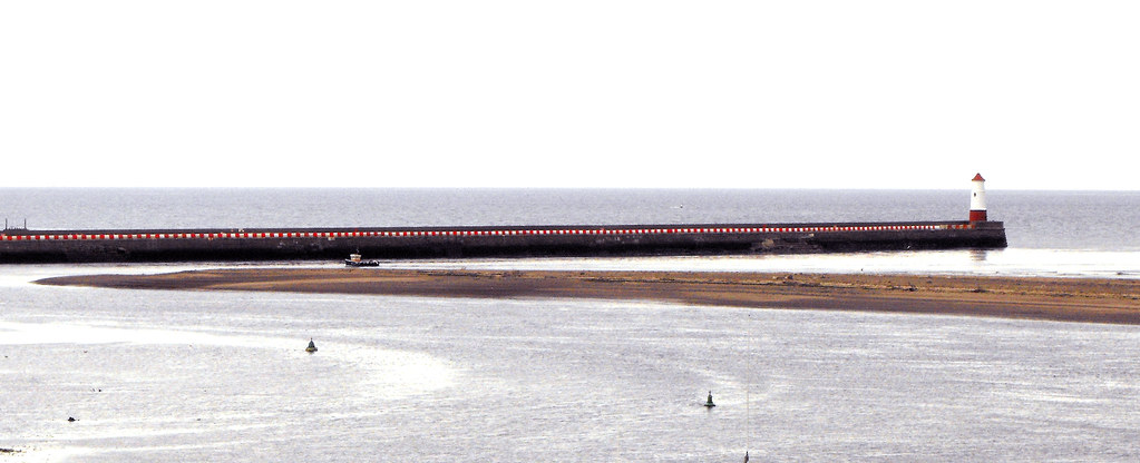
The figures are more impressionist in his Spittal Sands (1960) – perhaps it’s a mistier day, but I reognise the spot which is just south of Berwick. And is that the same harbour arm in Untitled (Beach Scene with Central Monument and Chimney), sketched in felt tipped pen? There’s a chimney or two that makes me think of the (fish?) smoking chimney in Spittal.
 There’s also South Shields – Waiting for the Tide (1960) – showing Lowry’s love of solitude and quiteness and isolation. Am I misrecognising A Ship (1965) as Tynemouth?
Is that a version of the aerials next to Tynemouth Priory? But there’s a harbour arm he will have lost (and yet I recall two paintings of the same scene, I think Sunderland, where towers were moved. He’s an artist who will recompose landscapes.)
 Then, there’s the Self-Portrait as a Pillar in the Sea (1966), awfully phallic. It’s not a surprise to me – do I recall drawn versions of this at Sunderland? There is another painting like this, also 1966, in Sunderland.
Lowry writes, somewhere, “Look at my seascapes, they don’t really exist you know, they’re just an expression of my own loneliness.” In some paintings the sea and sky merge – the elemental boundaries merge. And then, somewhere again, he writes, apparently about the world of art, “I spent my whole life wondering what it all means, I can’t understand it, don’t understand it at all, can’t see any point in it myself. Still, there it is, you keep on working, and you keep on wondering what it all means, and it goes on and on and on and, there you are.” It reminds me of childhood reading, it reminds me of Eeyore.
And I had to laugh.
There’s a Lowry cartoon called The Shark (1970) where the shark is the art world and the person in the shark’s mouth is Lowry. Better than Damien Hirst’s shark. There are other people in the sea. Waving. Or drowning.
I had a sudden flash, at this point, of someone else that had a reputation for being gloomy, but was also blackly comic. I wondered if they ever could have met – the other one was an insurance clerk, but Lowry was a rent collector. I thought, for a moment, he worked for the Pru. Ah well.
But this is a show to see.
 Stand still and look at the flat square.
 And from that she got to her curve paintings – some black and white, others using greys, some playing with blue and green and red and grey. Take Cataract 2 (or 3, because I can find a picture of that one) and see how it refuses to lie flat. Cataract 2 is more like an arrow than this – note the stripes aren’t parallel, are offset.
 But they didn’t vanish forever, as in 1997 there was a return. Lagoon 2 widens the vertical stripes and interrupts them, if not with curves then with segments of circles. The vertical lines are further disturbed by diagonals. In the area given to studies, we see variants that led to this and similar designs – trying out colours, rearranging segments, working on graph paper and tracing paper. “Lagoon” points us to something more organic than maths, something away from the abstract.
 The most recent piece in the exhibition I think (despite that 2014 date) is a wall painting, Rajasthan (2012) – red, orange, green, grey and the white of the wall. There’s not the same sense of the breaking of the plane, but there’s the breaking of the frame. Given what I’m currently reading about the (American?) battle between the wall and the easel, this feels timely.