William Eggleston: Portraits (National Portrait Gallery, 21 July-23 October 2016)
Tag / exhibition reviews

Painting Exposed
Painting with Light (11 May-24 September 2016, Tate Britain)
I am bringing two pieces of baggage to this show.
Firstly a sense that a few London galleries seem to be finding excuses to show the ever popular Preraphs — compare the National Gallery Painters’ Paintings and the V&A’s Botticelli. And also the talk by Karen Shepherdson on Tony Ray-Jones and Martin Parr puts a debate about photography as art and commerce onto my mind. And having just seen William Eggleston at The National Portrait Gallery, my mind was on art.
Continue reading →
While Someone Else is Sleeping
Bruegel in Black and White: Three Grisailles Reunited (Courtauld Gallery, 4 February–8 May 2016)
I knew Pieter Bruegel the Elder from that W.H. Auden poem, about Icarus and life going on, and I went away and looked at reproductions of his extraordinary canvases back in the day to see what W.H. was on about. Most years I turn to Bruegel’s Battle of Carnival and Lent to illustrate Bakhtin’s ideas of carnival – or at least, the historical sweep.
The Courtauld Gallery has given us a unique chance – one of the works cannot leave the gallery – to look at his three authenticated grisailles for the first time.
No, I had no idea what they were either.
A grisaille is a painting more or less in black and white, although shades of grey seem possible. Sometimes, I gather, in brown. These can be used to extraordinary effect – the depiction of night and darkness, perhaps, or a three dimensional impact on a plane. One of the locations of such works is on the closed flaps of altarpieces in Dutch churches – and so a religious subject is often presupposed and Hieronymus Bosch had already produced some of these. What Bruegel seems to have done is to lay down an area of white on wood – compare L.S. Lowry’s use of white paint to prime his canvases – a drawing added in charcoal or red chalk, a thin black wash added to most of the canvas and then Bruegel painted on top of that, presumably mostly in greys. The grisailles seem to have been painted in a hurry, with alterations whilst the paint dried.
Until the mid-twentieth century, two examples were known: The Death of the Virgin and Three Soldiers, with a third, A Woman Taken in Adultery coming up for auction in 1952 and eventually being bequeathed to the Samuel Courtauld Trust collection. Two of these clearly have religious themes, and the existence both of prints of these and of a Resurrection suggests that there is at least one more yet to be found.
 The Death of the Virgin is dated c. 1562-5 and is a nocturnal, almost chiaroscuro, depiction of the dying moments of the Virgin Mary surrounded by worshippers, partly lit by a candle in her hands, but also luminescent. Everyone is in (then) contemporary dress, of course – it is an extra-Biblical interpolation. Life goes on, too, of course, a cluttered table and chair are at the end of the bed, someone is asleep in the corner and, best of all, a cat is in the prime position by the fire. These details show up better in the 1574 print version by Philips Galle, where the light levels are considerably higher and some of the awkward perspectives of a chair are rectified. On the other hand, that chair perhaps nods to Van Gogh to come. One the other hand, that underplays the religious significance of the light of Mary set against the candles and the fire.
A Woman Taken in Adultery is taken from the He-that-is-without-sin bit of John (8.1-11) – although why Christ is writing this rather than saying it out loud eludes me. Christ is leaning over on the left hand side of the picture, scratching in the dust in Dutch, his head just overlapping the woman, and the Pharisees are on the right of the picture, stones to the ready on the paving. Note Christ is either on a lower step or (I can’t quite tell from the perspective) there is a gap between his paving and the Pharisees’. There is a crowd in the background – some passing by, others gawping. The fact that Christ is writing with his right hand suggests this was an original work rather than a preparation for prints.
Pieter’s son Jan sent the grisaille to patron Cardinal Federico Borromeo in Milan, but the latter felt this was too generous, had a copy made in about 1825, and sent it back. Pieter Perret made a print in 1579 – again this is much light, with a foreground text – and Jan had painted a copy roughly 1597, which brings us slightly closer to the foreground foursome and isolated the crowd more distinctly. None of these have the vitally of Bruegel’s original. Pieter’s son, Pieter Bruegel the Younger, also copied the painting, apparently several times, with a colour one on display here. The realism and the individuation of the figures is at the expense of the spiritual dimension – it feels less religious.
The Three Soldiers (1568) seem not to be a religious subject – there is a drummer and a fifer and in the background a soldier with a flag. The best guess is that these are Landsknechte, mercenaries, which could have fought for Spain or the Holy Roman Empire. My dim and distant history A Level reminds me of the ongoing wars in Europe – the Netherlands, Spain, Italy, the Holy Roman Empire – and the forces of Catholicism, various flavours of Protestantism and the counter-reformation. It is perhaps a plea for religious tolerance? At one point, the grisaille was owned by the future Charles I, although it briefly left the royal collections during the Commonwealth, it seems to have passed from William III to a private secretary, William van Huls.
Two more grisailles round out the exhibition — The Visit to the Far (c. 1600), attributed to Jan Brueghel the Elder, and Frans Pourbus the Elder’s The Last Supper (c. 1570). The former had been thought to be by Pieter, but is reckoned to be inferior – a series of figures in a farmhouse, with a nurse and baby in the foreground. It may be a copy of a lost Bruegel painting, it may be a pastiche. Again the absence of a religious subject must be noted – but of course non-religious examples may have been lost.

Art vs Empire
Artist and Empire (Tate Britain, 25 November 2015–10 April 2016)
The initial question was, which artist, which empire?
Well, of course, this is Tate Britain, so the British Empire, but you don’t want to ignore the French, the Spanish, the Portuguese, the Belgian, the Ottoman, the Viking, the Roman … And that is to limit ourselves to a Eurocentric model. African and Asian empires… My history knowledge is insufficient. Is there a league table of evil empires?
Am I assuming the British Empire is evil from the get go?
And here, of course, we are in the heart of the Tate, a space built on the profits of the sugar trade:
The Tate Gallery Liverpool is based in the Albert Dock complex, on the north bank of the river Mersey. In order for the dock to be opened in 1846, a public house, several houses and a previous dock had to be demolished. One of its major commodities was sugar, and Henry Tate was one of those who used the docks to import the sugar needed for his business. The sugar initially came from cane cut by slaves on the plantations of the Caribbean, though formal slavery was gradually abolished throughout the nineteenth century. In 1889, Tate donated a collection of 65 contemporary paintings to the nation, together with a substantial bequest for a gallery to show them, and 1897, the National Gallery of British Art opened in Millbank, London, on the north bank of the river Thames.
As far as I can tell — and the exhibition is silent on this — Tate’s business was built in the second half of the nineteenth century and thus after the slave trade as such. It is in the era of indentured labour and apprentices, better than pure slavery but clearly in an infrastructure that was first built with slavery in mind. There are few depictions of slavery that I recall from the exhibition — perhaps only part of one landscape and in the margins of Walter Crane’s supposedly radical map. I don’t think there are any depictions of sugar or tea or cocoa or tobacco or even bananas — the cash crops of empire.
The first room, “Mapping and Marking”, shows the various charts that filled in the blank parts of the world for the British explorer, the unveiling of Australia, the breadth of the pink parts of the world and views of exotic climes. In applying cartography, a western politician convenience is imposed upon existing indigenous models of land use and land ownership, existing names are subsumed under British toponyms. There is a nod to Ireland, too, perhaps the first British colony, if Wales is excluded…
(And Scotland? Are we Trainspotting‘s bunch of effete wankers or did the invitation to James VI mean the Scots colonised us? In any case, the early part of exploration was an English-and-Welsh-colony. Oh, but what about the chunks of France we had?)
There are African flags, relics of colonising, but their creators are speechless.
In “Trophies of Empire” we see the purpose of empire — to find objects to fill zoos and museums and botanical gardens, public spaces and entertainments sometimes aside asylums, sometimes in the cause of temperance. The spoils of empire here are not sugar or tea or cocoa or tobacco or even bananas, but plants and animals; the dingo, the Tasmanian tiger, the crane, flowers… There are also the carvings and niknaks of anonymous tribes people, rarely ascribed to an actual maker. I recall looking around the Brenchley collection in Maidstone Art Gallery and Museum and wondered how much of it was plundering and how much the Victorian equivalent of “They went to the Pacific Northwest and All They Got Me Was This Lousy Headdress”. The objects are literally from all over the world, but without the rigour of the Pitt-Rivers Museum classification by function. It is not at this point clear what the sorting narrative of the exhibition is — but there’s a broad chronologucal approach.
 The third room, “Imperial Heroics”, is a space for eighteenth and nineteenth century history painting, with accounts of massacres and last stands and slaughtered colonists. Little of it, frankly, is any good and the answer to the question not quite posed by the exhibition’s title is that we were not good at looking at empire. The best that can be said is the art undercuts its own messages — the symbolism of Queen Victoria giving a bible to a native leader (Thomas Jones Barker (c. 1863)) or Britannia slaughtering a tiger (Edward Armitage’s Retribution (1858)) cries out for critique. Are some of these paintings depictions of people rightfully defending themselves from invasion?

One representation that clearly requires further head scratching is William Blake’s The Spiritual Form of Nelson Guiding Leviathan (c.1805–9), which I don’t think I’ve seen before and perhaps needs to be located in his cosmic history of the world that links Biblical to British history. Nelson for him would be current affairs — Blake does do satire too — but odd to see Nelson as a Hindu god and a mannacled slave ready to be rescued.
The fourth room, “Power Dressing”, has depictions of colonists in nature dress and natives dressed in colonial dress. Inevitably there’s going to be issues of appropriation, patronisation, various levels of Orientalism, and again there’s a low quality threshold. I suspect the colonialist cannot win, as it were, in terms of ethics. I wonder also if there’s a problem with using the term “power dressing” — which I associate with women trying to be successful in the workplace in the 1980s — in the curation and the term “cross-dressing”, with its gender connotations, in the booklet.
The penultimate room, “Face to Face”, is a series of portraits, some by westerners of the indigenous, some by the colonised of the coloniser. I don’t recall if there were any self-portraits of the natives. There are also figurines or statuettes, but again there’s uneasiness from the anonymity of the artists (a legacy of the looter or the commissioner or the purchaser) and the geographical spread of the objects. Australasia melts into India melts into Africa. It’s all the same empire.
The final room is divided in two, “Out of Empire” and “Legacies of Empire”, I suspect the smallest space of the six. This covers the century of decolonisation and independence, a period when colonial artefacts had reached western museums and influenced (read: were appropriated by) western artists. Henry Moore springs to mind, but he isn’t here. Artists came to Britain from the colonies having studied art or to study art — a Sidney Nolan I don’t recall seeing before springs to mind as an exemplar. A handful of artists get to represent the Commonwealth artists’ commentary on empire — centrally Donald Locke’s Trophies of Empire, an open cabinet of curiosities of jars and pots and objects almost shaped like sex toys, with shackles and handcuffs. This is one of the few representations of slavery in the exhibition. There are also photos by Locke’s son Hew Locke, statues of colonial figures, Edmund Burke and Edward Colston, overlaid with bling.

I don’t think in the end that the artists here really faced up to empire – the “postimperial” ones, maybe, but I think the exhibituon needs a lot more contextualisation than the casual observer who hasn’t bought the catalogue can give it. In the bookshop, you can buy Franz Fanon or read about King Leopold’s slave, but that kind of discourse isn’t in the show.
”

To Be Frink
Elisabeth Frink: The Presence of Sculpture (Djanogly Gallery, Nottingham Lakeside Arts, 25 November 2015–28 February 2016)
My sculptures of the male figure are both man and mankind. In these two categories are all the sources of all my ideas for the human figure. Man, because I enjoy looking at the male body and this has always given me and probably always will, the impetus and the energy for a purely sensuous approach to sculptural form. I like to watch a man walking and swimming and running and being. I think that my figures of men now say so much more about how a human feels than how he looks anatomically. I can sense in a man’s body a combination of strength and vulnerability — not as weakness but as the capacity to survive through stoicism or passive resistance, or to suffer or feel
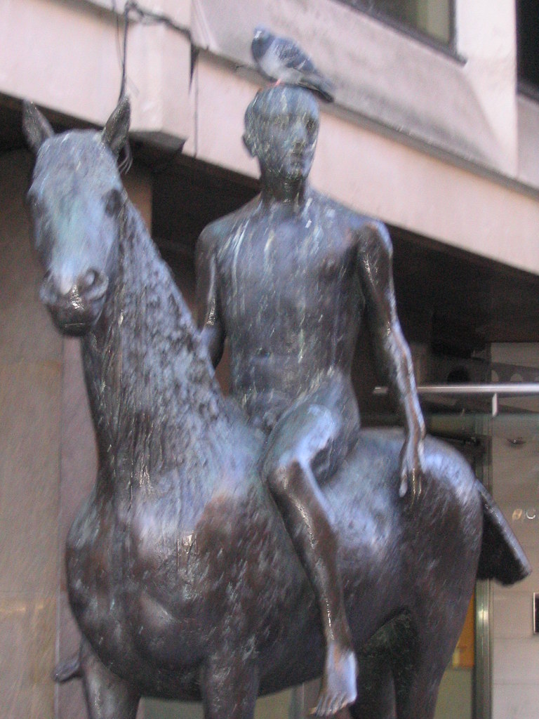 Outside Caffè Nerd on Dover Street, just off Piccadilly, is a small equestrian statue, usually with a pigeon on its head. I sat by it a few times before I realised it was an Elisabeth Frink, and I confess that I don’t recall why I began to pay attention to her. There was a small show at Woking I took myself off to a couple of years ago and materials at the Beaux Arts Gallery, London.
In my mental map, British twentieth-century scuplture was dominated by three names — Henry Moore, Barbara Hepworth and Eduardo Paolozzi — before we get into the Caros and the Gormleys and the more conceptual sculptors. Moore and Hepworth seem to occupy a curious middle ground between neoromanticism and modernism — shapes somewhere between the abstract and the bodily, sensual, demanding to be caressed. Paolozzi is plainly of the machine age — the aesthetics of collage and the cyborg, Lego bricks and circuit boards in bronze.
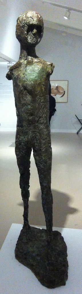
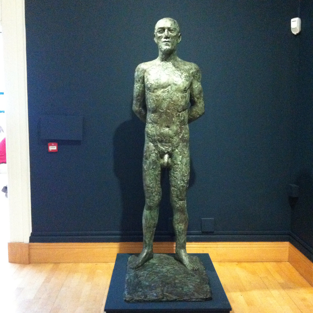 Whilst all three are producers of solid work, Moore and Hepworth are more abstract and Paolozzi is more surreal than Frink. Frink’s sculpture has an extraordinary physicality to it. Her statues are of walking, running, jumping, flying and falling men — yeah, pretty well all men — and clearly there is tension between such movement and the fitness of bronze or concrete. Even the standing men seem to loom, arms behind their back, cock and balls hanging, solid presences, somewhere between threatening and sexualised.
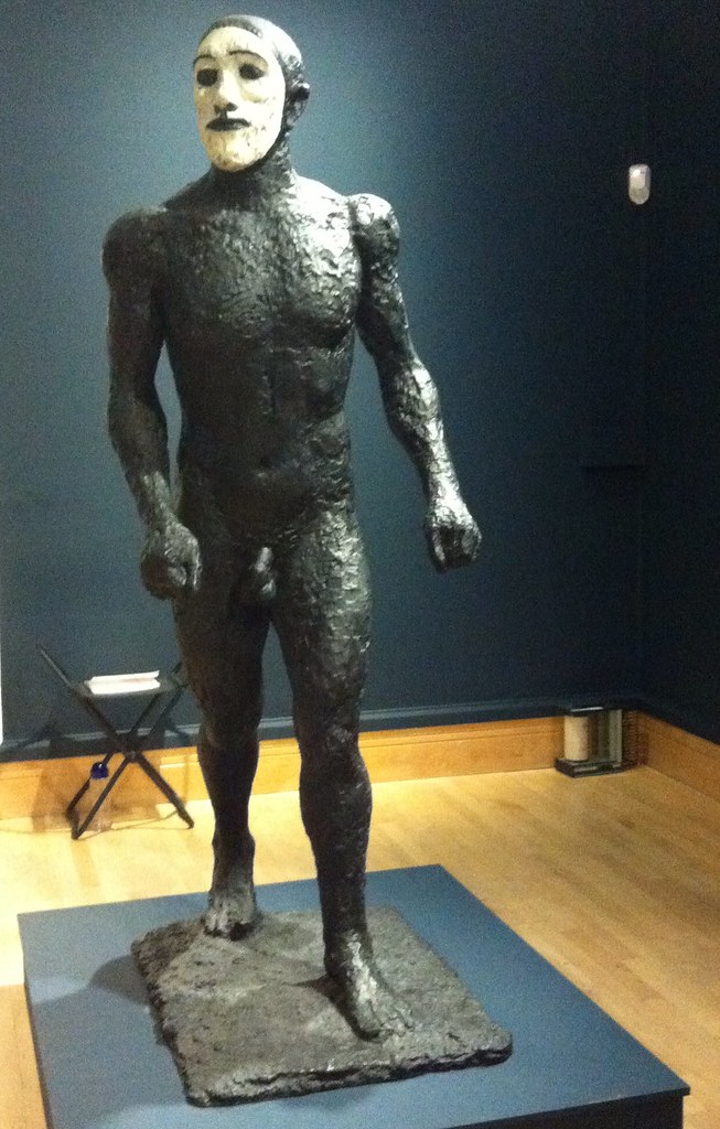 Imagine: some of these were commissioned for the headquarters of W. H. Smiths. Remember that when you try to get your free chocolate bar with a copy of The Mail on Sunday. The Walking Man became one of the Riace, named for the bronze statues found in the sea in 1972, and is in white face, one of Frink’s odd experiments in coloured bronze. Apparently her statue of a dog was coloured; the Desert Quarter (1985) bronze is white. Are these angels or demons?
She’s presented here in a curiously dialectic way; on the one had she was a child during the Second World War although she knew of the horrors of Belsen and the atomic bombs, the anxieties of the Cold War; on the other hand her public commissions are associated with the Utopianism of the Garden City and New Town movement in the post-war rebuilding. Sculpture was meant to inspire people — whether outside civic buildings or shopping centres, or in the new Coventry and Liverpool Metro Cathedrals.
Her Christ, in a gouache, is muscular, the emphasis on the physicals over the divine. There are pictures here of the crucified Christ, the body emphasised over the cross. There is a Mary and a nun, and a study for Judas, which is also known as the warrior. Her military men — the flying men, the air men — always already seem traumatised, the sculptural equivalent of post-traumatic stress syndrome. And that makes me wonder about her Judas; he betrayed with a kiss, he was paid his thirty pieces of silver, he bought the field and hung himself. Was Judas a warrior — did he fight with his demons and lose?
 There is her Birdman, apparently commissioned for a school but thought destroyed (like her first commission, but a damaged version was found this year), a tall, gangly man, with stubs on his back, decommissioned wings perhaps, a fallen angel among men. There is her Running Man (1978), not, apparently, an athlete, but rather a fugitive from some unspecified conflict. Her Flying Men (1982) are hang gliders but seem about to cast themselves into space — inspired by one Léo Valentin (1919-56) who made his own birdlike wings in a vain attempt to fly. Is he also her Falling Man (1961)?
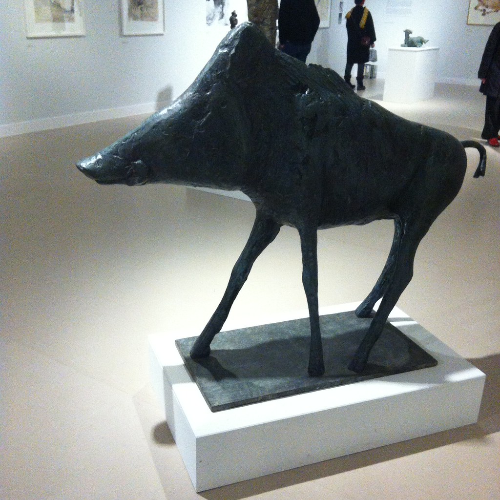 There are animals — lots of horses, sometimes with riders, a boar for Harlow, warthogs and dogs. Dogs whose heads you want to pat but mustn’t. There are birds, but of ill omen, her Harbinger Bird III (1961) and Warrior Bird (1953), corvids, menacing; on the other hand her eagles, often designed for pulpits and linked to the Kennedy assassination (there is also an uneasy sculpture, The Assassins, but all of them are uneasy).
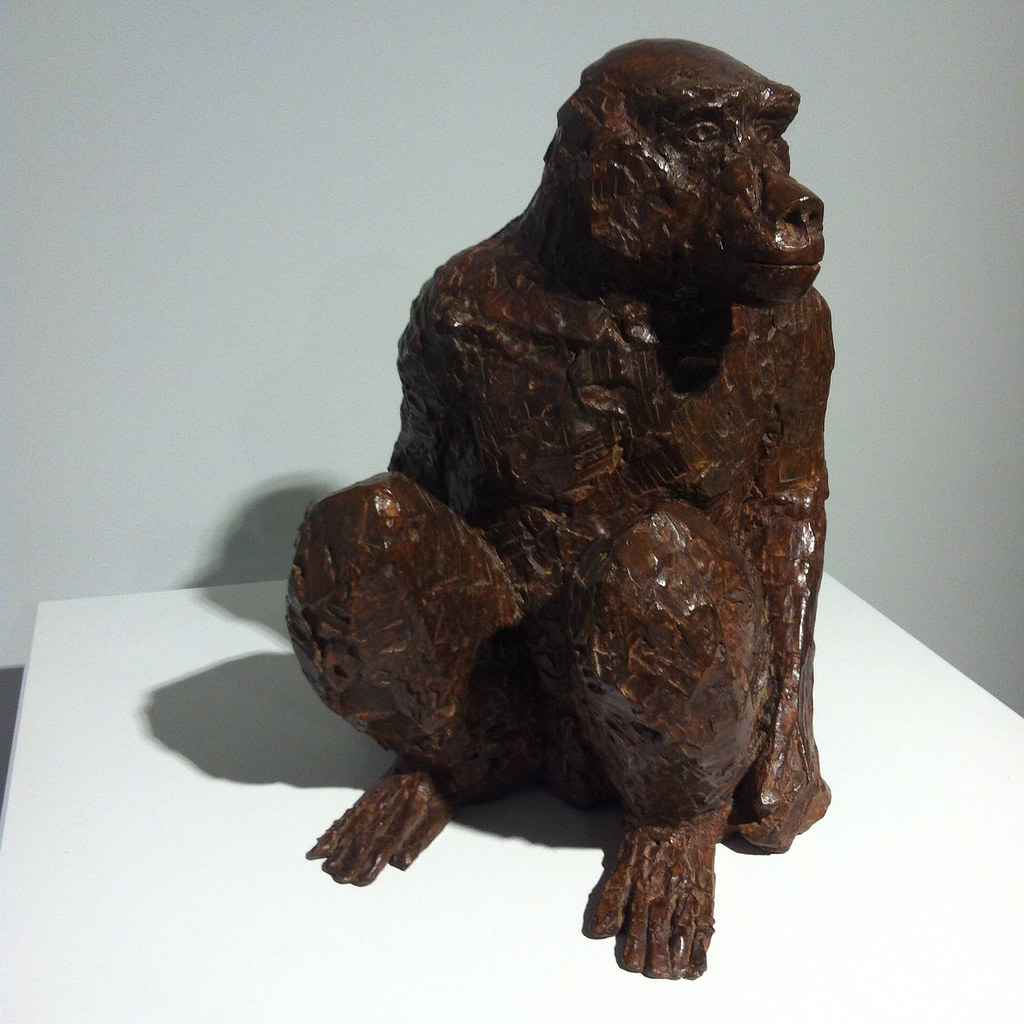
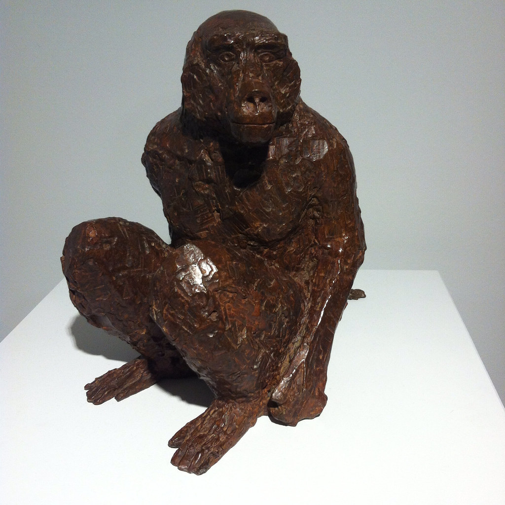
And of course, there is the baboon, commissioned for London Zoo, but it’s a different version here. And there’s a water colour, apparently inspired by an Australian trip although that makes little sense, of an encounter between a man and a baboon. Apparently the baboon is unimpressed by the man.
So her subject is man rather than woman. She may have done mother and child pairs like Hepworth and Moore, but none are here on display, and she was clearly a mother. The few female statues here are caped or cowled. Is there an avoidance of female objectification? Is her aim to objectify men? There were warrior women she could have portrayed, traumatised refugees. But clearly that was not for her.

Bridget Courbevoie
Bridget Riley: Learning from Seurat (Courtauld Art Gallery, 17 September 2015–17 January 2016)
I tried to find the bridge (Bridge at Courbevoie (1886-87)) on Google maps but failed — the river Seine, the bridge, a distant factory, trees, fisher men, walkers. Georges Seurat’s brand of Post-Impressionism, pointillism, made up from coloured dots, half way between colour printing and cathode ray tubes. In another place, Roy Lichtenstein was to enlarge dots and make pop art of comics.
Copying is original.
Deliberately, if annoyingly, the copy and original hang either side of the doorway, challenging you to find a viewpoint from which they can be compared. You carry the memory of one to the other.


Bridget Riley may have seen the painting at the Courtauld – I presume it was at the Warburg Institute, Woburn Square in 1959, having recently moved from Portman Square? — but instead it struck her in R.H. Wilenski’s book on Seurat and she then decoded to paint her own version. It’s bigger, of course, but then the book may not have been clear how big the original was. I think she knew, really, so decided to make the dots larger, and so the intensity of the original is pushed even further from photorealism. The sky is curiously yellow, matching the colour in the water and the grass. He creates light from colour and that seems to be what fascinated Riley.
If the colours become abstract, then so do the shapes — triangles, poles, lozenges, anticipating Riley’s move from stripes into something more… foliated. The Lagoon paintings, for example.

And then, on an opposite wall, Pink Landscape (1960), the shimmer of summer heat in Sienna represented by dots of red and green and pink and orange and blue, and a child’s farmhouse of white walls and a red roof. The shapes of the fields form lozenges.
Wilenski writes of Bridge that “The little man in the bowler hat has missed his train back to Paris and will be scolded by his wife; the child will be late for tea and spanked, maybe, by its mother.”
Heigho.
But we would lose the narrative in Riley as the pinstripes become stripes.
Here we’re offered variants on stripes — Late Morning I (1967) with green and red and white and blue stripes insisting on length and direction, the vertical, Vapour (1970) with white, brown, purple, green stripes overlapping, question the plane and Ecclesia (1985), thicker stripes, taking on volume.
But Tremor (1962) draws the eye — black and white triables that also form curves and ribbons and you swear the painting rotates in front of you.
A painting approximates reality through strokes, dots, stripes and the pointillist returns it to dots. Riley’s insight was to occupy the geometry, to chase the relation of shape, in canvases that move both optically and emotionally, to create luminence.
Bibliography
- Bridget Riley: Learning from Seurat (London: The Courtauld Gallery/Ridinghouse, 2015)
- Wilenski, R. H., Seurat (London: Faber & Faber, 1949)
Take A Chance On Me
Take a Chance on Me
Risk (Turner Contemporary, 10 October 2015-17 January 2016)
The Anthea Turner — a gallery whose Chipperfield design works better in Wakefield — is committed to always showing some J. M. S. Turner and contemporary art, for which read the past one year’s except when it suits them. They’ve had some great solo shows (Mondrian and Colour was frankly more interesting than the Liverpool Tate show), which are interspersed with themed shows. The second exhibition, about Youth, was amazing, Curiosity had some good items but wasn’t more than the sum of its parts and the Self left me a little cold.
So, Risk. Art which puts the artist at risk or may offend against dominant values?
Well, yes, Ruth Proctor films herself falling off a scaffold onto cardboard boxes (here is the scaffold, here are the boxes), Bas Jan Ader documents the start of his transAtlantic voyage that was never completed, Ai Weiwei gives various landmarks the finger. Meanwhile we have surgery footage of Orlan’s cosmetic surgery, Gregor Schneider’s faintly uncanny film of two neighbouring houses redecorated to be identical, Martha Abramovic leaning back from a bow and arrow pointed at her heart.
But then it’s extended to chance and fate. Gerard Richter scrapes back at his paint with a squeegee, post Minimalists let their art hang according to gravity, Marcel Duchamp drops string and Chris Burden drops steel beams into wet concrete.
And then, brace yourself, Turner experiments to see how different paints dry or soak into paper.
Careful now.
There’s a print of an old life jacket and a reconstruction of an ancient Chinese earthquake detector.
What there isn’t is any Jackson Pollock who also allowed chance into his aesthetic through pouring and dripping or Helen Frankenthaler with her too-wet paint or Frank Bowling’s dribbles. One might object that being open to chance is an abandonment of craft, but presumably there’s a selection process. There’s a film (whose makers I forget) which is a kind of mouse trap sequence, where rolling ball sets off a chain reaction. We don’t see however many versions didn’t work. And we don’t see what Duchamp did with the templates he made from the string.
There wasn’t any art that has been banned or challenged (Mapplethorpe’s photos, Magritte’s nudes might have been interesting, some of the vandalised art show at Tate Britain a couple of years back).
The biggest risk here, of course, is that there is such a show in a multimillion pound gallery in one of the more deprived corners of England — Margate was a Portas town, its twin industries of TB recovery and funfair being undermined by progress. Like Gateshead’s BALTIC, another venue which is curated rather than collected, it could simply do crowd pleasers (such as Grayson Perry), but instead challenges its clientele. It has to risk failure.
With a few exceptions, alas, in this it was a success.
Meanwhile, a ten minute walk, a megabaguette, a thirty minute bus ride and another ten minute walk away there is the UpDown Gallery, which specialises mainly in limited edition prints. ive not caught every show there, but those I have I’ve liked.
Upstairs, ending really soon, is the work of Loukas Morley, a ready-made artist in the tradition of Beauys with the colour sense of Hodgkin. Painting on various types of wood, either circular or rectangular or squaregular, clearly on the flat, he builds up layers of paint and resin, abstract yet active, usually allowing the ghost of the grain below. There are also witty sculptures – a board rubber, plastic lids from spray paints, crumpled metal á la John Chamberlain, a lemon as still life. He has been curated by Cedric Christie in the past and I suspect a cross-influence.

Meanwhile, downstairs, ending really soon, is Martin Grover and his (to be honest, annoyingly titled) The Peoples Limousine. It would be unfair to call Grover (like Magritte) a one-joke artist, even if it is a funny joke. He specialises in fake bus stop signs, wring out variants on the symbols, possible stops and kinds of route. One refer to Talking Heads songs, another to British movies set in London (Going Places: The London Nobody Knows/Meantime & High Hopes/Seven Days to Noon/The Fallen Idol/The Bells Go Down). Yes, it’s arbitrary, but it’s done with wit and charm.

There are also lists of lists, masquerading as compilation albums, depictions of famous musicians (Barry White, Marvyn Gaye) wandering around London or past CarpetRight. And then my favourites: The South London Procrastination Club (Established: not just yet). There’s a hint of the thirties railway destination poster about his more straight forward prints, but any of them should put a smile on your face.
It’s too late for this show — unless you go on Sunday — but keep an eye out.
Because You’re Hepworth It
Barbara Hepworth: Sculpture for a Modern World (Tate Britain, 24 June-25 October 2015)
I’ve already written a rather grumpy account of this exhibition, which has a few things that annoyed me. I should also add that the plinths bearing the sculptures could do with a second label describing the work, since sod’s law meant that on almost every occasion I would look at the other three sides first. Sometimes, of course, the label turns out to be on the wall. Grr.
I was fairly sure, however, that the work would transcend my caveats — and so, having read the catalogue, I went back for a second look.
 Meanwhile, up in Wakefield, the Hepworth is showing a film of the 1968 Tate Hepworth retrospective made by Bruce Beresford. What strikes me immediately about this is how many of the works of art are freely visible and not behind glass. I guess that she was still alive then and could have repaired anything that got broken — the insurance is presumably much higher now. It is so frustrating though. We’re told (she tells us? — and I get the sense from this film of Hepworth speaking unlike the bloody awful Dudley Ashton Shaw Sculpture in a Landscape documentary where a highly theatrical Cecil Day-Lewis intones Jacquetta Hawkes’s poetry in an odd example of barking despite having a dog of your own) that she is interested in the oval, the vertical and the human. From my notes — maybe from the film — I’ve written
inner and outer form, nut in shell, child in womb, shell/crystal, puritanical and geometric spiritual
And then I’ve added (and this is me): modern or romantic (and that is a ponder for another post).
So we’ll walk through the rooms again — beginning with the maze of vitrines. This is her early handcarvings, broadly speaking figurative, realist, mimetic. There are animals, torsos, seated figures and a baby. These works are direct carved on various kinds of wood and marble, and the missing name here is Leon Underwood, who seems to have been the master of the technique.
 Hepworth’s shown here among her contemporaries, largely — husband John Skeaping, Henry Moore, Jacob Epstein and I noted two women, Ursula Edgcumbe and Elsie Henderson for future reference. The cynical side of me wonders if this downplays her — she was not unique. Skeaping’s Buffalo (1930) in lapis lazuli is beautiful and I think her side by side doves (1927) are better than Epstein’s one on top of the other (1914-15), but frankly you want your Picasso for doves and Epstein’s strengths lie elsewhere. The positive side is that she can hold her own in a wider community of sculptors between the wars. Infant (1929) is perhaps the most striking, the narrow Torso (1932), made from African blackwood and more like a totem, is the most Hepworthian.
By this point, of course, she had been born in Wakefield in 1903 and studied art in Leeds (meeting that Henry Moore chappy), moving to London where it was as cheap and as easy to get to Paris and Europe than back to Yorkshire. (There’s your north/south divide in a nutshell.) She was runner up to a prize that took her to Italy and which was to inspire her work and led her to marry the actual winner, John Skeaping.
She split from Skeaping in 1933 — the catalogue suggests in part that he was not sympathetic to her Christian Science — and had already met Ben Nicholson who at that point (1931) was married to the artist Winifred Nicholson. The two became lovers and moved in together. So in the second room we have the fruits of their lives together, with artists of different ages inspiring each other. The cynical reading is he helped her, the radical reading is she helped her. I write as a fan of Ben Nicholson — who triangulated romantic landscape, still life, abstraction and the faux naïf. His landscapes flatten into abstraction, and through the 1920s and 1930s the shapes became simplified into squares and rectangles — in time he met with Mondrian, although I think the link was more through Winifred. In time he removed colour, to produce a kind of white, almost flat, sculpture. His art seems to be an exploration of how much can be removed from an image and remain something you can see.
 It has to be said that the influence of Hepworth on Nicholson is more obvious than the reverse — I’d be clearer in seeing her as a muse to him than vice versa. Throughout his pictures there are a series of double faces in profile, reduced to lines, intersecting, overlapping, Mr and Mrs. We see this motif in her self portrait in sonogram, and perhaps in one of the sculptures where the face appears to be two intersecting faces. It wasn’t immediately clear what else aesthetically she was getting out of the deal, beyond shifting to a point when she gave more abstract descriptive names for her work. Perhaps he gave her a scratchier sensibility. He was apparently more sympathetic to her religious beliefs than Skeaping had been.
With Nicholson she travelled again in mainland Europe, meeting Hans Arp, Pablo Picasso and Piet Mondrian. She contributed photos of her work to art journals such as Circle and Abstraction-Création (which included Marlow Moss, I see, and had odd ideas about alphabetical order). Mondrian was later to live downstairs from them in London, before his final move to New York. A lot of her pieces of the later 1930s seem to be two smooth pieces — often discs, placed together on a plinth. Apparently both pieces weren’t necessarily fixed, so a degree of adjustment could then be made. Among these pieces were works called Mother and Child — the Madonna and Child trope being oddly missing from the first room — although apparently she broke from tradition by having these as distinct rather than single pieces.

In 1943, she seems to have started adding string to her work. I seem to recall Moore did something similar, but I don’t know who got there first. Sculpture and Colour (Oval Form) Pale Blue and Red (see what I mean about those titles?) is white, almost eye shaped, but hollowed out with two holes. In one you can see the blue interior, and red strings from the edge of the hole to a single, vanishing, point. It is as if goes to infinity. Through the other, side, hole, you can see the strings from a different angle.
 By the fourth room we’re up to the Second World War. One side has some of the drawings and paintings she did in a hospital of various operations, after her daughter was ill, apparently intrigued by the similarities between doctors’ and artists’ hands — and I think I saw more of these at Mascalls Gallery once. You need a strong nerve. Another wall has more abstract pieces — the exegetical text tells us she didn’t have time or space for more during the war, but the Hepworth in Wakefield notes the way that she used two dimensional work as a way into sculpture as well as on its own merits. But central to the room are four pieces of carved wood, Pendour (1947), Pelagos (1946), Wave (1943-44) and Oval Sculpture (1943), some plane, some elm, all but hollowed out and curled. They perhaps have the look of hazelnuts nibbled by squirrels, but are beautiful and the best pieces in the exhibition.

By the fifth room time begins to trip over itself. At some point she’s moved to St Ives and has a studio where she lives with a garden space and has rented the Palais de Danse as a second studio. She has become more ambitious, wanting to make bigger pieces; the catalogue notes her wish to crack America. Around three walls we see photos of some of her works in the studio and in situ, her big pieces for Mullard electronics (1956), John Lewis (1963) and the United Nations (1961-64), and we also see her montages imagining sculpture in rural or modernist locations. This is also the room with the ropey documentary.
Behind it, the exhibition redeems itself — four pieces made from a heavy African wood called guarer. The catalogue explains there is a mystery as to who got the wood for her and who paid for it, and what happened to the parts left over. They are larger cousins to the wooden pieces in the previous room; they seem to be experiments in how much you can take away from a form and still have some form.
Ah, you can look, but you mustn’t touch…
Finally, there’s the recreation of the Rietveld Pavilion (1956); concrete air bricks for a wall, partly filled in, some kind of wooden roof, and (here) an end wall purporting to be forest. Hepworth’s work was shown here in 1965 and since. It doesn’t fool us we’re outside, but there are five or so bronze pieces. Some have forms within forms, are twisted, some might be weathered anvils. These are clearly not mimetic, but nor do they feel organic — they are their own thing. Their sublime beauty is enough to make you forget that it’s not until 1975 that Hepworth died, in a fire.


But Hepworth is at her best in St Ives and Wakefield and the Yorkshire Sculpture Park and Edinburgh Botanical Gardens and at the front of Tate Britain and in a garden on Attebury Street.
The Enlightenment Condition
Jean-Étienne Liotard National Gallery of Scotland, 4 July-13 September 2015, Royal Academy of Arts, 24 October 2015-31 January 2016)
 I confess I had never heard of Jean-Étienne Liotard. He was born in Geneva in 1702 and began his training there before going to Paris for further training. He then travelled to Naples and Rome in the 1730s, as well as travelling several times to Constantinople. Much of what he did were portraits, both of the famous people he met and of the people who were effectively on a grand tour. Many of them — including himself — dressed up as if they were Turks, in a clear example of orientalism.
Back in Western Europe, he was much in demand oas a portraitist of the royals families in Vienna, Paris and London, sometimes in oil, sometimes in pastels. Supposedly they are more relaxed and intimate than the typical royal portraits — he had an incredulity to court formality. His depiction of hands is striking — so to speak — or of fingers, almost as if he was showing off. He was very open to making money from his work through mezzotints and engravings. He also painted many self portraits and pictures of his family (it would have been helpful to have these by the side of some of the royal portraits on show at The Queen’s Gallery, Holyrood).
I was slightly confused by the chronology of the exhibition — are the royal and society portraits (actors, actresses) not later than the pictures of Constantinople? Still, the incredible trompe l’oieil of the paintings in the third room are worth seeing last.
I was, naturally, struck by the picture of Count Jean Diodati at his villa c.1762-70; just over forty years later this was to be the birthplace of Frankenstein.
