On a Certain Tendency in British Art 1920-1950

In using the myth, in manipulating a continuous parallel between contemporaneity and antiquity, Mr. Joyce is pursuing a method which others must pursue after him. They will not be imitators, any more than the scientist who uses the discoveries of an Einstein in pursuing his own, independent, further investigations. It is simply a way of controlling, of ordering, of giving a shape and a significance to the immense panorama of futility and anarchy which is contemporary history. […] Instead of narrative method, we may now use the mythical method. It is, I seriously believe, a step toward making the modern world possible for art”

The Mythic Method: Classicism in British Art 1920-1950 (Pallant House, 28 October 2016-19 February 2017)

Occasionally I feel as if I should have done some homework before seeing an exhibition.

I will have read, I’m sure, “”ULYSSES, ORDER, AND MYTH” by T.S. Eliot back in the day, 1988 or 1989, and so would have once been aware of the tension between Classicism and Romanticism, and Modernism’s fight against the Victorians. Ulysses appears to the unwary reader a chaotic work, but if anything it is over structured, with bodily organs and literary styles and of course the narrative of the Odyssey. We have a dialectic tension between bringing an archetypal tale up to date and raising a wandering Jew and a wandering poet to the level of classical heroes.

The Pallant, a gallery of which I thoroughly approve down to hours of train timetable research to get there, has a thesis here of British art adopting what Eliot calls the mythical method in the aftermath of the First World War. The attempt is to present the contemporary, the up to date, through a classical lens. Perhaps it is a clutching at order in the ruins of the British Empire. We had had all the isms — Futurism, Vorticism, Cubism — and then a move from the abstract back into the representational. Compare, say, the early work of David Bomberg (who is missing from here) to his post war work.

It is a good story.

Take John Armstrong’s GPO Pheidippides, one of a series of posters advertising the GPO using historical narratives, here the runner who brought news of a battle to Sparta. The athlete is central, between images of male soldiers and waiting women. The image is meant to be of a Greek urn, but there is no attempt at perspective here. Telecommunications with the kudos of myth.


Or Meredith Frampton’s curious Still Life (1932), a hyperreal, photorealistic and yet surreal account of a broken urn on a plinth, alongside masonry and a sculpted head, sawn and shattered trees, flowers, barley and a tape measure. It is a Ozymandian, fallen world, highly suggestive of … hmmm.

And we have more evidently classical subjects — the Vanessa Bell and Duncan Wood Toilet of Venus (a pudgy Venus among the orange and yellow and pink), William Roberts’s The Judgement of Paris (1933) (where the trousered Paris guards his golden apple from a dog) and Roberts’s Parson’s Pleasure (a classical image of donnish nudity on the banks of the Cherwell, with dog paw like trees — and a nod to Le Déjeuner sur l’herbe).

The second room has one of my favourite painters — Edward Burra, with Arcadia, a satire perhaps of the Bright Young Things of the Waugh generation, some in fancy dress, some in berets, over the top male nude statues,cross dressers, and even the staircases in the ornamental garden setting seem voluptuous (Pallant is all too coy, alas). And a little dog steals the show. The other stand out pieces here are again John Armstrongs, as if they wanted a show on him but couldn’t get enough, Psyche Crossing the Styx (1927); Psyche is here a figure from Munch, the rowers fleshy skeletons and the setting seems like it in an interior bodily space. In the Wings (1930) mixes a bust and body parts in a Angus Calder like set of mobiles and wire frames.

The third room offers portraits, by both Proctors, by Frampton again, and more strikingly Gerald Leslie Brockhurst. Here we have Wallis, Duchess of Windsor, described as a contemporary Mona Lisa but with a less enigmatic grin. The flawless depiction, three quarter length, was evidently a piece of propaganda, hard to see now without the unease of eighty years of further royal history and what we think we know about Windsor sympathies. The painting must just predate the Second World War as it is 1939. Meanwhile there is an air about the other portraits of Magritte — indeed many of the paintings on show seem to be edging towards the suburban surreal.

The penultimate room is dominated by photos and a second Burra. The photographs are almost all by Madame Yevonde, working name of Yevonde Cumbers Middleton, with subjects somewhere between art and fashion, in stunning colours. She takes a series of wives of famous men — and each of them is labelled Mrs Famous Man — and dresses them as a classical goddess or figure. Mrs Bryan Guinness, for example, is better known as Diana Mitford, who was to marry Oswald Mosley at Goebbels’s house with Hitler in attendance. At around the same time, Leni Riefenstahl was using classical imagery to dangerous effect; it should be noted that the bleached ruins of Armstrong’s Pro Patria (1938) are anti-fascist in tone.

The Burra is Santa Maria in Aracolei balances several storeys of a building and windows — one with green curtains and a face — with a strange, Daliesque statue with a oddly human hand and a shirt of … feathers? Between the two halves is a staircase, which seems to have a real world equivalent although apparent Burra hadn’t visited the site. Like Burra’s other paintings it is a water colour, in this case on four sheets of paper. It nicely echoes Edith Rimmington’s double portrait of Athena, Sisters of Anarchy in which one of two statues of Athena is turning into an owl. I’d just come across the name at Sussex Modernism, where Rimmington is presented as a photographer.

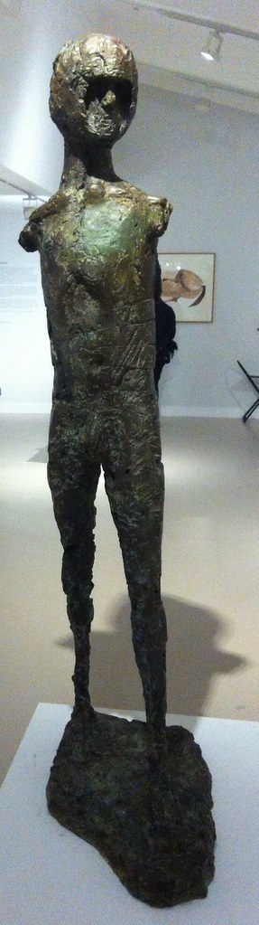
I don’t seem to have made many notes in the final room — I think there was something by David Jones, a name to which I will return — but the stand out piece was Frank Runacres’s Untitled (Ruins) (1939) where works of art, sculpture, wheels, frames and other rubble seem precariously piled over a woman, her head on hand. The bombing of Spain had already happened, but this seems to be looking ahead to the blitz. And in a corner, two small pieces by Henry Moore, one a reclining figure in bronze, but with atypical drapery.

And so we have an interesting narrative, although that one Jones and a single Eric Gill piece point to a counter narrative that could also be told: artists of the period also drew on Biblical narratives, although I would admit the mythic points more to the work of Ravilious, Wadsworth, Nash and other English Romantic Surrealists. Don’t forget Christopher Wood, however, nor Stanley Spencer, probably superior to any of the works on display here.

And if you go back to the PreRaphaelites you can see an equivocation between the mythic and Biblical, but with much more denial of the contemporary in complex ways.

And so, the method is, methinks, a tendency, among other tendencies, but no less interesting for that.

Halfterm Hockney Hideously Heaving

Hockney puts the queue in queer.

David Hockney (Tate Britain, 9 February-29 May 2017)

Several years ago, I travelled back to Nottingham for the opening of Nottingham Contemporary for an exhibition of Hockney’s early work; when I arrived on the Friday the queue was around the block. I never saw the RAA iPod exhibition as all the tickets sold out. I did see the prints at Dulwich Picture Gallery — and that was heaving. The portraits at the RAA were crowded, but I think I booked in advance.

So it was hardly surprising see that there were substantial queues for the Tate Britain exhibition — it had only just opened and it was half term. But if you want to go, book first. Use the cloak room. It’ll get hot in the exhibition.

It is sobering and instructive to realise that aside from a few pictures in the first and second rooms, you could have an entirely different retrospective of Hockney’s sixty years of work: there are the Rake’s Progress pictures; illustrations to Grimm; his prints; the bigger picture of the Yorkshire trees; the chair portraits recently shown at the RAA…

This is not to say that Hockney is a repetitive artist, indeed he is the opposite, constantly reinventing himself, but perhaps as a consequence he seems a difficult artist to pin down.

Which Hockney is on display?

I confess I found the crowd overwhelming — you see the art watchers not the work — and I went around rather quickly. I was a little surprised as to the size of the exhibition — the special exhibition space on the ground floor is normally four large rooms, much smaller than the spaces at Modern. But here we have a dozen rooms, I presume expanded into the final part of the walk through of British art. I will have to go back — maybe in members’ hours.

The first room is a little odd in its mix of periods, and you do wonder whether chronology is to be abandoned. Certainly interpretation is not there for you — each room is named, but the labels for each work are limited to names and dates. When we reach portraits, there is no biography, when we see the famous painting with the misnamed cat, Mr and Mrs Clark and Percy, you’re not going to find the real name, although some details are in the gallery guide.

The second room sees him on the edge of pop art — with canvas often visible around the paint, as if the paintings are unfinished, There are almost cartoonish figures, graffiti, obscenities, gay themes. We Two Boys Together Clinging is an obvious example, a nod to Whitman; was this the painting in Nottingham which was connected to Hockney’s obsession with the headline “TWO BOYS CLING TO CLIFF ALL NIGHT”, next to the royal insignia painting CR (for Cliff Richard)? We get the first signs of the obsession with America, which will turn into studies of swimming pools and sunbathers and boys lying on beds. Sometimes he is leaning in the direction of the abstract, sometimes a mix of the photographic (but curiously flat) and sometimes there’s a nod or two to Seurat and pointillism.

And then to photography itself, with pictures assembled from Polaroids and then 35mm, multiple viewpoints of the same topic, with a nod to Picasso perhaps.

This feeds back into paintings made on several canvases, landscapes that don’t quite connect, whether Yorkshire or way out west. Eventually this would lead to the Yorkshire trees that filled one wall at an RAA summer exhibition — but shown here only in preparatory paintings. Years later he would drive a landrover along a country road in each of the four seasons, constructing the landscape from several screens. On the one hand there are black and white charcoal drawings, on the other highly coloured landscapes that owe something to Vincent Van Gogh. It is as if he overdoses on colour and then revivifies himself with monochrome shapes and vice versa.

And in conclusion the iPad pictures, animated constructions, but from first sight not as interesting in completion as in execution. Somewhere we break from painting as time fixed on a plane from a single point of view to a reality constructed from multiple perspectives that foregrounds the time factor. Somewhere this ties back to his use of photocopiers and faxes and multiple layered prints (sometimes involving layer Perspex), none of which is on show here. His painting of space or the elimination of space.

And so, somehow, for all his apparent radicalism, Hockney like Alan Bennett has become a national treasure, packing us in. Somehow I need to penetrate his apparent shallowness — the depth of depthlessness. But it will take at least one more visit.

More than a Load of Pollocks

Abstract Expressionism (Royal Academy of Arts, September 2016—2 January 2017)

There’s a story that in the late 1940s, the CIA funded Abstract Expressionism. It was an exercise of soft power, from the people who funnelled money into the animated Animal Farm and exploding cigars. The Soviets were busy with their Socialist Realism, whilst the Americans were channelling the chap with the lily pads with bigger brushes. The AES paint big, really big, and it takes a lot to transport all those canvases around the world. In one version the Tate wasn’t able to afford a huge exhibition and an benefactor gave the money. The story is the money came from the CIA.

If Abstract Expressionism didn’t bring down the Berlin Wall, then at least it came up with pretty cool murals.

It’s the sort of thing that can leave you cold, but if you surrender to it it’s pretty amazing.

Just like capitalism.

The cavernous spaces of the Royal Academy seem appropriate, although they’ve never quite got the walk through right. These are huge, abstract paintings, determinedly non-representation, yet in theory expressing an inner emotion. Of course, we don’t always know what that emotion is, but you can always supply your own.

The first room was a kind of overture, showing paintings from many of the big names prior to the glory days. Some of these are portraits, few of them are great, but you can see the roots in Barnett Newman’s green stripes on dark red. There’s a curious Mark Rothko, Gethsemane (1944), presumably alluding to the night of Christ’s betrayal, and sort of cruciform, but it might be an eagle with an American football. And a weird cloud flag.

Clyfford’s Still’s PH-726 (1936) has wobbly male and female bodies inscribed within a block — a two dimensional version of what Moore and Epstein were carving at about the same time. A new name to me, I confess, but one I will return to later.

And so the various stars come out — and the rooms which focused on one or two artists were stronger than those which offered dubious thematic arrangements. That being said, I don’t get on with Arshile Gorky, having bounced off his Tate Modern show a few years ago. A numbers of them look like oddly painted figures in a room — say Diary of a Seducer (1947) — and I see I’ve made the note to myself, “bad photoshop”.

Jackson Pollock, on the other hand, is truly sublime. I never quite wrote up all my notes from Liverpool, but the late, black pour, works feel like the figurative abstracted. Like Rorschach tests, you can find the sail boat if you squint right. He gives in to the chaos of the drip, somewhere between randomness, automatic painting and the unconscious at work. There’s a huge mural, designed for Peggy Guggenheim’s New York apartment, with “a prancing, bestial presence” which maybe you wouldn’t want to live with. You don’t get a lot of help from the titles — even Summertime (1948) isn’t that helpful, with its wide, short overlapping of colours and drizzles. The trajectories of flies on a summer’s evening? There’s his Blue Poles (1952), with its striking, vertical totems, daring you to distinguish figure from ground. There are other colours, of course, (black grey white) but it’s striking how often he returns to red, blue and yellow, as if he’s unravelled a Piet Mondrian.

[and there, tucked on one wall, is Lee Krasner, not quite the token woman — though it does have to be said that AE is a very blokey genre with its SIZE DOES MATTER statements in oil — who takes four years to come to terms with Pollock’s stupid death in a car crash, who only then can “wrestle” with his ghost to produce The Eye is the First Circle (1960), which inevitably has to be read as homage and imitation rather than the work of an artist in her own right. Later, we’ll come across Helen Frankenthaler, whose exhibition I missed at the Turner, with Europa (1957) although I saw no bull.]

Mark Rothko is glorious, as always, and the room of his work at Tate Modern can reduce me to tears. As always the paintings seem to ride the walls, rather than be hung on the them, the layers, the laminates of colour lumess and dammit that is a word. You are surrounded by them in an octagonalroom, dwarfed, and I was annoyed to see people taking selfies against them — not because of any objection to such narcissism, but because my instinct is to disappear into these canvas rather than superimpose myself upon them. There are exquisite vertigo.

I don’t think I’ve come across Clyfford Still’s work before, but I’ve put his museum in Denver on my long term to do list (when the US is more sensible about the TSA…). These are vast canvases, representing vast landscapes, abstracted into colours. My favourite was PH247 (1951), also known as Big Blue, a luminous canvas of many blues, interrupted by dark brown and orangish vertical strokes. This, too, is a room to get lost in.

Less successful is Willem de Kooning’s work, here dominated by his paintings of women, of which he wrote “I wanted them to be funny … so I made them satiric and monstrous, like sibyls”. Gee, thanks. These are women as landscapes, rather than in, to my eyes deeply misogynistic. His other landscapes, notably Dark Pond (1948), which I misread as and viewed as Duck Pond, are better, but I don’t feel inclined to follow him up.

The shared rooms were on the whole less successful, with less of a chance to get to know the range of the artists’ work. A few women sneak in here — Joan Mitchell, Helen Frankenthaler, Janet Sobel — and I suspect the only Black artist, Norman Lewis. I wanted to know much more about his work. A room of drawings, books, prints and photographs got a little unruly, as the labels and pictures were not always as clear as they might be in the crowds. The final room gives space to Joan Mitchell’s four huge canvases of Salut Tom, echoing Postimpressionism as much as Abstract Expressionism, and represents late work of some of the big names — although of course Pollock was long since dead.

One final room to draw attention to is the one of Barnett Newman and Ad Rheinhardt, who interrupt swathes of colour with zipped colours or focal zones. Rheinhardt retreated into the Malevich black square for fourteen years — 60″ x 60″ canvases painted all back. The spartan austerity is striking. But Newman was the revelation, and I wonder if he was the inspiration for the Abstract Expressionist Rabo Karabekian’s The Temptation of Saint Anthony in Kurt Vonnegut’s Breakfast of Champions (1973). Eve (1950) is a mostly red canvas with a dark red stripe on the right hand side and its twin Adam (1951-52) is brown with three red stripes of different widths. I have know idea if they connect, but he somehow feeds into Bridget Riley‘s stripes. Newman writes “only those who understand the meta can understand the metaphysical and his paintings are as much their paint as anything else — the rich blues and reds.

Of course, these artists went through a whole range of political experiences from Pearl Harbor to Watergate, and I guess they mark the point when the art world shifts from Paris to New York, with Rauschenberg and Warhol waiting in the wings (and O’Keeffe‘s rather different abstracts predate, postdate and overlap with their heyday). They are, of course, always on the edge of being the emperor’s new clothes, just paint on canvas, randomness. But in the vast spaces of the Royal Academy most of the work transcends that caveat.

Beyond the Lady Garden

Georgia O’Keeffe (Tate Modern 6 July-30 October 2016)

you hung all your own associations with my flowers on my flowers and you write about my flowers as I think and see what you think and see of the flowers and I don’t”

“Miss O’Keeffe’s drawings … were of intense interest from a psycho-analytical point of view” Camera Work MDCCCCXII

Joanna Russ’s How to Suppress Women’s Writing is a blistering anatomy of the ways in which critics dismiss female authors. I suspect the same is true in the way we treat female artists. So many of them are just plain ignored, not part of the history, whereas others get related to more famous (artist) husbands. The recent Barbara Hepworth exhibition at Tate Britain is a case in point — the juxtaposition of her work with Ben Nicholson’s (much as I like him), risks privileging the influence in one way.

The muse is female.

And so we come to Georgia O’Keeffe (1887-1986), who I in my ignorant way had assumed was just a painter of flowers (see also Mrs Delany with her collages and Winnifred Nicholson). And those flowers were, well, obviously, yanno, well, um.

Yonic.

Vaginal.

If the pen is the penis, then the paintbrush might as well be a, um.

Flowers.

Lady gardens.

What should be immediately clear from this exhibition — too big an exhibition I suspect, as is often the Tate Modern way — is that there is much more to her flowers and indeed they form a tiny part of her output. Even, perhaps, the least interesting part.

She’s born in Wisconsin and moves to Virginia, but comes to the attention of photographer and curator Alfred Stieglitz, undeniably a fine photographer. He’s married, but tempts her across to New York and shows her work in the 219 gallery he owns.

Not only that, but he takes photographs of her — not all nudes, but a goodly deal of the ones on display were, close in on breasts, torsos, stomachs, belly button and genitalia. Great photos, yes, but a woman dissected for our pleasure, and apparently he’d done much the same to .

O’Keeffe’s work is largely abstract at this point — vertical ribbons of colour with curves or diagonals cutting across them. I always find myself in a Rorsach diagnosis with abstract, narrativising them perhaps, and you can read them as curtains (a domestic space) or even as legs or …

Quite.

A painting such as Grey Lines with Black, Blue and Yellow (c. 1923) was in fact a response to head of the Teachers College, Columbia University, Alon Bement playing music, and a lot of these paintings seem to be responses. Meanwhile, another of Stieglitz’s protégés, Paul Strand is mixing street photography with photos of objects flattened into abstract patterns of black and white. Stieglitz was to turn more abstract and photograph clouds as part of his Equivalent States series — a homage perhaps to John Constable, but also an influence on O’Keeffe’s trajectory.

As Stieglitz and O’Keeffe set up life together, in a circle that included Paul and Rebecca Strand, John Marin, Paul Rosenfeld, Marsden Hartley and Dorothy Norman, the hunt was on to find a distinctly American artistic voice, a means of responding to New York, although the two aims were likely incompatible, at least for O’Keeffe. Strand went about it by sneaking photos of the passers by, but also with almost abstract images of commuters walking past Wall Street buildings. Marin produced a stunning painting of Downtown New York, whereas Stieglitz took photos from the various apartments in skyscrapers they occupied. O’Keeffe painted the skyscrapers at night, often from street level, but also elevated views across the city — Untitled (New York) and East Pier No 3 show the river, the factory, the cranes and derricks and a single church spire. It’s like an L. S. Lowry, although just predates them.

They had a holiday home at Lake George, where he took photographs and she painted (Strand took a great photo of a baby buggy there, but felt he was trespassing on another man’s territory.) O’Keeffe’s landscapes of the lake are almost symmetrical along a horizontal line, the hills and mountains reflected, the composition tightly cropped like a photo. There she could also paint flowers, the Jimson weeds, pansies, iris, poppies, huge, overblown, but almost cropped.

We might associate flowers with the feminine, although it was Blake’s rose that was sick, along with nature and domestic spaces, but we mare projecting. I don’t think that there is a single painting of a human being in any of the paintings on display here — her A Man from the Desert (1941) is presumably a scarecrow. There’s Lake George, Coat and Red (1919) which may include Stieglitz’S black cape with a red lining, but he’s not there. The body, that abject definition of the female, is absent and so perhaps we project that onto the canvases. Taking our cue from Stieglitz and the early reviews of her work, she is painting anatomy but sublimated. Clearly those flowers are —

Really?

I mean, I’m not exactly a connoisseur, but I think that reading takes a great deal of squinting, even if some feminist art critics seemed to follow that up. It seems a way of making her interesting whilst dismissing her; the paintings aren’t quite proper. Stieglitz as patron, editor of the journal Camera Work, boyfriend and husband, was managing her reception. O’Keeffe was to deny the interpretation and, despite the fact that she might not be best placed to perceive her own unconscious psyche, I’d take her at her word.

A wider world was calling. Strand takes her up to Canada and she paints Nature Forms — Gaspé (1932), landscape as abstract, a storm in a spiral, full of flow and power, blurring sky, sea and land. It’s sublime rather than frightening. And she follows Hartley down to New Mexico, where a wealthy woman on her second husband heading to her third, with an unlikely collection of surnames, Mabel Dodge Luhan, is collecting artists. The land is red and yellow, to my eyes barren and sterile, but I suspect to her utterly fertile. The churches and other buildings are made from clay, adobe, there’s a church that might date back to 1000AD (which definitely gives me pause). It’s a landscape carved out by indigenous people and Spanish colonisation and… she finds America.

Someone said that New York is not America, but an island off the coast of America. For O’Keeffe the authentic America is west of the Hudson River, into the south west, what she calls the Faraway.

(Wasn’t that Enid Blyton? Maybe it’s somewhere near Whileaway.)

Ansel Adams is documenting the people and the buildings in photographs, and snaps a few of her too. She’s a whole woman, even if she seems to be masquerading.

There are few flowers here, but there are lots of bones. There are deer skulls, mule skulls, and so forth, in European art language part way to a memento mori, the mutability of life, or part of a Dalí-Esther surreal juxtaposition of the skin beneath the skull. The juxtaposition of a white skull with blue and red stripes points toward an American symbolism. For O’Keeffe, the bones were more alive than the animals that they were once part of, they were solid rather than surreal. It’s hard to shake off the echoes, though, as a skull of a ram reminds me of the very European Herne the Hunter. But then there’s Mule’s Skull with Pink Poinsettia (1936) and From the Faraway, Nearby (1937) itself, stunning works, seizing control of scale and perspective.

Stieglitz was clearly trying to keep control. She decided to ship a barrel of bones back East, but Stieglitz co-opted them, photographing her hands and a skull before she could paint them. He tried to keep his territory marked.

He’s not a villain, of course, I like his work, but still. And from all accounts they remained in love even if she was moving away (and he toward Norman). Driving away, even.

At least this time it was her hands.

She’d rented a place in Alcade, New Mexico, and found a new landscape of interest, a set of limestone cliffs in the Chama River Valley near Abiquiú, known as the White Place, and in 1934 spends time at the Ghost Ranch, where she finds a rock formation that becomes known as the Black Place. She painted both locations, along with the ranch, repeatedly, although the exhibitions focuses more on the black than the white. Here we have clefts and vertiginous heights, again hinting of bodies and buttocks and, well, maybe, but it is a stunning set of works that continue into the Second World War.

Eventually she buys the Rancho de los Burros on the Ghost Ranch, because of the views from the patio, and an inspiring door in the wall in its courtyard. She is to return to this door — an echo of a teaching exercise she had set decades before about the use of painterly space: draw a square and add a door. Domestic space becomes abstract — in at least one painting, My Last Door (1952-54) becomes almost a Malevich black square on a terracotta background. She is also painting the cottonwood trees and the blue skies — a return to skies — viewed through holes in the bones. Oddly the bones are flattened — white with grey — with an almost concave sky visible in the space.

She is returning to her earlier abstracts, with vertical stripes disrupted by diagonals and smoke, such as Blue I (1958) and Blue II (1958). I want to read them as the sky viewed through drapes, but I’m domesticating them again. And then there are the paintings of native, local culture.

She has also seen this landscape from above, from a plane, and she paints this new perspective — desert and plain and sky. Sometimes it looks like airbrush or acrylic, Rothko as landscape, but it is her own language. Stieglitz had died in 1946, and she was definitely her own artist now.

The exhibition leaves her in the 1960s, although she has a decade of painting left, with failing eyesight and health. Like Hepworth, we don’t see the physical decline.

There is no need to sexualise her and there is no need to make special pleading for her as a woman painter. She is an artist. She made deals, she negotiated, she is more than “just” the flowers. And this show depicts her in a wealth of detail.

Beyond the Lady Gardens

Georgia O’Keeffe (Tate Modern 6 July-30 October 2016)

“you hung all your own associations with my flowers on my flowers and you write about my flowers as I think and see what you think and see of the flowers and I don’t”

“Miss O’Keeffe’s drawings … were of intense interest from a psycho-analytical point of view” Camera Work MDCCCCXII

Joanna Russ’s How to Suppress Women’s Writing is a blistering anatomy of the ways in which critics dismiss female authors. I suspect the same is true in the way we treat female artists. So many of them are just plain ignored, not part of the history, whereas others get related to more famous (artist) husbands. The recent Barbara Hepworth exhibition at Tate Britain is a case in point — the juxtaposition of her work with Ben Nicholson’s (much as I like him), risks privileging the influence in one way.

The muse is female. Continue reading →

A Boy’s Best Friend is his…

L. S. Lowry: The Art & the Artist (The Lowry, Salford Quays)

A few years ago I was lucky enough to have the Tate Britain exhibition of L. S. Lowry to myself for my birthday.

Well, maybe for a minute.

Ten seconds.

But it was mine.

About twenty years ago I went to Salford for a job interview and looked at the Lowrys on display in the Salford Museum and Art Gallery, which was since moved to a purpose-built gallery on Salford Quays. In the meantime I’d visited Berwick on Tweed and South Shields — Lowry holiday spots — an exhibition of drawings (at Sunderland?) and the Jerwood Lowry and the Sea exhibition.

All of this showed he was more than the naive artist of the matchstalk men and matchstalk cats and dogs claim; for a start he was taught painting for a number of years in the Manchester and Salford area.

Going to the Lowry — the largest public collection of his art — reveals an even richer story, although there are perhaps too many pieces of work to deal with in a single trip.

It all hangs on the mysterious Portrait of Ann and his repeated claims that his art — even of phallic columns in the sea — is a series of self portraits.

He was born into a reasonably well off family and lived in a nice part of Manchester — his father a lay preacher and a clerk expecting to become a partner and his mother a piano teacher. But they were living beyond their means and moved to Pendlebury, with Lowry having to get a job as a rent collector rather than becoming an artist. He used his first wage packet to pay for lessons, but his growing interest in representing the industrial north west did not win him British customers — although he was successful in mainland Europe. The death of his father left him in debt and led his mother to take to her bed until she died.

Lowry had found his vision after a Manchester Guardian critic had told him his paintings were too dark — he started priming his canvases with layers of white paint to create a lighter background. Frequently he adds a railing or a curb or a brown shade along the bottom edge of his canvas as if it is a proscenium arch.

At the Tate Britain show, they were selling copies of Luigi Pirandello’s Six Characters in Search of an Author without any explanation – apparently it was a favourite play and it expires a certain amount of meta drama and the issue of representing the real.

Meanwhile we have the Portrait of Ann,his offering to a Royal Academy show and atypical of how he was thought. Who was this woman? Sometimes he said she was a model, a daughter of a Yorkshire industrialist, a god daughter, other times a prima Donna ballerina, presumably for the Rambert. She was Ann Herder or maybe Ann Hilder. But apparently she has never been traced and yet she appears across dozens of paintings.

An ex? A model glimpsed in the streets?

In footage shown at the gallery, a suited Lowry — looking for all the world like a William S. Burroughs — explains his favourite composers are Donazetti and Bellini, the latter recommended to him…

…by Ann.

Once Lowry started earning money from his paintings he started buying art — an early Lucian Freud, various late Dante Gabriel Rosettis. These, apparently, were hung in his bedroom and were mostly portraits of Jane Morris.

These were perhaps his impossible girl, a woman forever out of reach.

The guide to the exhibition pointed to a painting The Funeral Party (1953) with nine distinct and disconnected figures — possibly Lowry’s father to the far right, a Lowry as child on the left, apparently wearing a dress. The boy is looking at a young girl in shorts. Cross-dressing or a phenomenon of hand me downs, I wonder? Nine figures in search of an artist.

Would this make one of the women his mother?

There’s a double portrait where a Lowry-like figure over laps with an Ann; male and female. His nightmarish self portrait Head of a Man is apparently painted over an earlier self portrait on top of a portrait of a woman, possibly of his mother. There is, apparently, a portrait of Ann of the same dimensions.

It seems as if Lowry could never quite please his mother, could never be the son she wanted — more to the point, could never be the daughter she wanted. The Anns and the later pictures of miniskirted young women clearly offered an erotic charge for him — given a comment in the gallery’s documentary about “innocent girls playing tennis”, I wonder if he ever saw that Athena poster of a tennis player — but we also need to remember that he saw all of his art as a self portrait. He also painted erotica, found after his death, destroying or tearing up some of it.

Whilst we must not ignore the class analysis at the heart of his art — the thoughts of a friend that Salford gallery or art school was not the place for the likes of them, the social climb and fall, the thin line between making do and poverty, the snobbery of the London sophisticates — there seems to be an attempt to heal a wound in his art. This seems to have failed.

Lowry never married — perhaps he was too involved in supporting his mother, perhaps he wasn’t interested in women that way… It’s a wild kind of speculation, but was there some kind of masquerade or cross dressing, did he try to become — in art or reality — the daughter? Was Ann an imaginary friend?

I honestly don’t know. Maybe Ann was just Ann, but why mislead so often and wildly about her in interviews?

And meanwhile, crazily, I hear the strains of a Bernard Herrmann score and a vision of Mrs Bates….

To Be Frink

Elisabeth Frink: The Presence of Sculpture (Djanogly Gallery, Nottingham Lakeside Arts, 25 November 2015–28 February 2016)

My sculptures of the male figure are both man and mankind. In these two categories are all the sources of all my ideas for the human figure. Man, because I enjoy looking at the male body and this has always given me and probably always will, the impetus and the energy for a purely sensuous approach to sculptural form. I like to watch a man walking and swimming and running and being. I think that my figures of men now say so much more about how a human feels than how he looks anatomically. I can sense in a man’s body a combination of strength and vulnerability — not as weakness but as the capacity to survive through stoicism or passive resistance, or to suffer or feel

One for PigeonhedOutside Caffè Nerd on Dover Street, just off Piccadilly, is a small equestrian statue, usually with a pigeon on its head. I sat by it a few times before I realised it was an Elisabeth Frink, and I confess that I don’t recall why I began to pay attention to her. There was a small show at Woking I took myself off to a couple of years ago and materials at the Beaux Arts Gallery, London.

In my mental map, British twentieth-century scuplture was dominated by three names — Henry Moore, Barbara Hepworth and Eduardo Paolozzi — before we get into the Caros and the Gormleys and the more conceptual sculptors. Moore and Hepworth seem to occupy a curious middle ground between neoromanticism and modernism — shapes somewhere between the abstract and the bodily, sensual, demanding to be caressed. Paolozzi is plainly of the machine age — the aesthetics of collage and the cyborg, Lego bricks and circuit boards in bronze.

Standing ManWhilst all three are producers of solid work, Moore and Hepworth are more abstract and Paolozzi is more surreal than Frink. Frink’s sculpture has an extraordinary physicality to it. Her statues are of walking, running, jumping, flying and falling men — yeah, pretty well all men — and clearly there is tension between such movement and the fitness of bronze or concrete. Even the standing men seem to loom, arms behind their back, cock and balls hanging, solid presences, somewhere between threatening and sexualised.

Riace IIIImagine: some of these were commissioned for the headquarters of W. H. Smiths. Remember that when you try to get your free chocolate bar with a copy of The Mail on Sunday. The Walking Man became one of the Riace, named for the bronze statues found in the sea in 1972, and is in white face, one of Frink’s odd experiments in coloured bronze. Apparently her statue of a dog was coloured; the Desert Quarter (1985) bronze is white. Are these angels or demons?
Desert Quarter
She’s presented here in a curiously dialectic way; on the one had she was a child during the Second World War although she knew of the horrors of Belsen and the atomic bombs, the anxieties of the Cold War; on the other hand her public commissions are associated with the Utopianism of the Garden City and New Town movement in the post-war rebuilding. Sculpture was meant to inspire people — whether outside civic buildings or shopping centres, or in the new Coventry and Liverpool Metro Cathedrals.

Her Christ, in a gouache, is muscular, the emphasis on the physicals over the divine. There are pictures here of the crucified Christ, the body emphasised over the cross. There is a Mary and a nun, and a study for Judas, which is also known as the warrior. Her military men — the flying men, the air men — always already seem traumatised, the sculptural equivalent of post-traumatic stress syndrome. And that makes me wonder about her Judas; he betrayed with a kiss, he was paid his thirty pieces of silver, he bought the field and hung himself. Was Judas a warrior — did he fight with his demons and lose?

BirdmanThere is her Birdman, apparently commissioned for a school but thought destroyed (like her first commission, but a damaged version was found this year), a tall, gangly man, with stubs on his back, decommissioned wings perhaps, a fallen angel among men. There is her Running Man (1978), not, apparently, an athlete, but rather a fugitive from some unspecified conflict. Her Flying Men (1982) are hang gliders but seem about to cast themselves into space — inspired by one Léo Valentin (1919-56) who made his own birdlike wings in a vain attempt to fly. Is he also her Falling Man (1961)?

BoarThere are animals — lots of horses, sometimes with riders, a boar for Harlow, warthogs and dogs. Dogs whose heads you want to pat but mustn’t. There are birds, but of ill omen, her Harbinger Bird III (1961) and Warrior Bird (1953), corvids, menacing; on the other hand her eagles, often designed for pulpits and linked to the Kennedy assassination (there is also an uneasy sculpture, The Assassins, but all of them are uneasy).

And of course, there is the baboon, commissioned for London Zoo, but it’s a different version here. And there’s a water colour, apparently inspired by an Australian trip although that makes little sense, of an encounter between a man and a baboon. Apparently the baboon is unimpressed by the man.

BaboonBaboon

So her subject is man rather than woman. She may have done mother and child pairs like Hepworth and Moore, but none are here on display, and she was clearly a mother. The few female statues here are caped or cowled. Is there an avoidance of female objectification? Is her aim to objectify men? There were warrior women she could have portrayed, traumatised refugees. But clearly that was not for her.

Bridget Courbevoie

Bridget Riley: Learning from Seurat (Courtauld Art Gallery, 17 September 2015–17 January 2016)

I tried to find the bridge (Bridge at Courbevoie (1886-87)) on Google maps but failed — the river Seine, the bridge, a distant factory, trees, fisher men, walkers. Georges Seurat’s brand of Post-Impressionism, pointillism, made up from coloured dots, half way between colour printing and cathode ray tubes. In another place, Roy Lichtenstein was to enlarge dots and make pop art of comics.

Copying is original.

Deliberately, if annoyingly, the copy and original hang either side of the doorway, challenging you to find a viewpoint from which they can be compared. You carry the memory of one to the other.
photo (2)

Bridget Riley may have seen the painting at the Courtauld – I presume it was at the Warburg Institute, Woburn Square in 1959, having recently moved from Portman Square? — but instead it struck her in R.H. Wilenski’s book on Seurat and she then decoded to paint her own version. It’s bigger, of course, but then the book may not have been clear how big the original was. I think she knew, really, so decided to make the dots larger, and so the intensity of the original is pushed even further from photorealism. The sky is curiously yellow, matching the colour in the water and the grass. He creates light from colour and that seems to be what fascinated Riley.

If the colours become abstract, then so do the shapes — triangles, poles, lozenges, anticipating Riley’s move from stripes into something more… foliated. The Lagoon paintings, for example.

sketch

And then, on an opposite wall, Pink Landscape (1960), the shimmer of summer heat in Sienna represented by dots of red and green and pink and orange and blue, and a child’s farmhouse of white walls and a red roof. The shapes of the fields form lozenges.

Wilenski writes of Bridge that “The little man in the bowler hat has missed his train back to Paris and will be scolded by his wife; the child will be late for tea and spanked, maybe, by its mother.”

Heigho.

But we would lose the narrative in Riley as the pinstripes become stripes.

Here we’re offered variants on stripes — Late Morning I (1967) with green and red and white and blue stripes insisting on length and direction, the vertical, Vapour (1970) with white, brown, purple, green stripes overlapping, question the plane and Ecclesia (1985), thicker stripes, taking on volume.

But Tremor (1962) draws the eye — black and white triables that also form curves and ribbons and you swear the painting rotates in front of you.

A painting approximates reality through strokes, dots, stripes and the pointillist returns it to dots. Riley’s insight was to occupy the geometry, to chase the relation of shape, in canvases that move both optically and emotionally, to create luminence.

Bibliography

  • Bridget Riley: Learning from Seurat (London: The Courtauld Gallery/Ridinghouse, 2015)
  • Wilenski, R. H., Seurat (London: Faber & Faber, 1949)

Because You’re Hepworth It

Barbara Hepworth: Sculpture for a Modern World (Tate Britain, 24 June-25 October 2015)

I’ve already written a rather grumpy account of this exhibition, which has a few things that annoyed me. I should also add that the plinths bearing the sculptures could do with a second label describing the work, since sod’s law meant that on almost every occasion I would look at the other three sides first. Sometimes, of course, the label turns out to be on the wall. Grr.

I was fairly sure, however, that the work would transcend my caveats — and so, having read the catalogue, I went back for a second look.

WakefieldMeanwhile, up in Wakefield, the Hepworth is showing a film of the 1968 Tate Hepworth retrospective made by Bruce Beresford. What strikes me immediately about this is how many of the works of art are freely visible and not behind glass. I guess that she was still alive then and could have repaired anything that got broken — the insurance is presumably much higher now. It is so frustrating though. We’re told (she tells us? — and I get the sense from this film of Hepworth speaking unlike the bloody awful Dudley Ashton Shaw Sculpture in a Landscape documentary where a highly theatrical Cecil Day-Lewis intones Jacquetta Hawkes’s poetry in an odd example of barking despite having a dog of your own) that she is interested in the oval, the vertical and the human. From my notes — maybe from the film — I’ve written

inner and outer form, nut in shell, child in womb, shell/crystal, puritanical and geometric spiritual

And then I’ve added (and this is me): modern or romantic (and that is a ponder for another post).

So we’ll walk through the rooms again — beginning with the maze of vitrines. This is her early handcarvings, broadly speaking figurative, realist, mimetic. There are animals, torsos, seated figures and a baby. These works are direct carved on various kinds of wood and marble, and the missing name here is Leon Underwood, who seems to have been the master of the technique.

Hepworth’s shown here among her contemporaries, largely — husband John Skeaping, Henry Moore, Jacob Epstein and I noted two women, Ursula Edgcumbe and Elsie Henderson for future reference. The cynical side of me wonders if this downplays her — she was not unique. Skeaping’s Buffalo (1930) in lapis lazuli is beautiful and I think her side by side doves (1927) are better than Epstein’s one on top of the other (1914-15), but frankly you want your Picasso for doves and Epstein’s strengths lie elsewhere. The positive side is that she can hold her own in a wider community of sculptors between the wars. Infant (1929) is perhaps the most striking, the narrow Torso (1932), made from African blackwood and more like a totem, is the most Hepworthian.

By this point, of course, she had been born in Wakefield in 1903 and studied art in Leeds (meeting that Henry Moore chappy), moving to London where it was as cheap and as easy to get to Paris and Europe than back to Yorkshire. (There’s your north/south divide in a nutshell.) She was runner up to a prize that took her to Italy and which was to inspire her work and led her to marry the actual winner, John Skeaping.

She split from Skeaping in 1933 — the catalogue suggests in part that he was not sympathetic to her Christian Science — and had already met Ben Nicholson who at that point (1931) was married to the artist Winifred Nicholson. The two became lovers and moved in together. So in the second room we have the fruits of their lives together, with artists of different ages inspiring each other. The cynical reading is he helped her, the radical reading is she helped her. I write as a fan of Ben Nicholson — who triangulated romantic landscape, still life, abstraction and the faux naïf. His landscapes flatten into abstraction, and through the 1920s and 1930s the shapes became simplified into squares and rectangles — in time he met with Mondrian, although I think the link was more through Winifred. In time he removed colour, to produce a kind of white, almost flat, sculpture. His art seems to be an exploration of how much can be removed from an image and remain something you can see.

It has to be said that the influence of Hepworth on Nicholson is more obvious than the reverse — I’d be clearer in seeing her as a muse to him than vice versa. Throughout his pictures there are a series of double faces in profile, reduced to lines, intersecting, overlapping, Mr and Mrs. We see this motif in her self portrait in sonogram, and perhaps in one of the sculptures where the face appears to be two intersecting faces. It wasn’t immediately clear what else aesthetically she was getting out of the deal, beyond shifting to a point when she gave more abstract descriptive names for her work. Perhaps he gave her a scratchier sensibility. He was apparently more sympathetic to her religious beliefs than Skeaping had been.

With Nicholson she travelled again in mainland Europe, meeting Hans Arp, Pablo Picasso and Piet Mondrian. She contributed photos of her work to art journals such as Circle and Abstraction-Création (which included Marlow Moss, I see, and had odd ideas about alphabetical order). Mondrian was later to live downstairs from them in London, before his final move to New York. A lot of her pieces of the later 1930s seem to be two smooth pieces — often discs, placed together on a plinth. Apparently both pieces weren’t necessarily fixed, so a degree of adjustment could then be made. Among these pieces were works called Mother and Child — the Madonna and Child trope being oddly missing from the first room — although apparently she broke from tradition by having these as distinct rather than single pieces.


In 1943, she seems to have started adding string to her work. I seem to recall Moore did something similar, but I don’t know who got there first. Sculpture and Colour (Oval Form) Pale Blue and Red (see what I mean about those titles?) is white, almost eye shaped, but hollowed out with two holes. In one you can see the blue interior, and red strings from the edge of the hole to a single, vanishing, point. It is as if goes to infinity. Through the other, side, hole, you can see the strings from a different angle.

By the fourth room we’re up to the Second World War. One side has some of the drawings and paintings she did in a hospital of various operations, after her daughter was ill, apparently intrigued by the similarities between doctors’ and artists’ hands — and I think I saw more of these at Mascalls Gallery once. You need a strong nerve. Another wall has more abstract pieces — the exegetical text tells us she didn’t have time or space for more during the war, but the Hepworth in Wakefield notes the way that she used two dimensional work as a way into sculpture as well as on its own merits. But central to the room are four pieces of carved wood, Pendour (1947), Pelagos (1946), Wave (1943-44) and Oval Sculpture (1943), some plane, some elm, all but hollowed out and curled. They perhaps have the look of hazelnuts nibbled by squirrels, but are beautiful and the best pieces in the exhibition.


By the fifth room time begins to trip over itself. At some point she’s moved to St Ives and has a studio where she lives with a garden space and has rented the Palais de Danse as a second studio. She has become more ambitious, wanting to make bigger pieces; the catalogue notes her wish to crack America. Around three walls we see photos of some of her works in the studio and in situ, her big pieces for Mullard electronics (1956), John Lewis (1963) and the United Nations (1961-64), and we also see her montages imagining sculpture in rural or modernist locations. This is also the room with the ropey documentary.

Behind it, the exhibition redeems itself — four pieces made from a heavy African wood called guarer. The catalogue explains there is a mystery as to who got the wood for her and who paid for it, and what happened to the parts left over. They are larger cousins to the wooden pieces in the previous room; they seem to be experiments in how much you can take away from a form and still have some form.

Ah, you can look, but you mustn’t touch…

Finally, there’s the recreation of the Rietveld Pavilion (1956); concrete air bricks for a wall, partly filled in, some kind of wooden roof, and (here) an end wall purporting to be forest. Hepworth’s work was shown here in 1965 and since. It doesn’t fool us we’re outside, but there are five or so bronze pieces. Some have forms within forms, are twisted, some might be weathered anvils. These are clearly not mimetic, but nor do they feel organic — they are their own thing. Their sublime beauty is enough to make you forget that it’s not until 1975 that Hepworth died, in a fire.


But Hepworth is at her best in St Ives and Wakefield and the Yorkshire Sculpture Park and Edinburgh Botanical Gardens and at the front of Tate Britain and in a garden on Attebury Street.

Anguished Martian

Agnes Martin (Tate Modern, 3 June–11 October 2015)

In the ongoing round of suppressing women’s writing, so to speak, it is striking how rare a solo-female artist show is in a major institution show. In the moloch of the Tate, things are getting better — there’s the Hepworth show at Britain and the Sonia Delaunay at Modern overlapped with this. I confess to not having heard of Agnes Martin — who I guess historically fits into Abstract Expressionism pigeon hole and was associated with Sol LeWitt and Donald Judd.

Born in Canada in 1912, she moved to Washington to study in 1931 and was influenced by Zen Buddhism scholar D.T. Suzuki. The early work includes various biomorphic forms, dominos, game boards and claws, with Earth colours of brown, yellow, grey and white being prominent. But clearly she was striving toward the square and the grid, with an evident dislike of the curve.

Three years ago, Tate Modern had a Yayoi Kusama, with thousands of spots, apparently symptomatic of her struggle with mental breakdowns and her willingly living in a psychiatric institution. Here we get the square grid as expression of Martin’s schizophrenia.

The obsession, the repetition, the very straight lines.

H’mm. I don’t know. I’m not sure the diagnosis is helpful.

But you can see that she works a very narrow range of variants on the grid and the stripe, the faded deck chair. By the time you get to The Island, a series of white squares with grey lines, the impact is very subtle and yet loud. It invokes eastern formlessness, apparently, but that again is a tad essentialist.

Holiday

The later paintings of black rhomboids on grey fields are positively excessive by comparison.

I’m not sure that at the end of the day I was hugely impressed by her. Certainly I’m glad to have made her acquaintance, so to speak, and it’s always useful to get a wider sense of a period of art. But it didn’t feel, alas, like coming across a long lost friend.