If You Go Back to the Woods Today

My Back to the Woods (National Gallery, 11 May-30 October 2016)

George Shaw is that rare beast, a painter who has been nominated for the Turner Prize. I was enough lucky to see the exhibition at the BALTIC, Gateshead, and to my mind it was the best work.

It couldn’t possibly win.

I don’t mean that in a modern art is crap way. I like contemporary art. I just haven’t found myself agreeing with the winners that often. Continue reading →

Painting Exposed

Painting with Light (11 May-24 September 2016, Tate Britain)

I am bringing two pieces of baggage to this show.

Firstly a sense that a few London galleries seem to be finding excuses to show the ever popular Preraphs — compare the National Gallery Painters’ Paintings and the V&A’s Botticelli. And also the talk by Karen Shepherdson on Tony Ray-Jones and Martin Parr puts a debate about photography as art and commerce onto my mind. And having just seen William Eggleston at The National Portrait Gallery, my mind was on art.
Continue reading →

While Someone Else is Sleeping

Bruegel in Black and White: Three Grisailles Reunited (Courtauld Gallery, 4 February–8 May 2016)

I knew Pieter Bruegel the Elder from that W.H. Auden poem, about Icarus and life going on, and I went away and looked at reproductions of his extraordinary canvases back in the day to see what W.H. was on about. Most years I turn to Bruegel’s Battle of Carnival and Lent to illustrate Bakhtin’s ideas of carnival – or at least, the historical sweep.

The Courtauld Gallery has given us a unique chance – one of the works cannot leave the gallery – to look at his three authenticated grisailles for the first time.

No, I had no idea what they were either.

A grisaille is a painting more or less in black and white, although shades of grey seem possible. Sometimes, I gather, in brown. These can be used to extraordinary effect – the depiction of night and darkness, perhaps, or a three dimensional impact on a plane. One of the locations of such works is on the closed flaps of altarpieces in Dutch churches – and so a religious subject is often presupposed and Hieronymus Bosch had already produced some of these. What Bruegel seems to have done is to lay down an area of white on wood – compare L.S. Lowry’s use of white paint to prime his canvases – a drawing added in charcoal or red chalk, a thin black wash added to most of the canvas and then Bruegel painted on top of that, presumably mostly in greys. The grisailles seem to have been painted in a hurry, with alterations whilst the paint dried.

Until the mid-twentieth century, two examples were known: The Death of the Virgin and Three Soldiers, with a third, A Woman Taken in Adultery coming up for auction in 1952 and eventually being bequeathed to the Samuel Courtauld Trust collection. Two of these clearly have religious themes, and the existence both of prints of these and of a Resurrection suggests that there is at least one more yet to be found.

catThe Death of the Virgin is dated c. 1562-5 and is a nocturnal, almost chiaroscuro, depiction of the dying moments of the Virgin Mary surrounded by worshippers, partly lit by a candle in her hands, but also luminescent. Everyone is in (then) contemporary dress, of course – it is an extra-Biblical interpolation. Life goes on, too, of course, a cluttered table and chair are at the end of the bed, someone is asleep in the corner and, best of all, a cat is in the prime position by the fire. These details show up better in the 1574 print version by Philips Galle, where the light levels are considerably higher and some of the awkward perspectives of a chair are rectified. On the other hand, that chair perhaps nods to Van Gogh to come. One the other hand, that underplays the religious significance of the light of Mary set against the candles and the fire.

A Woman Taken in Adultery is taken from the He-that-is-without-sin bit of John (8.1-11) – although why Christ is writing this rather than saying it out loud eludes me. Christ is leaning over on the left hand side of the picture, scratching in the dust in Dutch, his head just overlapping the woman, and the Pharisees are on the right of the picture, stones to the ready on the paving. Note Christ is either on a lower step or (I can’t quite tell from the perspective) there is a gap between his paving and the Pharisees’. There is a crowd in the background – some passing by, others gawping. The fact that Christ is writing with his right hand suggests this was an original work rather than a preparation for prints.

Pieter’s son Jan sent the grisaille to patron Cardinal Federico Borromeo in Milan, but the latter felt this was too generous, had a copy made in about 1825, and sent it back. Pieter Perret made a print in 1579 – again this is much light, with a foreground text – and Jan had painted a copy roughly 1597, which brings us slightly closer to the foreground foursome and isolated the crowd more distinctly. None of these have the vitally of Bruegel’s original. Pieter’s son, Pieter Bruegel the Younger, also copied the painting, apparently several times, with a colour one on display here. The realism and the individuation of the figures is at the expense of the spiritual dimension – it feels less religious.

The Three Soldiers (1568) seem not to be a religious subject – there is a drummer and a fifer and in the background a soldier with a flag. The best guess is that these are Landsknechte, mercenaries, which could have fought for Spain or the Holy Roman Empire. My dim and distant history A Level reminds me of the ongoing wars in Europe – the Netherlands, Spain, Italy, the Holy Roman Empire – and the forces of Catholicism, various flavours of Protestantism and the counter-reformation. It is perhaps a plea for religious tolerance? At one point, the grisaille was owned by the future Charles I, although it briefly left the royal collections during the Commonwealth, it seems to have passed from William III to a private secretary, William van Huls.

Two more grisailles round out the exhibition — The Visit to the Far (c. 1600), attributed to Jan Brueghel the Elder, and Frans Pourbus the Elder’s The Last Supper (c. 1570). The former had been thought to be by Pieter, but is reckoned to be inferior – a series of figures in a farmhouse, with a nurse and baby in the foreground. It may be a copy of a lost Bruegel painting, it may be a pastiche. Again the absence of a religious subject must be noted – but of course non-religious examples may have been lost.

A Boy’s Best Friend is his…

L. S. Lowry: The Art & the Artist (The Lowry, Salford Quays)

A few years ago I was lucky enough to have the Tate Britain exhibition of L. S. Lowry to myself for my birthday.

Well, maybe for a minute.

Ten seconds.

But it was mine.

About twenty years ago I went to Salford for a job interview and looked at the Lowrys on display in the Salford Museum and Art Gallery, which was since moved to a purpose-built gallery on Salford Quays. In the meantime I’d visited Berwick on Tweed and South Shields — Lowry holiday spots — an exhibition of drawings (at Sunderland?) and the Jerwood Lowry and the Sea exhibition.

All of this showed he was more than the naive artist of the matchstalk men and matchstalk cats and dogs claim; for a start he was taught painting for a number of years in the Manchester and Salford area.

Going to the Lowry — the largest public collection of his art — reveals an even richer story, although there are perhaps too many pieces of work to deal with in a single trip.

It all hangs on the mysterious Portrait of Ann and his repeated claims that his art — even of phallic columns in the sea — is a series of self portraits.

He was born into a reasonably well off family and lived in a nice part of Manchester — his father a lay preacher and a clerk expecting to become a partner and his mother a piano teacher. But they were living beyond their means and moved to Pendlebury, with Lowry having to get a job as a rent collector rather than becoming an artist. He used his first wage packet to pay for lessons, but his growing interest in representing the industrial north west did not win him British customers — although he was successful in mainland Europe. The death of his father left him in debt and led his mother to take to her bed until she died.

Lowry had found his vision after a Manchester Guardian critic had told him his paintings were too dark — he started priming his canvases with layers of white paint to create a lighter background. Frequently he adds a railing or a curb or a brown shade along the bottom edge of his canvas as if it is a proscenium arch.

At the Tate Britain show, they were selling copies of Luigi Pirandello’s Six Characters in Search of an Author without any explanation – apparently it was a favourite play and it expires a certain amount of meta drama and the issue of representing the real.

Meanwhile we have the Portrait of Ann,his offering to a Royal Academy show and atypical of how he was thought. Who was this woman? Sometimes he said she was a model, a daughter of a Yorkshire industrialist, a god daughter, other times a prima Donna ballerina, presumably for the Rambert. She was Ann Herder or maybe Ann Hilder. But apparently she has never been traced and yet she appears across dozens of paintings.

An ex? A model glimpsed in the streets?

In footage shown at the gallery, a suited Lowry — looking for all the world like a William S. Burroughs — explains his favourite composers are Donazetti and Bellini, the latter recommended to him…

…by Ann.

Once Lowry started earning money from his paintings he started buying art — an early Lucian Freud, various late Dante Gabriel Rosettis. These, apparently, were hung in his bedroom and were mostly portraits of Jane Morris.

These were perhaps his impossible girl, a woman forever out of reach.

The guide to the exhibition pointed to a painting The Funeral Party (1953) with nine distinct and disconnected figures — possibly Lowry’s father to the far right, a Lowry as child on the left, apparently wearing a dress. The boy is looking at a young girl in shorts. Cross-dressing or a phenomenon of hand me downs, I wonder? Nine figures in search of an artist.

Would this make one of the women his mother?

There’s a double portrait where a Lowry-like figure over laps with an Ann; male and female. His nightmarish self portrait Head of a Man is apparently painted over an earlier self portrait on top of a portrait of a woman, possibly of his mother. There is, apparently, a portrait of Ann of the same dimensions.

It seems as if Lowry could never quite please his mother, could never be the son she wanted — more to the point, could never be the daughter she wanted. The Anns and the later pictures of miniskirted young women clearly offered an erotic charge for him — given a comment in the gallery’s documentary about “innocent girls playing tennis”, I wonder if he ever saw that Athena poster of a tennis player — but we also need to remember that he saw all of his art as a self portrait. He also painted erotica, found after his death, destroying or tearing up some of it.

Whilst we must not ignore the class analysis at the heart of his art — the thoughts of a friend that Salford gallery or art school was not the place for the likes of them, the social climb and fall, the thin line between making do and poverty, the snobbery of the London sophisticates — there seems to be an attempt to heal a wound in his art. This seems to have failed.

Lowry never married — perhaps he was too involved in supporting his mother, perhaps he wasn’t interested in women that way… It’s a wild kind of speculation, but was there some kind of masquerade or cross dressing, did he try to become — in art or reality — the daughter? Was Ann an imaginary friend?

I honestly don’t know. Maybe Ann was just Ann, but why mislead so often and wildly about her in interviews?

And meanwhile, crazily, I hear the strains of a Bernard Herrmann score and a vision of Mrs Bates….

Art vs Empire

Artist and Empire (Tate Britain, 25 November 2015–10 April 2016)
The initial question was, which artist, which empire?

Well, of course, this is Tate Britain, so the British Empire, but you don’t want to ignore the French, the Spanish, the Portuguese, the Belgian, the Ottoman, the Viking, the Roman … And that is to limit ourselves to a Eurocentric model. African and Asian empires… My history knowledge is insufficient. Is there a league table of evil empires?

Am I assuming the British Empire is evil from the get go?

And here, of course, we are in the heart of the Tate, a space built on the profits of the sugar trade:

The Tate Gallery Liverpool is based in the Albert Dock complex, on the north bank of the river Mersey. In order for the dock to be opened in 1846, a public house, several houses and a previous dock had to be demolished. One of its major commodities was sugar, and Henry Tate was one of those who used the docks to import the sugar needed for his business. The sugar initially came from cane cut by slaves on the plantations of the Caribbean, though formal slavery was gradually abolished throughout the nineteenth century. In 1889, Tate donated a collection of 65 contemporary paintings to the nation, together with a substantial bequest for a gallery to show them, and 1897, the National Gallery of British Art opened in Millbank, London, on the north bank of the river Thames.

As far as I can tell — and the exhibition is silent on this — Tate’s business was built in the second half of the nineteenth century and thus after the slave trade as such. It is in the era of indentured labour and apprentices, better than pure slavery but clearly in an infrastructure that was first built with slavery in mind. There are few depictions of slavery that I recall from the exhibition — perhaps only part of one landscape and in the margins of Walter Crane’s supposedly radical map. I don’t think there are any depictions of sugar or tea or cocoa or tobacco or even bananas — the cash crops of empire.

The first room, “Mapping and Marking”, shows the various charts that filled in the blank parts of the world for the British explorer, the unveiling of Australia, the breadth of the pink parts of the world and views of exotic climes. In applying cartography, a western politician convenience is imposed upon existing indigenous models of land use and land ownership, existing names are subsumed under British toponyms. There is a nod to Ireland, too, perhaps the first British colony, if Wales is excluded…

(And Scotland? Are we Trainspotting‘s bunch of effete wankers or did the invitation to James VI mean the Scots colonised us? In any case, the early part of exploration was an English-and-Welsh-colony. Oh, but what about the chunks of France we had?)

There are African flags, relics of colonising, but their creators are speechless.

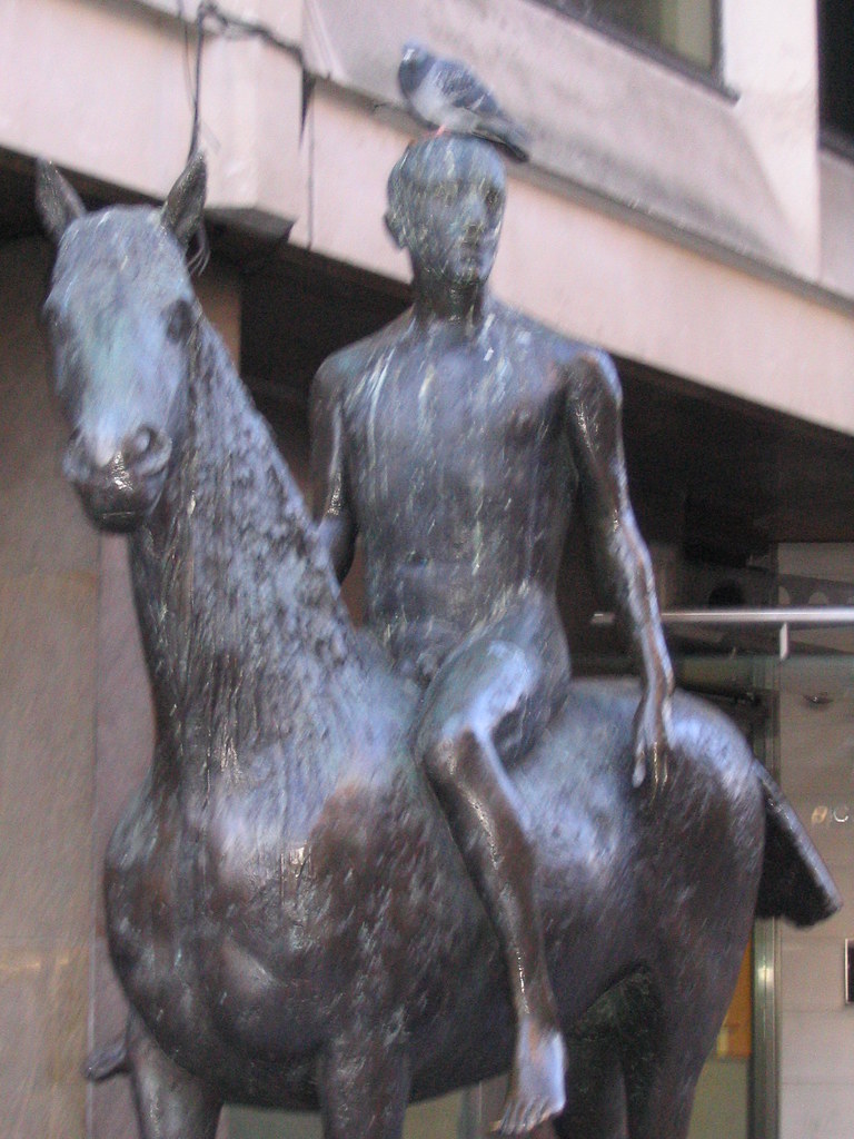
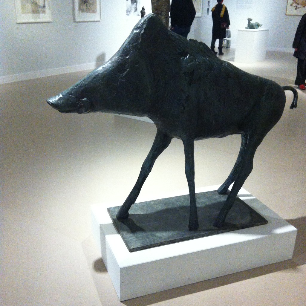
In “Trophies of Empire” we see the purpose of empire — to find objects to fill zoos and museums and botanical gardens, public spaces and entertainments sometimes aside asylums, sometimes in the cause of temperance. The spoils of empire here are not sugar or tea or cocoa or tobacco or even bananas, but plants and animals; the dingo, the Tasmanian tiger, the crane, flowers… There are also the carvings and niknaks of anonymous tribes people, rarely ascribed to an actual maker. I recall looking around the Brenchley collection in Maidstone Art Gallery and Museum and wondered how much of it was plundering and how much the Victorian equivalent of “They went to the Pacific Northwest and All They Got Me Was This Lousy Headdress”. The objects are literally from all over the world, but without the rigour of the Pitt-Rivers Museum classification by function. It is not at this point clear what the sorting narrative of the exhibition is — but there’s a broad chronologucal approach.

The third room, “Imperial Heroics”, is a space for eighteenth and nineteenth century history painting, with accounts of massacres and last stands and slaughtered colonists. Little of it, frankly, is any good and the answer to the question not quite posed by the exhibition’s title is that we were not good at looking at empire. The best that can be said is the art undercuts its own messages — the symbolism of Queen Victoria giving a bible to a native leader (Thomas Jones Barker (c. 1863)) or Britannia slaughtering a tiger (Edward Armitage’s Retribution (1858)) cries out for critique. Are some of these paintings depictions of people rightfully defending themselves from invasion?

One representation that clearly requires further head scratching is William Blake’s The Spiritual Form of Nelson Guiding Leviathan (c.1805–9), which I don’t think I’ve seen before and perhaps needs to be located in his cosmic history of the world that links Biblical to British history. Nelson for him would be current affairs — Blake does do satire too — but odd to see Nelson as a Hindu god and a mannacled slave ready to be rescued.

The fourth room, “Power Dressing”, has depictions of colonists in nature dress and natives dressed in colonial dress. Inevitably there’s going to be issues of appropriation, patronisation, various levels of Orientalism, and again there’s a low quality threshold. I suspect the colonialist cannot win, as it were, in terms of ethics. I wonder also if there’s a problem with using the term “power dressing” — which I associate with women trying to be successful in the workplace in the 1980s — in the curation and the term “cross-dressing”, with its gender connotations, in the booklet.

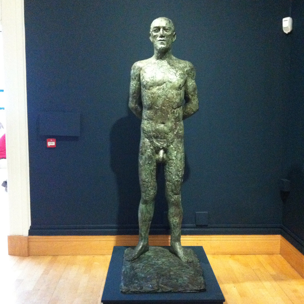
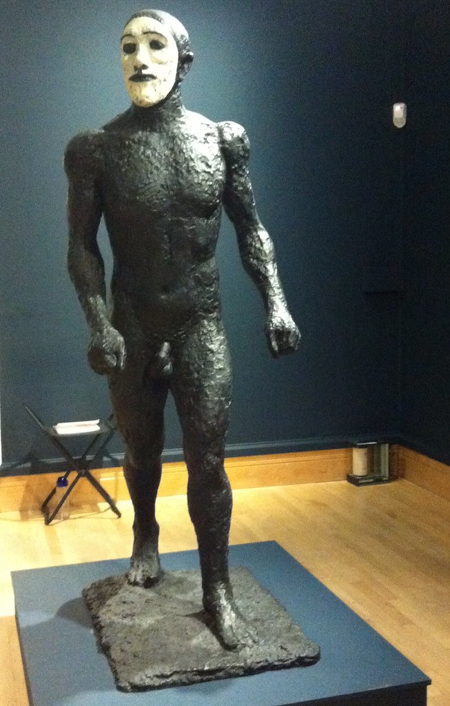
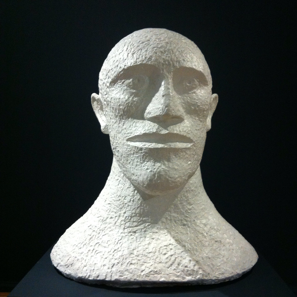
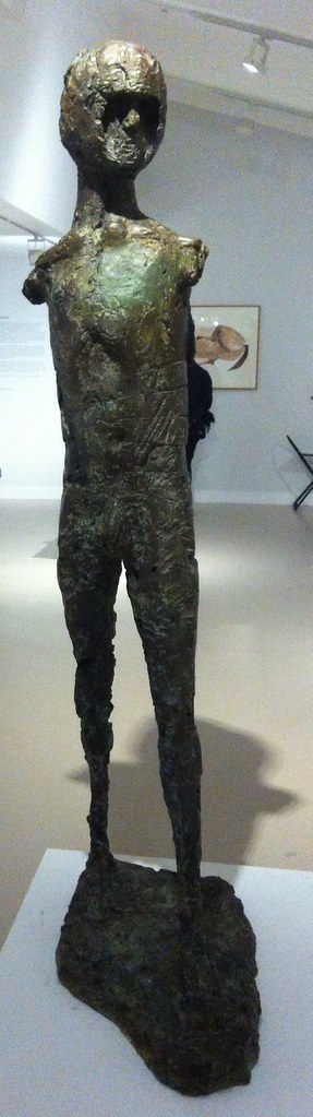
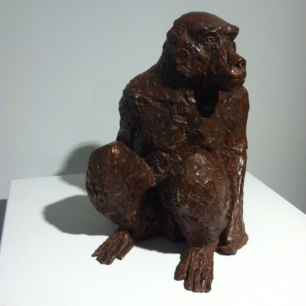
The penultimate room, “Face to Face”, is a series of portraits, some by westerners of the indigenous, some by the colonised of the coloniser. I don’t recall if there were any self-portraits of the natives. There are also figurines or statuettes, but again there’s uneasiness from the anonymity of the artists (a legacy of the looter or the commissioner or the purchaser) and the geographical spread of the objects. Australasia melts into India melts into Africa. It’s all the same empire.

The final room is divided in two, “Out of Empire” and “Legacies of Empire”, I suspect the smallest space of the six. This covers the century of decolonisation and independence, a period when colonial artefacts had reached western museums and influenced (read: were appropriated by) western artists. Henry Moore springs to mind, but he isn’t here. Artists came to Britain from the colonies having studied art or to study art — a Sidney Nolan I don’t recall seeing before springs to mind as an exemplar. A handful of artists get to represent the Commonwealth artists’ commentary on empire — centrally Donald Locke’s Trophies of Empire, an open cabinet of curiosities of jars and pots and objects almost shaped like sex toys, with shackles and handcuffs. This is one of the few representations of slavery in the exhibition. There are also photos by Locke’s son Hew Locke, statues of colonial figures, Edmund Burke and Edward Colston, overlaid with bling.

I don’t think in the end that the artists here really faced up to empire – the “postimperial” ones, maybe, but I think the exhibituon needs a lot more contextualisation than the casual observer who hasn’t bought the catalogue can give it. In the bookshop, you can buy Franz Fanon or read about King Leopold’s slave, but that kind of discourse isn’t in the show.

To Be Frink

Elisabeth Frink: The Presence of Sculpture (Djanogly Gallery, Nottingham Lakeside Arts, 25 November 2015–28 February 2016)

My sculptures of the male figure are both man and mankind. In these two categories are all the sources of all my ideas for the human figure. Man, because I enjoy looking at the male body and this has always given me and probably always will, the impetus and the energy for a purely sensuous approach to sculptural form. I like to watch a man walking and swimming and running and being. I think that my figures of men now say so much more about how a human feels than how he looks anatomically. I can sense in a man’s body a combination of strength and vulnerability — not as weakness but as the capacity to survive through stoicism or passive resistance, or to suffer or feel

One for PigeonhedOutside Caffè Nerd on Dover Street, just off Piccadilly, is a small equestrian statue, usually with a pigeon on its head. I sat by it a few times before I realised it was an Elisabeth Frink, and I confess that I don’t recall why I began to pay attention to her. There was a small show at Woking I took myself off to a couple of years ago and materials at the Beaux Arts Gallery, London.

In my mental map, British twentieth-century scuplture was dominated by three names — Henry Moore, Barbara Hepworth and Eduardo Paolozzi — before we get into the Caros and the Gormleys and the more conceptual sculptors. Moore and Hepworth seem to occupy a curious middle ground between neoromanticism and modernism — shapes somewhere between the abstract and the bodily, sensual, demanding to be caressed. Paolozzi is plainly of the machine age — the aesthetics of collage and the cyborg, Lego bricks and circuit boards in bronze.

Standing ManWhilst all three are producers of solid work, Moore and Hepworth are more abstract and Paolozzi is more surreal than Frink. Frink’s sculpture has an extraordinary physicality to it. Her statues are of walking, running, jumping, flying and falling men — yeah, pretty well all men — and clearly there is tension between such movement and the fitness of bronze or concrete. Even the standing men seem to loom, arms behind their back, cock and balls hanging, solid presences, somewhere between threatening and sexualised.

Riace IIIImagine: some of these were commissioned for the headquarters of W. H. Smiths. Remember that when you try to get your free chocolate bar with a copy of The Mail on Sunday. The Walking Man became one of the Riace, named for the bronze statues found in the sea in 1972, and is in white face, one of Frink’s odd experiments in coloured bronze. Apparently her statue of a dog was coloured; the Desert Quarter (1985) bronze is white. Are these angels or demons?
Desert Quarter
She’s presented here in a curiously dialectic way; on the one had she was a child during the Second World War although she knew of the horrors of Belsen and the atomic bombs, the anxieties of the Cold War; on the other hand her public commissions are associated with the Utopianism of the Garden City and New Town movement in the post-war rebuilding. Sculpture was meant to inspire people — whether outside civic buildings or shopping centres, or in the new Coventry and Liverpool Metro Cathedrals.

Her Christ, in a gouache, is muscular, the emphasis on the physicals over the divine. There are pictures here of the crucified Christ, the body emphasised over the cross. There is a Mary and a nun, and a study for Judas, which is also known as the warrior. Her military men — the flying men, the air men — always already seem traumatised, the sculptural equivalent of post-traumatic stress syndrome. And that makes me wonder about her Judas; he betrayed with a kiss, he was paid his thirty pieces of silver, he bought the field and hung himself. Was Judas a warrior — did he fight with his demons and lose?

BirdmanThere is her Birdman, apparently commissioned for a school but thought destroyed (like her first commission, but a damaged version was found this year), a tall, gangly man, with stubs on his back, decommissioned wings perhaps, a fallen angel among men. There is her Running Man (1978), not, apparently, an athlete, but rather a fugitive from some unspecified conflict. Her Flying Men (1982) are hang gliders but seem about to cast themselves into space — inspired by one Léo Valentin (1919-56) who made his own birdlike wings in a vain attempt to fly. Is he also her Falling Man (1961)?

BoarThere are animals — lots of horses, sometimes with riders, a boar for Harlow, warthogs and dogs. Dogs whose heads you want to pat but mustn’t. There are birds, but of ill omen, her Harbinger Bird III (1961) and Warrior Bird (1953), corvids, menacing; on the other hand her eagles, often designed for pulpits and linked to the Kennedy assassination (there is also an uneasy sculpture, The Assassins, but all of them are uneasy).

And of course, there is the baboon, commissioned for London Zoo, but it’s a different version here. And there’s a water colour, apparently inspired by an Australian trip although that makes little sense, of an encounter between a man and a baboon. Apparently the baboon is unimpressed by the man.

BaboonBaboon

So her subject is man rather than woman. She may have done mother and child pairs like Hepworth and Moore, but none are here on display, and she was clearly a mother. The few female statues here are caped or cowled. Is there an avoidance of female objectification? Is her aim to objectify men? There were warrior women she could have portrayed, traumatised refugees. But clearly that was not for her.

Bridget Courbevoie

Bridget Riley: Learning from Seurat (Courtauld Art Gallery, 17 September 2015–17 January 2016)

I tried to find the bridge (Bridge at Courbevoie (1886-87)) on Google maps but failed — the river Seine, the bridge, a distant factory, trees, fisher men, walkers. Georges Seurat’s brand of Post-Impressionism, pointillism, made up from coloured dots, half way between colour printing and cathode ray tubes. In another place, Roy Lichtenstein was to enlarge dots and make pop art of comics.

Copying is original.

Deliberately, if annoyingly, the copy and original hang either side of the doorway, challenging you to find a viewpoint from which they can be compared. You carry the memory of one to the other.
photo (2)

Bridget Riley may have seen the painting at the Courtauld – I presume it was at the Warburg Institute, Woburn Square in 1959, having recently moved from Portman Square? — but instead it struck her in R.H. Wilenski’s book on Seurat and she then decoded to paint her own version. It’s bigger, of course, but then the book may not have been clear how big the original was. I think she knew, really, so decided to make the dots larger, and so the intensity of the original is pushed even further from photorealism. The sky is curiously yellow, matching the colour in the water and the grass. He creates light from colour and that seems to be what fascinated Riley.

If the colours become abstract, then so do the shapes — triangles, poles, lozenges, anticipating Riley’s move from stripes into something more… foliated. The Lagoon paintings, for example.

sketch

And then, on an opposite wall, Pink Landscape (1960), the shimmer of summer heat in Sienna represented by dots of red and green and pink and orange and blue, and a child’s farmhouse of white walls and a red roof. The shapes of the fields form lozenges.

Wilenski writes of Bridge that “The little man in the bowler hat has missed his train back to Paris and will be scolded by his wife; the child will be late for tea and spanked, maybe, by its mother.”

Heigho.

But we would lose the narrative in Riley as the pinstripes become stripes.

Here we’re offered variants on stripes — Late Morning I (1967) with green and red and white and blue stripes insisting on length and direction, the vertical, Vapour (1970) with white, brown, purple, green stripes overlapping, question the plane and Ecclesia (1985), thicker stripes, taking on volume.

But Tremor (1962) draws the eye — black and white triables that also form curves and ribbons and you swear the painting rotates in front of you.

A painting approximates reality through strokes, dots, stripes and the pointillist returns it to dots. Riley’s insight was to occupy the geometry, to chase the relation of shape, in canvases that move both optically and emotionally, to create luminence.

Bibliography

  • Bridget Riley: Learning from Seurat (London: The Courtauld Gallery/Ridinghouse, 2015)
  • Wilenski, R. H., Seurat (London: Faber & Faber, 1949)

Watts the Name of the Gallery

The Art of Bedlam: Richard Dadd (Watts Gallery, 16 June-1 November 2015)

I wonder when we first associated art with madness? Perhaps the cave painters were seen as magical because of perceived links between bison and lunch. Certainly by the time of the Greeks we get all the stuff about muses and possession. We are fascinated by Blake and his angels and Syd Barrett and his madcap laughs and Spike Milligan and his depressions.

In the early to mid-nineteenth century we have mad poet John Clare and mad painter Richard Dadd.

Dadd was born 1817 in Chatham to a father who was clearly an intellectual mover and shaker, involved with the local philosophical and literary society. But they moved to London, specifically to Sussex Street, just around the corner from the Royal Academy of Arts (pre Somerset House days and pre-Burlington House presumably), and little Richard began to train as an artist. His reputation seems to have been made by a painting of Puck, a large child-like figure sat in the centre of a round picture in front of a crescent moon, with smaller fairies dancing around him.

He was commissioned in 1842 to travel with former Newport mayor and barrister Sir Thomas Phillips (1801–1867) on a grand tour, painting his way in Greece and Egypt and the Holy Land. There is a stunning picture of a campfire in the desert, a stripy blue sky, and, most curiously, the moon pierced on the top of a lance, although this is thought to have painting after his return. The painting, The Artist’s Halt in the Desert (c. 1846), disappeared into private hands, only to be rediscovered on The Antiques Road Show in the 1980s.

By then, Dadd’s mental health was already deteriorating — perhaps due to the heat, perhaps due to the exoticism, perhaps due to an existing condition. He was sent home. Back in England, whilst on a walk, he murdered his father and escaped to the continent. He might have escaped, but on the train he tried to kill two of his fellow passengers. He was overpowered and arrested and sent to prison in France for a year. In time he was deported to England, where he was put on trial but was declared criminally insane. For two decades he was incarcerated in Bethlem, then on the site of what was to become the Imperial War Museum, before being moved to the newly built Broadmoor where he died and was buried in 1886. As Nicholas Tromans points out, his period in the asylum coincides with the Foucauldian epistemological break of the regulation of mental health by doctors, and the growth of case records.

Whilst in the asylum, he was allowed to paint with greater or lesser freedom and resources, with one of his physicians, Charles Hood, becoming a collector of his work. This was partly therapy, partly because Hood was a connoisseur. There is a picture, Portrait of a Young Man, which is thought to be a portrait of Hood in an imagined leisure garden at the asylum; on the other hand there is a satiric piece The Curiosity Shop, which features a “connoisseur” looking at a picture through binoculars. Was Dadd playing games with Hood? Meanwhile he produced a series, Sketches to Illustrate the Passions — hatred, agony/raving madness, Ingratiation or self-contempt, deceit or duplicity, anger, grief or sorrow and patriotism — that seem to be a diagnostic set of mental conditions. The latter features two elderly military types, smoking pipes, in front of a map “A General Plan of the City of Olabolika” and a plan in incredibly tiny print.

All of these pictures are on display in this Watts Gallery exhibition, but that is to get ahead of ourselves.
Continue reading →

Pot Look

Grayson Perry: Provincial Punk (Turner Contemporary, 23 May 2015-13 September 2015)

Grayson Perry has his USP: the crossdressing, his alterego of Claire. This has speeded him on to National Treasure status, alongside his Turner Prize, Channel 4 documentaries and Reith Lectures. As always the avant garde and the rebellious is absorbed into the mainstream.

The Anthea Turner show acts as a retrospective and was heaving both times I went. I hope this is an appreciation of his work rather than a Dreamland ride of aghastness. You are repeatedly warned that some items on display are not suitable for children. They’re certain not suitable if you aren’t open to irony.

Because irony was the mode I was operating in. In a vitrined at the halfway point of the exhibition is a leather one piece motorcycle suit, with customised wording. It’s Thom Gunn drag, the hypermasculine, but from Essex rather than Kent. Does he love or hate Essex? Mockney Essex Boy Jamie Oliver is invoked at at later point. Pukka. Does he love or hate working class culture? Does he love or hate middle class culture? Does he love or hate arts and crafts? Does he love or hate the art world?

The first room is a series of pots — for the exegesis you have to consult pink handouts with the titles and descriptors of each pot, although the numbering is at random. I Love Beauty is one of the simpler ones — muted palette, a St Eustache-style deer vision, a Union Falg in monochrome, a woman (Claire?) holding sceptre and bird. Football Stands for Everything I Hate echoes the Eurocup, but with a list of pet hates: shouting; special brew; chewing gum; duvet covers and so on.

The second room was the hest to my taste — although here is where we get the most exegesis as to his background. More pots, tiles for a house, archive matials and a series of engravings: A Map of Days; Map of an Englishman and Print for a Politician. The latter is an imaginary landscape of a battleground, labelled with special interest grouos such as atheists, broadsheets, teenagers, gifted, fitness fanatics, Modernists, republicans, countryfolks, non-smokers. Which side are you on? It is encyclopedic without being completist, whimsical in its arbitrariness. Which side is Perry on? A similar aesthetic is at work in the other two etchings — qualities, moods and so on.

The third space, with the motorcycle suit, has two films, the less said about the better (there is also one in the second room), but then I’ve a low tolerance for filmed art. I’m sure he and his friends had fun, but we’re at a disadvantage in coming in oartway into 47 minutes and note really being able to hear the sound. My loss, perhaps.

The final room has three of his tapestries, handdrawn onto PhotoShop and then made on a computer controlled loom. Whilst in Tracey Emin’s tapestries shown here a few years ago, the labour of socres of women in producing them was silenced, here the labour is erased in favour of mechanisation. Again the mood is encyclopedic collage — the first piece is Comfort Blanket, A British Citizen at its heart, a stylised queen to the right, a monotone union flag to the left and a list of people and things that offer comfort. Margot Fonteyn, Beatrix Potter, Francis Bacon, David Bowie, Agatha Christie, Jamie Oliver… Is confort good or bad? The Walthamstow Tapestry, from where London bleeds into Essex or vice versa (and wasn’t William Morris from around those parts?), is a tapestry of the seven ages of man, not so much a rake’s progress as a trademark’s progress. Finally there is a work on heaven and pilgrimage, whose name I failed to note, made for his British Museum Tomb of the Unknown Craftsman exhibition: a series of names for heaven surrounded by places of pilgrimage and stylised drawings that need not match the placename.

It is problematic to gender art modes, but there is a tradition of tapestry and embroidery being the work of women. Is the same true of pottery? As crafts they might get conceived of as lesser than the other arts — and then we bounce off that Tomb of the Unknown Craftsman and Virginia Woolf’s assertion that “Anon[…] was often a woman.” Does “Claire” give Grayson access to such folk arts (although let’s note the various sailors’ embroiderings shown at the Tate’s Folk Art exhibition)? On the other hand, just as sf is not a male genre, so pottery should not be a female one. But something makes me twitchy.

I came away feeling a little underwhelmed; it reminds me of some versions of the dérive, where people walk according to some algorithm except when they’re not. There’s clearly a sexualised unconscious being revealed/concealed among the bricolage, and that’s a fair enough schtick. A thing of beauty is a joy til morning, as someone once said and beauty is in the eye of the potmaker. Beauty is a measure of capital and class, among other things.

Meanwhile, it needs to be noted (and applauded) that the Anthea Turner will always display contemporary art alongside JMS Turner. Sometimes an artist will curate alingside her retrospective, sometimes paintings on the theme of the main exhibition will be shown. Here it is noted that Perry uses technology in the making of his work — and Turner was also an explorer of the latest technique. I see straws being clutched at…

Anguished Martian

Agnes Martin (Tate Modern, 3 June–11 October 2015)

In the ongoing round of suppressing women’s writing, so to speak, it is striking how rare a solo-female artist show is in a major institution show. In the moloch of the Tate, things are getting better — there’s the Hepworth show at Britain and the Sonia Delaunay at Modern overlapped with this. I confess to not having heard of Agnes Martin — who I guess historically fits into Abstract Expressionism pigeon hole and was associated with Sol LeWitt and Donald Judd.

Born in Canada in 1912, she moved to Washington to study in 1931 and was influenced by Zen Buddhism scholar D.T. Suzuki. The early work includes various biomorphic forms, dominos, game boards and claws, with Earth colours of brown, yellow, grey and white being prominent. But clearly she was striving toward the square and the grid, with an evident dislike of the curve.

Three years ago, Tate Modern had a Yayoi Kusama, with thousands of spots, apparently symptomatic of her struggle with mental breakdowns and her willingly living in a psychiatric institution. Here we get the square grid as expression of Martin’s schizophrenia.

The obsession, the repetition, the very straight lines.

H’mm. I don’t know. I’m not sure the diagnosis is helpful.

But you can see that she works a very narrow range of variants on the grid and the stripe, the faded deck chair. By the time you get to The Island, a series of white squares with grey lines, the impact is very subtle and yet loud. It invokes eastern formlessness, apparently, but that again is a tad essentialist.

Holiday

The later paintings of black rhomboids on grey fields are positively excessive by comparison.

I’m not sure that at the end of the day I was hugely impressed by her. Certainly I’m glad to have made her acquaintance, so to speak, and it’s always useful to get a wider sense of a period of art. But it didn’t feel, alas, like coming across a long lost friend.