To Be Frink

Elisabeth Frink: The Presence of Sculpture (Djanogly Gallery, Nottingham Lakeside Arts, 25 November 2015–28 February 2016)

My sculptures of the male figure are both man and mankind. In these two categories are all the sources of all my ideas for the human figure. Man, because I enjoy looking at the male body and this has always given me and probably always will, the impetus and the energy for a purely sensuous approach to sculptural form. I like to watch a man walking and swimming and running and being. I think that my figures of men now say so much more about how a human feels than how he looks anatomically. I can sense in a man’s body a combination of strength and vulnerability — not as weakness but as the capacity to survive through stoicism or passive resistance, or to suffer or feel

One for Pigeonhed
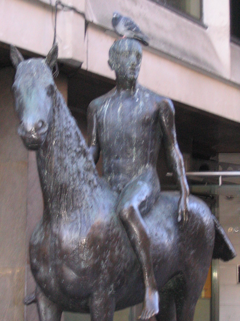
Outside Caffè Nerd on Dover Street, just off Piccadilly, is a small equestrian statue, usually with a pigeon on its head. I sat by it a few times before I realised it was an Elisabeth Frink, and I confess that I don’t recall why I began to pay attention to her. There was a small show at Woking I took myself off to a couple of years ago and materials at the Beaux Arts Gallery, London.

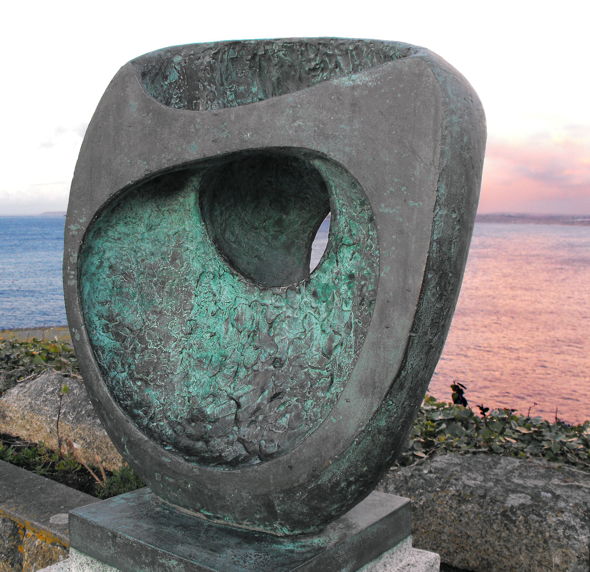
In my mental map, British twentieth-century scuplture was dominated by three names — Henry Moore, Barbara Hepworth and Eduardo Paolozzi — before we get into the Caros and the Gormleys and the more conceptual sculptors. Moore and Hepworth seem to occupy a curious middle ground between neoromanticism and modernism — shapes somewhere between the abstract and the bodily, sensual, demanding to be caressed. Paolozzi is plainly of the machine age — the aesthetics of collage and the cyborg, Lego bricks and circuit boards in bronze.

Standing Man
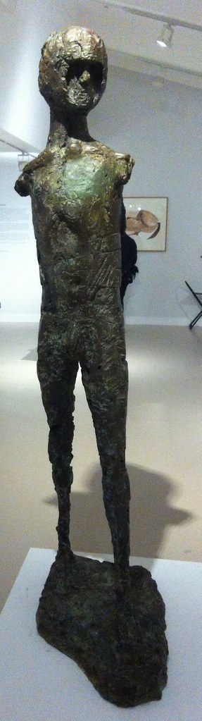
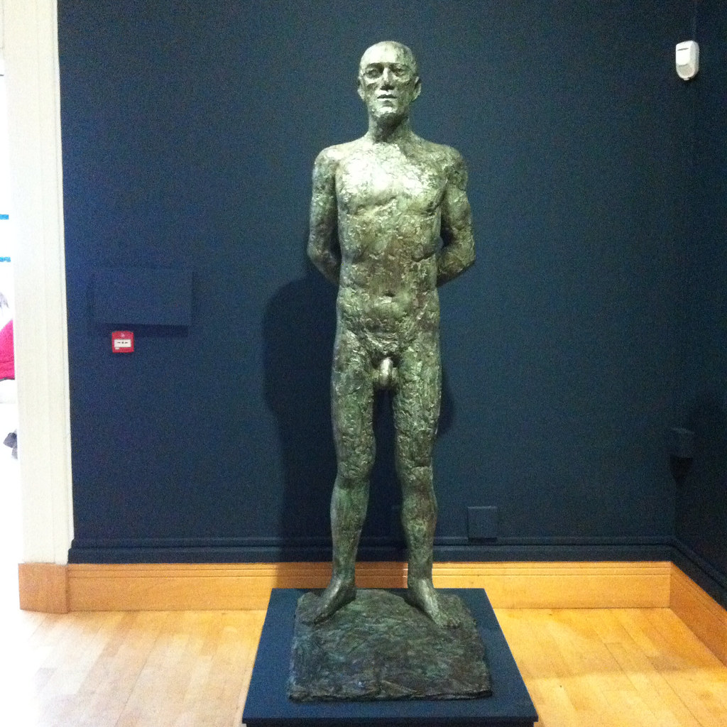
Whilst all three are producers of solid work, Moore and Hepworth are more abstract and Paolozzi is more surreal than Frink. Frink’s sculpture has an extraordinary physicality to it. Her statues are of walking, running, jumping, flying and falling men — yeah, pretty well all men — and clearly there is tension between such movement and the fitness of bronze or concrete. Even the standing men seem to loom, arms behind their back, cock and balls hanging, solid presences, somewhere between threatening and sexualised.

Riace III
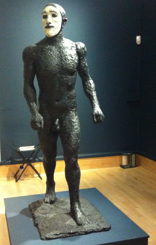
Imagine: some of these were commissioned for the headquarters of W. H. Smiths. Remember that when you try to get your free chocolate bar with a copy of The Mail on Sunday. The Walking Man became one of the Riace, named for the bronze statues found in the sea in 1972, and is in white face, one of Frink’s odd experiments in coloured bronze. Apparently her statue of a dog was coloured; the Desert Quarter (1985) bronze is white. Are these angels or demons?
Desert Quarter
She’s presented here in a curiously dialectic way; on the one had she was a child during the Second World War although she knew of the horrors of Belsen and the atomic bombs, the anxieties of the Cold War; on the other hand her public commissions are associated with the Utopianism of the Garden City and New Town movement in the post-war rebuilding. Sculpture was meant to inspire people — whether outside civic buildings or shopping centres, or in the new Coventry and Liverpool Metro Cathedrals.

Her Christ, in a gouache, is muscular, the emphasis on the physicals over the divine. There are pictures here of the crucified Christ, the body emphasised over the cross. There is a Mary and a nun, and a study for Judas, which is also known as the warrior. Her military men — the flying men, the air men — always already seem traumatised, the sculptural equivalent of post-traumatic stress syndrome. And that makes me wonder about her Judas; he betrayed with a kiss, he was paid his thirty pieces of silver, he bought the field and hung himself. Was Judas a warrior — did he fight with his demons and lose?

BirdmanThere is her Birdman, apparently commissioned for a school but thought destroyed (like her first commission, but a damaged version was found this year), a tall, gangly man, with stubs on his back, decommissioned wings perhaps, a fallen angel among men. There is her Running Man (1978), not, apparently, an athlete, but rather a fugitive from some unspecified conflict. Her Flying Men (1982) are hang gliders but seem about to cast themselves into space — inspired by one Léo Valentin (1919-56) who made his own birdlike wings in a vain attempt to fly. Is he also her Falling Man (1961)?

Boar
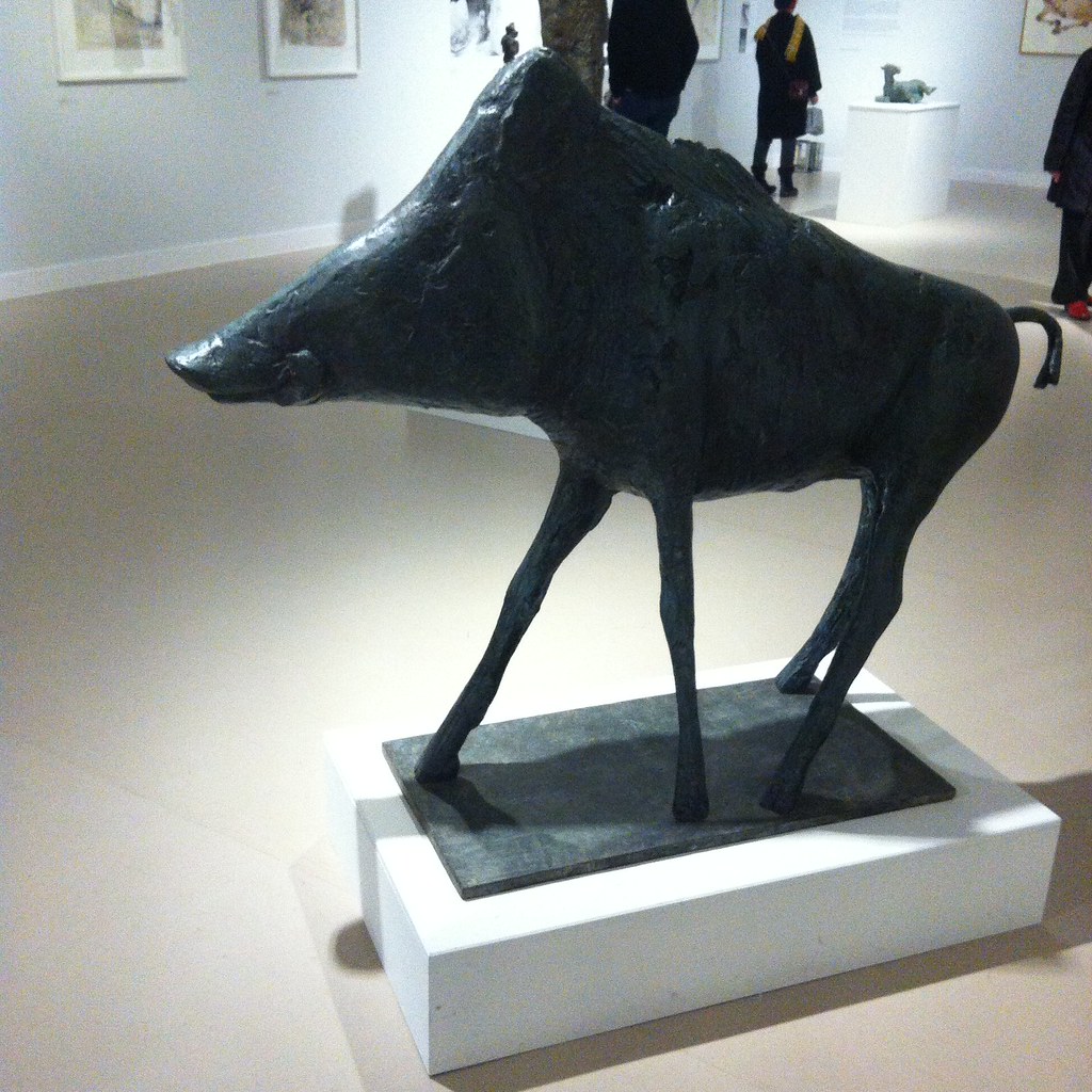
There are animals — lots of horses, sometimes with riders, a boar for Harlow, warthogs and dogs. Dogs whose heads you want to pat but mustn’t. There are birds, but of ill omen, her Harbinger Bird III (1961) and Warrior Bird (1953), corvids, menacing; on the other hand her eagles, often designed for pulpits and linked to the Kennedy assassination (there is also an uneasy sculpture, The Assassins, but all of them are uneasy).

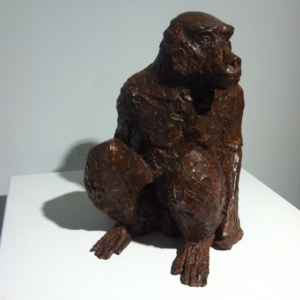
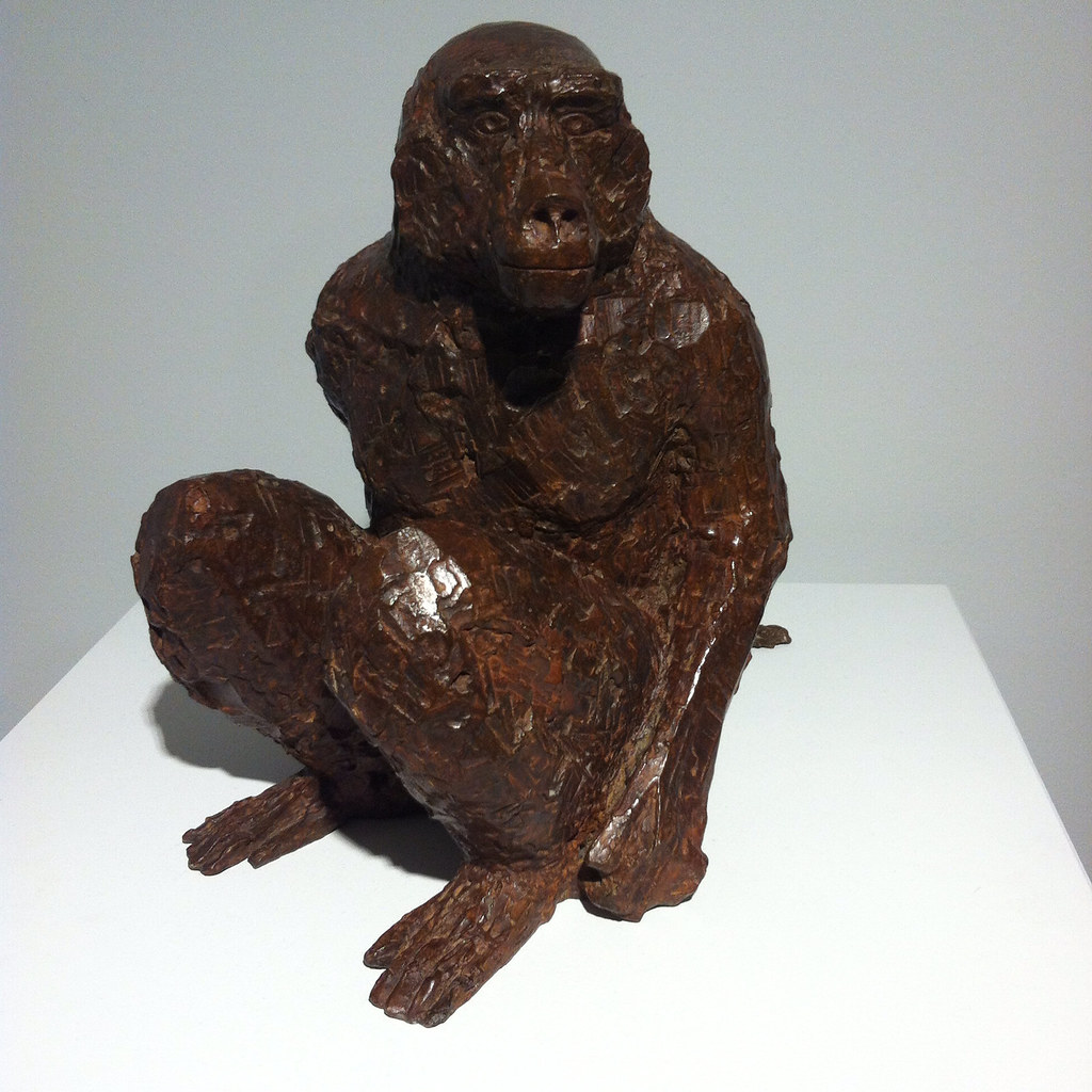
And of course, there is the baboon, commissioned for London Zoo, but it’s a different version here. And there’s a water colour, apparently inspired by an Australian trip although that makes little sense, of an encounter between a man and a baboon. Apparently the baboon is unimpressed by the man.

BaboonBaboon

So her subject is man rather than woman. She may have done mother and child pairs like Hepworth and Moore, but none are here on display, and she was clearly a mother. The few female statues here are caped or cowled. Is there an avoidance of female objectification? Is her aim to objectify men? There were warrior women she could have portrayed, traumatised refugees. But clearly that was not for her.

Bridget Courbevoie

Bridget Riley: Learning from Seurat (Courtauld Art Gallery, 17 September 2015–17 January 2016)

I tried to find the bridge (Bridge at Courbevoie (1886-87)) on Google maps but failed — the river Seine, the bridge, a distant factory, trees, fisher men, walkers. Georges Seurat’s brand of Post-Impressionism, pointillism, made up from coloured dots, half way between colour printing and cathode ray tubes. In another place, Roy Lichtenstein was to enlarge dots and make pop art of comics.

Copying is original.

Deliberately, if annoyingly, the copy and original hang either side of the doorway, challenging you to find a viewpoint from which they can be compared. You carry the memory of one to the other.
photo (2)

Bridget Riley may have seen the painting at the Courtauld – I presume it was at the Warburg Institute, Woburn Square in 1959, having recently moved from Portman Square? — but instead it struck her in R.H. Wilenski’s book on Seurat and she then decoded to paint her own version. It’s bigger, of course, but then the book may not have been clear how big the original was. I think she knew, really, so decided to make the dots larger, and so the intensity of the original is pushed even further from photorealism. The sky is curiously yellow, matching the colour in the water and the grass. He creates light from colour and that seems to be what fascinated Riley.

If the colours become abstract, then so do the shapes — triangles, poles, lozenges, anticipating Riley’s move from stripes into something more… foliated. The Lagoon paintings, for example.

sketch

And then, on an opposite wall, Pink Landscape (1960), the shimmer of summer heat in Sienna represented by dots of red and green and pink and orange and blue, and a child’s farmhouse of white walls and a red roof. The shapes of the fields form lozenges.

Wilenski writes of Bridge that “The little man in the bowler hat has missed his train back to Paris and will be scolded by his wife; the child will be late for tea and spanked, maybe, by its mother.”

Heigho.

But we would lose the narrative in Riley as the pinstripes become stripes.

Here we’re offered variants on stripes — Late Morning I (1967) with green and red and white and blue stripes insisting on length and direction, the vertical, Vapour (1970) with white, brown, purple, green stripes overlapping, question the plane and Ecclesia (1985), thicker stripes, taking on volume.

But Tremor (1962) draws the eye — black and white triables that also form curves and ribbons and you swear the painting rotates in front of you.

A painting approximates reality through strokes, dots, stripes and the pointillist returns it to dots. Riley’s insight was to occupy the geometry, to chase the relation of shape, in canvases that move both optically and emotionally, to create luminence.

Bibliography

  • Bridget Riley: Learning from Seurat (London: The Courtauld Gallery/Ridinghouse, 2015)
  • Wilenski, R. H., Seurat (London: Faber & Faber, 1949)

Take A Chance On Me

Take a Chance on Me

Risk (Turner Contemporary, 10 October 2015-17 January 2016)

The Anthea Turner — a gallery whose Chipperfield design works better in Wakefield — is committed to always showing some J. M. S. Turner and contemporary art, for which read the past one year’s except when it suits them. They’ve had some great solo shows (Mondrian and Colour was frankly more interesting than the Liverpool Tate show), which are interspersed with themed shows. The second exhibition, about Youth, was amazing, Curiosity had some good items but wasn’t more than the sum of its parts and the Self left me a little cold.

So, Risk. Art which puts the artist at risk or may offend against dominant values?

Well, yes, Ruth Proctor films herself falling off a scaffold onto cardboard boxes (here is the scaffold, here are the boxes), Bas Jan Ader documents the start of his transAtlantic voyage that was never completed, Ai Weiwei gives various landmarks the finger. Meanwhile we have surgery footage of Orlan’s cosmetic surgery, Gregor Schneider’s faintly uncanny film of two neighbouring houses redecorated to be identical, Martha Abramovic leaning back from a bow and arrow pointed at her heart.

But then it’s extended to chance and fate. Gerard Richter scrapes back at his paint with a squeegee, post Minimalists let their art hang according to gravity, Marcel Duchamp drops string and Chris Burden drops steel beams into wet concrete.

And then, brace yourself, Turner experiments to see how different paints dry or soak into paper.

Careful now.

There’s a print of an old life jacket and a reconstruction of an ancient Chinese earthquake detector.

What there isn’t is any Jackson Pollock who also allowed chance into his aesthetic through pouring and dripping or Helen Frankenthaler with her too-wet paint or Frank Bowling’s dribbles. One might object that being open to chance is an abandonment of craft, but presumably there’s a selection process. There’s a film (whose makers I forget) which is a kind of mouse trap sequence, where rolling ball sets off a chain reaction. We don’t see however many versions didn’t work. And we don’t see what Duchamp did with the templates he made from the string.

There wasn’t any art that has been banned or challenged (Mapplethorpe’s photos, Magritte’s nudes might have been interesting, some of the vandalised art show at Tate Britain a couple of years back).

The biggest risk here, of course, is that there is such a show in a multimillion pound gallery in one of the more deprived corners of England — Margate was a Portas town, its twin industries of TB recovery and funfair being undermined by progress. Like Gateshead’s BALTIC, another venue which is curated rather than collected, it could simply do crowd pleasers (such as Grayson Perry), but instead challenges its clientele. It has to risk failure.

With a few exceptions, alas, in this it was a success.

Meanwhile, a ten minute walk, a megabaguette, a thirty minute bus ride and another ten minute walk away there is the UpDown Gallery, which specialises mainly in limited edition prints. ive not caught every show there, but those I have I’ve liked.

Upstairs, ending really soon, is the work of Loukas Morley, a ready-made artist in the tradition of Beauys with the colour sense of Hodgkin. Painting on various types of wood, either circular or rectangular or squaregular, clearly on the flat, he builds up layers of paint and resin, abstract yet active, usually allowing the ghost of the grain below. There are also witty sculptures – a board rubber, plastic lids from spray paints, crumpled metal á la John Chamberlain, a lemon as still life. He has been curated by Cedric Christie in the past and I suspect a cross-influence.

Meanwhile, downstairs, ending really soon, is Martin Grover and his (to be honest, annoyingly titled) The Peoples Limousine. It would be unfair to call Grover (like Magritte) a one-joke artist, even if it is a funny joke. He specialises in fake bus stop signs, wring out variants on the symbols, possible stops and kinds of route. One refer to Talking Heads songs, another to British movies set in London (Going Places: The London Nobody Knows/Meantime & High Hopes/Seven Days to Noon/The Fallen Idol/The Bells Go Down). Yes, it’s arbitrary, but it’s done with wit and charm.

There are also lists of lists, masquerading as compilation albums, depictions of famous musicians (Barry White, Marvyn Gaye) wandering around London or past CarpetRight. And then my favourites: The South London Procrastination Club (Established: not just yet). There’s a hint of the thirties railway destination poster about his more straight forward prints, but any of them should put a smile on your face.

It’s too late for this show — unless you go on Sunday — but keep an eye out.

Because You’re Hepworth It

Barbara Hepworth: Sculpture for a Modern World (Tate Britain, 24 June-25 October 2015)

I’ve already written a rather grumpy account of this exhibition, which has a few things that annoyed me. I should also add that the plinths bearing the sculptures could do with a second label describing the work, since sod’s law meant that on almost every occasion I would look at the other three sides first. Sometimes, of course, the label turns out to be on the wall. Grr.

I was fairly sure, however, that the work would transcend my caveats — and so, having read the catalogue, I went back for a second look.

WakefieldMeanwhile, up in Wakefield, the Hepworth is showing a film of the 1968 Tate Hepworth retrospective made by Bruce Beresford. What strikes me immediately about this is how many of the works of art are freely visible and not behind glass. I guess that she was still alive then and could have repaired anything that got broken — the insurance is presumably much higher now. It is so frustrating though. We’re told (she tells us? — and I get the sense from this film of Hepworth speaking unlike the bloody awful Dudley Ashton Shaw Sculpture in a Landscape documentary where a highly theatrical Cecil Day-Lewis intones Jacquetta Hawkes’s poetry in an odd example of barking despite having a dog of your own) that she is interested in the oval, the vertical and the human. From my notes — maybe from the film — I’ve written

inner and outer form, nut in shell, child in womb, shell/crystal, puritanical and geometric spiritual

And then I’ve added (and this is me): modern or romantic (and that is a ponder for another post).

So we’ll walk through the rooms again — beginning with the maze of vitrines. This is her early handcarvings, broadly speaking figurative, realist, mimetic. There are animals, torsos, seated figures and a baby. These works are direct carved on various kinds of wood and marble, and the missing name here is Leon Underwood, who seems to have been the master of the technique.

Hepworth’s shown here among her contemporaries, largely — husband John Skeaping, Henry Moore, Jacob Epstein and I noted two women, Ursula Edgcumbe and Elsie Henderson for future reference. The cynical side of me wonders if this downplays her — she was not unique. Skeaping’s Buffalo (1930) in lapis lazuli is beautiful and I think her side by side doves (1927) are better than Epstein’s one on top of the other (1914-15), but frankly you want your Picasso for doves and Epstein’s strengths lie elsewhere. The positive side is that she can hold her own in a wider community of sculptors between the wars. Infant (1929) is perhaps the most striking, the narrow Torso (1932), made from African blackwood and more like a totem, is the most Hepworthian.

By this point, of course, she had been born in Wakefield in 1903 and studied art in Leeds (meeting that Henry Moore chappy), moving to London where it was as cheap and as easy to get to Paris and Europe than back to Yorkshire. (There’s your north/south divide in a nutshell.) She was runner up to a prize that took her to Italy and which was to inspire her work and led her to marry the actual winner, John Skeaping.

She split from Skeaping in 1933 — the catalogue suggests in part that he was not sympathetic to her Christian Science — and had already met Ben Nicholson who at that point (1931) was married to the artist Winifred Nicholson. The two became lovers and moved in together. So in the second room we have the fruits of their lives together, with artists of different ages inspiring each other. The cynical reading is he helped her, the radical reading is she helped her. I write as a fan of Ben Nicholson — who triangulated romantic landscape, still life, abstraction and the faux naïf. His landscapes flatten into abstraction, and through the 1920s and 1930s the shapes became simplified into squares and rectangles — in time he met with Mondrian, although I think the link was more through Winifred. In time he removed colour, to produce a kind of white, almost flat, sculpture. His art seems to be an exploration of how much can be removed from an image and remain something you can see.

It has to be said that the influence of Hepworth on Nicholson is more obvious than the reverse — I’d be clearer in seeing her as a muse to him than vice versa. Throughout his pictures there are a series of double faces in profile, reduced to lines, intersecting, overlapping, Mr and Mrs. We see this motif in her self portrait in sonogram, and perhaps in one of the sculptures where the face appears to be two intersecting faces. It wasn’t immediately clear what else aesthetically she was getting out of the deal, beyond shifting to a point when she gave more abstract descriptive names for her work. Perhaps he gave her a scratchier sensibility. He was apparently more sympathetic to her religious beliefs than Skeaping had been.

With Nicholson she travelled again in mainland Europe, meeting Hans Arp, Pablo Picasso and Piet Mondrian. She contributed photos of her work to art journals such as Circle and Abstraction-Création (which included Marlow Moss, I see, and had odd ideas about alphabetical order). Mondrian was later to live downstairs from them in London, before his final move to New York. A lot of her pieces of the later 1930s seem to be two smooth pieces — often discs, placed together on a plinth. Apparently both pieces weren’t necessarily fixed, so a degree of adjustment could then be made. Among these pieces were works called Mother and Child — the Madonna and Child trope being oddly missing from the first room — although apparently she broke from tradition by having these as distinct rather than single pieces.


In 1943, she seems to have started adding string to her work. I seem to recall Moore did something similar, but I don’t know who got there first. Sculpture and Colour (Oval Form) Pale Blue and Red (see what I mean about those titles?) is white, almost eye shaped, but hollowed out with two holes. In one you can see the blue interior, and red strings from the edge of the hole to a single, vanishing, point. It is as if goes to infinity. Through the other, side, hole, you can see the strings from a different angle.

By the fourth room we’re up to the Second World War. One side has some of the drawings and paintings she did in a hospital of various operations, after her daughter was ill, apparently intrigued by the similarities between doctors’ and artists’ hands — and I think I saw more of these at Mascalls Gallery once. You need a strong nerve. Another wall has more abstract pieces — the exegetical text tells us she didn’t have time or space for more during the war, but the Hepworth in Wakefield notes the way that she used two dimensional work as a way into sculpture as well as on its own merits. But central to the room are four pieces of carved wood, Pendour (1947), Pelagos (1946), Wave (1943-44) and Oval Sculpture (1943), some plane, some elm, all but hollowed out and curled. They perhaps have the look of hazelnuts nibbled by squirrels, but are beautiful and the best pieces in the exhibition.


By the fifth room time begins to trip over itself. At some point she’s moved to St Ives and has a studio where she lives with a garden space and has rented the Palais de Danse as a second studio. She has become more ambitious, wanting to make bigger pieces; the catalogue notes her wish to crack America. Around three walls we see photos of some of her works in the studio and in situ, her big pieces for Mullard electronics (1956), John Lewis (1963) and the United Nations (1961-64), and we also see her montages imagining sculpture in rural or modernist locations. This is also the room with the ropey documentary.

Behind it, the exhibition redeems itself — four pieces made from a heavy African wood called guarer. The catalogue explains there is a mystery as to who got the wood for her and who paid for it, and what happened to the parts left over. They are larger cousins to the wooden pieces in the previous room; they seem to be experiments in how much you can take away from a form and still have some form.

Ah, you can look, but you mustn’t touch…

Finally, there’s the recreation of the Rietveld Pavilion (1956); concrete air bricks for a wall, partly filled in, some kind of wooden roof, and (here) an end wall purporting to be forest. Hepworth’s work was shown here in 1965 and since. It doesn’t fool us we’re outside, but there are five or so bronze pieces. Some have forms within forms, are twisted, some might be weathered anvils. These are clearly not mimetic, but nor do they feel organic — they are their own thing. Their sublime beauty is enough to make you forget that it’s not until 1975 that Hepworth died, in a fire.


But Hepworth is at her best in St Ives and Wakefield and the Yorkshire Sculpture Park and Edinburgh Botanical Gardens and at the front of Tate Britain and in a garden on Attebury Street.

Watts the Name of the Gallery

The Art of Bedlam: Richard Dadd (Watts Gallery, 16 June-1 November 2015)

I wonder when we first associated art with madness? Perhaps the cave painters were seen as magical because of perceived links between bison and lunch. Certainly by the time of the Greeks we get all the stuff about muses and possession. We are fascinated by Blake and his angels and Syd Barrett and his madcap laughs and Spike Milligan and his depressions.

In the early to mid-nineteenth century we have mad poet John Clare and mad painter Richard Dadd.

Dadd was born 1817 in Chatham to a father who was clearly an intellectual mover and shaker, involved with the local philosophical and literary society. But they moved to London, specifically to Sussex Street, just around the corner from the Royal Academy of Arts (pre Somerset House days and pre-Burlington House presumably), and little Richard began to train as an artist. His reputation seems to have been made by a painting of Puck, a large child-like figure sat in the centre of a round picture in front of a crescent moon, with smaller fairies dancing around him.

He was commissioned in 1842 to travel with former Newport mayor and barrister Sir Thomas Phillips (1801–1867) on a grand tour, painting his way in Greece and Egypt and the Holy Land. There is a stunning picture of a campfire in the desert, a stripy blue sky, and, most curiously, the moon pierced on the top of a lance, although this is thought to have painting after his return. The painting, The Artist’s Halt in the Desert (c. 1846), disappeared into private hands, only to be rediscovered on The Antiques Road Show in the 1980s.

By then, Dadd’s mental health was already deteriorating — perhaps due to the heat, perhaps due to the exoticism, perhaps due to an existing condition. He was sent home. Back in England, whilst on a walk, he murdered his father and escaped to the continent. He might have escaped, but on the train he tried to kill two of his fellow passengers. He was overpowered and arrested and sent to prison in France for a year. In time he was deported to England, where he was put on trial but was declared criminally insane. For two decades he was incarcerated in Bethlem, then on the site of what was to become the Imperial War Museum, before being moved to the newly built Broadmoor where he died and was buried in 1886. As Nicholas Tromans points out, his period in the asylum coincides with the Foucauldian epistemological break of the regulation of mental health by doctors, and the growth of case records.

Whilst in the asylum, he was allowed to paint with greater or lesser freedom and resources, with one of his physicians, Charles Hood, becoming a collector of his work. This was partly therapy, partly because Hood was a connoisseur. There is a picture, Portrait of a Young Man, which is thought to be a portrait of Hood in an imagined leisure garden at the asylum; on the other hand there is a satiric piece The Curiosity Shop, which features a “connoisseur” looking at a picture through binoculars. Was Dadd playing games with Hood? Meanwhile he produced a series, Sketches to Illustrate the Passions — hatred, agony/raving madness, Ingratiation or self-contempt, deceit or duplicity, anger, grief or sorrow and patriotism — that seem to be a diagnostic set of mental conditions. The latter features two elderly military types, smoking pipes, in front of a map “A General Plan of the City of Olabolika” and a plan in incredibly tiny print.

All of these pictures are on display in this Watts Gallery exhibition, but that is to get ahead of ourselves.
Continue reading →

Pot Look

Grayson Perry: Provincial Punk (Turner Contemporary, 23 May 2015-13 September 2015)

Grayson Perry has his USP: the crossdressing, his alterego of Claire. This has speeded him on to National Treasure status, alongside his Turner Prize, Channel 4 documentaries and Reith Lectures. As always the avant garde and the rebellious is absorbed into the mainstream.

The Anthea Turner show acts as a retrospective and was heaving both times I went. I hope this is an appreciation of his work rather than a Dreamland ride of aghastness. You are repeatedly warned that some items on display are not suitable for children. They’re certain not suitable if you aren’t open to irony.

Because irony was the mode I was operating in. In a vitrined at the halfway point of the exhibition is a leather one piece motorcycle suit, with customised wording. It’s Thom Gunn drag, the hypermasculine, but from Essex rather than Kent. Does he love or hate Essex? Mockney Essex Boy Jamie Oliver is invoked at at later point. Pukka. Does he love or hate working class culture? Does he love or hate middle class culture? Does he love or hate arts and crafts? Does he love or hate the art world?

The first room is a series of pots — for the exegesis you have to consult pink handouts with the titles and descriptors of each pot, although the numbering is at random. I Love Beauty is one of the simpler ones — muted palette, a St Eustache-style deer vision, a Union Falg in monochrome, a woman (Claire?) holding sceptre and bird. Football Stands for Everything I Hate echoes the Eurocup, but with a list of pet hates: shouting; special brew; chewing gum; duvet covers and so on.

The second room was the hest to my taste — although here is where we get the most exegesis as to his background. More pots, tiles for a house, archive matials and a series of engravings: A Map of Days; Map of an Englishman and Print for a Politician. The latter is an imaginary landscape of a battleground, labelled with special interest grouos such as atheists, broadsheets, teenagers, gifted, fitness fanatics, Modernists, republicans, countryfolks, non-smokers. Which side are you on? It is encyclopedic without being completist, whimsical in its arbitrariness. Which side is Perry on? A similar aesthetic is at work in the other two etchings — qualities, moods and so on.

The third space, with the motorcycle suit, has two films, the less said about the better (there is also one in the second room), but then I’ve a low tolerance for filmed art. I’m sure he and his friends had fun, but we’re at a disadvantage in coming in oartway into 47 minutes and note really being able to hear the sound. My loss, perhaps.

The final room has three of his tapestries, handdrawn onto PhotoShop and then made on a computer controlled loom. Whilst in Tracey Emin’s tapestries shown here a few years ago, the labour of socres of women in producing them was silenced, here the labour is erased in favour of mechanisation. Again the mood is encyclopedic collage — the first piece is Comfort Blanket, A British Citizen at its heart, a stylised queen to the right, a monotone union flag to the left and a list of people and things that offer comfort. Margot Fonteyn, Beatrix Potter, Francis Bacon, David Bowie, Agatha Christie, Jamie Oliver… Is confort good or bad? The Walthamstow Tapestry, from where London bleeds into Essex or vice versa (and wasn’t William Morris from around those parts?), is a tapestry of the seven ages of man, not so much a rake’s progress as a trademark’s progress. Finally there is a work on heaven and pilgrimage, whose name I failed to note, made for his British Museum Tomb of the Unknown Craftsman exhibition: a series of names for heaven surrounded by places of pilgrimage and stylised drawings that need not match the placename.

It is problematic to gender art modes, but there is a tradition of tapestry and embroidery being the work of women. Is the same true of pottery? As crafts they might get conceived of as lesser than the other arts — and then we bounce off that Tomb of the Unknown Craftsman and Virginia Woolf’s assertion that “Anon[…] was often a woman.” Does “Claire” give Grayson access to such folk arts (although let’s note the various sailors’ embroiderings shown at the Tate’s Folk Art exhibition)? On the other hand, just as sf is not a male genre, so pottery should not be a female one. But something makes me twitchy.

I came away feeling a little underwhelmed; it reminds me of some versions of the dérive, where people walk according to some algorithm except when they’re not. There’s clearly a sexualised unconscious being revealed/concealed among the bricolage, and that’s a fair enough schtick. A thing of beauty is a joy til morning, as someone once said and beauty is in the eye of the potmaker. Beauty is a measure of capital and class, among other things.

Meanwhile, it needs to be noted (and applauded) that the Anthea Turner will always display contemporary art alongside JMS Turner. Sometimes an artist will curate alingside her retrospective, sometimes paintings on the theme of the main exhibition will be shown. Here it is noted that Perry uses technology in the making of his work — and Turner was also an explorer of the latest technique. I see straws being clutched at…

Sickert to ’em (Down, Down, Diepper and Down)

Sickert in Dieppe (Pallant House, Chichester, 4 July—4 October 2015)

So, in my head, I get him mixed up with James Whistler. Or possibly John Singer Sargent. He’s the one that Stephen Knight and Patricia Cornwell reckon to be Jack the Ripper. Whatever. So, he’s born in Munich in 1860, son and grandson of an artist, who initially wanted to be an actor in London, but became a pupil of Whistler (ha!). In 1883 he went to Paris and met Edgar Degas – whose paintings and sculptures include dancers – and learned from him about impressionism. Oddly, he seems to have learned to avoid all the en pleine air nonsense and was advised to make drawings and work in a studio. Splendid. Back in London, he started making pictures of music halls. Splendid. Later he was to become part of the Camden Town group.

He was described as flamboyant and bohemian — and the portraits and photos endorse this. He’d later hang out with Audrey Beardsley and give him a painting lesson. And so it is somewhat of a surprise to me that he first came to Dieppe on his honeymoon with Ellen Cobden (daughter of the anti-Corn Law guy) in 1885. Dieppe was a fashionable seaside resort, increasingly popular with the Bohemian fraternity, and initially Sickert produced seascapes, on small oak panels, before focusing more on architecture. Whilst apparently he had been more interested in portraiture in Britain, now he moved to landscapes. Having spent a number of “seasons” in Dieppe (alongside a trip to Venice), he settled there as his marriage disintegrated and before his divorce was finalised. He found a mistress, Augustine Villain, and lived in the harbour area for a period. In 1912 he bought a house in the Dieppe countryside, with his second wife Christine Angus, but was forced back into town by the outbreak of war. Having returned to England, it was not until 1919 that he got back to Dieppe, but within a couple of years Christine died of tuberculosis. Degas worked once more on the seafront also sketched then painted people at the casino. There were also a series of dark pictures of figures in bedrooms – probably alluding to the Camden Town murder.

The paintings are mostly street scenes – the Hôtel Royal, the Rue Notre Dame, the church of St. Jacques and the statue of Admiral Duquesne – and the tone is overall rather brown and muddy. Wendy Baron writes: “His main harmony was generally based on hardly more than two colours corresponding to the dark and midtones, with the addition of creamy buff for the lights [… h]e often used blue-black with brown or mauve.” (69). Four commissioned landscapes intended for a restaurant – but rejected by the owner – seem to distill this and you face one of these as you enter the exhibition. There is clearly the essence of Impressionism here, with wet paint applied on wet paint in layers, but you get the sense that it is planned to appear improvised. There are various squared drawings and canvases that show the careful recording of buildings, which then can be painted back in any of his several studios.

I’m pleased I saw this exhibition – on a day I’d anticipated that I’d actually be in Brighton and after a journey from hell – but I can’t say I warmed to him. He was described as “the Canaletto of Dieppe” – and of course his time there included him working on canvases imagined in Venice. There is a sense of the mysterious to some of the pictures, and the moral commentary that may be in the late casino paintings. There’s a room of painters influenced by Sickert that’s also worth a look – and elsewhere a fascinating if largely black and white collection “St. Ives and British Modernism”, the George and Ann Dannatt Collection.

I can’t help but share a (paraphrased) comment from George Dannatt: “The objection to this art is often that ‘My child can do it’. So give it to a child. The answer is often silence.”

Bibliography

  • Wendy Baron, Sickert (London: Phaidon Press, 1973).

My Darling Caro

Caro in Yorkshire (Yorkshire Sculpture Park, 18 July-1 November 2015)
Caro in Yorkshire (The Hepworth Wakefield, 18 July-1 November 2015)


As far as I can see, twentieth-century British sculpture was dominated by Barbara Hepworth and Henry Moore and, whilst you would be unlikely to mistake the two, there is a sense of continuity. Both are very organic in form and were committed to sculpture in public spaces. Whilst both did work in bronze and other metals, there is a background in manual carving in wood, marble and so on. The aura of the handcrafted. Bronze, on the other hand, usually requires a foundry and experts in metal.

Since the late 1960s there has been the more conceptual — walk as sculpture, glass of water on shelf as sculpture (of a tree).

Before this, however, there was Anthony Caro (1924-2013), a generation younger than Moore — and one of his studio assistants. Caro’s early works would involve a hands on roach — lumpy bronzes, a twisted human form and drawings or painting that seem to me reminiscent of Henri Gaudier-Brzeska. But a trip to the USA in 1959 sent him down a more industrial route — large pieces of metal welded together. Whilst he was to play with bronzed surfaces — rusted, waxed and so forth — the break through works were painted in a limited range of colours.

Caro’s work in sculpture brings together painting and architecture, pushing the boundaries. Being metal, being forged, they are clearly solid and heavy, but at the same time they are often suspended or balanced, seemingly lightweight. “They’ve got an inside but they’ve got no centre,” he said of them. His Table Pieces are often suspended on the edge of tables or shelves, and presumably have a very carefully placed centre of gravity.

What he is also credited with is the disappearance of the plinth. I have a few thoughts about this to follow up, but once a huge lump of metal is placed upon the ground, the frame between world and art is wafer thin. From this comes the possibility of the texture in the grass or a pile of aggregates. Some of the work looks like a climbing frame or an adventure playground — if the Hepworth and Moore sculptures demand to be felt, than these demand to be climbed. In some cases, the sculptures offer a kind of Wendy house, but mostly there are attendants to stop you.

Across one hillside at the Yorkshire Sculpture Park there are a range of different bronzes — curves and planes, verticals and horizontals, holes and towers. Across the other side of the site are the early works, preparatory drawings (and you can see he draws figures like Moore), as well as works from across nearly fifty years. Alongside steel and bronze there is also the use of Perspex — apparently glass turned out to be unwieldy. He also sculpted in paper and plaster imitations of paper. Meanwhile the works at the Hepworth cover the period from the 1960s to his death.


I didn’t take a note of the architect, but for a period he tried to codesign a tower; unable to find the funding or whatever, he appropriated the shape as sculpture but turned it upside down. At this point I was reminded of the work of Eduardo Paolozzi, and the mosaic of machinery he explored.

I liked these works more than I expected to — there is an aesthetic to them that is pleasing as they balance the solid and the ethereal. There is space and nonspace. And whilst this may end up disappearing the artist, there’s an infection of the real world as art — the scaffolding becomes installation (indeed, Cedric Christie and others have made sculpture from scaffold poles).

All photos here

Hep Hep Hooray (Part Two to Follow)

Barbara Hepworth: Sculpture for a Modern World (Tate Britain 24 June-25 October 2015)

Hepworth plaqueI really like Barbara Hepworth’s work. It has a kind of tactility to it, a sensuousness — it cries out to be touched and caressed. I’ve been up to Wakefield and looked at the plasters and maquettes and the blue plaques, and down to St Ives to see the studio and at some point saw the hospital drawings.

So I was looking forward to this Tate overview, in the same space where they showed Henry Moore.

I’m going to do two write ups, because I want to do it justice. But this time round, I’m going to be critical whilst thinking you should really go.

Major galleries still rarely do one women shows (although note Tate Modern this spring and summer).

There’s always a danger when providing context that this takes away rather than enriches your appreciation of the materials. In the first room, there are lots of hand carved sculpture, not all by Hepworth. We’re told that one of her strengths was direct carving — inspired in this by Henri Gaudier-Brzeska, Jacob Epstein and Eric Gill, but also by the fact that the was apparently a whole lot more of this than we realised. Everyone was up to it. One missing name was Leon Underwood, whom I might well come back to, who was a tutor to Henry Moore. Was she that special?

Before she married Moore, she married Ben Nicholson and before that John Skeaping — another direct carver — and there is a room of works by Nicholson responding to hers and vice versa. I like Nicholson’s work, but, again, I’m a little worried it takes away from her. I suspect not, but.

Hepworth SculptureIn a later room there’s a documentary, Figures in a Landscape (Dudley Shaw Ashton, 1953), with Cecil Day-Lewis reading bad poetry over footage of the Cornish coast, telling us about how history and then Man has sculpted the landscape — you know that “invisible” sexism that defaults to and his? You want to scream, YOU KNOW HEPWORTH IS A WOMAN, YES? Eventually her sculptures start appearing in the landscape, and for a more you assume the apes will start worshiping them and a certain theme will appear on the soundtrack. Or you assume it’s the inspiration for Led Zeppelin’s Presence.

At the end of the show, there’s a recreation of the Rietveld Pavilion from a Dutch sculpture garden, with sculpture finally naked — up to then, more or less, everything is in vitrines. I know that hands can leave marks and grease and patina — but I don’t recall Moore’s being so glassed off. Were there ropes? It’s great to get a full 360 view of them, but it makes the exhibition a maze (where have they hidden the label this time?) and its frustration because you just wanna touch. And at the end it’s not clear if you can.

Hepworth died in 1975.

The pavilion was 1965.

Did she not sculpt for a decade? Was the later work earlier? Or was it all large scale stuff like the UN piece or the John Lewis’s one?

It just stops.

Did I miss a chronology of the artist? Okay, the exhibition guide tells you she died in a fire, but it still feel a little off-key.

The really sad thing is there is fantastic stuff here, but I’m not sure justice is done to it. I will go back, I suspect in late August now, having read the catalogue, and say more.

And He Painted Matchstalk Men and Matchstalk Cats and Sharks

Lowry by the Sea (Jerwood Gallery, Hastings, 11 June 2015-1 November 2015)

Whilst my birthday is all too often a series of examples of bad timing, I was lucky enough to have one which coincided with a members’ private view of the L.S. Lowry exhibition at Tate Britain. For a few glorious moments, I had the exhibition to myself. Lowry is one of those artists we’re not meant to like because people like him and because there was a one-hit wonder in the 1970s about him.

What that exhibition made clear was that Lowry was a greater artist than given usually credit for – although I suspect his faux naivitée could be objected to. Whilst Alfred Wallis was self-taught, Lowry attended the Manchester School of Art and was trained by French Impressionist Pierre Adolphe Valette. Lowry made sense in terms of Impressionism, even if you don’t accept his own constructions of working class realities as art in their own right.

I stumbled across the fact that there was a Lowry show at the Jedward Jerwood Gallery, a newish and controversial space at Hastings. It’s a fifteen minute train ride back from Bexhill (where Riley is) or a two-hour walk. The Jerwood is home to the Jerwood Collection, the philanthropic gathering of art by a pearl company which also gives prizes for painting, drawing and sculpture. The collection is mainly early twentieth century British, but I have to say it can come across as a bit muddy and grey in its pallette. I think I’ve been disappointed by the two big exhibition rooms on the right as you enter – I can’t recall a show blowing me away there. At the moment it’s a selection from the Fraser Collection, along with Scottish artists from the Jerwood, and I confess to being underwhelmed. There was some interesting sculptural pieces in the space where there was the Marlow Moss show.

But the hit or miss part of the Jerwood is the two upstairs rooms that tend to have temporary shows. At the moment, it’s Lowry, representing the seaside. Should we be surprised that his choice of holiday destination was Berwick on Tweed, South Shields and Sunderland? The Jerwood does like its sea exhibitions, but this is a good one.
There’s only really one Lowry that is immediately recognisable as a Lowry, July, the Seaside (1943), a series of tiny incidents on the beach – games being played, a punch and judy kiosk, sitting, lying, walking, prams, swings. It is the urban crowd transplanted from factory gates and football matches to the sea – possibly in north Wales. What is striking is that the people are dressed much the same – there is no concession to sea and sun. Still, there’s a war on.


Berwick Jetty
The figures are more impressionist in his Spittal Sands (1960) – perhaps it’s a mistier day, but I reognise the spot which is just south of Berwick. And is that the same harbour arm in Untitled (Beach Scene with Central Monument and Chimney), sketched in felt tipped pen? There’s a chimney or two that makes me think of the (fish?) smoking chimney in Spittal.

There’s also South Shields – Waiting for the Tide (1960) – showing Lowry’s love of solitude and quiteness and isolation. Am I misrecognising A Ship (1965) as Tynemouth?

Is that a version of the aerials next to Tynemouth Priory? But there’s a harbour arm he will have lost (and yet I recall two paintings of the same scene, I think Sunderland, where towers were moved. He’s an artist who will recompose landscapes.)
Then, there’s the Self-Portrait as a Pillar in the Sea (1966), awfully phallic. It’s not a surprise to me – do I recall drawn versions of this at Sunderland? There is another painting like this, also 1966, in Sunderland.

Lowry writes, somewhere, “Look at my seascapes, they don’t really exist you know, they’re just an expression of my own loneliness.” In some paintings the sea and sky merge – the elemental boundaries merge. And then, somewhere again, he writes, apparently about the world of art, “I spent my whole life wondering what it all means, I can’t understand it, don’t understand it at all, can’t see any point in it myself. Still, there it is, you keep on working, and you keep on wondering what it all means, and it goes on and on and on and, there you are.” It reminds me of childhood reading, it reminds me of Eeyore.

And I had to laugh.

There’s a Lowry cartoon called The Shark (1970) where the shark is the art world and the person in the shark’s mouth is Lowry. Better than Damien Hirst’s shark. There are other people in the sea. Waving. Or drowning.

I had a sudden flash, at this point, of someone else that had a reputation for being gloomy, but was also blackly comic. I wondered if they ever could have met – the other one was an insurance clerk, but Lowry was a rent collector. I thought, for a moment, he worked for the Pru. Ah well.

But this is a show to see.