Hep Hep Hooray (Part Two to Follow)

Barbara Hepworth: Sculpture for a Modern World (Tate Britain 24 June-25 October 2015)

Hepworth plaqueI really like Barbara Hepworth’s work. It has a kind of tactility to it, a sensuousness — it cries out to be touched and caressed. I’ve been up to Wakefield and looked at the plasters and maquettes and the blue plaques, and down to St Ives to see the studio and at some point saw the hospital drawings.

So I was looking forward to this Tate overview, in the same space where they showed Henry Moore.

I’m going to do two write ups, because I want to do it justice. But this time round, I’m going to be critical whilst thinking you should really go.

Major galleries still rarely do one women shows (although note Tate Modern this spring and summer).

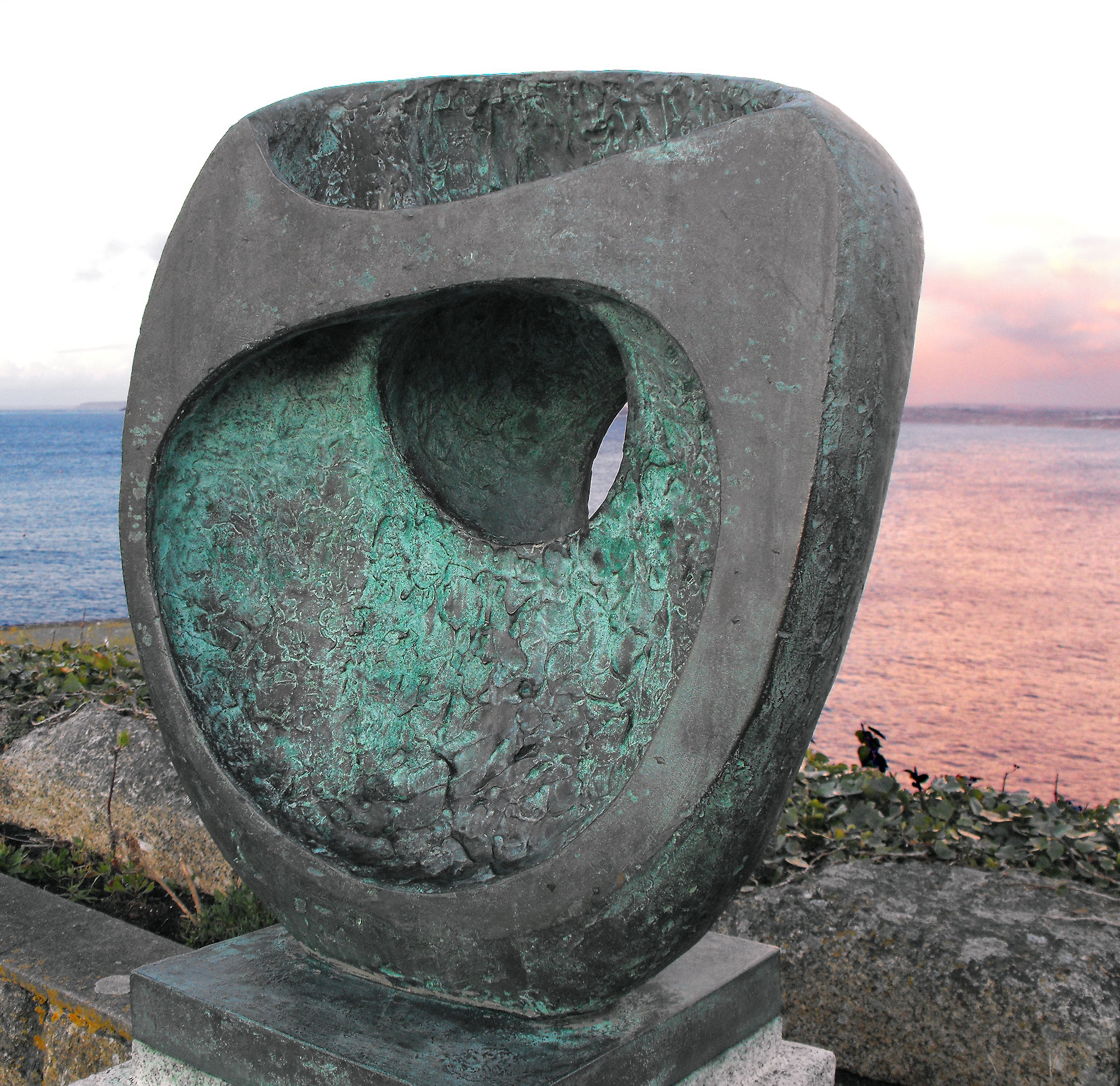
There’s always a danger when providing context that this takes away rather than enriches your appreciation of the materials. In the first room, there are lots of hand carved sculpture, not all by Hepworth. We’re told that one of her strengths was direct carving — inspired in this by Henri Gaudier-Brzeska, Jacob Epstein and Eric Gill, but also by the fact that the was apparently a whole lot more of this than we realised. Everyone was up to it. One missing name was Leon Underwood, whom I might well come back to, who was a tutor to Henry Moore. Was she that special?

Before she married Moore, she married Ben Nicholson and before that John Skeaping — another direct carver — and there is a room of works by Nicholson responding to hers and vice versa. I like Nicholson’s work, but, again, I’m a little worried it takes away from her. I suspect not, but.

Hepworth SculptureIn a later room there’s a documentary, Figures in a Landscape (Dudley Shaw Ashton, 1953), with Cecil Day-Lewis reading bad poetry over footage of the Cornish coast, telling us about how history and then Man has sculpted the landscape — you know that “invisible” sexism that defaults to and his? You want to scream, YOU KNOW HEPWORTH IS A WOMAN, YES? Eventually her sculptures start appearing in the landscape, and for a more you assume the apes will start worshiping them and a certain theme will appear on the soundtrack. Or you assume it’s the inspiration for Led Zeppelin’s Presence.

At the end of the show, there’s a recreation of the Rietveld Pavilion from a Dutch sculpture garden, with sculpture finally naked — up to then, more or less, everything is in vitrines. I know that hands can leave marks and grease and patina — but I don’t recall Moore’s being so glassed off. Were there ropes? It’s great to get a full 360 view of them, but it makes the exhibition a maze (where have they hidden the label this time?) and its frustration because you just wanna touch. And at the end it’s not clear if you can.

Hepworth died in 1975.

The pavilion was 1965.

Did she not sculpt for a decade? Was the later work earlier? Or was it all large scale stuff like the UN piece or the John Lewis’s one?

It just stops.

Did I miss a chronology of the artist? Okay, the exhibition guide tells you she died in a fire, but it still feel a little off-key.

The really sad thing is there is fantastic stuff here, but I’m not sure justice is done to it. I will go back, I suspect in late August now, having read the catalogue, and say more.

Manifest Pollocks

Blind Spots: Jackson Pollock (Tate Liverpool, 1 July 2015-17 October 2015)

Jackson Pollock was born in 1912 in Cody, Wyoming, but grew up in Arizona and California. Having gone to art school (and been expelled), he became an artist for the Federal Work Program. His big stylistic breakthrough was the all-over drip painting, although pouring might be a better word. The whole canvas is covered by oil or thinned enamel paint dripped from brushes or syringes; in most cases the paint over lies and is overlain with other paint, in some cases the canvas is visible.

Pollock was slotted into the abstract expressionism category — abstract because it wasn’t figurative, expressionist because he was expressing his feelings and emotions on the canvas. This wasn’t necessarily a term he liked and I will come back to it. Pollock was an alcoholic and went through Jungian psychoanalysis to attempt to cure this — the assumption is that his art can be understood in Jungian terms, presumably expressing a nonindividuated ego and archetypes. Early paintings had Greek mythic titles and he is also assumed to be drawing in an interest in Native American art.

I hope to return to this but I’m troubled — action painting gives access to the unconscious and more primitive stares of mind, such as that of the Native American.

Koffs.

Really?

In 1951, after a less successful exhibition of the kind of paintings we know Pollock for, he took a change in direction: the black paintings. These were largely blank canvases with thinned black enamel dribbled on them — sometimes calligraphy, sometimes faces, sometimes scribbles — and it is this set of paintings that becomes central to Blind Spots, the current exhibition. Whilst they’ve never been entirely ignored, they have been downplayed.

Pollock wasn’t the first to paint in black — Malevich’s black squares have been seen at at least two British shows in the last year, at Tate Modern and the Whitechapel. Willem de Kooning had a black and white painting, coincidentally also in the Tate at the moment. But Pollock painted just in black.

I was worried — I prefer twentieth to pre-twentieth-century art, but I don’t like all abstract art. I was worried that I’d be wasting my time seeing this, even though I prepared by reading three or four books on Pollock. Pollock is the epitome of the “My six year old can paint like that” school of art criticism; it’s said of Picasso, too. And bollocks. But I wasn’t sure I’d get it.

I don’t pretend this to be profound, but it struck me that there is an opposition between figurative and abstract, figure and ground, paint and canvas and so on. Paint is applied in layers — in three dimensions, however trivially, as new paint obscures old.

If abstract expressionism gives us access to the unconscious, how do we know it’s the artist’s unconscious rather than our own? Does that matter?

Of course, schooled in deconstruction, you’d expect me to pick away at the oppositions.

There are specks rather than spots in this exhibition — but blind spots are the part of your eye where the nerve and exits and lacks rods and cones, there the bit that wing mirrors can’t pick out (Pollock died in a car crash) and blind spots are the things critucs overlook. But there was for me a misprison — I thought of Paul de Man’s Blindness and Insight, the blind spot of a text or of the critic’s reading of it.

Hmmm.

At the start of the exhibition is a found collotype of a mother and child, mostly obscured in black ink.

Obscure vs. reveal. Mask vs. unmask.

The mother and child is a key trope — archetype of — of the history of art. The Madonna and Child. This is clearly a pop art version, but we need to keep an eye out for this in the exhibition. Pollock’s mother and Pollock? Maybe. Is the black ink covering them up or revealing them? It certainly draws attention — you look harder.

The idea of looking is set up for us in the first picture of the show. It is the keynote.

(To be continued…)

And He Painted Matchstalk Men and Matchstalk Cats and Sharks

Lowry by the Sea (Jerwood Gallery, Hastings, 11 June 2015-1 November 2015)

Whilst my birthday is all too often a series of examples of bad timing, I was lucky enough to have one which coincided with a members’ private view of the L.S. Lowry exhibition at Tate Britain. For a few glorious moments, I had the exhibition to myself. Lowry is one of those artists we’re not meant to like because people like him and because there was a one-hit wonder in the 1970s about him.

What that exhibition made clear was that Lowry was a greater artist than given usually credit for – although I suspect his faux naivitée could be objected to. Whilst Alfred Wallis was self-taught, Lowry attended the Manchester School of Art and was trained by French Impressionist Pierre Adolphe Valette. Lowry made sense in terms of Impressionism, even if you don’t accept his own constructions of working class realities as art in their own right.

I stumbled across the fact that there was a Lowry show at the Jedward Jerwood Gallery, a newish and controversial space at Hastings. It’s a fifteen minute train ride back from Bexhill (where Riley is) or a two-hour walk. The Jerwood is home to the Jerwood Collection, the philanthropic gathering of art by a pearl company which also gives prizes for painting, drawing and sculpture. The collection is mainly early twentieth century British, but I have to say it can come across as a bit muddy and grey in its pallette. I think I’ve been disappointed by the two big exhibition rooms on the right as you enter – I can’t recall a show blowing me away there. At the moment it’s a selection from the Fraser Collection, along with Scottish artists from the Jerwood, and I confess to being underwhelmed. There was some interesting sculptural pieces in the space where there was the Marlow Moss show.

But the hit or miss part of the Jerwood is the two upstairs rooms that tend to have temporary shows. At the moment, it’s Lowry, representing the seaside. Should we be surprised that his choice of holiday destination was Berwick on Tweed, South Shields and Sunderland? The Jerwood does like its sea exhibitions, but this is a good one.
There’s only really one Lowry that is immediately recognisable as a Lowry, July, the Seaside (1943), a series of tiny incidents on the beach – games being played, a punch and judy kiosk, sitting, lying, walking, prams, swings. It is the urban crowd transplanted from factory gates and football matches to the sea – possibly in north Wales. What is striking is that the people are dressed much the same – there is no concession to sea and sun. Still, there’s a war on.


Berwick Jetty
The figures are more impressionist in his Spittal Sands (1960) – perhaps it’s a mistier day, but I reognise the spot which is just south of Berwick. And is that the same harbour arm in Untitled (Beach Scene with Central Monument and Chimney), sketched in felt tipped pen? There’s a chimney or two that makes me think of the (fish?) smoking chimney in Spittal.

There’s also South Shields – Waiting for the Tide (1960) – showing Lowry’s love of solitude and quiteness and isolation. Am I misrecognising A Ship (1965) as Tynemouth?

Is that a version of the aerials next to Tynemouth Priory? But there’s a harbour arm he will have lost (and yet I recall two paintings of the same scene, I think Sunderland, where towers were moved. He’s an artist who will recompose landscapes.)
Then, there’s the Self-Portrait as a Pillar in the Sea (1966), awfully phallic. It’s not a surprise to me – do I recall drawn versions of this at Sunderland? There is another painting like this, also 1966, in Sunderland.

Lowry writes, somewhere, “Look at my seascapes, they don’t really exist you know, they’re just an expression of my own loneliness.” In some paintings the sea and sky merge – the elemental boundaries merge. And then, somewhere again, he writes, apparently about the world of art, “I spent my whole life wondering what it all means, I can’t understand it, don’t understand it at all, can’t see any point in it myself. Still, there it is, you keep on working, and you keep on wondering what it all means, and it goes on and on and on and, there you are.” It reminds me of childhood reading, it reminds me of Eeyore.

And I had to laugh.

There’s a Lowry cartoon called The Shark (1970) where the shark is the art world and the person in the shark’s mouth is Lowry. Better than Damien Hirst’s shark. There are other people in the sea. Waving. Or drowning.

I had a sudden flash, at this point, of someone else that had a reputation for being gloomy, but was also blackly comic. I wondered if they ever could have met – the other one was an insurance clerk, but Lowry was a rent collector. I thought, for a moment, he worked for the Pru. Ah well.

But this is a show to see.

Abstract Goes the Easel

A Marriage of Styles: Pop to Abstraction (Mascalls Gallery, Paddock Wood, Kent, 28 March-6 June 2015)

This is, ish, very ish, the fiftieth anniversary of the second wave of British Pop Art and the University of Kent, and so Pop Art has decided to mark this by having three universities.

Ah, sorry, my mistake, the University of Kent have three exhibitions – one on campus, which I presume they didn’t feel the need to tell anyone about as I missed it, one on Paolozzi and Tony Ray-Jones, which I’ve written about for Foundation, and A Marriage of Styles at Mascalls Gallery. This gallery has a rather good exhibition policy, but it is a l-o-n-g mile’s walk from Paddock Wood station (thankfully on the flat) and is at a school, so I’ve not been as often as I’ve wanted to. I caught this show on the penultimate day and I’m so glad I did. I should note, also, that there are current two rooms at Tate Modern specifically devoted to Pop Art, even though you’d think that would be at Britain?

So what is Pop Art? Well, the word Pop was used in a slide by Eduardo Paolozzi at his presentation Bunk! at the inaugural meeting of the Independent Group in 1952 and Lawrence Alloway in 1958 was to apply it to art that drew on the visual language of advertising, comic books and everyday life, breaking down boundaries between high and low art. In the US, you’d put Andy Warhol and Roy Lichtenstein, who clearly pointed the way for the next generation of British artists, who were mostly at art college in the early 1960s. But if Pop Art constructs a reality through actual or implied collage, these artists were also influenced by more abstract, non-representational, images.

The Paddock Wood show had eleven paintings – I’m guessing one for each member of the the 1966 English worldcup football team – in its two rooms, mostly one to a wall. I’m going to talk about them one by one, mostly from my notes scribbled in the gallery. Continue reading →

In Search of the Indigenous

From the Forest to the Sea: Emily Carr in British Columbia (Dulwich Picture Gallery, London, 1 November 2014-15 March 2015)

I confess that I had never heard of Emily Carr, apparently one of Canada’s best loved female painters. Of course, the list of female painters is depressingly short — although I’m fond of female surrealists such as Frieda Kahlo and Leonora Carrington, not to mention Laura Knight, Paula Rego, Elisabeth Blackadder and Bridget Riley… I presumed that she might have some connection to the Group of Seven, in part because the Dulwich Picture Gallery had a show of their work a few years ago.

If memory serves there were a number of landscapes painted on wood, painted on location in the wilds of Ontario and points north, accompanied by full scale canvases. Slightly before them was Tom Thomson (1877–1917), who I think I saw a show by in Toronto (unless it was in Adelaide…). The landscapes are strangely depopulated, presenting Canada as a Terra Nullis, untouched by human hands. Of course, there were any number of indigenous native groupings, out of sight. It left me a little uncomfortable — but we’ll come back to that.

Emily Carr’s exhibition began with paintings of forest from the 1920s – in a sense toward the end of the story. The leaves spiral, there is a real sense of action in the painting – although, of course Carr writes “If there is no movement in the painting, then it is dead paint”. One of the most significant paintings is “Indian Church” (1929).

This is not Terra Nullis, because there is clearly the impact of western society on the forest, a whole way of thinking in the new world. But she was also interested in theosophy and mysticism and argues that “Metamorphosis between species and states is the only predictable feature of the cosmos”. Magic? Maybe.

Daughter of English immigrants to British Columbia, Carr had an interest from an early age in the wilderness outside the settlement. She had art lessons as a child and, despite the death of her parents, went to study at the California School of Design, San Francisco where she learned how to paint outside. On graduating she went to London, to the Westminster School of Art and took courses at places such as St Ives. Back in Canada she taught and painted, before travelling in 1907 to Alaska. She was inspired by Native American culture and art, and started trying to reproduce it in her paintings: “Indian art broadened my seeing, loosened the formal tightness … I was as Canadian-born as the Indian but behind me were the Old World heredity and ancestry”. Her paintings stay largely deserted – although some of the sites she depicted had been abandoned through disease or general depopulation. Here’s Janice Stewart: “Emily Carr found in her unproblematic identification with the Indians of the Canadian west coast a second skin to inhabit, which seems to have allowed her to paint and write beyond the gendered boundaries of contemporary conventional aesthetics. Carr identified the creative part of herself as Indian.” But Stewart is more interested in Carr’s writing than her paintings.

In 1910, Carr took a trip to Paris, where she was exposed to the Impressionism (and I guess early Post-Impressionism). Again, this would feed into her art – and it did strike me that some of her landscapes had the flavour of Vincent Van Gogh to them (whom she referred to as a “crazy poor chap”).

One striking painting is of Kwakwaka’wakw war canoes (1908 and 1912)– and this one does contain figures.

These are exactly the same boats as appeared in Edward S. Curtis Land of the Head Hunters (1914) – an extraordinary and deeply problematic drama where native culture was presented in a deliberately antiquated manner:

Inevitably she has taken a decision in the representation or not of indigenous peoples. A photograph of Blunden Harbour from 1901 (with people)

became the centre of a painting in 1930:

I’m torn – I don’t have enough data from the exhibition to know whether the elimination of the indigenous (whilst retaining their cultural productions) shows respect for them or is part of the Terra Nullis drive. As a female artist who kept not quite being taken seriously, she found something in the peopels she met to inspire her. But is is a form of romanticisation? Gerta Moray labels it “aestheticized nostalgia”, and suggests that Carr’s attempt to preserve what she perceived as a dying culture contributed to the decline.

Sources

  • Moray, Gerta (1993) Northwest Coast Culture and the Early Indian Paintings of Emily Carr, 1899-1913. Diss. University of Toronto, 1993.
  • Morra, Linda (2004) “‘Like Rain Drops Rolling Down New Paint’: Chinese Immigrants and the Problem of National Identity in the Work of Emily Carr,” American Review of Canadian Studies, 34(3): 415-438.
  • Stewart, Janice (2005) “Cultural Appropriations and Identificatory Practices in Emily Carr’s ‘Indian Stories’”, Frontiers: A Journal of Women Studies 26(2): 59-72.

Don’t Mention Mike Yarwood

Inventing Impressionism (National Gallery, London, 4 March-31 May 2015)

There are two groups of painters that to my mind seem awfully old-fashioned and chocolate box, and having seen their work I feel the need for a blast of Howard Hodgkin or Leonora Carrington. And yet, despite being immensely popular crowd pleasers now, in their time they were as revolutionary as YBAs. I mean the Preraphaelites and the Impressionists.

This seems an innocent enough landscape, a suburban church on a spring day. It’s Sydenham, in 1871. The church is still there, although Camille Pissarro makes the tower taller.

And here’s Monet’s Westminster in 1871. That tower looks wrong.

These and about eighty other paintings were brought together in an exhibition at the National Gallery, based around the dealer,  Paul Durand-Ruel, who was a champion of the Impressionists. He had inherited the painting business from his father, and saw potential for an emerging group of artists in Paris in the 1860s. He bought cheap when the market was low, then sold at a huge profit. He seems also to have manipulated the market at times to bid up prices. In 1870 he left Paris, to get away from the Franco-Prussian War, and in a London gallery began a series of shows of French artists. He also met artists such as Claude Monet and Camille Pissarro, who were also living in London. If the French weren’t interested, maybe the British would be. He paid artists a monthly wage and focused on individual artists for catalogues and exhibitions. Whilst his business was subject to the rises and falls of the French economy, he clearly was a hugely successful dealer. And he looked from Europe to America, where a new market awaited, sending one of his sons out there to manage affairs.

And yet critics had conniptions at some of the paintings. Pierre-Auguste Renoir’s “Study: Torso, Sunlight Effect” (1875-6)


Albert Wolff in Le Figaro wrote “Try to explain to Monsieur Renoir that a woman’s torso is not a mass of decomposing flesh with those purplish green stains that denote a state of complete putrefaction in a corpse.” Imagine if they saw a Paula Rego or a Lucian Freud. They’d have heart attacks.

I guess it’s a failure on my part to think myself back into the 1870 mindset — it doesn’t feel revolutionary. It feels nice.


,

Gold to Guilt

Cotton to Gold (Two Temple Place, London, 31 January-19 April 2015)

“Doubtless prompted by the hardships endured by the workers, the industrialists of the North West supported a wide range of cultural causes that benefitted the inhabitants of the cotton town.”

This exhibition brings together the collections of several textile, rope and other industrial magnates as donated to their local museums — the Townley Hall, Burnley, the Haworth Art Gallery, Accrington and Blackburn Museum and Art Gallery. If you want to know what surplus labour is, have a look at this.

In the Good Old Days, the artisan weaved in their own home, but the process became machine-led and stream-driven and centred on the factories in ever-growing towns, especially in Lancashire. Try this: “One machine could produce around 40 yards of plain weave calico each day.” A single worker could operate eight machines. Calico is presumably made from cotton, that just happened to be lying around. Or brought in from the colonies. We’ll come back to them. Nearby there are the clogs worn by men, women and children in the factory – I forget whether the factory is for rope or textiles, but it hardly matters. The cotton rope on display is “less likely to break while powering the looms, thereby increasing productivity and profit.”

And, presumably, be safer for the workers. If that matters. I suppose it does.

One of the industrialists amassed a collection of eight hundred books, including rare early editions of Chaucer and Spenser, a Third Folio of Shakespeare, a Torah, books in Arabic and from Persia, Buddhist texts… Frankly he couldn’t have read chunks of it — his workers were presumably illiterate on the whole. There’s a first edition of Gulliver’s Travels. Covets.

We have coins and icons and stuffed birds — the collector preferred paintings but still had a range of corpses, a fan of leucistic specimens apparently — and Millais drawings and Japanese prints and Turner watercolours (who doesn’t have one?! I’ve seen thousands of the buggers in municipal galleries) and ivory carvings. There’s a warning about this but there’s an Incan corpse from the twelfth century collected by William T. Taylor, who appears to have been involved in archaeology, but more to the point worked in hydroelectric dams in Kashmir, Nepal, Mexicon and Peru. Apparently “he seems to have paid scant regard to the claims of the local people to the objects he brought back.” No shit.

At the start, the curators claim that “the exhibition highlights the circumstance of the exceptional accumulation” of objects. To a point, yes, to a point.

The industrialists put money into galleries and museums, as well as into churches and cathedrals. They endowed schools and … orphanages. How many of the orphans worked in the factories? How many were orphaned by the factories?

At the same time, one has a sneaking respect for the owner of Burnley Brewing Company, Edward Stocks Massey (whose legacy was used to buy other collections), who promised a large sum of money to the Burnley Corporation, but the amount would drop every time one of his 150 pubs lists its license. Fortunately for Burnley, he died fairly soon.

Of course, very few museums have ethical collections. It’s just that it is rarely so flagrant and hinted at but not entirely visible. There are undoubtedly some beautiful objects here — for me the highlight is a rather crappy Blake drawing. As proven by many dozens of municipal galleries, industrialists had lousy tastes (or kept the good stuff).*

The downfall came in the 1940s when India, apparently the destination for fifty per cent of Lancastrian cotton, boycotted it. The market fell and there were times when a factory a week closed. Bloody colonials, with their demands for independence…
* In this, of course, I may well be being unfair to self-made men. But made on the back of the labour of others.

Exhibitions for Expotitions (February/March 2015)

I have a Google spreadsheet on which I keep a list of exhibitions that I am thinking of going to. It isn’t complete, it’s south-east centric and check before you travel if it’s on or open. (Plus if I’m not going to be interested in a thousand years, I don’t list it).

I’ve trued to be clever and list here the show opening or closing between now and 31 March 31, by ordered of urgency (THEY’RE CLOSING). Unfortunately, in switching between programs my highly logical European date format (day/month/year) have converted to the odd US ones (month/day/year) and I’ve no inclination to correct them this time.

Upon this Key, Time Will Slide

I don’t recall how it was I first got into Tangerine Dream in the early 1980s. With Neil and Paul I shared an interest of making music although I was always on the production side. I don’t recall whether we got into Tangerine Dream because Neil had a keyboard or whether Neil got a keyboard because we were into Tangerine Dream. Pink Floyd and Led Zeppelin and Genesis were hanging around, perhaps drifting from older brothers’ bedrooms and there were two drama teachers who were to be our gurus to alt.culture. Jean-Michelle Jarre had released three albums – Oxygene was too abstract for me, Magnetic Fields felt too commercial and Equinox was just about right.

We were considered to be old enough to be allowed to go into town with friends or even on our own without adult supervision, and not only were there two or even three HMVs, but Selectadisc had two branches, probably three shops, and WH Smiths still sold vinyl. Brothers in Arms was yet to convince us that plastic boxes were the way forward. There may have been an Our Price and an (ho hum) Andy’s Records, and a market stall and – a miraculous discovery – Good Vibrations, a secondhand music shop raising money for Greenham Common protestors with a psychic cat who sat on the precise stack of LPs you wanted to look through next.

Of course, we must have heard some – it was regularly used in documentaries and we watched Horizon most weeks – or got into it somehow because one day I went into town and went from shop to shop checking prices. The cheapest two available were Phaedra and Rubycon and I suspect that I just thought that the ghostly blues of the sleeve were more pleasing than the drop of water on Rubycon.

It would be ten years or more before I was to read Walter Benjamin but already I got aura. A gatefold is a thing of beauty and a joy forever. The twelve inch of cardboard already gives a fantastic canvas, but a gatefold gives you a landscape. In time it gives you Roger Dean (and you end up with Avatar) and a whole new world. (Triple albums on the other hand I was in two minds about. Maybe they were a little … decadent? Pretentious?) The album held a magic that CDs never did – they were regressive in design terms, mere functional – and I cannot embrace to download, as a child of objects rather than services. I scoured the sleep for information – dates, personnel, who played what and noted a child’s face (a boy? a girl?) hidden in plain sight in the artwork.

And having got the bus home and the not then so Aged Ps being out at work, I could listen to Phaedra on the stereo in the living room. There is that moment of anticipation when you buy a record you know nothing about – if I could remember church services I might compare to the vicar raising the host or something – the moment of not knowing what sound is going to emerge or whether the stylus will not just scrape across that disk.

I can’t write about music and I can’t dance about architecture, but then you knew that. A seventeen minute thirty nine seconds instrumental using moogs, mellotrons, organs and sequencers – the flob flob flob running water/fan of the VCS3 – and somewhere in the mix guitars and bass and flute. It felt – at an age too young for drugs – like I’d been taken on a trip. Certainly I was already hooked.

Meanwhile Neil had gone out and bought Rubycon. He played it to me and I liked it but obviously it wasn’t quite as good as Phaedra, although it had that secret head hidden on it. We had a kind of unspoken agreement – home taping was killing music and so we would each buy a Tangerine Dream album and allow the other to record it. We went into town and – trust a thirty year memory – we bought Stratosfear and Tangram. (Might it have been Exit with its sell-out five minute tracks or Ricochet?) I can’t remember if Neil’s version of Tangram had an inner sleeve design or an insert, but some versions had them. We researched tangrams. We looked up the strange words from the track titles in dictionaries and thesauri. We went out and bought Force Majeure and Hyperborea and I liked both them rather more than Neil did who wasn’t sure if that had been a fiver well spent.

At some point Paul joined in – I think we let him buy Cyclone (oh poor pretentious children) and I think he bought White Eagle and I had this sense that was risking the pact because we weren’t keeping up in buying them all together (really? What was I thinking?). Over the next two years we collected all the Virgin studio albums and two live albums. The local library had – why I have no idea but someone must have ordered it – the OST for Sorcerer and one of us must have bought Thief and Le Parc. The double live album Poland came out and was maybe a little meh. The Virgin years were behind us. TD wise.

And we saw them live at Nottingham Concert Hall, sat in the front row and then we had everything they’d released (or we assumed) and the new stuff was too electronica my tastes. I saw them live again and again too much BPM. By then we were at uni and I listened to taped copies and the albums gathered dust – I bought some of Paul’s cast offs and filled in my gaps. Vinyl was over though.

How did we know what the gaps were? I suspect we scoured microfiche in the library and maybe there was a reference book. I’d borrowed Atem, Alpha Centauri and Zeit (“Shite”) from the library, but a boxset scored me copies along with Electronic meditation. Klaus Schulze had gone solo and I think I was the only one to really like him – although the fake strings of X (“Heinrich von Kleist”?) nearly swayed Neil’s classical loving Dad. Peter Baumann released two albums – poppy technoish – and so did Steve Joliffe – one about extra bodily experiences the other butterflies. Edgar Froese released solo work – but that was pretty well Tangerine Dream anyway, although I was less of a fan. I tried atonal music and Bach and dipped into Eloi, but never quite went the krautrock route. I collected Bo Hansson’s four albums and some of Gong and… the pretentious progrock of Yes.

Vinyl was dead. My brother bought me CD compilations and when I saw the other CDs in Fopp for a fiver I picked them up. I put some on my hard drive. My brother burnt me later albums onto CDs, I found bits on Spotify and YouTube but it lost the aura.

And now Edgar Froese is dead. Chris Franke aside, he was for me Tangerine Dream.

I’d only just played one of their CDs but don’t blame me.

It’s a whole chunk of my teen years – my eighties as uncanny echo of the then hated (by others) seventies, the decade that taste forgot. Did I write about them in Solar Flares? (I dance on the inside.) It was technology and culture and internationalism; it was Saturday mornings; it was friendships and altruism and rivalries; it was teenage bedrooms and joss sticks and a row of trainers by the front door; it was playing with keyboards and home made multitrack; it was a pile of TDK D90s. It was a way into baroque and to minimalism, although for me it wasn’t the diddly diddly diddly music our parents scorned but the minimalism that would change, the abstract that shifted into tune – the unexpected melody of a piano, the screech of electric guitar disguised. It was analogue fucking with digital. It was the thrill of the hunt, it was that pile of record sleeves. It felt real and it would last forever.

It didn’t. It probably wasn’t.

Exhibitions for Expotitions

I used to maintain a listing of exhibitions that might interest me – so I didn’t keep missing stuff. It was never completist, and had a south east/Midlands/Newcastle/Edinburgh bias because I tend to go there, but I figured it might be of use to people. I fell off this due to life and am slowly reconstructing from scratch. Check venues before travel – many galleries close Mondays. It’s messier than I’d prefer, because I want to post it.

Closes October 2014

Continue reading →