John Virtue: The Sea (Towner Gallery, Eastbourne, 17 January 2015-12 April 2015)
Ori Gersht: Don’t Look Back (Towner Gallery, Eastbourne, 7 February 2015-26 April 2015)
Where we perceive a chain of events, he sees one single catastrophe which keeps piling wreckage and hurls it in front of his feet. The angel would like to stay, awaken the dead, and make whole what has been smashed. But a storm is blowing in from Paradise; it has got caught in his wings with such a violence that the angel can no longer close them. The storm irresistibly propels him into the future to which his back is turned, while the pile of debris before him grows skyward. This storm is what we call progress.
As an incomer to southron lands, I guess I should never speak ill of Kent, but Sussex has the edge over it in terms of galleries — Updown, Anthea Turner Contemporary, Mascall’s and Sidney Cooper weighed up against Pallant House, the De La Warr Pavilion, the Jedward and the Towner, not to mention Brighton. Against Chipperfield’s retread of his Wakefield Hepworth design in the (oh go on then) Turner Contemporary, they have a number of glorious modernist or modernist-style buildings and (oh go on then) the Jerwood. More to the point, alongside exhibitions there are collection strategies, but that’s another story.
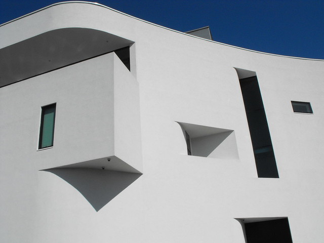
That being said, as with the De La Warr, the Towner needs a lick of paint.
First to the top floor, and John Virtue’s monochromatic renderings of the sea. I went to see Maggie Hambling’s Walls of Water, in part because of the virtriolic review by Jonathan Jones, and that works on a similar principle of abstract expressionist versions of naturalism. Whilst Hambling allows herself colour, Virtue barely gets to grey. Would the Blakeney Tourist Board be chuffed? I was a little disappointed by the paintings simply having numbers and dates (I like that kind of hermeneutic unpacking) and I wondered how some of them can take three years… And yet, that sizeable floor space of the Towner allows for distance and, once you stop, pause, focus, lose yourself, there is something powerful. I reckon you need Ralph Vaughan Williams’s symphony being played, but there is something going on here. Despite myself, I liked.
And then to Ori Gersht, on the second floor, and a photographer who teaches in Rochester. Central to this show are two films — and I confess to a certain amount of impatience with art films (as opposed to film as art). All too often it’s poor cinematography and I’ve got the joke fairly quickly and how the hell can you view it properly in gallery conditions?
First here, though, a room of photographs, treescapes, mountainsides, a little blurred, a little resembling an album cover, something by Led Zeppelin?

Something, someone, at the back of my head — Caspar David Friedrich, the romantic artist of the mountain top?
Through to a second room — there’s a double, jarring, out of alignment photo of a tree, a silver birch? I have a memory of a painting, I think by Johan Christian Dahl, of a tree, that represented Norway.

And then a further memory, more recent, of someone who did this for Germany. The mind is blank.
Is Gersht in this tradition? [ETA: yes, well, of course… see below]
Onto the film Evaders (2009), a twin screen production which begins… well you watch it on a loop, so you come in partway through, and I’ve lost track, but we have a bearded man in a hotel room, and we have him walking in the dark, and we have wind, we have a storm, we have mountainsides. There is a voiceover, reading Walter Benjamin’s “Theses on the Philosophy of History” in relation to Paul Klee’s Angelus Novus, and Gersht is clearly making a link between Benjamin’s words and his fateful attempted walk to freedom in 1940 from Nazi occupied France across the Pyrenees to Spain. But emigration from Portbou was forbidden and Benjamin, in ill-health, faced deportation back to a concentration camp. He chose to kill himself. Benjamin is played by Clive Russell (I knew I recognised him) and the music is by Scanner.
A number of the photographs shown near the tree were taken almost blindly out of a moving window, from a train Gersht travelled on between Krakow and Auschwitz — a route Jewish prisoners would have been taken on to the camps, but on windowless trains. There’s a problem with art “about” the holocaust, about aestheticizing atrocity — Adorno’s line “Kulturkritik findet sich der letzten Stufe der Dialektik von Kultur und Barbarei gegenüber: nach Auschwitz ein Gedicht zu schreiben, ist barbarisch, und das frißt auch die Erkenntnis an, die ausspricht, warum es unmöglich ward, heute Gedichte zu schreiben”, normally paraphrased something like “no [lyric] poetry after Auschwitz”, springs to mind. But it must be engaged with. The moving camera gives an uncanny blurring; in the next room, Gersht is in Galicia, modern western Ukraine, home of his father and other ancestors. These are overexposed, tending to white out, again haunted. Friedrich is invoked in the notes, the romanticisation of the landscape.
This brings us to the second film, The Forest (2005), again on a loop, mostly of a forest and stillness, but with slow, dreadful, ear-splitting, felling of trees. The film slows into slow motion (he filmed at high speed?), again playing with the durée of the image. The loop means you lose the beginning and the end, until there’s a fade to and from black. Where does the work (of art in the age of mechincal reproduction) begin?
The words “The Clearing” allude to Martin Heidegger, and his sense of Being as standing out as in a clearing.
In the midst of beings as a whole an open place occurs. There is a clearing, a lighting… Only this clearing grants and guarantees to us humans a passage to those beings that we ourselves are not, and access to the being that we ourselves are.
In the film, the labour is invisible, missing, and I think from an ecological perspective, the clearing hear is ambivalent at back. Sustainable forestry? A century or two of growing over in an extend second of fall? And again, we are viewing this within the context of the mid-twentieth century atrocities of the Second World War. There is a sublimity at work here, but a terrible beauty was born.
ETA:

Caspar David Friedrich, Der Einsame Baum (The Lonely Tree, 1822, Alte Nationalgalerie, Berlin)
A little digging pointed me to Der einsame Baum (The lonely tree, 1822) by Caspar David Friedrich. I’m not entirely sure where I came across it — possibly in a book on Peder Baulke (who was Norwegian but active in Germany). The consensus is that this tree is an oak, and among the interpretations is that it represents the German people — although in 1822 it was still Prussia. The Riesengebirge/Krkonoše mountains in the background (if it is them) are now in the Czech republic but marked a division between Bohemia and Silesia. I’ve been unable to find a copy of Gersht’s photo, which looked to my untrained arboreal eye to be a silver birch. It’s a very different image from Friedrich’s, of course, but it’s still within the context of German identity.
 I really like Barbara Hepworth’s work. It has a kind of tactility to it, a sensuousness — it cries out to be touched and caressed. I’ve been up to Wakefield and looked at the plasters and maquettes and the blue plaques, and down to St Ives to see the studio and at some point saw the hospital drawings.
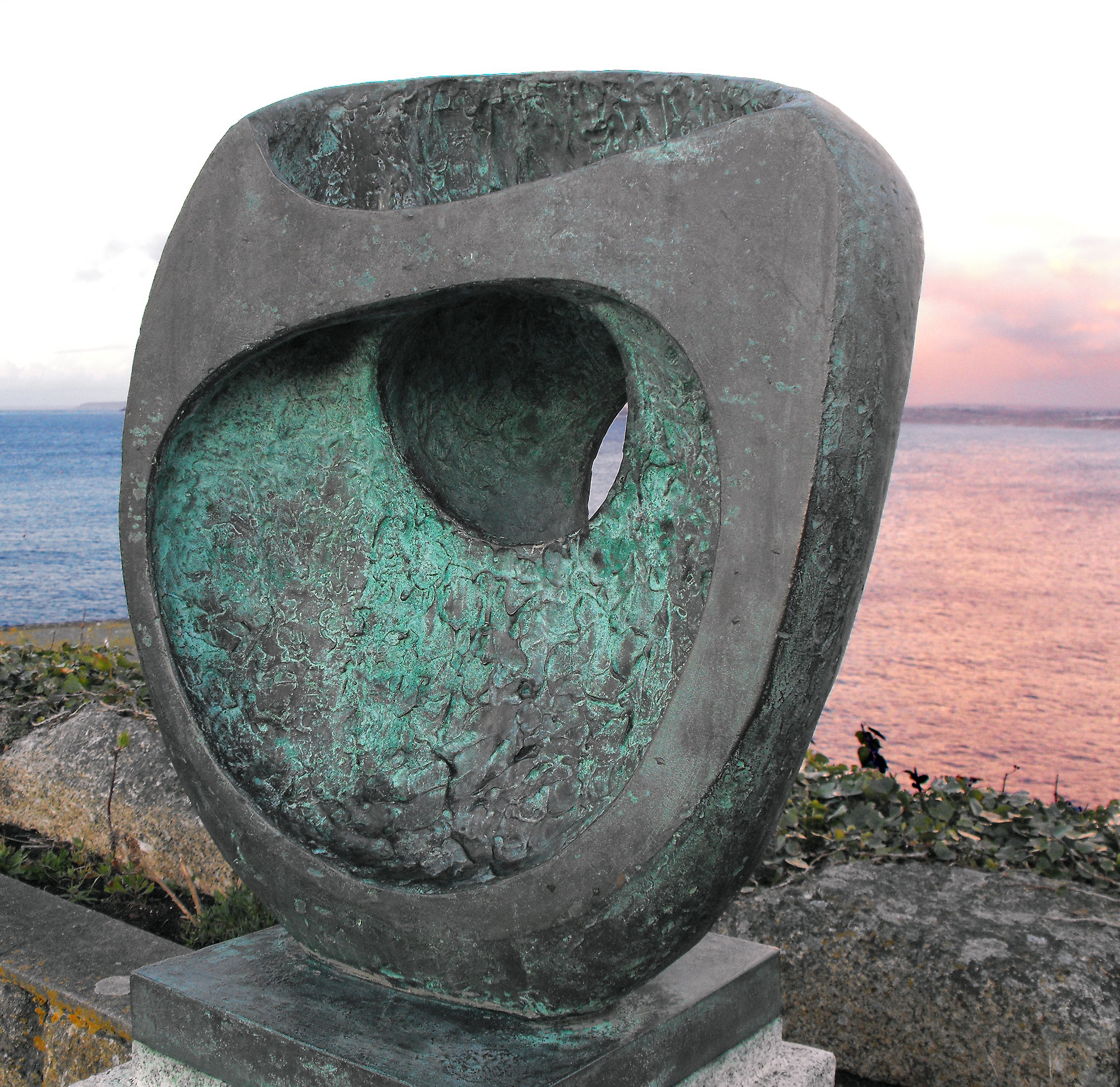 In a later room there’s a documentary, Figures in a Landscape (Dudley Shaw Ashton, 1953), with Cecil Day-Lewis reading bad poetry over footage of the Cornish coast, telling us about how history and then Man has sculpted the landscape — you know that “invisible” sexism that defaults to and his? You want to scream, YOU KNOW HEPWORTH IS A WOMAN, YES? Eventually her sculptures start appearing in the landscape, and for a more you assume the apes will start worshiping them and a certain theme will appear on the soundtrack. Or you assume it’s the inspiration for Led Zeppelin’s Presence.
 There’s only really one Lowry that is immediately recognisable as a Lowry, July, the Seaside (1943), a series of tiny incidents on the beach – games being played, a punch and judy kiosk, sitting, lying, walking, prams, swings. It is the urban crowd transplanted from factory gates and football matches to the sea – possibly in north Wales. What is striking is that the people are dressed much the same – there is no concession to sea and sun. Still, there’s a war on.
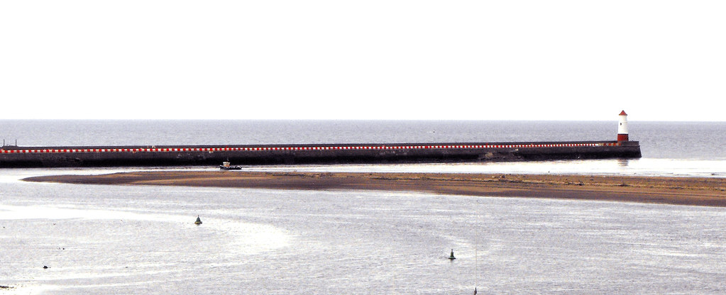
 There’s also South Shields – Waiting for the Tide (1960) – showing Lowry’s love of solitude and quiteness and isolation. Am I misrecognising A Ship (1965) as Tynemouth?
  Then, there’s the Self-Portrait as a Pillar in the Sea (1966), awfully phallic. It’s not a surprise to me – do I recall drawn versions of this at Sunderland? There is another painting like this, also 1966, in Sunderland.
 Stand still and look at the flat square.
 And from that she got to her curve paintings – some black and white, others using greys, some playing with blue and green and red and grey. Take Cataract 2 (or 3, because I can find a picture of that one) and see how it refuses to lie flat. Cataract 2 is more like an arrow than this – note the stripes aren’t parallel, are offset.
 But they didn’t vanish forever, as in 1997 there was a return. Lagoon 2 widens the vertical stripes and interrupts them, if not with curves then with segments of circles. The vertical lines are further disturbed by diagonals. In the area given to studies, we see variants that led to this and similar designs – trying out colours, rearranging segments, working on graph paper and tracing paper. “Lagoon” points us to something more organic than maths, something away from the abstract.
 The most recent piece in the exhibition I think (despite that 2014 date) is a wall painting, Rajasthan (2012) – red, orange, green, grey and the white of the wall. There’s not the same sense of the breaking of the plane, but there’s the breaking of the frame. Given what I’m currently reading about the (American?) battle between the wall and the easel, this feels timely.