Bish Bash Bosch

And so somewhere along the line I heard that a once in a lifetime exhibition of the work of Hieronymus Bosch was being shown in his home town of Den Bosch. Somewhat nervously, I decided that I wanted to go, although I nearly left it too late to book a slot. I booked a hotel in Amsterdam, a city I’d wanted to visit for years, and could have got to from Hull, had I spare time and spare cash and the same time.

So I went, and did the Rijksmuseum and the Van Gogh and took the train down to Den Bosch for what was a crowded but fantastic exhibition. I paid for it the next day, as my knee decided to pack up.

Ouchie.

Continue reading →

If You Go Back to the Woods Today

My Back to the Woods (National Gallery, 11 May-30 October 2016)

George Shaw is that rare beast, a painter who has been nominated for the Turner Prize. I was enough lucky to see the exhibition at the BALTIC, Gateshead, and to my mind it was the best work.

It couldn’t possibly win.

I don’t mean that in a modern art is crap way. I like contemporary art. I just haven’t found myself agreeing with the winners that often. Continue reading →

Beyond the Lady Gardens

Georgia O’Keeffe (Tate Modern 6 July-30 October 2016)

“you hung all your own associations with my flowers on my flowers and you write about my flowers as I think and see what you think and see of the flowers and I don’t”

“Miss O’Keeffe’s drawings … were of intense interest from a psycho-analytical point of view” Camera Work MDCCCCXII

Joanna Russ’s How to Suppress Women’s Writing is a blistering anatomy of the ways in which critics dismiss female authors. I suspect the same is true in the way we treat female artists. So many of them are just plain ignored, not part of the history, whereas others get related to more famous (artist) husbands. The recent Barbara Hepworth exhibition at Tate Britain is a case in point — the juxtaposition of her work with Ben Nicholson’s (much as I like him), risks privileging the influence in one way.

The muse is female. Continue reading →

Kit Out

Christopher Wood, Sophisticated Primitive (Pallant House, 2 July–2 October 2016)

There is a shadow over the art of Christopher Wood:

Aged twenty-nine, having just had tea with his mother, he threw himself under a train at Salisbury and was killed.

Continue reading →

Painting Exposed

Painting with Light (11 May-24 September 2016, Tate Britain)

I am bringing two pieces of baggage to this show.

Firstly a sense that a few London galleries seem to be finding excuses to show the ever popular Preraphs — compare the National Gallery Painters’ Paintings and the V&A’s Botticelli. And also the talk by Karen Shepherdson on Tony Ray-Jones and Martin Parr puts a debate about photography as art and commerce onto my mind. And having just seen William Eggleston at The National Portrait Gallery, my mind was on art.
Continue reading →

Norwegian Marigold

Painting Norway: Nikolai Astrup (Dulwich Picture Gallery, 5 February-15 May 2016)

It’s perhaps odd to think of landscape as political. It shouldn’t seem odd – humanity has shaped the planet with earthworks and agriculture and transportation across the centuries, and the ideological boundaries of course define it. Landscape painting goes further in its selection and depiction of topic, to write a nationality in oil or watercolours.

We’re pretty pisspoor when it comes to Norwegian artists – we only really know Edvard Munch and we mostly know him through misreading The Scream. Add to that Johan Dahl and Peder Balke (to whom I will come back in future blog entries), and I fear the list is exhausted. Munch isn’t really known for his landscapes as such, more his figures in them, but his backgrounds are clearly psychological in nature.

There’s a Dahl painting of a tree in one of the Bergen galleries, which represents Norway. This is presumably an echo, conscious or otherwise, of one of Caspar David Friedrich’s paintings of a tree, which represents Germany. Sylvan metonymy is the way forward – and no doubt a head scratching or two would recall an English oak to mind.

 Der Einsame Baum

Astrup (1880-1928) is an artist whose dates straddle the establishment of an independent Norway, and who is considered to be part of a generation of painters who were creating the country in paint – Norway had become ceded to Sweden from Denmark in 1814 and began fighting for independence, but it was not until 1905 that this finally came about. (I think there’s a set of artists, composers and writers in the 1840s and 1850s who were also working on this project, including Dahl.) Until the Dulwich Picture Gallery show Astrup had not been shown in the UK – and he was unknown to Andrew Graham-Dixon’s somewhat, uh, erratic, documentary on Norwegian art. The majority of canvases on show were landscapes – although sometimes there are groups of people, usually his family, whether siblings or wife and children, but also peasants planting or harvesting.

The most relevant image here is seen best in A Morning in March (c. 1920), a twisted trunk with two branches reaching upwards and splitting, with narrower twigs radiating out. On closer inspection, the tree becomes personifiable, animorphic, as a stretching figure – yawning? Screaming? – with those branches as hands. In woodcuts, some earlier, the figure looks more masculine, in others seems to be breasted.

Astrup was the son of a Lutheran minister and thus grew up both in a religious household and a damp one – the parsonage was not the healthiest of places. He seems to have spent many weeks in bed, presumably staring out of the windows, thus seeing the view in a variety of lights. Rather like Munch, although I suspect for different reasons, Astrup keeps returning to the same images – the same lake, the same mountain – but with different coloration. In painting different colours, he is painting different moods, which attach to spring, summer, autumn and winter.

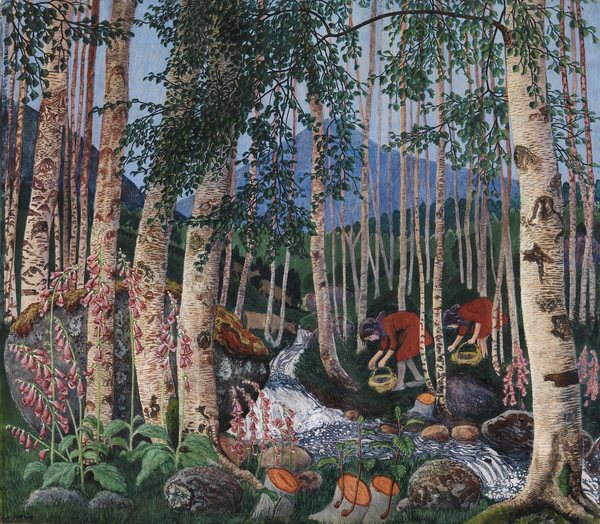
Alongside oils and water colours are wood block prints, carefully carved up from a number of different pieces of wood, ready to be applied with different colours of paint. (Remember, if you think this a primitive technique, that this was Escher’s preferred media.) Each time a block is applied, he has to wait for the paper to dry again – and the paper was liable to shrink and the block expand. A complex image like Foxgloves – which exists in numerous versions – might require twenty dryings before it was complete and a single bodge could ruin the image. Sometimes he would expand a print by adding oil paint ting, sometimes he would add it to an oil painting.

Whilst this was creating a national Norwegian visual language, he was inspired by the Japanese woodcuts he saw in Paris in 1902 and in London in 1908 – most clearly in the design known as Bird on a Stone, with a dipper on a stone on the edge of a fjord, a skinny tree in the foreground and mountains in the distance. The Japanese used water-based pigments, but like him pressed the paper against the block rather than vice versa.

This layout was to lead to a set of images of tree, fjord and mountainside, made concrete in the woodcut cover design for Stein Bugge’s Vår oh Vilje (1916), Spring and Desire, where a closer inspection of the mountains in the background reveal a naked woman lying on her back – a recumbent ice queen. This segues into Spring Night and Willow and A Morning in March, in which the ice queen forms an opposition to the (male) tree troll.

The same double take is necessary in his painting and prints of Grain Poles, where the wheat echoes the image of the troll – the catalogue helpfully points us to Theodor Kittelsen’s Troll Wondering How Old He Is (1911) and Grain Poles in Moonlight (1900), as well as pointing to a house as skull (Ålhus Church) and flames as dragons (Preparations for the Midsummer Eve Bonfire (1908)).

Such haunted landscapes would have been at odds with his father’s Lutheranism – indeed the paganism or Norse mythology underlying the Midsummer Eve Bonfires that he was to repeatedly paint reflect a tension with a disapproving parent. He had to stand at a distance – away from its ungodliness and eroticism. But it has its roots in a mythology than underpins Norwegian identity. At the same time, a painting such as Autumn Dusk in the Garden (1902) has a warm light coming from the parsonage and he seems to have been upset by its fall into disrepair and demolition.

The confluence of identity and landscape comes most clearly in his landscapes with marsh marigolds. These would include A Clear Night in June and A June Night and Marsh Marigolds. The vanishing of the flowers represents the passing of an earlier world and a nostalgia for it, as well as concrete evidence of agricultural development.

A number of Astrup’s paintings show the planting of crops or their harvesting, and in his later years he established a smallholding that was garden, house, studio and source of food. He experimented with traditional native plants and cross breeding. He worked on trees to turn them into trolls.

At the heart of his work, then, seems to be the need to record a passing way of life in an industrialised age that then faced the horrors of the First World War. His paintings fix a past that generate a sense of a Norwegianness that had only just achieved constitutional identity and may yet disappear in a globalised world. The authentic Norwegian appears to be art, customs and costumes associated with the rural farmers and peasants, presumably on the grounds that they remained untouched by Swedish and Danish influence, with Norway isolated from the rest of Europe, in part because of a distrust of centralisation. More than this, I am not yet qualified to pin down – I evidentally need to do some reading.

*
[I note “Traditionally Norway has had neither a strong landed gentry nor a solid urban bourgeoisie, and the vast majority of Norwegians were farmers or fishermen right up to the beginning of the 20th century.” (Thomas Hylland Eriksen) but “Furthermore, he [Øyvind Østerud] shows how important aspects of our national identity were defined by the urban bourgeoisie in the last century: ‘It was the urbane ruling class that defined the culture of the mountain peasantry – in an idealized form – as quintessentially Norwegian.'”]

Bibliography

  • Frances Carey, Ian Dejardin and MaryAnne Stevens Painting Norway: Nikolai Astrup 1880-1928 (London: Scala Arts, 2016)

While Someone Else is Sleeping

Bruegel in Black and White: Three Grisailles Reunited (Courtauld Gallery, 4 February–8 May 2016)

I knew Pieter Bruegel the Elder from that W.H. Auden poem, about Icarus and life going on, and I went away and looked at reproductions of his extraordinary canvases back in the day to see what W.H. was on about. Most years I turn to Bruegel’s Battle of Carnival and Lent to illustrate Bakhtin’s ideas of carnival – or at least, the historical sweep.

The Courtauld Gallery has given us a unique chance – one of the works cannot leave the gallery – to look at his three authenticated grisailles for the first time.

No, I had no idea what they were either.

A grisaille is a painting more or less in black and white, although shades of grey seem possible. Sometimes, I gather, in brown. These can be used to extraordinary effect – the depiction of night and darkness, perhaps, or a three dimensional impact on a plane. One of the locations of such works is on the closed flaps of altarpieces in Dutch churches – and so a religious subject is often presupposed and Hieronymus Bosch had already produced some of these. What Bruegel seems to have done is to lay down an area of white on wood – compare L.S. Lowry’s use of white paint to prime his canvases – a drawing added in charcoal or red chalk, a thin black wash added to most of the canvas and then Bruegel painted on top of that, presumably mostly in greys. The grisailles seem to have been painted in a hurry, with alterations whilst the paint dried.

Until the mid-twentieth century, two examples were known: The Death of the Virgin and Three Soldiers, with a third, A Woman Taken in Adultery coming up for auction in 1952 and eventually being bequeathed to the Samuel Courtauld Trust collection. Two of these clearly have religious themes, and the existence both of prints of these and of a Resurrection suggests that there is at least one more yet to be found.

catThe Death of the Virgin is dated c. 1562-5 and is a nocturnal, almost chiaroscuro, depiction of the dying moments of the Virgin Mary surrounded by worshippers, partly lit by a candle in her hands, but also luminescent. Everyone is in (then) contemporary dress, of course – it is an extra-Biblical interpolation. Life goes on, too, of course, a cluttered table and chair are at the end of the bed, someone is asleep in the corner and, best of all, a cat is in the prime position by the fire. These details show up better in the 1574 print version by Philips Galle, where the light levels are considerably higher and some of the awkward perspectives of a chair are rectified. On the other hand, that chair perhaps nods to Van Gogh to come. One the other hand, that underplays the religious significance of the light of Mary set against the candles and the fire.

A Woman Taken in Adultery is taken from the He-that-is-without-sin bit of John (8.1-11) – although why Christ is writing this rather than saying it out loud eludes me. Christ is leaning over on the left hand side of the picture, scratching in the dust in Dutch, his head just overlapping the woman, and the Pharisees are on the right of the picture, stones to the ready on the paving. Note Christ is either on a lower step or (I can’t quite tell from the perspective) there is a gap between his paving and the Pharisees’. There is a crowd in the background – some passing by, others gawping. The fact that Christ is writing with his right hand suggests this was an original work rather than a preparation for prints.

Pieter’s son Jan sent the grisaille to patron Cardinal Federico Borromeo in Milan, but the latter felt this was too generous, had a copy made in about 1825, and sent it back. Pieter Perret made a print in 1579 – again this is much light, with a foreground text – and Jan had painted a copy roughly 1597, which brings us slightly closer to the foreground foursome and isolated the crowd more distinctly. None of these have the vitally of Bruegel’s original. Pieter’s son, Pieter Bruegel the Younger, also copied the painting, apparently several times, with a colour one on display here. The realism and the individuation of the figures is at the expense of the spiritual dimension – it feels less religious.

The Three Soldiers (1568) seem not to be a religious subject – there is a drummer and a fifer and in the background a soldier with a flag. The best guess is that these are Landsknechte, mercenaries, which could have fought for Spain or the Holy Roman Empire. My dim and distant history A Level reminds me of the ongoing wars in Europe – the Netherlands, Spain, Italy, the Holy Roman Empire – and the forces of Catholicism, various flavours of Protestantism and the counter-reformation. It is perhaps a plea for religious tolerance? At one point, the grisaille was owned by the future Charles I, although it briefly left the royal collections during the Commonwealth, it seems to have passed from William III to a private secretary, William van Huls.

Two more grisailles round out the exhibition — The Visit to the Far (c. 1600), attributed to Jan Brueghel the Elder, and Frans Pourbus the Elder’s The Last Supper (c. 1570). The former had been thought to be by Pieter, but is reckoned to be inferior – a series of figures in a farmhouse, with a nurse and baby in the foreground. It may be a copy of a lost Bruegel painting, it may be a pastiche. Again the absence of a religious subject must be noted – but of course non-religious examples may have been lost.

Don’t Confuse Her With the Actor

Lee Miller: A Woman’s War (Imperial War Museum, London, 15 October 2015-24 April 2016)

Do you know you are not allowed to drink beer in the Imperial War Museum? Or – given that I’m fairly surely they sell it in their café – you are not allowed to drink beer you’ve brought with you in the IWM? Also, I’m pretty sure I’ve seen themed beers in the shop.

I was forced to use a locker for the bottle of Solaris I’d bought for the train home.

I think the last paid exhibition I saw at the Imperial War Museum was Don McCullin – his fantastic war photography. Other photographers, of course, specialise in fashion, or in art, or landscapes or people.

Lee Miller (1907-1977) does art, people, landscape, fashion and war. A rare combination, especially, one might say, for a woman. I’ve seen various exhibitions of her work of late – as if her son Antony Penrose is a man on a mission – most recently her photos of Picasso and her family at the Scottish National Portrait Gallery, and there’s a vast website at www.leemiller.co.uk. She’s shown up among women surrealists, too.

I don’t think I’d picked up before that she’d been raped as a young child, nor that her father had photographed her in the nude. I recalled nudes of her, including self-portraits, and some of these are on display, along with Paul Homann’s cast of her torso (1939) – an echo of Man Ray’s photo of her – and this suggests an apparent degree of bodily freedom that seems a little odd. Exhibitionism as defence?

She’d worked as a model in New York for Arnold Genthe, George Hoyningen-Huene, Nickolas Muray and Edward Steichen, before going to Europe in 1929 and working with Man Ray as muse, model and photographer. She experimented with the solarisation process – which was also to be used by Barbara Hepworth. On her return to New York in 1932, she set up her own studio, but married wealthy businessman Aziz Eloui Bey and moved to Cairo. Her photography shifted from surrealism to landscape, focusing on the desert and ruined villages in the sands. On a trip to Paris she met the collector and artist Roland Penrose, beginning a long affair with him that would eventually become a marriage. She took photographs in the Balkans, as well as Syria and Egypt, before war broke out.

In theory she should have gone back to the United States, but she had taken a job with British Vogue. Initially she was working as a fashion photographer – it was Vogue, after all – and part of the work was to keep spirits up with the keeping up of standards. But as the war went on, it intruded on the photographs. Models posed in bomb sites or wore gas masks – fashion colliding with surrealism. She took photographs of women in uniforms and doing war work, as well as nurses.

By 1944, she was accredited as a war correspondent for Vogue — there’s an intriguing photograph by David E. Sherman of her in uniform in front of the Vogue cover with a soldier, women and a stars and stripes flag – and she got more involved in the war. The way she tells it, it was almost a lark, but that might be a survivor talking.

She was meant to go to Normandy, after the landings, and to avoid trouble, but she ended up in Saint-Malo, still under German control but heavily shelled by the American army. Unlike other journalists, Miller mixed with and apparently had affairs with the military, and didn’t buckle down to follow the official itinerary. She ended up in liberated Paris – where she photographed fashion shows – and went into Germany. The photographs on display include some of Dachau and Buchenwald, the concentration camps, one being feet in boots, somewhere between a dancer and a fashion shoot. In Munich she entered Hitler’s apartment, Scherman taking a photo of her in Hitler’s bath, nude of course, her muddied boots on the mat, a photo of Hitler on one side, a statuette on the other. It is a grim jest.

That was almost it – she returned to Britain in 1946 and took more photos of Budapest, finally reconciling with and marrying Roland. In 1948, Antony was born; Picasso continued to visit and remained a friend of the family. Miller gave up photography almost entirely – there’s a 1946 photograph of Max Ernst and Dorothea Tanning, with Ernst as a giant and she had photos in the 1955 The Family of Man exhibition curated by Steichen at MOMA, New York – in favour of becoming a cordon blue cook and writing about it for British Vogue.

Antony apparently didn’t know about the war photographs until after her death, which seems incredible. Miller was also focusing on helping Roland with his various biographies of artists.

But the body of work is remarkable – black and white, sharp, often square and remarkably well framed. Sometimes the fashion influence is discernible in the reportage, sometimes there is staging, but a dark humour and sense of surrealism often bubbles through. She wasn’t the only female war photographer – the exhibition mentions Margaret Bourke-White (1904-71), who was also with the US Army and had been in the Soviet Union in 1941 when the Germans invaded – but hers remains an impressive body of work.

Bridget Courbevoie

Bridget Riley: Learning from Seurat (Courtauld Art Gallery, 17 September 2015–17 January 2016)

I tried to find the bridge (Bridge at Courbevoie (1886-87)) on Google maps but failed — the river Seine, the bridge, a distant factory, trees, fisher men, walkers. Georges Seurat’s brand of Post-Impressionism, pointillism, made up from coloured dots, half way between colour printing and cathode ray tubes. In another place, Roy Lichtenstein was to enlarge dots and make pop art of comics.

Copying is original.

Deliberately, if annoyingly, the copy and original hang either side of the doorway, challenging you to find a viewpoint from which they can be compared. You carry the memory of one to the other.
photo (2)

Bridget Riley may have seen the painting at the Courtauld – I presume it was at the Warburg Institute, Woburn Square in 1959, having recently moved from Portman Square? — but instead it struck her in R.H. Wilenski’s book on Seurat and she then decoded to paint her own version. It’s bigger, of course, but then the book may not have been clear how big the original was. I think she knew, really, so decided to make the dots larger, and so the intensity of the original is pushed even further from photorealism. The sky is curiously yellow, matching the colour in the water and the grass. He creates light from colour and that seems to be what fascinated Riley.

If the colours become abstract, then so do the shapes — triangles, poles, lozenges, anticipating Riley’s move from stripes into something more… foliated. The Lagoon paintings, for example.

sketch

And then, on an opposite wall, Pink Landscape (1960), the shimmer of summer heat in Sienna represented by dots of red and green and pink and orange and blue, and a child’s farmhouse of white walls and a red roof. The shapes of the fields form lozenges.

Wilenski writes of Bridge that “The little man in the bowler hat has missed his train back to Paris and will be scolded by his wife; the child will be late for tea and spanked, maybe, by its mother.”

Heigho.

But we would lose the narrative in Riley as the pinstripes become stripes.

Here we’re offered variants on stripes — Late Morning I (1967) with green and red and white and blue stripes insisting on length and direction, the vertical, Vapour (1970) with white, brown, purple, green stripes overlapping, question the plane and Ecclesia (1985), thicker stripes, taking on volume.

But Tremor (1962) draws the eye — black and white triables that also form curves and ribbons and you swear the painting rotates in front of you.

A painting approximates reality through strokes, dots, stripes and the pointillist returns it to dots. Riley’s insight was to occupy the geometry, to chase the relation of shape, in canvases that move both optically and emotionally, to create luminence.

Bibliography

  • Bridget Riley: Learning from Seurat (London: The Courtauld Gallery/Ridinghouse, 2015)
  • Wilenski, R. H., Seurat (London: Faber & Faber, 1949)